One of the most common running themes on this blog is discussions of human bias, a topic I clearly believe deserves quite a bit of attention. In recent years though, I have started thinking a lot more about machine bias, and how it is slowly influencing more of our lives. In thinking about machine bias though, I’ve noticed recently that many people (myself included) actually tend to anthropomorphize machine bias and attempt to evaluate it as though it was bias coming from a human with a particularly wide-spread influence. Since anthropomorphism is actually a cognitive bias itself, I thought I’d take a few minutes today to talk about things we should keep in mind when talking about computers/big data algorithms/search engine results. Quite a few of my points here will be based off of the recent kerfluffle around Facebook offering to target your ads to “Jew haters”, the book Weapons of Math Destruction, and the big data portion of the Calling BS class. Ready? Here we go!
- Algorithm bias knows no “natural” limit. There’s an old joke where someone, normally a prankster uncle, tells a child that they’ll stop pouring their drink when they “say when”. When the child subsequently says “stop” or “enough” or someone other non-when word, the prankster keeps pouring and the glass overflows. Now, a normal prankster will pour a couple of extra tablespoons of milk on the table. An incredibly dedicated prankster might pour the rest of the container. An algorithm in this same scenario would not only finish the container but go run out to the store and buy more so they could continue pouring until you realized you were supposed to say when. Nearly every programming 101 class starts at some point with a professor saying “the nice part is, computer’s do what you tell them. The downside is, computers do what you tell them”. Thus, despite the fact that no sane person, even a fairly anti-Semitic one, would request an advertising group called “Jew haters”, a computer will return a result like this if it hits the right criteria.
- Thoroughness does not indicate maliciousness. Back in the 90s, there was a sitcom on called “Spin City” about a fictional group of people in the mayor’s office in New York City. At one point the lone African American in the office discovered that you could use their word processing software to find certain words and replace them with others, so in an attempt to make the office more PC, he sets them up to replace the word “black” with “African-American”. This of course promptly leads to the mayor’s office inviting some constituents to an “African-American tie dinner”, and canned laughter ensues. While the situation is fictional, this stuff happens all the time. When people talk about the widespread nature of an algorithm bias, there’s always a sense that some human had to put extra effort in to making the algorithm do absurd things, but it’s almost always the opposite. You have to think of all the absurd things the algorithm could do ahead of time in order to stop them. Facebook almost certainly got in to this mess by asking its marketing algorithm to find often-repeated words in people’s profiles and aggregate those for its ads. In doing so, it forgot that the algorithm would not filter for “clearly being an asshole” and exclude that from the results.
- While algorithms are automatic, fixing them is often manual. Much like your kid blurting out embarrassing things in public, finding out your algorithm has done something embarrassing almost certainly requires you to intervene. However, this can be like a game of whack-a-mole, as you still don’t know when these issues are going to pop up. Even if you exclude every ad group that goes after Jewish people, the chances that some other group has a similar problem is high. It’s now on Facebook to figure out who those other groups are and wipe the offending categories from the database one by one. The chances they’ll miss some iteration of this is high, and then it will hit the news again in a year. With a human, this would be a sign they didn’t really “learn their lesson” the first time, but with an algorithm it’s more a sign that no one foresaw the other ways it might screw up.
- It is not overly beneficial to companies to fix these things, EXCEPT to avoid embarrassment. Once they’re up and running, algorithms tend to be quite cheap to maintain, until someone starts complaining about them. As long as their algorithms are making money and no one is saying anything negative, most companies will assume everything is okay. Additionally, since most of these algorithms are proprietary, people outside the company almost never get insight in to their weaknesses until they see a bad result so obvious they realize what happened. In her book Weapons of Math Destruction , Cathy O’Neill tells an interesting story about one teachers attempt (and repeated failure) to get an explanation for why an algorithm called her deficient despite excellent reviews, and why so much faith was put in it that she was fired. She never got an answer, and ultimately got rehired by a (ironically better funded, more prestigious) district. One of O’Neills major take-aways is that people will put near unlimited trust in algorithms, while not realizing that the algorithms decision making process could be flawed. It would be nearly impossible for a human to wield that much power while leaving so little trace, as every individual act of discrimination or unfairness would leave a trail. With a machine, it’s just the same process applied over and over.
- Some groups have more power than others to get changes made, because some people who get discriminated against won’t be part of traditional groups. This one seems obvious, but hear me out here. Yes, if your computer program ends up tagging photos of black people as “gorillas”, you can expect the outcry to be swift. But with many algorithms, we don’t know if there are new groups we’ve never thought of that are being discriminated against. I wrote a piece a while ago about a company that set their default address for unknown websites to the middle of the country, and inadvertently caused a living nightmare for the elderly woman who happened to own the house closest to that location. This woman had no idea why angry people kept showing up at her door, and had no idea what questions to ask to find out why they got there. We’re used to traditional biases that cover broad groups, but what if a computer algorithm decided to exclude men who were exactly age 30? When would someone figure that out? We have no equivalent in human bias for more oddly specific groups, and probably won’t notice them. Additionally, groups with less computer savvy will be discriminated against, solely due to the “lack of resources to trouble-shoot the algorithm” issues. The poor. Older people. Those convicted of crimes.The list goes on.
Overall, things aren’t entirely hopeless. There are efforts underway to come up with software that can systematically test “black box” algorithms on a larger scale to help identify biased algorithms before they can cause problems. However, until something reliable can be found, people should be aware that the biases we’re looking for are not the ones you would normally see if humans were running the show. One of the reasons AI freaks me out so much is because we really do all default to anthropomorphizing the machines and only look out for the downsides that fit our pre-conceived notions of how humans screw up. While this comes naturally to most of us, I would argue it’s on of the more dangerous forms of underestimating a situation we have going today. So uh, happy Sunday!

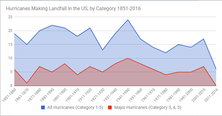
 On this graph you can draw lines to show not just “is it different” but also “when do we really care”. I think this is easier to show kids than just a p-value by itself, as there’s no equivalent visual to show p-values.