Welcome to the Calling Bullshit Read-Along based on the course of the same name from Carl Bergstorm and Jevin West at the University of Washington. Each week we’ll be talking about the readings and topics they laid out in their syllabus. If you missed my intro and want the full series index, click here or if you want to go back to Week 9 click here.
Wow, week 10 already? Geez, time flies when you’re having fun. This week the topic is “the ethics of Calling Bullshit” and man is that a rich topic. With the advent of social media, there are more avenues than ever for both the perpetuation and correction of bullshit than ever before. While most of us are acutely aware of the problems that arise with the perpetuating of bullshit, are there also concerns with how we go about correcting bullshit? Spoiler alert: yes. Yes there are. As the readings below will show, academia has been a bit rocked by this new challenge, and the whole thing isn’t even close to being sorted out yet. There are a lot more questions than answers raised this week.
Now, as a blogger who frequently blogs about things I think are kinda bullshit, I admit I have a huge bias in the “social media can be a huge force for good” direction. While I doubt this week’s readings will change my mind on that, I figured pointing out how biased I am and declaring my intention to fairly represent the opposing viewpoint might help keep me honest. We’ll see how it goes.
For the first reading, we’re actually going to take a look at a guy who was trolling before trolling was a thing and who may have single handedly popularized the concept of “scientific trolling”: Alan Sokal. Back in 1994, long before most of the folks on 4chan were born, Sokal became famous for having created a parody paper called “Transgressing the Boundaries: Toward a Transformative Hermeneutics of Quantum Gravity” that and getting it published in the journal Social Text as a serious work. His paper contained claims like “physical reality is a social construct” and that quantum field theory is the basis for psychoanalysis. Unfortunately for Social Text, they published it in a special “Science Wars” edition of their journal unchallenged. Why did he do this? In his own words: “So, to test the prevailing intellectual standards, I decided to try a modest (though admittedly uncontrolled) experiment: would a leading North American journal of cultural studies….publish an article liberally salted with nonsense if (a) it sounded good and (b) it flattered the editors’ idealogical preconceptions?” When he discovered the answer was yes, he published his initial response here.
Now whether you consider this paper a brilliant and needed wake up call or a cheap trick aimed at tarring a whole swath of people with the same damning brush depends largely on where you’re sitting. The oral history of the event is here (for subscribers only, I found a PDF copy here), does a rather fair job of getting a lot of perspectives on the matter. On the one hand, you have the folks who believe that academic culture needed a wake up call, and that they should be deeply embarrassed that no one knew the difference between a serious paper and one making fun of the whole field of cultural studies. On the other hand, you have those who felt that Sokal exploited a system that was acting in good faith and gave its critics an opportunity to dismiss everything that comes out of that field. Both sides probably have a point. Criticizing the bad parts of a field while encouraging people to maintain faith in the good parts is an incredibly tough game to play. I got a taste of this after my first presentation to a high school class, when some of the kids walked away declaring that the best course action was to never believe anything scientific. Whether you agree with Sokal or not, I will suspect every respectable journal editor has been on the look out for hoaxes a little more vigilantly ever since that incident.
Next up is an interesting example of a more current scientific controversy that appears to be spinning way out of control: nano-imaging. I’ll admit, I had no idea this feud was even going on, but this article reads more like a daytime TV plot than typical science reporting. There are accusations of misconduct, anonymous blog postings, attacks and counter attacks, all over the not particularly well known controversy of whether or not you can put stripes on nanoparticles. While the topic may be unfamiliar to most of us, the debate over how the argument is being approached is pretty universal. If you have a problem with someone else’s work and believe traditional venues for resolution are too slow, what do you do? Alternatively, what do you make of a critic who is mostly relying on social media to voice their concerns? These are not simple questions. As we’ve seen in many areas of life (most recently the airline industry), traditional venues do at times love to cover up their issues, silence critics and impede progress. On the other hand, social media is easily abused and sometimes can enable people with an agenda to spread a lot of criticism with minimal fact checking. From the outside, it’s hard to know what’s what. I had no opinion on the “stripes on nanoparticles” debate, and I have no way of judging who has the better evidence. I’m left with going with my gut on who’s sounding more convincing, which is completely the opposite of how we’re supposed to evaluate evidence. I’m intrigued for all the wrong reasons.
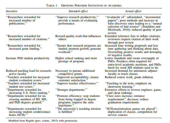
Going even further down the rabbit hole of “lots of questions not many answers”, the next reading is from Susan Fiske “Mob Rule or Wisdom of the Crowds” where she explains exactly how bad the situation is getting in psychology. She explains (though without names or sources) many of the vicious attacks she’s seen on people’s work and how concerning the current climate is. She sees many of the attacks as personal vendettas more focused on killing people’s careers than improving science, and calls the criticizers “methodological terrorists”. Her basic thesis is that hurting people is not okay, drives good people out of the field, and makes things more adversarial than they need to be.
Fiske’s letter got a lot of attention, and had some really good response opinions posted as well. One is from a researcher, Daniel Lakens, who wrote about his experience being impolitely called out on an error in his work. He realized that the criticism stung and felt unfair, but the more he thought about it the more true he realized it was. He changed his research practices going forward, and by the time a meta-analysis showed that the original criticism was correct, he wasn’t surprised or defensive. So really what we’re talking about here is a setup that looks like this:
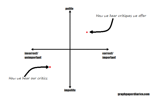
Yeah, this probably should have had a z-axis for the important/unimportant measure, but my computer wasn’t playing nice.
It is worth noting that (people being people and all) it is very likely we all think our own critiques are more polite and important than they are, and that our critics are less polite and their concerns less important than they may be.
Lakens had a good experience in the end, but he also was contacted privately via email. Part of Fiske’s point was that social media campaigns can get going, and then people feel attacked from all sides. I think it’s important that we don’t underestimate the social media effect here either, as I do think it’s different from a one on one conversation. I have a good friend who has worked in a psychiatric hospital for years, and he tells me that one of the first things they do when a patient is escalating is to get everyone else out of the room. The obvious reason for this is safety, but he said it is also because having an audience tends to amp people up beyond where they will go on their own. A person alone in a room will simply not escalate as quickly as someone who has a crowd watching. With social media of course, we always have a crowd watching. It’s hard to dial things back once they get going.
Some fields have felt this acutely. Andrew Gelman responds to Fiske’s letter here by giving his timeline of how quickly the perspective on the replication crisis changed, fueled in part by blogs and Twitter. From something that was barely talked about in 2011, to something that is pretty much a given now, we’ve seen people come under scrutiny they’ve never had before. Again, this is an issue shared by many fields….just ask your local police officer about cell phone cameras….but the idea that people were caught off guard by the change is pretty understandable. Gelman’s perspective however is that this was a needed ending to an artificially secure spot. People were counting on being able to cut a few corners with minimal criticism, then weren’t able to anymore. It’s hard to feel too much sympathy for that.
Finally we have an article that takes a look at PubPeer, a site that allows users to make anonymous post-publication comments on published articles. This goes about as well as you’d expect: some nastiness, some usefulness, lots of feathers ruffled. The site has helped catch some legitimate frauds, but has also given people (allegedly) an outlet to pick on their rivals without fear of repercussion or disclosing conflicts of interest. The article comes out strongly against the anonymity provided and calls the whole thing “Vigilante Science”. The author goes particularly hard after the concept that anonymity allows people to speak more freely than they would otherwise, and points out that this also allows people to be much meaner, more petty, and possibly push an agenda harder than they could otherwise.
Okay, so we’ve had a lot of opinions here, and they’re all over the graph I made above. If you add in the differences in perception of tone and importance of various criticisms, you can see easily why even well meaning people end up all over the map on this one. Additionally, it’s worth nothing that there actually are some non-well meaning people exploiting the chaos in all of this, and they complicate things too. Some researchers really are using bad practices and then blaming others when they get called out. Some anonymous commenters really are just mouthing off or have other motivations for what they’re saying.
As I said up front, it should not come as a shock to anyone that I tend to fall on the side of appreciating the role of social media in science criticism. However, being a blogger, I have also received my fair share of criticism from anonymous sources and have a lot of sympathy for the idea that criticism is not always productive as well. The graph I did a few paragraphs ago really reflects my three standards for criticism I give and receive. There’s no one size fits all recommendation for every situation, but in general I try to look at these three things:
- Correct/incorrect This should be obvious, but your criticism should be correct. If you’re going to take a shot at someone else’s work, for the love of God make sure you’re right. Double points if you have more than your own assertion to back you up. On the other hand, if you screw up, you can expect some criticism (and you will screw up at some point). I’m doing a whole post on this later this week.
- Polite/impolite In general, polite criticism is received better than impolite criticism. It’s worth noting of course that “polite” is not the same as “indirect”, and that frequently people confuse “direct” for “rude”. Still, politeness is just….polite. Particularly if you’ve never raised the criticism before, it’s probably best to start out polite.
- Important/unimportant How important is it that the error be pointed out? Does it change the conclusions or the perspective?
These three are not necessarily independent variables. A polite note about a minor error is almost always fine. On the other hand it can be hard to find a way of saying “I think you’ve committed major fraud” politely, though if you’re accusing someone of that you DEFINITELY want to make sure you have your ducks in a row. I think the other thing to consider is how easy the criticism is to file through other means. If you create a system where people have little recourse, where all complaints or criticisms are dismissed or minimized, people will start using other means to make complaints. This was part of Sokal’s concern in the first reading. How was a physicist supposed to make a complaint with the cultural studies department and actually be listened to? I’m no Sokal, but personally I started this blog because I was irritated with the way numbers and science were getting reported in the media, and putting all my thoughts in one place seemed to help more than trying to email journalists who almost never seemed to update anything.
When it comes to the professional realm, I think similar rules apply. We’re all getting used to the changes social media has brought, and it is not going away any time soon. We’re headed in to a whole new world of ethics where many good people are going to disagree. Whether you’re talking about research you disagree with or just debating with your uncle at Thanksgiving, it is worth thinking about where your lines are and what battles you want to fight and how you want to fight them.
Okay, that wraps up a whole lot of deep thoughts for the week, see you next week for some Fake News!
Week 11 is up! Get your fake news here!