Millenials and Parenting

Recently Time Magazine ran an article called “Help! My Parents are Millennials!” that caught my interest.  Since I am both a parent and (possibly) a millennial, I figured I’d take a look to see what exactly they were presuming my child would complain about.

I was particularly interested in how they were defining “millennial”, since Amanda Hess pointed out over a year ago that many articles written about millennials actually end up interviewing Gen Xers and just hoping no one notices. Time’s article started off doing exactly that, but then they quickly clarified that they define “millennial” as those born from the late 70s to the late 90s.  This is actually about a seven year shift from what most other groups consider millennials, with the most commonly cited years of birth being 1982 to 2004 or so. Interestingly, only Baby Boomers get their own official generational definition1 endorsed by the Census Bureau: birth years 1946 to 1964.

I bring all this up, because the Time article include some really interesting polling data that purports to show parental attitude differences. Those results are here. Now it looks like they polled 2,000 parents, representing 3 generations with kids under 18.  I DESPERATELY want to know what the number of respondents for each group was. See, if you do the math with the years I gave above, the only Boomers who still have kids under the age of 18 are those who had them after the age of 33….and that’s for the very youngest year of Boomers. While of course it’s not impossible to have or adopt children over that age, it does mean the available pool of Boomers that meet the criteria is going to be smaller and skewed toward those who had children later. Additionally, if you look at the Gen X range, you realize that Time cut this down to just 10 years because of how early they started the Millennials. I don’t know for sure, but I’d guess the 2,000 was heavily skewed towards Millennials.  Of course, since we couldn’t even get numbers, we can’t possibly know which of the attitude differences they looked at were statistically significant. This annoys me, but is pretty common.

What irritated me the most though, is the idea that you can really compare parenting attitudes for parents who are in entirely different phases of parenting.  For example, there was a large discrepancy in Millennial vs Boomer parents who worried that other people judge what their kids eat. Well, yeah. Millennials are parenting small children right now, and people do judge parents more for what a 5 year old eats than a 16 year old.

Additionally, there were some other oddities in the reporting that made me think the questions were either asked differently than reported, the respondents were unclear on what they should answer, or the sample size was small.  For example, equal numbers of Boomers and Millennials said they were stay-at-home parents, which made me wonder how the question was phrased. Are 22% of Boomers still really staying home with their teenagers? My guess is some of them answered what they had done.  Another oddity was the number who said they’d never shared a picture of their child on social media. I would have been more interested in the results if they’d sorted this out by those who actually had a social media account. I also am thinking this phrasing could be deceptive. I know a few Boomers who would probably say they don’t share pictures of their kids, but will post family photos. YMMV.

Anyway, I think it’s always good to keep in mind how exactly generations are being defined, and what the implications of these definitions are. Attitude surveys among generations will always be tough to do in real time, as much of what you’ll end up testing is really just some variation of “people in their 50s think differently from those in their 20s”.

1. Typical

Blog Updates

As many of you know, I used to run a blog called Bad Data Bad! and this morning I figured out how to import all of those old blog posts in to this blog. I’ll be going back and tinkering a bit…tagging the posts, possibly removing some if I don’t like them anymore, etc. and I may be mucking about with other parts of the site as well.

Stay tuned.

Guns and Graphs Part 2

In the comment section on my last post about guns and graphs there was some interesting discussion about some of the data.  SJ had some good data to toss in, and DH made a suggestion that a graph of gun murders vs non-gun murders might be interesting.  I thought that sounded pretty interesting as well, so I gave it a whirl:

Gun graph 4

Apologies that not every state abbreviation is clear, but at least you get the outliers. Please note that the axes are different ranges (it was not possible to read if I made them the same) so Nevada is really just a 50/50 split, whereas Louisiana is actually pretty lopsided in favor of guns.  That being said, the correlation here is running at about .6, so it seems fair to say that states that have more gun homicides have more homicides in general. Now to be fair, this chart may underestimate non-gun murders, as those are likely a little harder to count than gun related murders. I don’t have hard data on it, but I’m somewhat inclined to believe that a shooting is easier to classify then a fall off a tall building.  Anyway, I pulled the source data from here.

While I was looking at that data, I thought it would be interesting to see if the percent of the population that owned guns was correlated with the number of gun murders:
Gun graph 5

Aaaaaaaaand…there’s no real correlation there. It’s interesting to note that Hawaii and Wyoming are dramatically different in ownership percentage, but not gun homicide rate. Louisiana and Vermont OTOH, have nearly identical ownership rates and completely different gun homicide rates.

Then, just for giggles I decided to go back to the original gun law ranking I was using, and see if gun ownership percentage followed that trend:

Gun graph 6

There does appear to be a trend there, but as the Assistant Village Idiot pointed out after the last post, it could simply be that places with lower gun ownership have an easier time passing these laws.


Bitterness and Psychopathy

I’m having some insomnia problems at the moment, so it was about 4am today when I turned on my coffee maker and sat down to do some internet perusing. I was just taking my first sip, when I stumbled upon this article titled “People Who Take Their Coffee Black Have Psychopathic Tendencies“.

Oh. Huh.

As a fairly dedicated black coffee drinker, I had to take a look.  The article references a study here that tested the hypothesis that an affinity for bitter flavors might be associated with the “Dark Tetrad” traits: Machiavellianism, psychopathy, every day sadism and narcissim.

I read through the study1, and I thought it was a good time to talk about effect sizes. First, lets cover a few basics:

  1. This was a study done through Mechanical Turk
  2. People took personality tests and rated how much they liked different foods, the researchers ran some regressions and reported the correlations  for these results
  3. They did some other interesting stuff to make sure people really liked the bitter versions of the foods they were rating and to make sure their results were valid

Alright, so what did they find? Well, there was a correlation between preference for bitter tastes and some of the “Dark Tetrad” scores, especially everday sadism2. The researchers pretty much did what they wanted to do, and they found statistically significant correlations.

So what’s my issue?

My issue is we need to talk about effect sizes, especially as this research gets repeated. The correlation between mean bitter taste preference and the “Dark Tetrad” scores over the two studies ranged from .14 to .20.  Now that’s a significant finding in terms of the hypothesis, but if you’re trying to figure out if a black coffee drinker you love might be a psychopath3? Not so useful.

See, an r of .14 translates in to an R2 of about .02. Put in stats terms, that means that 2% of the variation in psychopathy score can be explained by4 variation in the preference for bitter foods or beverages. The other 98% is based on things outside the scope of this study. For r = .2, that goes up to 4% explained, 96% unexplained.

Additionally, it should be made clear that no one bitter taste was associated with these traits, only the overall score on ALL bitter foods was.  So if you like coffee black, but have an issue with tonic water or celery, you’re fine.

The researchers didn’t include the full list of foods, but I was surprised to note that they included beer as one of the bitter options. Especially when looking at antisocial tendencies, it seems potentially confounding to include a highly mood altering beverage alongside foods like grapefruit. I’d be interested in seeing the numbers rerun with beer excluded.


1. And no, I didn’t add cream to my coffee. Fear me.
2. It’s worth noting that the mean score for this trait was lower than any other trait however…1.77 out of 5. It’s plausible that only the bottom of the range was tested.
3. Hi honey!
4. In the mathematical sense that is, this does not prove causation by itself

Popular Opinion

A few years ago, there was a brief moment in the NFL where all anyone could talk about was Tim Tebow.  Tebow was a controversial figure who I didn’t have much of an opinion on, but he sparked a comment from Chuck Klosterman (I think) that changed the way I think about political discussions.  I’ve never been able to track the exact quote down, but it was something like “half the country loves him, half the country hates him, but both sides think they’re an oppressed minority.” Now I don’t know if that was really true with Tebow, but I think about it every time someone says “what no one is talking about…” or “the conventional wisdom is….” or even just a basic “most people think is….” I always get curious about how we know this.  It’s not unusual that I’ll hear someone I know and love assert that the media never talks about something I think the media constantly talks about. It’s a perplexing issue.

Anyway, that interest is why I was super excite by this Washington Post puzzle that showed how easily our opinions about what others think can be skewed even if we’re not engaging in selection bias.  It also illustrates two things well: 1) why the opinion of well known people can be important and 2) why a well known person advocating for something does not automatically mean that issue is “settled”.

Good things to consider the next time I find myself claiming that “no one realizes” or “everyone thinks that”.

Guns and Graphs

One of my favorite stats-esque topics is graphs. Specifically how we misrepresent with graphs, or how we can present data better.  This weeks gun control debate provided a lot of good examples of how we present these things….starting with this article at Slate States With Tighter Gun Control Laws Have Fewer Gun Deaths.  It came with this graph:

Gun graph 1

Now my first thought when looking at this graph was two-fold:

  1. FANTASTIC use of color
  2. That’s one heck of a correlation

Now because of point #2, I looked closer. I was sort of surprised to see that the correlation was almost a perfect -1….the line went almost straight from (0,50) to (50,0).  But that didn’t make much sense….why are both axes using the same set of numbers? That’s when I looked at the labels and realized they were both ranks, not absolute numbers. Now for gun laws, this makes sense. You can’t count number of laws due to variability in the scope of laws, so you have to use some sort of ranking system. The gun control grade (the color) also gives a nice overview of which states are equivalent to each other. Not bad.

For gun deaths on the other hand, this is a little annoying. We actually do have a good metric for that: deaths per 100,000.  This would help us maintain the sense of proportion as well.  I decided to grab the original data here to see if the curve change when using the absolute numbers.  I found those here.   This is what I came up with:

Gun graph 2

Now we see a more gradual slope, and a correlation of probably around -.8 or so (Edited to add: I should be clear that because we are dealing with ordinal data for the ranking, a correlation is not really valid…I was just describing what would visually jump out at you.). We also get a better sense of the range and proportion.  I didn’t include the state labels, in large part because I’m not sure if I’m using the same year of data the original group was.1

The really big issue here though, is that this graph with it’s wonderful correlation reflects gun deaths, not gun homicides….and of course the whole reason we are currently having this debate is because of gun homicides. I’m not the only one who noticed this, Eugene Volokh wrote about it at the Washington Post as well. I almost canned this post, but then I realized I didn’t particularly like his graph either. No disrespect to Prof Volokh, it’s really mostly that I don’t understand what the Brady Campaign means when it gives states a negative rating.  So I decided to plot both sets of data on the same graph and see what happened.  I got the data on just gun homicides here.

Gun graph 3

That’s a pretty big difference.  Now I think there’s some good discussion to have around what accounts for this difference – suicides and accidents – and if that’s something to take in to account when reviewing gun legislation, but Volokh most certainly handles that discussion better than I.  I’m just a numbers guy.


1. I also noticed that Slate flipped the order the Law Center to prevent Gun Violence had originally used, so if you look at the source data you will see a difference. The originally rankings had 1 as the strongest gun laws and 50 as the weakest. However, Slate flipped every state rank to reflect this change, so no meaning was lost. I think it made the graph easier to read.

Buzzfeed or Research Study?

The Telegraph has a report on a new study  that attempts to divide people in to 4 different types of drinkers, based on how alcohol affects them.  The four types are:

  1. Hemingway
  2. The Nutty Professor
  3. Mary Poppins
  4. Mr Hyde

My first thought was “this sounds like a Buzzfeed quiz”.  So I went looking, and found that yes, Buzzfeed has actually done this quiz.  Oddly, the Buzzfeed version has way more boring names for their classifications.  OTOH, they probably used more interesting gifs…though to be fair I haven’t seen the study questionnaire to verify.

When I went to actually read the study, I realized that they actually kicked it off by citing Buzzfeed-esque clickbait headlines.  So basically, a study inspired by Buzzfeed headlines ends up sounding like a Buzzfeed headline, and the research version was more creative than the Buzzfeed version. Whoa.

No One Asked Me: Moving Sucks

“Why does moving suck?”

-two of my cousins, while cleaning out their childhood home in 90 degree heat


Ugh, moving. Yeah, that definitely sucks. Get back to packing.


You’re still here.


Okay, seriously. You need to pack.


Okay, fine. Twist my arm, I’ll distract you.


So the thing about moving, is that it sucks.  It’s bad for several notable reasons, on which I am more than happy to expound:

1. Time spent packing and moving is like some sort of horrible geometric progression that theoretically approaches finished but feels like it’s never going to get there.

So a pretty typical geometric progression looks like this:

16jul15pic1

The stuff of dreams or nightmares, depending on your perspective

Which could translate in to percent of move completed, like this:

16jul15pic2

Behold the angst of the x-axis

Now if you take that first series, there’s a somewhat fundamental mathematical rule that tells us this will eventually happen:

16jul15pic3

The “…” literally means “and we go on like this FOR EV ER.

Nice equation, but you know what it’s telling us about getting to that perfect ending?  YOU NEED AN INFINITE NUMBER OF TERMS BEFORE YOU GET THERE.  To me, this means that no matter how beautiful the picture in your head of how organized you’ll be or how nicely you’re going to leave everything looking, you’ll eventually have to start calling .9875 close enough and just start shoving things in trash bags and labeling them with Band-aids and sharpies.1  

2. Moving is all the household chores at one time.

Household chores are a pretty highly researched area, especially when it comes to how fairly we divide them up.  The lousy thing about moving is that it turns your life in to one big several day long whirl of all the household chores, and none of it feels fair.  You have to clean and organize and sort and probably do laundry.  Then you have to do it all over again when you get where you’re going. Ugh.

Household chores just don’t bring happiness.  Neither does moving, at least for women2.

3. Moving is probably just another term in a bigger equation of lousy things.

One of the interesting things about looking in to the research on moving is that the process itself is most commonly studied when it’s attached to other things like divorce, childhood, aging, etc.  For example, the Holmes and Rahe stress scale3
assigns a general sort of “stress number” to all sorts of different life events. The value assigned for “changing residence” is fairly small (20), but if you look at that list, it’s really uncommon to change residences without ticking at least a few of the other boxes. 

For example, the last time I moved, I was pregnant (40) and not unrelatedly, we got a new family member shortly thereafter (39).  We also took on a mortgage (31) and changed our living conditions (25).  The magic number for Holmes and Rahe (in terms of predicting stress related health events) is 150….and in 2 months our household racked up a 155.  That’s enough to put both my husband and I at an elevated risk for a serious health breakdown over the next two years.  Now let’s look at my last 3 moves:

16jul15pic4

I wanted to add “in law trouble” for 29 to that last one, but I actually really like my in laws and had fun living with them. Take that Holmes-Rahe!

So two out of the three of them actually got me above the 150 level in a very short period of time.  When you consider that the Holmes/Rahe scale is actually supposed to cover the last year of your life, you can see why a move can  impact your whole year pretty quickly.  Additionally, keep in mind that neither of my “bad” moves were really that uncommon.  Changes in family status (marriage, babies, divorce, etc) and just wanting or needing more space/better neighborhood/to own a home are far and away the most common types of moves.  In fact, if you look at the Census Bureau list of the most common reasons for moving, it reads like….well, like the Holmes and Rahe stress scale.  People move when things change and changes are stressful.  People then associate moving with stress, and we all come to the accurate conclusion that it sucks.

Put another way, it’s not so much that moving sucks, is just that it’s a seemingly endless series of chores and housework that is almost always associated with a level of stress that is so bad it can make you sick.

Glad I could clear that up.


1. This is definitely a thing I have done.
2. To be fair, most of the moves studied in that study were family moves, possibly initiated by the man changing jobs. This can skew things a bit. Whatever. I hate moving.
3. The Wikipedia page also has an example of a version for non-adults, defined as anyone who doesn’t feel like the first list understands their problems well enough.

R&C: Exercise and Parenting

This week’s paper is about exercise.  And parenting.  And exercising while parenting.  And controlling for self-reporting vs measured exercise….all topics that I personally find fascinating and close to home. The study is Associations between parenting partners’ objectively-assessed physical activity and Body Mass Index: A cross-sectional study which is a mouthful of a name, but is much simpler than it looks.  Essentially it’s comparing parenting partners (moms and dads who live together, but may or may not be married) and their activity levels.  This has been done before, but mostly using self reporting.  This study was attempting to see what physical activity rates were when people wore a monitor to track their activity levels.  This controls for the very real possibility that people may inflate their activity levels to match their spouse, or spouses may both inflate their activity levels, etc etc.  Here’s the study:

14jul15


Now this is some interesting data.  Controlling for multiple other factors, women’s activity levels do appear to be positively correlated with their coparent’s….but mostly on weekends.   The study authors suggest that much activity during the week is actually a product of commuting or other routines, and thus is less correlated to what your spouse dose.  Makes sense.

What makes less sense is trying to tie activity level directly to weight loss, which the authors do right in the introduction.  While exercise is good for all sorts of things, increasing it does not automatically result in weight loss.  Interestingly, even among study participants the more active gender (men) did not have a lower BMI than the less active gender (women).  Of course for this study, the data set did not include any information about the current health status of the participants, so we don’t know if some of them were active and trying to lose weight during the study, or any other confounding factors.  Either way, it does seem clear that you will likely pick up some of your partners health habits, so chose wisely.

No One Asked Me: Love at First Sight

Would you believe in a love at first sight?  Yes I’m certain that it happens all the time.

-John Lennon and Paul McCartney (cowriters)


This week’s question comes from a little known group called “The Beatles”.  It’s from their song “With a Little Help From My Friends1, and the sentiment was raised by my friend John when we were discussing relationships.  Now John’s a little bit of a hopeless romantic pragmatic idealist, so the idea of love at first sight kind of appeals to him.  But does it exist?  And more importantly, does it really happen all the time?  Let’s take a look!

Alright, let’s be honest here…the question of whether or not you can really fall in love at first sight is one typically addressed by philosophical debates, not statisticians. Literally everyone has an opinion on this, and often a strong one. It’s a question that inspires all sorts of crazy debates, tons of movies, countless songs, and a mildly disturbing yet rather watchable reality show.  I’m not a philosopher and I’m not getting in to all of that “what is love” junk2, but I can tell you in the dating market it’s kind of a guy thing.  In a user survey done by Match.com, they found that about 60% of men believed in it, and 40% said it had happened to them.  For women, those numbers were about 50% and 30%, respectively.  Those numbers would suggest that John and Paul were on to something, as it certainly seems to be a pretty common occurrence.  But is that the whole story?

What jumps out at me as a I pondered this question was a concept known as the toupee fallacy.  This seems to be one of those questions where the facts we’re not seeing might be as important as the ones we are seeing.  I’m concerned that there’s some silent evidence at play here, and we may be missing a few things.  Namely, we’re not seeing how often people think they’ve fallen in love at first sight, only to be quickly disappointed.  Whatever this feeling or moment we are talking about is only gets counted if it works.  Here, let me illustrate:

09jul15pic1

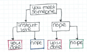
It all looks so easy, doesn’t it?

So pretty much everyone we meet falls in one of those 4 boxes.  When we talk about love at first sight though, we often only talk about it in the context of those two red boxes, ie people who wind up together.  What we can’t forget about is that blue box there…those we meet, feel an instant attraction to that never pans out.  Here’s the same information put another way:

09jul15pic2

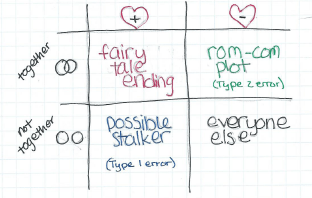
Possible Stalker/Type 1 error is my new band name.

Now what we’re generally going for in life is either the box in red or the box in black.  In stats terms the red ones are true positives (falling in love with someone who loves you) and the black are true negatives (not falling in love with someone who doesn’t love you).  The other two boxes are actually what we’d call Type 1 errors and Type 2 errors….ie, the chance that we make the wrong call initially.  If we presume the null hypothesis is that most people don’t love us3, we can call the box in blue, our type 1 error and the box in green our type 2 error.  In love, we almost always prefer Type 2 errors….in other words, we want to find out we loved someone when we didn’t realize it rather than fall in love with someone who doesn’t like us.

But what influences the number of people who fall in each box?  Well, for that we have to take a look at the words that make up both of our conditions.


Let’s start with “end up together”.

During the discussion that prompted this question, John and I were specifically chatting about people who end up married.  Now, in 2015, this may not be a great metric to go by.  Many people who are in love do not get married, date or cohabitate for much longer than past generations, or otherwise define their loving relationships differently.  The point is not to cover every possible scenario, but rather to remind people that the more narrowly you define “end up together” the less likely it is to happen from a strictly statistical point of view.  For example, in the numbers I gave in the beginning of the post, 40% of men said they had fallen in love at first sight…but these were men participating in a survey for singles on a dating website.  Of course some of those men could have been widows, but the rest of them either ended the relationship that started with love at first sight, or had it ended for them.  Does this count?  Some will say yes, others will say no.  Your standards will influence how many people are covered by that first row.

Now, “didn’t end up together” seems more straightforward, but it actually can also cover a range of scenarios.  I made a joke in my table about someone who falls in love with someone who doesn’t love them being a stalker, but that’s not the whole story.  Most of us have met someone who we thought was awesome….for 5 seconds until they opened their mouths.  Or until part way through the first date.  Or two weeks later when you saw their massive teddy bear collection.  You get the picture.  The point is, not ending up with someone can mean a whole lot of things from “they were taken” to “we decided we were better as friends”.  How broadly you define this will also determine how often people fall in this category.

Love At First Sight (LAFS)

Alright, lets move on to love at first sight.  How are we defining this and how often is it happening?  Well, this one can get interesting.  LAFS is one of those things people tend to define by saying things like “if you have to ask, it didn’t happen”.  You know it when you see it.  This makes it ripe for hijinks and chicanery, which I’ll get in to in a minute.  In it’s most basic sense though, everyone seems to agree it’s some sort of overwhelming feeling of attraction bordering on feeling magnetically pulled towards a person.  How broadly you define this, and how often you think this has happened to you already are going to effect the number of people in that box.

So now that we’ve got some definitions, let’s put some generally fictitious numbers in those boxes.  Let’s say you’ve met about 1000 people in the generally correct age/gender/orientation that you’re attracted to.  Here’s what happened with them.  You’ve dated about 20, and twice think you felt something that could have been LAFS.  One of those worked out, one didn’t.  Your percentages are here.  We get these numbers:

09jul15pic3

There’s a Taylor Swift song somewhere in here.

So unfortunately, the chances are kind of small.  You can run the numbers for your own life, but my guess is it will be pretty small there too.

But John and Paul promised me! You said they were on to something! 

Okay, you got me.  So what’s going on here?

Well, the answer is really that we don’t actually often think of this in the terms I put above.  We’re not evaluating our own lives and our own chances, we’re trying to go off of other people’s experiences.  We are not calculating overall probabilities like I did above, we’re doing conditional probabilities.  No one asks people what happened when they didn’t find love, we ask them what happens when they did find love.  In stats this is a huge difference.  We just went from a regular probability to a conditional probability.  Basically, it’s the difference between these two equations:

09jul15pic4

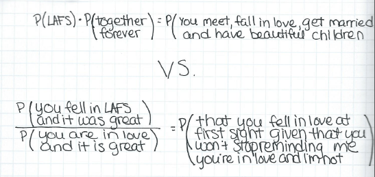
P here is “probability” and the rest is about how I’m totally not bitter.  

That first equation gives us a .01% chance, and the second one gives us a 5% chance, using the numbers above.  That’s 500 times higher!

And this is assuming everyone’s being honest about who they’re putting in what box.  Spoiler alert: they’re not.

Most of this isn’t intentional though.  It’s just that as humans, we don’t tend to remember all the details of good events.  In fact, our memories of bad events are much stronger and typically more detailed.  So when two people fall in love and things work out, they will likely not really remember the moments of doubt or insecurity that may have actually been present in the beginning of their relationship.  They will retell the story more amusingly and more positively than the actual events may have warranted.  This is so prevalent in fact that it is actually considered a hallmark of a healthy relationship. We can infer then that by only talking to people in happy relationships, we may actually be overestimating how many people met and “just knew”4.  That’s why research on this is so sparse….the data confounds itself.

Ugh, well that’s not great news.

No, and it gets worse.  When John and Paul claimed that this happened all the time, they were likely right….but that won’t help you.  For example, let’s say that 1 out of 1000 people every year are likely to experience un-exaggerated, for real, LAFS with someone they stay with.  That’s about 25,000 people a year in the USA.   That’s 67 a day.  You will almost certainly know some of these people….but they may not ever be you.  Bummer.

Got any more good news?

Well yeah, actually, I do!  See, the thing is, LAFS may not even be the ideal here.  There’s actually some interesting evidence that people who date for longer stay married longer5.  Apparently it’s long engagements that threaten marital stability, not long dating periods.  So while those in the LAFS/stay together box may get a lot of attention, the ones in the no LAFS/stay together box may be quietly outdoing them. Also, when finding true love, most people really are more interested in the exponential distribution, not the Poisson distribution6. In other words, we’re not so concerned about the number of events, but rather how long we have to wait for it! Once you find the one, you probably won’t care so much how it happens, and evidence suggests that you and your beloved will keep altering your story bit by bit until it’s worthy of it’s own movie with the attractive Hollywood folks of your choice.  You’ll get there.  May your W = time to first event be short, and your moment generating function be beautiful.


1. Weird fact I learned about this song while researching this post: the first line was originally “what would you do if I sang out of tune, would you throw ripe tomatoes at me?” but Ringo made them change it when he realized their rabid fans might take it seriously.
2. Baby don’t hurt me.
3. Okay, emo kid.
4. If you ever want to see this in action, find a friend who you knew pre and post divorce. If you know the story of how they met their ex, it’s really interesting to ask them again after their divorce. It is almost guaranteed the story will have changed, gotten briefer or otherwise be a bit altered. Do NOT point this out to them. Don’t ask me how I know this.
5. Some of this data is kinda old…marriage and dating practices have changed rapidly over the last few decades. Caveat emptor.
6. Our love is anything but a normal distribution!