Government benefits OR definitions and the census strike again

Last week I got a little fascinated by the census bureau data…..and this weekend I was sent an article from the Wall Street Journal regarding yet another set of Census Bureau Data that was getting passed around.

This one addressed the number of households in the US receiving “government benefits”….apparently it’s up to 49.1%.
Now that’s a scary number, but I am always wary of the phrase “government benefits” when it’s used in a statistical context.  The problem is that it’s an incredibly vague term, and can be used to cover a myriad of programs….not all of which are what initially spring to mind.  
I first learned to be wary of this term when my dear liberal brother mentioned that some group he had been following had claimed that there was some ludicrous number of government handout programs in place today.  The number struck him as high, so he got on their website and found out that they were actually counting both federal assistance programs AND tax breaks (such as home interest deductions, student loan interest deductions, dependent credits, etc) as “entitlements”.  Thus in this case I am extra vigilant about my “find the definition” rule.
I took a look around the census website (we’ve become good friends lately) and found the list they were using as of 2008*:
  • Dept of Veteran’s Affairs – Compensation, Pension, Education Assistance
  • Medicare
  • Social Security
  • Unemployment
  • Workman’s Comp
  • Food Stamps
  • Free/Reduced-Price School Lunch and Breakfast Program
  • Housing Assistance
  • Federal and State Supplemental Security Income (SSI)
  • Medicaid
  • Temporary Assistance for Needy Families (TANF)
  • Supplemental Nutrition Program for Women, Infants, and Children (WIC)
Not a terribly surprising list, though I wouldn’t have realized that Veteran’s benefits were on there.  Even without the economy going down hill or any other expansion of programs, the Veteran’s benefits most certainly would have expanded in the past few years as people continue

Additionally, it would be important to note that only one member of the household needed to receive this in order to be counted.  That struck me because my parents and my grandmother all live in the same house, which means both of my dear hard working parents are lumped in to that 49.1% number.

Whatever your feeling about government benefits, it’s important to know exactly which ones are being counted in any list.  I’d imagine that many people who might dislike Medicaid might not care to eliminate Veteran’s Benefits, and those who don’t like TANF may very well support workman’s comp.  Just something to be aware of, especially in an election year.

*To note: the latest data I could find was from 2008.  I really hate that the WSJ doesn’t link to where the heck it got it’s numbers.  I couldn’t find the stuff they put up anywhere on the census bureau website.  I’m not doubting them, I just wonder if it would have killed them to include a link????

Time to Go Back to Work

But here’s my new superhero alter ego, just for laughs:

H/T to the Assistant Village Idiot, though I think he got it from his son Ben.

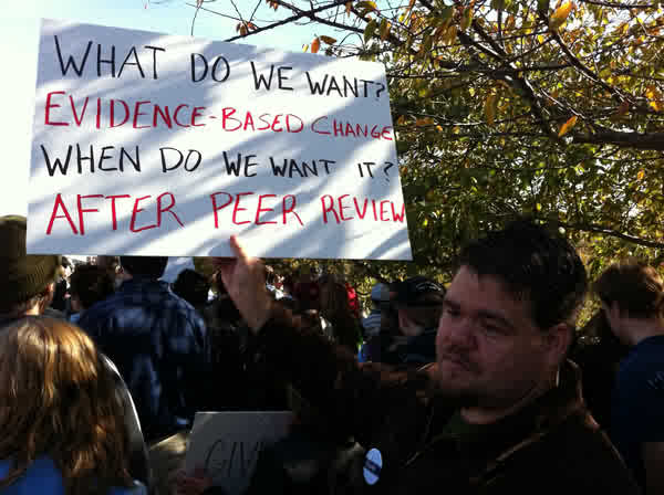
It reminded me of my favorite protest sign from the Rally to Restore Sanity:

Happy Tuesday!

Everything old is new again

One of my favorite things about growing up in the family I did, surrounded by the friends my parents had, was the large amount of historical context I was fed for nearly every topic that interested me.

People like my father (who posts here as Michael) and David (the Assistant Village Idiot) were always quick to fill me in on the history of whatever topic I happened to bring up.  This always gave me a good appreciation for the story behind the story as it were, and made me truly relish a good piece of context.  Growing up in the 80’s, this was like having Wikipedia just sort of follow me around.  Come to think of it, some kids may not have appreciated that as much as I did.

I mention all this because I’m packing up my condo this weekend, and have been toting around my laptop to watch Hans Rosling’s hour long documentary “The Joy of Stats” while I work.  I highly recommend this, if not for any new stats knowledge, than at least for the examples he gives and the history lesson.

One of the more interesting points he made actually related to some of my census data posts from earlier this week, so I thought I’d pass it along.

First, if you haven’t read the comment from Glenn, the former Census Bureau employee, on my post about racial categorizations, you should.  He filled in some details I didn’t know….I would never have guessed that it was the Office of Budget Management that set racial categories for the government….and he concludes his comments with this:

Confusing? Yes. Please keep in mind that the purpose of these categories isn’t always statistical but political. Politics makes for strange statistics at times.

I liked that phrase.  I think that “The politics of statistics” should be an interdisciplinary undergrad class of some sort.

Anyway, according to Rosling’s documentary, it was actually the government of Sweden that helped invent the modern study of statistics, and they began to find it so useful that other governments started using it too.  Apparently, it was not actually referred to as statistics, but instead “political arithmetic”.

It is almost surreal to realize that up until that point, countries often didn’t know how many residents they had, or what their biggest challenges were.  An extra bonus in the film is the map of “Bastardy in England”.  Highly recommended.

Weekend Moment of Zen 5-26-2012

Hans Rosling’s enthusiasm gets me every time.  Here, he takes on the ideas of unlimited population growth and religions influence on baby making:

http://video.ted.com/assets/player/swf/EmbedPlayer.swf

Apparently he has a one hour documentary on stats.  I’m adding watching it to my list of goals for the long weekend.

Watch the definitions

A quick one for a Friday:

I’ve blogged before about paying careful attention to the definition of words used in study results.  It is often the case that the definition used in the study/statistic may not actually match what you presume the definition is.

Eugene Volokh posted a good example of this today, when he linked to this op-ed in the Detroit Free Press.  It cites a spokesperson from the Violence Policy Center who states that “Michigan is one of 10 states in which gun deaths now outpace motor vehicle deaths”.

My knee jerk reaction was that seemed high, but my tired Friday brain probably would have kept skimming.  Then I read why Volokh was posting it:

The number of accidental gun deaths in Michigan in 2009 (the most recent year reported in WISQARS) was … 12, compared to 962 accidental motor-vehicle-related deaths. 99% of the gun deaths in Michigan that year consisted of suicides (575) and homicides (495).

To be honest, I had presumed homicides were included, but suicide death didn’t even occur to me.   I’d be interested to see how many of the vehicular deaths were suicides, my guess is the percentage would not be as high as in the gun case.  Either way, I’m sure I’m not the only one who didn’t realize what was being counted.

Watch the definitions, and have a fabulous Memorial Day weekend!

More census data….the minority-majority issue

I was happy to see that my post from yesterday  got an excellent comment from Glenn, a former Census Bureau employee.  He let me know that it was likely the sample they used was actually a stratified cluster sample, which is not exactly what I had surmised, but close.

As I was looking up more info on some of the Census Bureau data, I ran in to a fascinating column from Matthew Yglesias over at Slate.com.  In it, he describes his experience filling out the census form, and how his own experience made him question some of the data being released.

In specific, he questioned the recent headline that we are quickly heading towards a minority-majority society.  He mentions that as a 25% Cuban man, he looks very white, but was not sure how to answer the question regarding whether he was “Hispanic in origin”.  If he wasn’t sure how to answer a race question, how many others were in his boat?  He further comments that as people continue to become increasingly of mixed racial background (keeping in mind that 1 out of 12 marriages is now mixed race) it is much more likely that we will have to shift our concept of what “white” is to keep up with the times.

As Elizabeth Warren can tell you, percentage of heritage matters….but where do we draw the line?  If 3% Native American isn’t enough, how much is?  I mean that quite literally.  I don’t know.

In my cultural competency class in school, we had a fascinating example of racial confusion.  One of the girls I sat next too mentioned that her grandparents were from Lebanon, had immigrated to South America, her parents were both born there, married, moved to the US, and that’s where she was born.  Her skin was fair, she was fluent in Spanish, and she felt she spent her life explaining that she was genetically Arabic, ethnically South American and culturally American.  I don’t know what she checked off on the census, but I’m sure nothing captured that particular combination accurately.

As times change, so do our ideas of race. When reading the history of census racial classification, it’s hard to disagree with Yglesias’ assertion that today’s racial breakdown will not be comparable to whatever breakdown we have in ten years.  That’s a good thing to keep in mind when analyzing racial data.

 Racial numbers are as good as the categories we have to put them in.   

The (ACS) Devil and Daniel Webster

As a New Hampshire native, I am prone to liking people named Daniel Webster.

It is thus with some interest that I realized that the Florida Congressman who is sponsoring the bill to eliminate the American Community Survey happens to share a name with the famous NH statesman.  I have been following this situation since I read about it on the pretty cool Civil Statistician blog, run by a guy who runs stats for the census bureau.

Clearly there’s some interesting debate going on here about data, analysis, role of the government, and the classic “good of the community vs personal liberty” debate.

I’m going to skip over most of that.

So why then, do I bring up Daniel Webster?

Well, I was intrigued by this comment from him , as reported in the NYT article on the ACS:

“We’re spending $70 per person to fill this out. That’s just not cost effective,” he continued, “especially since in the end this is not a scientific survey. It’s a random survey.”

It was that last part of the sentence that caught my eye.

I was curious, first of all, what the background was of someone making that claim.  I took a look at his website, and was pleased to discover that Rep. Webster is an engineer.   It’s always interesting to see one of my own take something like this on (especially since Congress only has 6 of his kind!).

That being said, is a random survey unscientific?

Well, maybe.

In grad school, we actually had to take a whole class on surveys/testing/evaluations, and the number one principal for polling methods is that there is no one size fits all.  The most scientifically accurate way to survey a group is based on the group you’re trying to capture.  All survey methods have pitfalls.   One very interesting example our professor gave us was the students who tried to capture a sample of their college by surveying the first 100 students to walk by them in the campus center.  What they hadn’t realized was that a freshman seminar was just letting out, so their “random” survey turned out to be 85% freshman.  So over all, it’s probably worse when your polling methodology isn’t random than when it is.

There’s all kinds of polling methods that have been created to account for these issues:

  • simple random sampling – attempts to be totally random
  • systematic sampling – picking say, every 5th item on a list
  • stratified sampling – dividing population in to groups and then picking a certain percentage from each one (above this would have meant picking 25 random people from each class year)
  • convenience sampling – grabbing whoever is closest
  • snowball sampling – allowing sampled parties to refer/lead to other samples
  • cluster sampling – taking one cluster of participants (one city, one classroom, etc) and presuming that’s representative of the whole
There are others, though most subtypes off of these types (see more here).
So what does the ACS use?  
As best I can tell, they use stratified sampling.  They compile as comprehensive a list as they can, then they assign geocodes, and select from there.  So technically, their sampling is both random and non-random.   

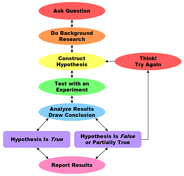
Now, NYT analysis aside, I wonder if this is really what Webster was questioning.  The other meaning one could take from his statement is that he was challenging the lack of scientific method.  As an engineer, he would be more familiar with this than with sampling statistics (presuming his coursework looked like mine).  What would a scientific survey look like there?  Well, here’s the scientific method in a flowchart (via Sciencebuddies.org):

So it seems plausible he was actually criticizing the polling being done, not the specific polling methodology.  It’s an important distinction, as all data must be analyzed on two levels: integrity of data, and integrity of concept.   When discussing “randomness” in surveys, we must remember to acknowledge that there are two different levels going on, and criticisms can potentially have dual meanings.

Back It Up!

One of the more thought provoking moments of my high school career came from a youth pastor who decided to find an amusing way of calling out a bunch of church kids.  It seemed he had at some point grown weary of hearing too many good church going adolescents start sentences with “Well it says in the Bible….” when what they actually mean was “I heard in a sermon/my Dad says/my mom believes/I read this book once/I’m pretty sure this is true”.   Anyway,  he was a clever sort of youth pastor, and he realized that calling out and/or publicly shaming offenders would probably lead to lots of discord, hurt feelings, and possibly calls from parents, so he decided to take a different tack.

Starting with a few key young gentleman, he began to tell everyone that whenever they heard the phrase “It says in the Bible” they were all allowed (in fact encouraged) to all yell “BACK IT UP!!!!”  At this point whoever had made the claim had to stop and find a verse to back themselves up and read it to the group.  If they couldn’t find a verse quickly, the conversation continued, and they were condemned to sitting rifling through the concordance until they either admitted they couldn’t find it, or they stayed quiet for the rest of the conversation.

I bring this up because I WANT THIS TO BE A THING.

Wouldn’t it be great if we could do this with research?  I bet the story I mentioned in my post this morning wouldn’t have happened if every time we heard/read someone saying “Research shows” we could all scream “BACK IT UP!!!” and then silence them until they found the proper citation (and no, Wikipedia and Malcolm Gladwell would not count as actual citations).

For the printed word on the internet, we need some sort of meme for this that people could leave in comments sections of articles with vague “research” claims…perhaps a gif of some sort (where are the 4channers when I need them???).  I took a poke around the internets and this is the best I could find was this lady:

GIFSoup

I think this could work.  There has to be an unemployed journalist or two out there who could help me spread this around.

Sometimes people just make things up

ALWAYS LOOK FOR A PRIMARY SOURCE.

THEN MAKE SURE THAT PRIMARY SOURCE SAYS WHAT THEY SAY IT SAYS.

Sorry for the caps lock, but some people seem to doubt that other would actually fabricate stats to prove a point.  They do, and in the New York Times no less.

H/T Instapundit.

Correlation and Causation: Real World Problems

In yesterday’s post, I got a bit worked up over sloppy reporting on a study on dietary interventions in pregnancy. 

This led to an interesting comment from the Assistant Village Idiot regarding weight gain recommendations for pregnant women.  The current weight gain recommendation is 25 – 35 pounds for a normal BMI woman, but AVI commented that it used to be much lower, and that women were hospitalized to stop them from eating too much.
I didn’t actually know that, so I immediately decided to look it up.  
I stumbled on to a fascinating presentation put together by an OB at UCSF on the history of maternal weight gain recommendations (link goes to the PowerPoint slides).  It not only confirmed what AVI had mentioned, but also gave some of the reasoning….which turned out to be a very interesting example of people erroneously conflating correlation with causation.  
Apparently part of the reason why they (they being doctor’s circa 1930) were so nervous about weight gain in pregnancy was that they were trying to prevent preeclampsia.  Now preeclampsia is a life threatening condition if left untreated, and one of the warning signs is rapid weight gain.  Apparently some doctors actually thought that the symptom was the cause, and believed that all excessive weight gain was a sign the patient was about to become preeclamptic.  Thus, the theory went, limiting weight gain would prevent preeclampsia and aid in “figure preservation” to boot*.  
Sadly, this also led to higher infant mortality, disability, and mental retardation….which seems a pretty steep price to pay for what was really a data analysis error.  As I’ve said before, this is why statistics are so relevant in medicine….the cost for getting things wrong is too steep to not be careful.
*To note, it is actually true that preeclampsia is linked to higher weight/glucose/insulin production….but the way they went about addressing it did as much harm to the fetus as good.  Current weight gain recommendations are set to optimize outcomes for the babies, not the mothers.