What I’m Reading: September 2017

If you’ve been seeing talk about the PURE study that recently was being reported under headlines like “Huge new study casts doubt on conventional wisdom about fat and carbs“? The study found that those with low fat diets were more likely to die by the end of the study than those with higher fat diets. However, Carbsane took a look and noticed some interesting things. First, the US wasn’t included, so we may need to be careful about generalizing the results there. They also included some countries that were suffering other health crises at the time, like Zimbabwe. Finally, the group they looked at was adults age 35 to 70, but they excluded anyone who had any pre-existing heart problems. This was the only disease they excluded, and it makes some of the “no correlation with heart disease”  conclusions a little harder to generalize. To draw an equivalency, it’s like trying to figure out if smoking leads to lung cancer by excluding everyone in your sample who has lung problems already. What you really want to see is both groups, together and separately.

For my language oriented friends: this article about how cultures without words for numbers get by was really interesting. They make the assumption that counting distinct quantities is an inherently an unnatural thing to do, but I have to wonder about that. Some people do seem more numbers oriented than others, so what happens to those folks? Do people who are good at numbers and quantities just get really depressed in these cultures? Do they find another outlet? As someone who starts counting things to deal with all kinds of emotions (boredom, stress, etc), I feel like not having words for numbers would have a serious impact on my well being.

There’s a lot of herbs and supplements out there being marketed with dubious health claims, but exactly how those claims are worded depends on who you are. This article on how the same products are marketed on InfoWars and Goop is an interesting read, and a good reminder about how much information we get can be colored by marketing spin.

On a political note, this Economist article about the concept of anti-trust laws in the data age was food for thought. 

Finally, I decided to do my capstone project for my degree on a topic I’ve become a little bit obsessed with: dietary variability. Specifically, I’m looking at those who identify that they are food-insecure (defined as not having the resources to obtain enough food to eat in the last 30 days) , and comparing their health habits to those who have enough. While I already have the data set, I’ve been looking for interesting context articles like this one, which explores the “food-insecurity paradox”. Apparently in the US, women who are food insecure are actually more likely to be obese than those who aren’t. Interesting stuff.

Measuring Weather Events: A Few Options

Like most people in the US this past week, I was glued to the news watching the terrible devastation Hurricane Harvey was inflicting on Houston. I have quite a few close friends and close work collaborators in the area, who thankfully all are okay and appear to have suffered minimal property damage themselves. Of course all are shaken, and they have been recommending good charities in the area to donate to.  As someone’s whose lived through a home flood/property destruction/disaster area/FEMA process at least once in my adult life, I know how helpless you feel watching your home get swallowed by water and how unbelievably long the recovery can be. Of course when I went through it I had a huge advantage….the damage was limited to a small number of people and we had easy access to lots of undamaged places. I can’t imagine going through this when the whole city around you has suffered the same thing, or how you begin to triage a situation like this.

However, as the total cost of Hurricane Harvey continues to be fully assessed, I want to make a comment on some numbers I’m seeing tossed around. It’s important to remember in the aftermath of weather events of any kind that there are actually a few different ways of measuring how “big” it is:

  1. Disaster Measurement:
    1. Lives lost
    2. Total financial cost
    3. Long term impacts to other infrastructure (i.e. ability to rebuild, gas pipelines,etc)
  2. Storm measurement
    1. Size of weather event (i.e. magnitude of hurricane/volume of rainfall)
    2. Secondary outcomes of weather event (i.e. flooding)

538 has a good breakdown of where Harvey ranks (so far) on all of these scales here.

Now none of this matters too much to those living through the storm’s aftermath, but in terms of overall patterns they can be important distinctions to keep in mind. For example, many people have been wondering how Harvey compares to Katrina. Because of the large loss of life with Katrina (almost 2,000 deaths) and the high cost ($160 billion) it’s clear that Katrina is the benchmark for disastrous storms. However, in terms of wind speed and power of the storm, Katrina was actually pretty similar to Hurricane Andrew in 1992 which resulted in 61 deaths and had a quarter of the cost. So why did Katrina have such a massive death toll? Well, as 538 explains:

Katrina’s devastation was a result of the failure of government flood protection systems, violent storm surges, a chaotic evacuation plan and an ill-prepared city government.

So the most disastrous storms are not always the biggest, and the biggest storms are not always the most disastrous. This is important because the number of weather events causing massive damage (as in > $1 billion) is going up:

Source of graph.
Source of disaster data.

However, the number of hurricanes hitting the US has not gone up in that time (more aggregate data ending in 2004 here, storm level data through 2016 here). This graph does not include 2017 or Hurricane Harvey.

Now all of these methods of measuring events are valid, depending on what you’re using them for. However, that doesn’t mean the measures are totally interchangeable. As with all data, the way you intend to use it matters. If you’re making a case about weather patterns and climate change, costly storm data doesn’t prove the weather itself is worsening. However if you’re trying to make a case for infrastructure spending, cost data may be exactly what you need.

Stay safe everyone, and if you can spare a bit of cash, our friends in Houston can use it.

Baby, You Can’t Drive My Car

This week I was rather surprised to find out that a early-20s acquaintance of mine who lives in a rather rural area did not have a driver’s license. I know this person well enough to know there is no medical reason for this, and she is now pursuing getting one. Knowing the area she lives in I was pretty surprised to hear this, particularly considering she has a job and a small child.

Now living around a large city with lots of public transportation options, I do know people who are medically unable to get a license (and thus stick close to public transit) and those who simply dislike the thought of driving (because they grew up around public transit), but I hadn’t met many people in the (non-big city) area I grew up in who didn’t get a license.

As often happens when I’m surprised by something, I decided to go ahead and look up some numbers to see how warranted my surprise was. It turns out I was right to be surprised, but there may be a trend developing here.

According to the Federal Highway Administration, in 2009 87% of the over-16 population had a driver’s license. There’s a lot of state to state variation, but the states I’ve lived in do trend high when it comes to the number of drivers per 1000 people:

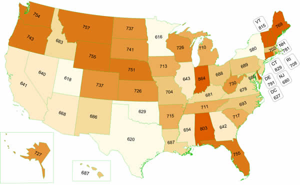
Note: that map is licenses per 1000 people of all ages, so some states with particularly young populations may get skewed.

This appeared to confirm my suspicions that not having a license was relatively unusual, particularly in the New England region. Most of the places that have lower rates of licenses are those that have big cities, where presumably people can still get around even if they don’t know how to drive. I am a little curious about what’s driving the lowish rates in Utah, Texas and Oklahoma, so if anyone from there wants to weigh in I’d appreciate it.

I thought that was the end of the story, until I did some more Googling and found this story from the Atlantic, about the decreasing number of people who are getting driver’s licenses. The data I cited above is from 2009, and apparently the number of licensed drivers has been falling ever since then. For example, this paper found that in 2008, 82% of 20-24 year olds had driver’s licenses, but by 2014 76.7% did. In contrast, in 1983 that number was 91.8%.

So what’s the reason for the decline? According to this survey, the top 5 reasons for those aged 18 to 39 are “(1) too busy or not enough time to get a driver’s license (37%), (2) owning and maintaining a vehicle is too expensive (32%), (3) able to get transportation from others (31%), (4) prefer to bike or walk (22%), (5) prefer to use public transportation (17%)”.

Like most surveys though, I don’t think this tells the whole story. For example, the top reason for not having a license is that people are “too busy” to get one, but the study authors noted that those without licenses are less likely to be employed and have less education than those with licenses. This suggests that it is not extended outside commitments that are preventing people from getting licenses. Additionally, anyone who has ever lost the use of their car knows it can take a lot more time to get a ride from someone else than it does just to hop in your own vehicle.

My personal theory is that getting a drivers license is something that requires a bit of activation energy to get going. Over the last decade or two, state legislatures have progressively enacted laws that put more restrictions on teen drivers, so the excitement of “got my license this morning and now I’m taking all my friends out for a ride tonight” no longer exists in many states. For example, in Massachusetts drivers under 18 can’t drive anyone else under 18 (except siblings) for the first 6 months. This is probably a good practice, but it almost certainly decreases the motivation of some kids to go through all the work of getting their license. After all, this is an age group pretty notorious for being driven by instant gratification.

Additionally, with high costs for insurance and vehicles, many parents may not be as excited for their kids to get their license. Without parental support, it can be really hard to navigate the whole process, and if a parent starts to think it may be easier to keep driving you than to pay for insurance, this could further decrease the numbers. With younger generations spending more time living at home, parental support is an increasing factor. Anyone attempting to get a license has a certain reliance on the willingness of others to teach them to drive and help them practice, so the “too busy” reason may actually be driven just as much by the business of those around you as your own business. You can be unemployed and have plenty of time to practice driving, but if no one around you has time to take you out, it won’t help.

Finally, there may be a small influence of new technology. With things like Uber making rides more available more quickly and Amazon delivering more things to your door, it may actually be easier to function without a license than it was 10 years ago. Even the general shift from “have to go out to do anything fun” to “can stay home and entertain myself on line” may account for a bit of the decreased enthusiasm for getting licensed to drive. For any one person it’s doubtful that’s the whole reason, but for a few it may be enough to tip the scales.

It will be interesting to see if this corrects itself at some point…will those not getting their license at 18 now get it at 28 instead, or will they forego it entirely? The initial survey most (about 2/3rds) still plan on pursuing one at some point, but whether or not that happens remains to be seen.

The Real Dunning-Kruger Graph

I’m off camping this weekend, so you’re getting a short but important PSA.

If you’ve hung out on the internet for any length of time or in circles that talk about psych/cognitive biases a lot, you’ve likely heard of the Dunning-Kruger effect. Defined by Wiki as “a cognitive bias wherein persons of low ability suffer from illusory superiority, mistakenly assessing their cognitive ability as greater than it is.”, it’s often cited to explain why people who know very little about something get so confident in their ignorance.

Recently, I’ve seen a few references to it accompanied by a graph that looks like this (one example here):

While that chart is rather funny, you should keep in mind it doesn’t really reflect the graphs Dunning and Kruger actually obtained in their study. There were 4 graphs in that study (each one from a slightly different version of the study) and they looked like this:

Humor:

Logic and reasoning (first of two):

Grammar:

And one more logic and reasoning (performed under different conditions):

So based on the actual graphs, Dunning and Kruger did not find that the lowest quartile thought they did better than the highest quartile, they found that they just thought they were more average than they actually were. Additionally it appears the 3rd quartile (above average but not quite the top), is the group most likely to be clearsighted about their own performance.

Also, in terms of generalizability, it should be noted that the participants in this study were all Cornell undergrads being ranked against each other. Those bottom quartile kids for the grammar graph are almost certainly not bottom quartile in comparison to the general population, so their overconfidence likely has at least some basis.  It’s a little like if I asked readers of this blog to rank their math skills against other readers of this blog….even the bottom of the pack is probably above average. When you’re in a self selected group like that,  your ranking mistakes may be more due to a misjudging of those around you as opposed to just an overconfidence in yourself.

I don’t mean to suggest the phenomena isn’t real (follow up studies suggest it is), but it’s worth keeping in mind that the effect is more “subpar people thinking they’re middle of the pack” than “ignorant people thinking they’re experts”. For more interesting analysis, see here, and remember that graphs drawn in MS Paint rarely reflect actual published work.


5 Nutrition and/or Food Research Blogs I Like to Read

I’ve written a bit here over the years about nutrition research and my own general journey with weight management, but I realized I’ve only really referred in passing to the people who I read when I want to catch up on the field. I figured this was a pretty good time to do a post on that.

  1. For all things vegan: Anyone who followed my old old blog knows that I actually spent several years as a vegan. I eventually gave it up, but I still like to read up what’s going on in the world of plant based nutrition. Ginny Messina (aka the Vegan RD) is a registered dietitian who is a vegan primarily for ethical reasons. As such, she uses her dietitian training to help vegans be as healthy as possible, while also helping lead the charge for veganism to be more evidenced based when they stray out of ethics and in to nutrition claims. She writes critiques of other vegans work if she feels they overstate the evidence, and she even coauthored a book called “Even Vegans Die“. Overall a pretty awesome example of someone who advocates for a particular diet while also adhering to evidence.
  2. For the ancestral health crowd: If you’re paleo or just interested in how our evolutionary history influences how we think about food, Stephan Guyenet is a must read. A neuroscientist who specializes in obesity related research, his research focus is on why we overeat and what we can do about it. His book The Hungry Brain is one of the most well balanced science based nutrition books I’ve ever read, and has received quite a bit of praise for being honest and evidence based.
  3. For deep dives in to the science: There are not many bloggers that I read that make me go “holy crap did this person dig deep in to this paper”, but CarbSane is one blogger who gets that reaction from me on nearly every post. She doesn’t just read papers and give you the gist, she posts tables, cites other literature, and is basically a blog equivalent of a nutritional biochemistry class. She is probably the person most responsible for making me aware of the problem of misreprecitation in nutrition science, because she has the patience, knowledge and wherewithal to figure out exactly what commonly cited papers do and do not say. Oh, and she’s lost over 100 lbs too, so she actually has a good eye for what is and isn’t useful for real people to know. For a taste of what she does, try her posts on the “Biggest Loser Regain Study” that made headlines.
  4. For weight management and health policy: There’s really a bit of a tie here, as I really like both Yoni Freedhoff’s Weighty Matters blog and Darya Rose’s Summer Tomato for this topic.  Freedhoff is a Canadian MD who runs a weight loss center, and he blogs from the medical/health policy perspective. His book “The Diet Fix” covers evidence based ways of making any diet more effective, and he encourages people to take the approach (vegan, low carb, paleo, etc etc) that they enjoy the most. Darya Rose is a neuroscientist who also gives advice about how to make your “healthstyle” more practical and easier to stick to,  and her book “The Foodist” is on the same topic. I like them because they both continuously emphasize that anything too difficult or complicated is ultimately going to be tough to maintain. It’s all about making things easier on yourself.
  5. For those in the greater New Hampshire area: Okay, this ones pretty region specific, but the Co-op News blog from the Hanover Co-op has a special place in my heart. An online version of a newsletter that’s been going since 1936, it features frequent posts from my (dietitian) cousin and my (incredible chef) uncle. It’s a great place to check out if you need advice on anything from using up summer vegetables to figuring out if macaroni and cheese is okay to eat. It also serves to remind me that I should invite myself over to their house more often. That food looks awesome.

Bonus round: if your looking for some one off reads, this week I read this takedown of the science in the vegan documentary “What the Health” and enjoyed it. I also liked this paper that reviewed the (now infamous) Ancel Keys “7 Countries Study” and shed some light on what the original study did and did not say.

Of course if you have a favorite resource, I’d love to hear it!

Follow Up Gazette – the Science Section

James over at “I Don’t Know, But” had a brilliant idea this week for a journal called “The Follow Up Gazette” (motto: all the things we found out later), that would re-report the news after all the facts were in. His examples were mostly local news, but I would like to throw my hat in the ring to be the editor of the science section. James is of course fully capable of this job himself, but DAMN do I want to do something like this. Let me help James, please.

I’ve been  thinking a lot about this topic, as I had yet another run in with a TED talk recently. We got a question at work from a prospective bone marrow donor asking if we were using a particular collection device in our harvests. None of us had ever even heard of this device, and we were all rather confused where she had gotten her information. A quick google search gave us the answer: there is a TED talk from 8 years ago explaining the device and promising to revolutionize the way marrow harvests are done. Investigating further, we discovered that while this device had gained FDA approval for use in humans,  we couldn’t find any research in humans proving its efficacy, or really any mention of it in the literature past 2009. It’s clear something didn’t go quite as planned, though I’ll be damned if I can find a publicly available record of what. Calling around various people in the field confirmed that no one was using it and that it was not being actively marketed, but we found very few details as to why.

This got me thinking: how would the content of TED talks change if everyone who gave one was required to give an update 5 or 10 years later?

This may seem like a minor point, but I do think it skews our view of science and development of products to hear all of the hype and none of the follow up. Seeing the headline “Brand new drug promises 5 years of extra life for people with horrible disease” juxtaposed with “Actually in practice it was only like 3 months” might help temper our expectations. Alternatively, it may yield that some things were actually shown to be better/safer/whatever than actually thought. My mother recently mentioned that she saw a beautiful house built under power lines, and it hit her that she hadn’t heard a “living under power lines is unhealthy” reference in years. She mentioned that she  assumed that meant that the evidence had shown otherwise, and indeed it has. The Follow-Up Gazette science section would address both sides of this coin, the over hype and the fear mongering. Ideally this would not only educate people in how to consume media, but also encourage media to be slightly more circumspect in their reporting.

James: consider this my application, and thank you in advance for your consideration.


A Pie Chart Smorgasbord

This past week I was complaining about pie charts to a friend of mine, and I was trying to locate this image to show what I was complaining about:

Source.

I knew I had come across this on Twitter, and in finding the original thread, I ALSO discovered all sorts of people defending/belittling the lowly pie chart. Now I generally fall in the anti-pie chart camp, but these made me happy. I sourced what I could find a source on, but will update if anyone knows who I should credit.

First, we have the first and best use for a pie chart:

No other chart represents that data set quite as well.

Sometimes though, you feel like people are just using them to mess with you:

Source.

Sometimes the information they convey can be surprising:

But sometimes the conclusions are just kind of obvious:

And you have to know how to use them correctly:

They’re not all useless, there are some dramatic exceptions:

If you want more on pie charts, try these 16, uh, creative combinations, or read why they’re just the worst here.

Sharing Your Feelings

Yesterday morning during some random Twitter scrolling, I saw two interesting tweets in my feed that seemed a bit related. The first was one complaining about a phenomena that has been irritating the heck out of me recently :

//platform.twitter.com/widgets.js

If the embed doesn’t work, here’s the link. The first shot is some text from a Pacific Standard article about Lisa Durden’s firing. In it, the author claims that “In contrast to other free speech-related controversies on college campuses, there has been almost no media coverage of Durden’s ouster.” The Google news search however shows a different story….in fact many media outlets have covered the story.

Now this type of assertion always seems a little surprising to me for two reasons:

  1. We have absolutely unprecedented access to what people and news outlets are/are not reporting on, and any claim like this should be easy to verify.
  2. It’s an easy claim to modify in a way that makes it a statement of opinion, not fact. “there has been far less media outrage” would seem to preserve the sentiment without being a statement of fact.

Once I started thinking about it, I felt like I heard this type of assertion made quite frequently. Which of course got me wondering if that sort of hyper-attention was part of the phenomena. I think everyone knows the feeling of “I heard one reference to this issue/unusual word/obscure author and now I have seen it 5 places in two days”. I got to wondering….could a related (but opposite) phenomena happen when it came to people you disagreed with saying things? Were people purposefully ignoring or discounting reporting from outlets that didn’t fit their narrative, or were they actually not hearing/registering things that were getting said?

I started wondering further when in one recent case, a writer for the Federalist actually Tweeted out the links to her search results that “proved” the New York Times wasn’t covering a story about NSA abuses under Obama. However, the NYTs had actually covered the story (they broke it actually), and clicking on her links shows that their story was among the results she had been scanning over. She issued a correction Tweet a few hours later when someone pointed that out, which makes me doubt she was really trying to deceive anyone. So what made her look at the story and not see it?

Well, this brings me to the second Tweet I saw, which was about a new study about the emotional drivers of political sharing across social networks. I don’t have access to the full text of the paper, but two interesting findings are making headlines:

  1. For the issues studied (gun control, same-sex marriage, climate change), including moral-emotional language in your headline increased sharing by 20%
  2. This sharing increase occurred almost exclusively in your in-group. Liberals and conservatives weren’t sharing each others stories.

I’m speculating wildly here, but I wonder if this difference in the way we share stories contributes to perceptions that the other side is “not talking” about something. When something outrages my liberal (or conservative) friends, the same exact article will show up in my news feed 10 times. When the opposing party comments on it/covers it, they almost never share the same exact story, they comment/share different ones. They only comment on the same story when they oppose the coverage.

For example, in the NSA case above, the story that got Mollie Hemingway looking at search results was titled “Obama intel agency secretly conducted illegal searches on Americans for years.”. The ones she missed in the NYTs results was “N.S.A. Halts Collection of Americans’ Emails About Foreign Targets” and “How Trump’s N.S.A. Came to End a Disputed Type of Surveillance“. Looking at those 3 headlines, it’s easy to see why you could miss they were all talking about the same thing. At the same time, if you’re going to claim that a story isn’t being reported, you need to double check that it’s not just your feelings on the story that aren’t being mirrored.

And also lest I be a hypocrite here, I should talk about the time I committed this error because I failed to update my information. Back in February I made that error, claiming that TED didn’t update their webpage to reflect the controversy with Amy Cuddy’s research. I was right the first time I claimed it and wrong the second time. I could have sworn I rechecked it, but I either didn’t recheck when I thought I did, or I simply didn’t see the correction that got added. Was it because I was looking for a more dramatic correction, bold letters or some other sort of red flag? Yeah, I’d say that was part of it. TED does not appear nearly as concerned about the controversy as I am, but that doesn’t mean they failed to talk about it.

I need a name for this one I think.

Statisticians and Gerrymandering

Okay, I just said I was blogging less, but this story was too interesting to pass without comment. A few days ago it was announced that the Supreme Court had agreed to hear a case about gerrymandering, or the practice of redrawing voting district lines to influence the outcome of elections. This was a big deal because previously the court has only heard these cases when the lines had something to do with race, but had no comment on redraws that were based on politics. The case they agreed to hear was from Wisconsin, and a lower court found that a 2011 redistricting plan was so partisan that it potentially violated the rights of all minority party voters in the affected districts.

Now obviously I’ll leave it to better minds to comment on the legal issues here, but I found this article on how statisticians are getting involved in the debate quite fascinating. Obviously both parties want the district lines to favor their own candidates, so it can be hard to cut through the noise and figure out what a “fair” plan would actually look like. Historically, this came down to just two parties bickering over street maps, but now with more data available there’s actually a chance that both gerrymandering and the extent of gerrymandering can be measured.

One way of doing this is called the “efficiency gap” and is the work of Eric McGhee and Nicholas Stephanopolous, who explain it here. Basically this measures “wasted” votes, which they explain like this:

Suppose, for example, that a state has five districts with 100 voters each, and two parties, Party A and Party B. Suppose also that Party A wins four of the seats 53 to 47, and Party B wins one of them 85 to 15. Then in each of the four seats that Party A wins, it has 2 surplus votes (53 minus the 51 needed to win), and Party B has 47 lost votes. And in the lone district that Party A loses, it has 15 lost votes, and Party B has 34 surplus votes (85 minus the 51 needed to win). In sum, Party A wastes 23 votes and Party B wastes 222 votes. Subtracting one figure from the other and dividing by the 500 votes cast produces an efficiency gap of 40 percent in Party A’s favor.

Basically this metric highlights unevenness across the state. If one party is winning dramatically in one district and yet losing in all the others, you have some evidence that those lines may not be fair. If this is only happening to one party and never to the other, your evidence grows. Now there are obvious responses to this….maybe some party members really are clustering together in certain locations….but it does provide a useful baseline measure. If your current plan increases this gap in favor of the party in power, then that party should have to offer some explanation. The author’s proposal is that if the other party could show a redistricting plan that had a smaller gap, the initial plan would be considered unconstitutional.

To help with that last part, two mathematicians have created a computer algorithm that draws districts according to state laws but irrespective of voting histories. They then compare these hypothetical districts “average” results to the proposed maps to see how far off the new plans are. In other words, they basically create a normal distribution of results, then see how the current proposals line up. To give context, of the 24,000 maps they drew for North Carolina, all were less gerrymandered than the one the legislature came up with. When a group of retired judges tried to draw new districts for North Carolina, they were less gerrymandered than 75% of the computer models.

It’s interesting to note that some of the most gerrymandered states by this metric are actually not the ones being challenged. Here are all the states with more than 8 districts and how they fared in 2012. The ones in red are the ones facing a court challenge. The range is based on plausible vote swings:

Now again, none of these methods may be perfect, but they do start to point the way towards less biased ways of drawing districts and neutral tests for accusations of bias. The authors note that the courts currently employ simple mathematical tests to evaluate if districts have equal populations: +/- 10%.  It will be interesting to see if any of these tests are considered straightforward enough for a legal standard. Stay tuned!

What I’m Reading: June 2017

Happy Father’s Day folks! As summer approaches I’m probably going to be blogging just once a week for a bit as I fill my time with writing papers for my practicum/vacation/time on the beach. Hopefully some of those distractions will be more frequent than others. I figured that means it’s a great time to put up some links to other stuff.

First up, after 12 weeks of doing my Calling Bullshit read-along, I got a chance to interview the good professors for this piece for Misinfocon. Check it out! Also, they got a nice write up in the New Yorker in a piece about problems with big data. I have to say, reading a New Yorker writer’s take on a topic I had just attempted to write about was definitely one of the more humbling experiences of my life. Whatever, I was an engineering major, y’all should be glad I can even string a sentence together (she said bitterly).

I don’t read Mother Jones often, but I’ve seen some great stuff from them lately calling their own team out on the potential misuses of science they let fly. This piece about the World Health Organization’s decision to declare RoundUp a possible carcinogen raises interesting questions about certain data that wasn’t presented to the committee making the decision. It turns out there was a large study that suggested RoundUp was safe that was actually not shown to the committee, for reasons that continue to be a bit murky. While the reasons may or may not be valid, it’s hard to imagine that if that had been Monsanto’s data and it showed a safety issue anyone would have let that fly.

Speaking of calling out errors (and after spending some time mulling over my own) I picked up Megan McArdle’s book “The Up Side of Down: Why Failing Well is the Key to Success“. I just started it, but in the first few chapters she makes an interesting point about the value of blogging for development: unlike traditional media folks, bloggers can fail at a lower level and faster than regular journalists. By essentially working in public, they can get criticism faster and react more quickly, which over time can make their (collective) conclusions (potentially) better. This appears to be why so many traditional media scandals (she highlights the Dan Rather incident) were discovered and called out by bloggers. It’s not that the bloggers were more accurate, but that their worst ideas were called out faster and their best ones could more quickly rise to the top. Anyway, so far I’d recommend it.

This post about how the world-wide rate of population growth is slowing was interesting to me for two reasons: 1) I didn’t actually know the rate of growth had slowed that much 2) it’s a great set of charts to show the difference between growth and rate of growth and why extrapolation from visuals can sometimes be really hard.

I also learned interesting things from this Economist article about world wide beer consumption. Apparently beer consumption is falling, and with it the overall consumption of alcohol. This seems to be driven by economic development in several key countries like China, Brazil and Russia. The theory is that when countries start to develop, people immediately start using their new-found income to buy beer. When development continues, they start becoming more concerned about health and actually buy less beer and move on to more expensive types of alcohol. I never thought about this before, but it makes sense.

On a “things I was depressed to learn” note, apparently we haven’t yet figured out the best strategy for evacuating high-rises during fires. Most fire safety efforts for high rises are about containing and controlling the blaze, but if that fails there’s not a great strategy for how to evacuate or even who should evacuate. You would assume everyone should just take the stairs, but they point out that this could create a fluid mechanics problem for getting firefighters in to the building. Huh.

This post on why women are underrepresented in philosophy provides a data set I thought was interesting: percent of women expressing interest in a field as a college major during their freshman year vs percent of women receiving a PhD in that field 10 years later, with a correlation of .95. I’d be interested to see if there’s some other data points that could be worked in there (like % of women graduating with a particular undergrad degree) to see if the pattern holds, but it’s an interesting data point all on its own. Note: there’s a small data error in the calculations that I pointed out in the comments, and the author acknowledged. Running a quick adjustment I don’t think it actually changes the correlation numbers, which is why I’m still linking. Update: the author informs me he got a better data set that fixed the error and confirmed the correlation held.