10 GIFs for Stats/Data People

Nope, this isn’t a gifts post, it is a GIFs post! It occurred to me this past week that one of the things I’m fairly well known for at work and in my personal life is my absolute dedication to gif usage. I send them as often as I can get away with at work (this shows up as “frequently employees novel communication methods to get her point across” on my review, if you’re curious), and I use them pretty regularly in personal emails, particularly around Fantasy Football/Game of Thrones Fantasy League Season. As such, it is a little weird that I almost never use them on my blog unless Ben’s involved. Well, that’s changing today! Here are 10 gifs that I use (or want to remember to use) in stats and data situations. While it will never have the market share of therapeutic geometry porn, I get a kick out of them:

  1. When you’ve been sitting through a really boring presentation full of opinions and theory, and someone finally gets to some numbers and evidence:                                              
  2. When someone’s trying to walk you through some risk assessments, but you’re pretty sure they’re mucking with definitions, confused about probability and independence, and you just want to do the math yourself: 
  3. When you’ve been working really hard on a pet theory, and your data is on point, your effect sizes look good and…..no dice:  Time to run a subgroup analysis!
  4. When you see some amazing data well used and it just makes you fundamentally happy: 
  5. When someone in a meeting uses a ridiculous statistic they clearly haven’t thought through or don’t understand, and you need to send something to your coworker who you just know understands your angst: 
  6. When you’ve done every analysis possible, in every iteration possible, and you can’t find a significant correlation between two things, but then someone asks if you’re 100% there’s actually no relationship between the two variables and you start trying to explain p-values and all they hear is: 
  7. When you import your data in to a new file type and suddenly everything just goes haywire: 
  8. When you’ve been working for hours on your SAS/R code and you’re waiting for it to run and goddammit this better work:
  9. When someone says “gee, I wish we had that data….” and you realize that you actually already pulled it together just for fun, and you’re so excited to say you have it:
  10. …..and then when you realize this makes you sound like an absolute crazy person: 

Got one I missed? Let me know!

Surveys, Privacy and the Usefulness of Lies

I’ve been thinking a lot about surveys this week (okay, I’m boring, I think a lot about them every week), but this week I have a particularly good reason. A few years ago, I wrote about a congressman named Daniel Webster and his proposal to eliminate the American Community Survey. I’ve been a little fascinated with the American Community Survey ever since, and last week I opened my mailbox to discover that we’d been selected to take it this year.

For those unfamiliar with the American Community Survey, it’s an ongoing survey by the Census Bureau that asks people lots of information about their houses, income, disability and employment status. Almost every time you see a chart that shows you “income by state” or “which county is the richest” or “places in the US with the least internet access”, the raw data came from the American Community Survey.  This obviously provides lots of good and useful information to many people and businesses, but it’s not without it’s critics. People like Congressman Webster object to the survey for reasons like government overreach, the cost and possible privacy issues with the mandatory* survey.

While I’ve written about this for years, I actually had never taken it so I was fairly excited to see what all the fuss was about. Given the scrutiny that’s been placed on the cost, I was interested to see that the initial mailing strongly encouraged me to take the survey online (using a code on the mailing) and cited all the cost savings associated with me doing so. Filling out surveys online almost certainly reduces cost, but in this day and age it also tends to increase the possible privacy issues. While the survey doesn’t ask for sensitive information like social security numbers, it does ask lots of detailed information about salary, work status, the status of your house, mortgage payments and electricity usage. I wouldn’t particularly want a hacker getting a hold of this, nor would most others I suspect.

I don’t particularly know how the Census Bureau should proceed with this survey or what Congress will decided to do, but it did get me thinking about privacy issues with online surveys and how to balance the need for data with these concerns. I work in an industry (healthcare) that is actually required by regulations to get feedback on how we’re doing and make changes accordingly, yet we also must balance privacy concerns and people who don’t want to give us information. Many people who have no problem calling you up and lecturing you about everything that went wrong while they were in the hospital absolutely freeze when you ask them to fill out a survey: they find it invasive. It’s a struggle. One of my favorite post election moments actually reflected this phenomena, in the form of a Chicago Tribune letter to the editor from a guy who said he’d never talked to a pollster in the run up to the election. His issue? He hates pollsters because they want to capture your every thought AND they never listen to people like him.  While many people like and appreciate services that reflect their perspective, are friendlier, more usable, and more tailored to their needs, many of us don’t want to be the person whose data gets taken to get there. For good reason too: our privacy is disappearing at an alarming rate, and data hacks are pretty much weekly news.

So how do survey purveyors get the trust back? One of the newest frontiers in this whole balancing act is actually coming from Silicon Valley, where tech companies are as desperate for user data as users are concerned about keeping it private. They have been advancing something called “differential privacy”, or the quest to use statistical techniques to render a data set collectively useful while rendering individual data points useless and unidentifiable. So how would this work?

My favorite of the techniques is something called “noise injection” where fake results are inserted in to the sample at a known level. For example: a survey asks you if you’ve ever committed a crime. Before you answer, you are told to flip a coin. If the coin says heads, you answer truthfully. If the coin says tails, you flip the coin again. If the coin says heads this time, you say “yes, I’ve committed a crime”. Tails, you haven’t. When the researchers go back in, they can take out the predicted fake answers and find the real number. For example, let’s say you started with 100 people. At the end of the test, you find that 35 say they committed a crime, and 65 say they haven’t. You know that 25 of those 35 should have answered “yes” due to coin flip, so you have 10 who really said “yes”. You can also subtract 25 from the 65 to get 40.

They now know the approximate real percentage of those who have committed a crime (20% in this example), but you can’t know if any individual response is true or not. This technique has possible holes in it (what if people don’t follow instructions?) and you have to cut your sample size in half, but  just asking people to admit to a crime directly with a “we promise not to share your data” actually doesn’t work so well either.  Additionally, the beauty of this technique is that it works better the larger your sample is.

Going forward we may see more efforts like this, even within the same survey or data set. While 20 years ago people may have been annoyed to fill out a section of a survey with fake data, today’s more privacy conscious consumers may be okay with it if it means their responses can’t be tied to them directly. I don’t know that the Census Bureau would ever use anything like this, but as we head towards the  2020 census, there will definitely be more talk about surveys, privacy and methodology.

*The survey is mandatory, but it appears the Census Bureau is prohibited by Congress from actually enforcing this.

Hans Rosling and Some Updates

I’ve been a bit busy with an exam, snow shoveling and a sick kiddo this week, so I’m behind on responding to emails and a few post requests I’ve gotten. Bear with me.

I did want to mention that Hans Rosling died, which is incredibly sad. If you’ve never seen his work with statistics or his amazing presentations, please check them out. His one our “Joy of Stats” documentary is particularly recommended. For something a little shorter, try his famous “washing machine” TED talk.

I also wanted to note that due to some recent interest, I have updated my “About” page with a little bit more of the story about how I got in to statistics in the first place. I’ve mentioned a few times that I took the scenic route, so I figured I’d put the story all in one place. Click on over and find out how the accidental polymath problems began.

As an added bonus, there are also some fun illustrations from my awesome cousin Jamison, who was kind enough to make some for me.  This is my favorite pair:

gpd_true_positivegpd_false_positive

See more of his work here.

Finally, someone sent me this syllabus for a new class called “Calling Bullshit” that’s being offered at the University of Washington this semester. I started reading through it, but I’m thinking it might be more fun as a whole series. It covers some familiar ground, but they have a few topics I haven’t talked about much on this blog. I’ll likely start that up by the end of February, so keep an eye out for that.


Stats in the News: February 2017

I’ve had a couple interesting stats related news articles forwarded to me recently, both of which are worth a look for those interested in the way data and stats shape our lives.

First they came for the guys with the data

This one comes from the confusing world of European economics, and is accompanied by the rather alarming headline “Greece’s Response to Its Resurgent Debt Crisis: Prosecute the Statistician” (note: WSJ articles are behind a paywall, Google the first sentence of the article to access it for free). The article covers the rather concerning story of how Greece attempted to clean up it’s (notoriously wrong) debt estimates, only to turn around and prosecute the statistician they hired to do so. Unsurprisingly, things soured when his calculations showed they looked even worse than they’d said and were used to justify austerity measures. He’s been tried 4 times with no mathematical errors found, and it appears that he adhered to general EU accounting conventions in all cases. Unfortunately he still has multiple cases pending, and in at least one he’s up for life in prison.

Now I am not particularly a fan of economic data. Partially that’s because I’m not trained in that area, and partially because it appears to be some of the most easily manipulated data there is. The idea that someone could come up with a calculation standard that was unfair or favored one country over others is not crazy. There’s a million ways of saying “this assumption here is minor and reasonable but that assumption there is crazy and you’re deceptive for making it”. There’s nothing that guarantees that the EU recommended way of doing things was fair or reasonable, other than that they claim they are. Greece could have been screwed by German recommendations for debt calculations, I don’t know. However, prosecuting the person who did the calculations as opposed to vigorously protesting the accounting tricks is NOT the way to make your point….especially when he was literally hired to clean up known accounting tricks you never prosecuted anyone for.

Again, no idea who’s right here, but I do tend to believe (with all due respect to Popehat) that vagueness in data complaints is the hallmark of meritless thuggery. If your biggest complaint about a statistic is it’s outcome, then I begin to suspect your complaint is not actually a statistical one.

Safety and efficacy in Phase 1 clinical trials

The second article I got forwarded was an editorial from Nature, and is a call for an increased focus on efficacy in Phase 1 clinical trials. For those of you not familiar with the drug development world, Phase 1 trials currently only look at drug safety without having to consider whether or not they work. Currently about half of all drugs that proceed to phase 2 or phase 3 end up failing to demonstrate ANY efficacy.

The Nature editorial was spurred by a safety trial that went terribly wrong and ended up damaging almost all of the previously healthy volunteers. Given that there are a limited number of people willing to sign up to be safety test subjects, this is a big issue. Previously the general consensus had been to leave this up to companies to decide what was and was not worth proceeding with, believing that market forces would get companies to screen the drugs they were testing. However, given some recent safety failures and recent publications showing how often statistical manipulations are used to push drugs along have called this in to question. As we saw in our “Does Popularity Influence Reliability” series, this effect will likely be worse the more widely studied the topic is.

It should be noted that major safety failures and/or damage from experimental drugs is fairly rare, so much of this is really a resource or ethics debate. Statistically though, it also speaks to increasing the pre-study odds we talked in the “Why Most Published Research Findings are False” series. If we know that low pre-study odds are likely to lead to many false positives, then raising the bar for pre-study odds seems pretty reasonable. At the very least the company’s should have to submit a calculation, along with the rationale. I still maintain this should be a public function of professional associations.

What I’m Reading: Farming, the Future, Risk, AI, and Other Things Keeping Me Up At Night

Note: I started trying to do a regular reading list here, but my reading list has sent me in to an existential tailspin this month, so I’m going to just reflect a little on all of that, talk about some farming, and then I’m going to remind you that artificial intelligence is probably the biggest threat to humanity you haven’t bothered worrying about today. Figured you may want that heads up.

I don’t normally read novels, but my farmer brother loves Wendell Berry and has been encouraging me to read Jayber Crow for quite some time and a few weeks ago I actually got around to it. It’s one of his “Port Williams” novels, which all take place from the perspectives of various members of a fictitious town in Kentucky starting in the 1920s and ending in the 1970s. There’s a lot of religious and theological themes to the novel that quite a few of my readers will probably have opinions about, but that’s not what caught my eye. What intrigued me was how in 300 pages or so, the novel takes the main character from a young man to an old man, and the reflections on how his slice of America and their approach to land changed in that time, and the impact it had on the community. If you don’t have a farming philosophy (or didn’t spend most of your childhood around people who had one, whether they called it that or not), this may not strike you as much as it did me. I grew up hearing about my grandfather’s (who would have been about Jayber’s age) approach and how my uncle tried to change it, how my other Uncle took it over when my grandfather died, and then how my brother continues the tradition. Land use  as a reflection of greater social change is kind of a thing in my family, and it was interesting to see that captured in an novel format. The subtle influence of technology on the perceptions of land and farming were also rather fascinating. Also at this point it’s kind of nice to read a recounting of the 20th century that’s not entirely Boomer-centric.

Concurrent with that book, I also read “But What If We’re Wrong? Thinking About the Present As If It Were the Present” by Chuck Klosterman. In it, Klosterman reflects on all the ways we talk about the past, and continuously reminds us that people in 100 years will remember us quite differently than we like to think. He points out that we all know this in general, but if you point to anything specific, our first reaction is to get defensive and explain that whatever particular idea we’re discussing is one of the ones that will endure. We’re willing to acknowledge that the future will be different, but only if that difference is familiar.

To further mess with my self-perception, I still haven’t entirely recovered from reading Antifragile a few months ago. There’s a lot of good stuff in that book (including a discussion of the Lindy Effect, a helpful rule of thumb for what ideas will actually persist in 100 years), but what Taleb is really famous for is his concern about Black Swans. Black Swans are events that are unexpected. They are hard to predict. They are not really what we were focusing on. They shape history dramatically, but we all forget about it because we focus our statistical predictions on things that have a prior probability (if you want to blame the Bayesians) or things that have larger risks (if you want to blame the frequentists).

So on to this mix of risk and uncertainty and reflections on the past and future, I decided to start reading more about artificial intelligence (AI) risk. For the sake of my insomnia, this was an error. However, now that I’m here I’d like to share the pain. If you want an exceptionally good comprehensive overview of where we’re at, try the Wait But Why post  on the topic, or for something shorter try this. If you’re feeling really lazy, let me summarize:

  1. We are racing like hell to create something smarter than ourselves
  2. We will probably succeed, and sooner than you might think
  3. Once we do that, pretty much by definition whatever we create will start improving itself faster than we can, towards goals that are not the same as ours
  4. The ways this could go horribly wrong are innumerable
  5. Almost no one  appears worried about this

By #5 of course I mean no one on my Facebook feed. Bill Gates, Stephen Hawking and Elon Musk are actually all pretty damn concerned about this. The problem is that something like this is so far outside our current experience that it’s hard for most people to even conceive of it being a risk….but that lack of familiarity doesn’t actually translate in to lack of risk. If you want the full blow by blow I suggest you go back and read the articles I suggested, but here’s a quick story to illustrate why AI is so risky:

You know that old joke where someone starts pouring you water or serving you food and says “say when”, then fails to stop when you say things like “stop” or “enough” or “WHAT ARE YOU DOING YOU MANIAC” because “you didn’t say when!”? Well, I know people who will take that joke pretty far. They will spill water on the table or overflow your plate or whatever they need to sell the joke. However, I have never met a person who will go back to the faucet and get more water just to come back to the table and keep pouring. That’s a line that all humans, no matter how dedicated to their joke, understand. It wouldn’t even occur to most people. When we’re talking about computers though, that line doesn’t exist. Computers keep going. Anyone who’s ever accidentally crashed a program by creating an infinite while loop knows this. The oldest joke in the coding world is “the problem with computers is that they do exactly what you tell them to”. Even the most malicious humans have a fundamental bias towards keeping humanity in existence. Maybe not individuals, but the species as a whole is normally not a target. AI won’t have this bias.

Now, I’m not saying we’re all doomed, but I’m definitely in anxious avenue here:

The fact that almost everyone I know has spent more time thinking about their opinion on Donald Trump’s hair than AI risk doesn’t help. At a bare minimum, this should at least register on the national list of things people talk about, and I don’t even think it’s in the top 1000.

On the minus side, this reading list has made me a little pensive. On the plus side, I’m kind of like that anyway. On the DOUBLE plus side, bringing up AI risk in the middle of any political conversation is an incredibly useful tool for getting people to stop talking to you about opinions you’re sick of hearing.

Anyway, if you’d like to send me some lighter and  happier reading for February, I might appreciate it.

The Perfect Metric Fallacy

“The first step is to measure whatever can be easily measured. This is OK as far as it goes. The second step is to disregard that which can’t be easily measured or to give it an arbitrary quantitative value. This is artificial and misleading. The third step is to presume that what can’t be measured easily really isn’t important. This is blindness. The fourth step is to say that what can’t be easily measured really doesn’t exist. This is suicide.” – Daniel Yankelovich

“Andy Grove had the answer: For every metric, there should be another ‘paired’ metric that addresses the adverse consequences of the first metric” -Marc Andreessen

“I didn’t feel the ranking system you created adequately captured my feelings about the vendors we’re looking at, so instead I assigned each of them a member of the Breakfast Club. Here, I made a poster.” -me

I have a confession to make: I don’t always like metrics. There. I said it. Now most people wouldn’t hesitate to make a declaration like that, but for someone who spends a good chunk of her professional and leisure time playing around with numbers it’s kind of a sad thing to have to say. Some metrics are totally fine of course, and super useful. On the other hand, there are times when it seems like the numbers subsume the actual goal, and those become front and center. This is bad. In statistics, numbers are a means to an end, not the end. I need a name for this flip flop, so from here on out I’m calling it  “The Perfect Metric Fallacy”.

The Perfect Metric Fallacy: The belief that if one simply finds the most relevant or accurate set of numbers possible, all bias will be removed, all stress will be negated, and the answer to complicated problems will become simple, clear and completely uncontroversial.

As someone who tends to blog about numbers and such, I see this one a lot.  On the one hand, data and numbers are wonderful because they help us identify reality, improve our ability to compare things, spot trends, and overcome our own biases. On the other hand, picking the wrong metric out of convenience or bias and relying too heavily on it can make everything I just named worse plus piss everyone around you off.

Damn.

While I have a decent number of my own stories about this, what frustrates me is how many I hear from others. When I tell people these days that I’m in to stats and data, almost a third of people respond with some sort of horror story about how data or metrics are making their professional lives miserable. When I talk to teachers, this number goes up to 100%.

This really bums me out.

It seems after years of  disconnected individuals going with their guts and kind of screwing everything up, people decided that now we should put numbers on those grand ideas to prove that they were going to work. When these ideas now fail, people either blame the numbers (if you’re the person who made the decision) or the people who like the numbers (if you’re everybody else).  So why do we let this happen? Almost everyone up front knows that numbers are really just there to guide decision making, so why do we get so obsessed with them?

  1. Math class teaches us that if you play with numbers long enough, there will be a right answer There’s a lot of times in life when your numbers have to be perfect. Math class. Your tax return. You know the drill. Endless calculations, significant figures, etc, etc. In statistics, that’s not true. It’s a phenomena known as “false precision“, where you present data in a way that makes it look more accurate than it really can be. My favorite example of this is a clinic I worked with at one point. They reported weight to two significant figures (as in 130.45 lbs), but didn’t have a standard around whether or not people had to take their coat off before they weighed them. In the beginning of the post, I put a blurb about me converting a ranking system in to a Breakfast Club Poster. This came up after I was presented with a 100 point scale to rank 7 vendor against each other in something like 16 categories. When you have 3 days to read through over 1000 pages of documentation and assign scores, your eyes start to blur a little and you start getting a little existential about the whole thing. Are these 16 categories really the right categories? Do they cover everything I’m getting out of this? Do I really feel 5 points better about this vendor than that other one, and are both of them really 10 points better than that 3rd one? Or did I just start increasing the strictness of my rankings as I went along, or did I get nicer as I had to go faster, or what? It wasn’t a bad ranking system, but the problem was me. If I can’t promise I kept consistent in my rankings over 3 days, how can I attest to my numbers at the end?
  2. We want numbers to take the hit for unpleasant truths A few years ago someone sent me a comic strip that I have promptly sent along to nearly everyone who complains to me about bad metrics in the workplace: This almost always gets a laugh, and most people then admit that it’s not the numbers they have a problem with, it’s the way they’re being used. There’s a lot of unpleasant news to deliver in this world, and people love throwing up numbers to absorb the pain. See, I would totally give you a raise or more time to get things done but the numbers say I can’t. When people know you’re doing exactly what you were going to do to begin with, they don’t trust any number you put up. This gets even worse in political situations. So please, for the love of God, if the numbers you run sincerely match your pre-existing expectations, let people look over your methodology, or show where you really tried to prove yourself wrong. Failing to do this gives all numbers a bad rap.
  3. Good Data is Hard to Find One of the reasons statistician continues to be a profession is because good data is really really really hard to find, and good methods for analysis actually require a lot of leg work. Over the course of trying to find a “perfect metric” many people end up believing that part of being “perfect” is being easily obtainable. As my first quote mentions, this is ridiculous. It’s also called the McNamara Fallacy, and it warns us that the easiest things to quantify are not always the most important.
  4. Our social problems are complicated The power of numbers is strong. Unfortunately, the power of some social problems is even stronger. Most of our worst problems are multi faceted, which of course is why they haven’t been solved yet. When I decided to use metrics to address my personal weight problem, I came up with 10 distinct categories to track for one primary outcome measure. That’s 365,000 data points a year, and that’s just for me. Scaling that up is immensely complicated, and introduces all sorts of issues of variability among individuals that don’t exist when you’re looking at just one person. Even if you do luck out and find a perfect metric, in a constantly shifting system there is a good chance that improving that metric will cause a problem somewhere else. Social structures are like Jenga towers, and knocking on piece out of place can have unforeseen consequences. Proceed with caution, and don’t underestimate the value of small successes.

Now again, I do believe metrics are incredibly valuable and used properly can generate good insights. However, in order to prevent your perfect metric from turning in to a numerical bludgeon, you have to keep an eye on what your goal really is. Are you trying to set kids up for success in life or get them to score well on a test? Are you trying to maximize employee productivity or keep employees over the long term? Are you looking for a number or a fall guy? Can you know what you’re looking to find out with any sort of accuracy? Things to ponder.


Fun With Funnel Plots

During my recent series on “Why Most Published Research Findings Are False“, we talked a lot about bias and how it effects research. One of the classic ways of overcoming bias in research is either to 1) do a very large well publicized study that definitively addresses the question or 2) pull together all of the smaller studies that have been done and analyze their collective results. Option #2 is what is referred to as a meta-analysis, because we are basically analyzing a whole bunch of analyses.

Now those of you who are paying attention may wonder how effective that whole meta-analysis thing is. If there’s some sort of bias in either what gets published or all of the studies being done, wouldn’t a study of the studies show the same bias?

Well, yeah, it most certainly would. That’s why there’s a kind of cool visual tool available to people conducting these studies to take a quick look at the potential for bias. It’s called a funnel plot, and it looks exactly as you would expect it to:

Basically you take every study you can find about a topic, and you map the effect size noted on the x-axis, and the size of the study on the y-axis.  With random variation, the studies should look like a funnel: studies with small numbers of people/data points will vary a lot more than larger studies, and both will converge on the true effect size. This technique has been used since the 80s, but was popularized by the excitingly titled paper “Bias in Meta-Analysis Can Be Detected by a Simple Graphical Test”.  This paper pointed out that if you gather all studies together and don’t get a funnel shape, you may be looking at some bias. This bias doesn’t have to be on the part of the researchers by the way….publication bias would cause part of the funnel to go missing as well.

The principle behind all this is pretty simple: if what we’re looking at is a true effect size, our experiments will swing a bit around the middle. To use the coin toss analogy, a fairly weighted coin tossed 10 times will sometimes come up 3 heads, 7 tails or vice versa, but if you toss it 100 times it will probably be much closer to 50-50. The increased sample size increases the accuracy, but everything should be centered around the same number….the “true” effect size.

To give an interesting real life example, take the gender wage gap. Now most people know (or should know) that the commonly quoted “women earn 77 cents on the dollar” stat is misleading. The best discussion of this I’ve seen is Megan McArdle’s article here, and in it an interesting fact emerges: even controlling for everything possible, no study has found that women outearn men.  Even the American Enterprise Institute and the Manhattan Institute both put the gap at 94 to 97 cents on the dollar for women. At one point in the AEI article, they opine that such a small gap “may not be significant at all”, but that’s not entirely true. The fact that no one seems to find a small gap going the other direction actually suggests the gap may be real. In other words, if the true gap was zero, at least half of the studies should show women out earning men. If the mid-line is zero, we only have half the funnel. Now this doesn’t tell us what the right number is or why it’s there, but it is a pretty good indication that the gap is something other than zero. Please note: The McArdle article is from 2014, so if there’s new data that shows women out earn men in a study that controls for hours worked and education level, send it my way.

Anyway, the funnel plot is not without it’s problems. Unfortunately there’s not a lot of standards around how to use it, and changing the scale of the axis can make it look more or less convincing than it really should be. Additionally, if the number of studies is small, it is not as accurate. Finally, it should be noted that missing part of the funnel is not definitive proof that publication or other bias exists. It could be that those compiling the meta-analysis had a hard time finding all the studies done, or even that the effect size varies based on methodology.

Even with those problems, it’s an interesting tool to at least be aware of, as it is fairly frequently used and is not terribly hard to understand once you know what it is. You’re welcome.

New Year’s Resolution: Stats/Data Book List 2017

Last year I started a bit of a tradition with my “to read” list of numbers/stats/math books for 2016. This year I wanted to continue the tradition by putting together a list of books I’m reading in 2017.

January: The Numerati 
This promises to be an interesting and potentially frightening look at how people are collecting your data and using it to attempt to predict behavior.

February: The Mathematics of Love
I mean, how better to say “I love you” on Valentine’s Day than to learn all the mathematical models and patterns that are being used to predict/describe romantic behavior?

March: The Seven Pillars of Statistical Wisdom
Like “The Lady Tasting Tea” last year, this promises to be an interesting history of statistical thought.

April: Good Charts
From the Harvard Business School, a simple guide to good charts.

May: Bad Pharma
I loved Ben Goldacre’s “Bad Medicine”, and I’m hoping “Bad Pharma” is just as good.

June: A Numerate Life
I’ve enjoyed John Allen Paulos and his books, so I’m interested to read his autobiography…hopefully on the beach.

July: Thinking in Numbers
From the guy who wrote “Born on a Blue Day”, an autistic savant describes how he sees the world in numbers.

August: Winning With Data  
Another “big data” book, this one looks to teach people how to take advantage of the information that’s out there.

September: The Theory that Would Not Die
A history of Bayes Theorem, and why it won’t go away

October: Naked Statistics
I’ve heard this book recommended a few times, so I figured I’d give it a whirl.

November: Best Mathematics Writing 2016
This book isn’t even out yet, but once it is I’m all over it.

December: The Truthful Art
Another data viz book that looks promising.

Of course if I missed anything good, let me know!

Data Driven Weight Loss: A Tale of Scales and Spreadsheets

In honor of the New Year and New Year’s Resolutions and such, I’m trying out a different type of post today.  This post isn’t  about statistical theory or stats in the news, but actually about how I personally use data in my daily life. If you’re not particularly interested in messy data, personal data, or weight loss, I’d skip this one.

Ah, it’s that time of year again! The first day of 2017, a time of new beginnings and resolutions we might give up by February. Huzzah!

I don’t mean to be snarky about New Year’s Resolutions. I’m actually a big fan of them, and tend to make them myself. I’m still trying to figure out some for 2017, but in the meantime I wanted to comment on the most common New Year’s Resolution for most people: health, fitness, and weight loss.  If Mr Nielsen there is to be believed, a third of Americans resolve to lose weight every year, and another third want to focus on staying fit and healthy. It’s a great goal, and one that is unfortunately challenging for many people. It seems there are a million systems to advise people on nutrition, exercise plans and other such things, and I am not about to add anything to that mix. What I do have however is my own little homegrown data project I’ve been tinkering with for the last 9 months or so. This is the daily system I use to help me work on my own health and fitness by using my own data to identify challenges and drive improvements. While it certainly isn’t everyone’s cup of tea, I’d gotten a few questions about it IRL, so I thought I’d put it up for anyone who was interested in either losing weight or just seeing the process.

First, some personal background: Almost exactly 2 years ago (literally: December 31st, 2014), I decided to start meeting with a nutritionist to help me figure out my diet and lose some weight. Like lots of people who have a lot on their plate (pun intended), I had a ridiculous amount of trouble keeping my weight in a healthy range. The nutritionist helped quite a bit and I made some good progress (and lost half the weight I wanted to!), but I realized at some point I would have to learn how to manage things on my own.  Having an actual person track what you are doing and hold you accountable is great and was working well, but I wanted something I could keep up without having to make an appointment.

Now, the math background: Around the same time I was pondering my weight loss/nutritionist dilemma  I got asked to give a talk at a conference on the topic “What Gets Measured Gets Managed”. One of the conference organizers had worked with me a few years earlier and said “I know you were always finding ways of pulling data to fix interesting problems, do you have anything recent you’d like to present?” Now this got me thinking about my weight. How was it that I could always find a data driven way to address a work problem, but couldn’t quite pull it together for something important to me in my personal life? I had tried calorie counting in the past, and I had always gotten frustrated with the time it took and the difficulty in obtaining precise measurements, but what if I could come up with some simpler alternative metrics?  With my nutritionists blessing (she had a remarkable tolerance for my love of stats), I decided to work on it.

The General Idea: Since calories were out, I decided to  play around with the idea of giving myself a general “score” for a day. If I could someone capture a broad range of behaviors that contributed to weight gain and the frequency in which I engaged in them, I figured I could figure out exactly what my trouble spots were, troubleshoot more effectively and make sure I stayed on track.  At the end of each week I’d add up my weekly score and weigh myself. If I lost weight, no problem. If I gained weight, I’d tweak things.

The Categories: The first step was to come up with categories that covered every possible part of my day or decision I felt contributed noticeably to my weight. I aimed for 10 because base 10 rules our lives. My categories fell in to four types:

  1. Meals and snacks I eat 3 meals and 2 snacks each day, so each got their own category.
  2. Treat foods Foods I need to watch: sweets/desserts, chips, and alcohol each got their own category
  3. Health specific issues I have celiac disease and have to avoid gluten. Since eating gluten seems to make me either ridiculously sick or ravenously hungry, I gave it a category so I could note if I thought I got exposed
  4. Healthy behaviors I ultimately only track exercise here, but I have considered adding sleep or other non-food behaviors too.

The Scores:  Each score ranges from 0 to 5, with zero meaning “perfect, wouldn’t change a thing” and five meaning “gosh, that was terribly ill-advised”.  Between those two extremes, I came up with a slightly different scoring system for each category.

  1. Meals and snacks Basically how full I feel after I eat.  I lay out a reasonable serving or meal beforehand, and then index the score from there. If I take an extra bite or two because the food just tastes good, I give myself a 1. If I was totally stuffed, it’s a 5. Occasionally I’ve even changed my ranking after the fact when I get to the next meal and discover I’m not hungry.
  2. Treat foods One serving = 1 point, 2 servings = 3 points, more than that is 4 or 5. The key here is serving. Eating a bunch of tortilla chips before a meal at a mexican restaurant is almost never one serving, and a margarita at the same restaurant is probably both alcohol and sugar. It helps to research serving sizes for junk food before attempting this one.
  3. Health specific issues For gluten, if I think I got a minor exposure, it’s a 1. The larger the exposure I got, the higher the ranking I give it. The day I got served a hamburger with what was supposed to be a gluten free only to discover it wasn’t? Yeah, that’s a 5.
  4. Exercise I generally map out my workouts for the week, then my score is based on how much I complete. A zero means I did the whole thing, a 5 means I totally skipped it. I like this because it incentivizes me to start a workout, even if I don’t finish it.

With 10 categories ranked 0 to 5, my daily score would be somewhere between 0 “perfect wouldn’t change a thing” and 50 or “trying to re-enact the gluttony scene from Seven“.  To start, I figured I’d want to be below a score of 5 per day or 35 per week. Since I am not built for suffering, that seemed manageable.

Obviously all of those scores are a bit of a judgment call. If I lose track of what I ate or feel unhappy with it, I give myself a 5. I try not to over think these rankings to much, and just go with my gut. That mexican meal with the chips and margarita for example was a 5 for the chips, 3 for feeling full after dinner, 1 for the alcohol and 1 for the sugary margarita. Is that 100% accurate? Doubtful, but does a score of 10 seem about right for that meal? Sure. Will my scale be lower the day after a meal like that? No. A score of 10 works. With the categories and the score, my weekly spreadsheets end up looking like this:

trackerpic

How I use this data: Okay, so remember how I started this with “what gets measured gets managed”? I use this data to find weak spots, figure out where I’m having the most trouble, and to come up with solutions. For example, every month I add my scores up and figure out which category is my worst one. When I first started, I realized that I actually skipped a lot of workouts. When I looked at the data, I noticed that I would have one good week of working out followed by one bad week. When I thought about it, I realized I was trying to complete really intense workouts, and that I was basically burning myself out and needing to take a week off to regroup. When I decided to actually decrease the intensity of my workout plan, I stopped skipping days. Since the workout you actually do tends to be better than the one you only aspire to do, this was a win. Another trend I noted was that I frequently overate at dinner. This was solved by packing a bigger lunch. There’s a few other realizations like this, and they all had pretty simple fixes. For January I’m working on reducing the number of chips I eat, because damn can I not eat chips in moderation.

The results: So has this worked? Yes! Since April, I’ve lost almost 5 points off my BMI, which takes me from the obese/overweight line to the healthy/overweight line. Here’s my 7 day moving average (last 7 days averaged together) score plotted against a once a week weigh in. The red line is my goal of 5:

healthtrackerpic

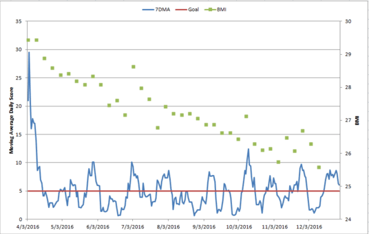
Note: There are some serious jumps on this chart, mostly because I can retain a crazy amount of water if I eat too much sodium.

At the moment I’ve decided to give myself a month off from weigh-ins since the holidays can be so crazy, but on that last weigh in I was only 3 lbs away from being in the normal BMI range. As I mentioned, I’m not built for suffering. Slow weight loss is fine with me.

It’s interesting to note that I actually don’t make my goal of 5 or less per day all the time. Over the 274 days I’ve been tracking, I only was at 5 or under about 70% of the time. I still lost weight. I’ve thought about raising my limit and trying to stay under it all the time, but as long as this is still working I’m going to stick with it.

General thoughts: Much of the philosophy behind how I pulled this data actually comes from the quality improvement “good enough” world, as opposed to the hard research “statistical significance” world. The weigh in data is always there to test my hypotheses. If my scoring system said I was fine but my weight was going up, I would change it. I’m sure that I have not accurately categorized every day I’ve had since April, but as long as my daily scores are close enough to reality, it works. It’s the general trend of healthy behaviors that matters, not any individual day. The most important information I’ve gotten out of this process is what small tweaks I can make to help myself be more healthy. Troubleshooting the life I actually have a getting specific feedback about which areas I have problems with has been immensely helpful. Too often health and diet advice advises us to impose Draconian limits on ourselves that set us up for failure. By tracking specific behaviors and tweaks over the course of months, it’s a lot easier to figure out the high impact changes we can make.

If I had any advice for anyone wanting to try a similar system, it would be to really customize the categories you track and to think through a ranking system that makes sense to you. Once I invented my system, I actually only have to spend about 45 seconds a day ranking myself. I only change things if I see the weight creeping up or if some piece seems to not be working. At this point I review the categories and scores monthly to see if any new patterns are emerging. In the quality improvement world, we call this a PDSA cycle: Plan, Do, Study, Act. Plan what you want to do, do what you said you would do, study what you did, act on the new knowledge. By having data on individual aspects of my daily life, this process became more manageable.

Happy tracking!

GPD Most Popular Posts of 2016

Well hello hello and happy (almost) New Year! As 2016 winds down and I recover from my 3 straight days of Christmas parties, I thought I’d take a look at my stats and do a little recap of the most popular posts on this blog for 2016.  To be clear, these are posts that were written during the year 2016 and the traffic is for 2016. I lumped some series together because otherwise it got a little too confusing, so technically a few 2015 posts snuck in here. I hope you’ll forgive me. And links are included, in case you want to catch up on something you missed.

  1. How Do They Call Elections So Early? A simple question sent to me by a family member on Facebook quickly became my most popular post of the year. Got posted by someone on Twitter with the caveat “Trigger Warning: Math”, which is definitely my favorite intro ever.
  2. Immigration, Poverty, and Gumballs Another response to a  reader question “hey what do you think of this video?” that turned in to a meta-rant about mathematical demonstrations that distract from the real issues being addressed. This post briefly ended up on Roy Beck’s Wikipedia page as “notable criticism” of his video, but he still never returned my email. Bummer.
  3. Intro to Internet Science (series) While technically this series started in 2015, the bulk of it (Parts 3-10) were posted in 2016 so I’m letting it make the list. This got a boost from a few teachers assigning it to their classes, which was pretty awesome.
  4. 6 Examples of Correlation/Causation Confusion Read the post that got the comment “a perfect example of what makes this blog so great”. Sure, it was my brother who said that, but I still take it as a win.
  5. 5 Example of Bimodal Distributions (None of Which Are Human Height) Pretty sure this one is just getting cribbed for homework assignments.
  6. 5 Things You Should Know About the Great Flossing Debate of 2016 This post got me my favorite compliment of the year, when my own dentist told me I “did a pretty good job” with this. I get weirdly overexcited about praise from my dentist.
  7. Pop Science (series) Probably my favorite thing I (co) wrote in 2016, the Pop Science series with Ben was REALLY fun.
  8. 5 Things You Should Know About Medical Errors and Mortality Because a good cause o’ death discussion always brings the clicks.
  9. 5 Studies About Politics and Bias to Get You Through Election Season I am told this was fairly helpful.
  10. More Sex, More Models, More Housework I think it’s my witty writing style that makes this one so popular.

While they didn’t get the same type of traffic, I have to say I enjoyed writing/inventing the Tim Tebow Fallacy and the Forrest Gump Fallacy, and working through my feelings in Accidental Polymath Problems.

Of course I would love to hear your favorites/comments/suggestions for 2017, and if you have any fun reader questions, feel free to send them my way as well.

Happy new year everyone, and thanks for reading!