What I’m Reading: May 2016

My brother sent me this article about a guy who is using data anomalies to track down Medicare fraud. Interesting use of patterns, data, and humans to go where the government can’t.

Things are getting meta: a new study looks at how much people trust scientists who do science blogging.

I’ve seen a few interesting comments recently on various metrics being influenced by shifting demographics. This one from the Economist covers household income stats, and how they may not always be as straightforward as they appear.

As a math person, I’m supposed to be outraged by this story about a flight that got delayed because a professor was scribbling equations and it freaked his seatmate out. I don’t know though….our TSA tagline is “if you see something, say something”. That’s just asking for false positives people, why are we surprised?

For those in the USA wondering what the heck happened with our primary system this year, I liked this explanation about how hard it is to get a system to reflect the will of the people.

My book of the month is What’s a p-value anyway? 34 Stories to Help You Actually Understand Statistics. This one is definitely going on my list of books to recommend for high school or college students trying to pass a Stats 101 class.


Digital Nightmares and Things We Don’t Know

It took me a few years of working with data before I realized what my primary job was. You see, back when I was a young and naive little numbers girl, I thought my primary job was to use numbers to expand what we knew about topics. I would put together information, hopefully gain some new insights, and pass the data on thinking my job was done.

It didn’t take me long before I realized the job was barely half finished.

You see, getting new insights from data is good and important, but it’s no more important than what comes next. As soon as you have data that says “x”, the natural inclination of almost everybody is to immediately extrapolate that out to say “Oh great! So we know x, which means we know y and z too!”.  It’s then that my real job kicks in.  Defending, defining and reiterating the limitations of data is a constant struggle, but if you are going to be honest about what you’re doing it’s essential.

I bring this up because I ran across a disturbing story that illustrates how damaging it can be when we don’t read the fine print about our data.  The whole story is here (along with the great subtitle “The Hills Have IPs”), and it’s about one family’s tech-induced ten year nightmare.

The short version: 10 years ago, a company called MaxMind starts a business helping people identify locations for IP addresses associated with particular computers. When they can’t find a location, they set up a default for the geographic center of the USA. Unbeknownst to the company, this gets associated with the street address of a small farmhouse in Kansas.  Over the next decade, every person who attempts to track down an IP address that’s not otherwise located (about 600 million of them) is given this address, which causes a constant stream of irate people, law enforcement and others to show up at the door of this farmhouse believing that’s where their hacker/iPhone thief/caller/harasser etc lives. The family has no idea why this is happening, and the local police department literally says the bulk of their job is now keeping angry and confused people away from this family.

The reporter who wrote the article (seriously, go read it) is the first person to put two and two together and actually figure out where the mix up happened.

What’s interesting about this story is that when it was brought to their attention, the company pointed out they actually have ALWAYS told customers not to trust the addresses given. They have always told people that results were only accurate within zip code or town. It’s not surprising that many individuals failed to recognize this, but it IS concerning that so many law enforcement agencies failed to take this in to account.  This isn’t just local departments either….the FBI and IRS have investigated the address several times.

Want to know the scariest part? The reporter only figured this out by going through the companies records and then having someone build a computer program to find physical addresses associated with high numbers of  IP addresses.  While the Kansas farm was the worst, there were hundreds of other addresses with similar problems, including one that was a hub for lost iPhones that started her crusade. Without people grasping the limitations of this data, all of these homes are subject to people showing up angry, believing that someone else lives there.

As technology and the “big data” era expands, knowing what you don’t know is going to become increasingly critical. Small errors made at any one point in the system can and will be magnified over time until there can be real trouble. The fine print maybe never be as interesting as the big reveal, but it could save you a lot of trouble in the long run.
What I’m Reading: April 2016

With opening day at Fenway in less than a week, I figured it’s a good time for me to crack open this book: Understanding Sabermetrics: An Introduction to the Science of Baseball Statistics. If anyone knows any better books on the topic, I’d love to hear it!

Somewhat related, an interesting paper on the Gambler’s Fallacy with baseball umpires and asylum judges, among others.

James the lesser passed on this interesting link about that “simple abstracts get cited more often” paper.  There was a lot of assumptions going in to the model that came to that conclusion right there, and we all know those never go wrong.

Speaking of abstracts, this post on how to read a scientific paper was really good.

There was an interesting discussion over at West Hunter recently about the replication crisis in social psychology. In the comments section there was a lot of discussion about learning statistics and if that would help people think more rationally or not. I thought of that when I ran in to this article (about a year old) attempting to coin the term “dysrationalia” for those who are intelligent, but have trouble being rational. I need to start using that phrase.

Related new life goals: eventually get a job title as cool as “professor for the public understanding of risk“.


What I’m Reading: March 2016

The Unbearable Asymmetry of Bullshit. Alas, we are outnumbered.

It won’t help with the asymmetry thing much, but I love this site. I plan on using it early and often.

Oh wait, here’s some more on bullshit and academic infighting, along with a proposal to call the study of bullshit “Taurascatics“. I’m in.

And one more thing about bullshit and rage….for anyone who is overwhelmed or perplexed by the current state of politics, I read this blog post once a month to keep myself grounded: The Toxoplasma of Rage.  It’s a great reminder that your ingroup is persecuting my ingroup, and that you really need to stop. My ingroup is far too busy enumerating the faults of your ingroup to have time to deal with this crap.

On a lighter note, did you know James Garfield came up with his own proof of the Pythagorean theorem during a discussion with congress? I am wondering how many current members of Congress could actually define the Pythagorean theorem.

My book for the month (well, one of them) is Guesstimation: Solving the World’s Problems on the Back of a Cocktail Napkin. Basically it’s about how to estimate complicated problems. A little repetitious, but an interesting mental exercise book so far.

These are some interesting numbers on growing American commute times.  Apparently I spend 20.8 days a year commuting. I resent the “wasted life” part though. Between the train and the bus I get a lot of reading and thinking done. That’s pretty much what I would have done with that time if I had my druthers anyway.

This was an interesting piece about how to make science fairs better. I like the idea of a myth busters style fair. That could get fun.

There’s an interesting Vox piece about health/science journalism and how it’s a good way of losing friends. I liked the piece, but I think she left out the issue of policy recommendations. It’s one thing to talk about evidence for a problem, and it’s another thing to talk about policy recommendations. Very often we see people start with the former, end with the latter, then claim all criticism is because people “don’t like evidence”.  At work when this happens, we have one doctor who will immediately announce “you realize we just all wandered in to an evidence free zone right?”. I like him.  Anyway, describing a problem and prescribing solutions are two different things, and if you mix them up you are DEFINITELY going to lose some folks.

And speaking of evidence and policy, here’s an interesting one on weird statistical methodology in a nutrition paper.

Finally, here’s an interesting deep dive in to social psychology’s replication problem, what it means, and how seriously we should take it.

Terrorist Timelines and Bar Graphs

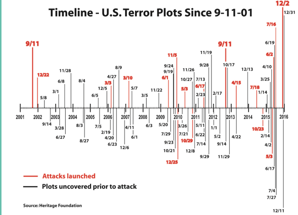
A reader going by the name of “Sound Information” sent along the following graph from this Brietbart article, with this comment:

Just saw the following graph in a Breitbart article, and thought “wow! those increasing bar lengths really indicate increase” — except really they are just an artifact of earlier dates being closer to the y-axis than later ones.

It’s a good point. The bar lengths do, at first glance, appear to represent something in terms of magnitude. It’s only when you look closely that you realize their length is mostly about making the dates readable.  I was curious how this graph would look if I just took the absolute numbers for each year so I did that and I came up with this graph:

attacksplots2

Note: all I did was transcribe their data. They got it from this Heritage Foundation timeline, and I didn’t look to see what got counted or not. I did however, take a look at discrepancies. I think I found 2 typos and 1 intentional addition to the Brietbart data:

  1. Breitbart lists a plot on  June 3, 2008 that the Heritage Foundation doesn’t list and I couldn’t find (probably typo).
  2. The Heritage Foundation has a plot listed on May 16, 2013 that Brietbart did not include (probably typo).
  3. September 11th, 2012 is included on the Breitbart list but not the Heritage Foundation one. This is the date of the Benghazi attacks on the US embassy in Libya (almost certainly intentionally added)

So overall there does appear to be an increase in absolute number, at least of the plots and events we know about or have record of.  This is one of those strange areas where we never quite know how big the sample size was. Some plots (especially single person events) likely fizzle with no one knowing, and more massive plots might be kept from us by FBI/CIA/etc for ongoing investigation reasons.

The other thing  missing from both graphs of course is the magnitude of any of these attacks. 2015 had 15 plots or attacks overall, but 9 of those involved just one person, and 5 involved 2 people. It’s hard to know if it’s more accurate to show number of events, magnitude of events or both. It feels strange to look at 9/11/01 and say “that’s one”, but there also is some value in seeing trends of smaller events.

Regardless of how you do the numbers, I think we all hope 2016 is a record low in every way possible.

SCOTUS Nomination Timing

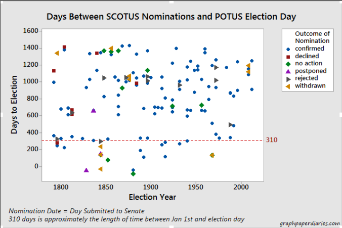
After yesterday’s news about the death of Antonin Scalia’s death, the conversation almost immediately turned to whether or not President Obama should or would nominate a new candidate.  There’s obviously a lot being said about this right now by better legal and political minds than mine, but I did start wondering what kind of timing there normally was between Supreme Court nominations and Presidential Elections.  Thanks to Wikipedia, I was able to find a list of all 160 Supreme Court nominations that have occurred since 1789. I combined this with a list of election dates, and calculated the difference between the day the person was submitted to the Senate and the next presidential election.  I graphed days vs election year, and color coded the dots with the outcome of the nomination.

A few notes:

  1. I didn’t fully vet the Wikipedia data. If there’s an error in that data, it’s in this chart.
  2. All day calculations for years prior to the 1848 election are approximate. Prior to that, states had a 34 day window prior to the first Wednesday in December to hold their election. I gave them a default date of November 3rd for their year, which could be off in some cases.
  3. There were a few cases in which presidents attempted to nominate someone after the election but before the next inauguration. If they got re-elected, I counted that nomination from the election that would take place 4 years later. If they were leaving office, I gave them a negative number.
  4. 310 days is approximately the number of days between January 1st of a year and the general election, so I put a reference line there.
  5. These nominations include Chief Justice nominations….and those nominees may have been active justices when they were nominated.

With that out of the way, here you go:

Days to election

Rutheford B Hayes sets the record for getting things in under the wire, as he nominated William Burnham Woods in late December of 1880. He actually also nominated Stanley Matthews in January of that year, but it didn’t go to a vote. Matthews was renominated and confirmed a few months later by Garfield.

Overall only about 15% of nominations ever have come in this close to the election, and the success rate of those nominations is a little less than half. To compare, those nominees submitted before January 1st of the election year have about an 80% all time success rate. Obviously we haven’t even dealt with this in a while, but it’s interesting to see that historically this was more common than in recent years.

This could get interesting kids!

Coming this February….

As I’ve mentioned in a few comments/conversations around here, one of the main goals of my current blogging kick has been to come up with some more defined project for myself and/or ongoing series. I’ve had quite a bit of fun with the “Intro to Internet Science” posts, and plan to do some other (hopefully) interesting things in the future.

Starting in February, I’m going to roll out a few of these ideas and see what works or at least keeps me entertained. As I start these series I’ll be adding them here, and you can find links to the individual series in the drop down at the top. In addition to a few A few things to look forward to:

Little Miss Probability Distribution: I’ve been obsessed with probability distributions and their relationships with each other, and I need to work that out somehow. Get ready to meet them and see how the get along.

From the Archives: As many reader know, I blogged quite a bit in 2012 and 2013 on all sorts of random issues. Most of that was pre-stats degree, so I’m taking a look in my archives to dig up some old posts and see what I’d say about them now.

Grade an Infographic: Infographics still drive me nuts. I am taking a red pen to them.

Math Words for People Who Like English: I had a really funny conversation with a language obsessed friend about some of the more fun words that exist in the world of math and statistics. I’m going to be highlighting a few of these for her and anyone else who is interested.

Book Suggestions for the Autodidact: I put up a few book lists recently, and I decided I’m going to keep a running list of my favorites for people who want more. You can find it in the bar at the top, or access the ongoing list here. I’ll be changing the number in the title as I add things.

Additionally, I’m going to keep up my R&C posts, where I deep dive/sketch out the different parts of a study either related to my life or the news, and probably keep up the personal life advice column, which keeps cracking me up. As I noted last week, reader questions are always welcome, and can be submitted here.

Millenials and Parenting

Recently Time Magazine ran an article called “Help! My Parents are Millennials!” that caught my interest.  Since I am both a parent and (possibly) a millennial, I figured I’d take a look to see what exactly they were presuming my child would complain about.

I was particularly interested in how they were defining “millennial”, since Amanda Hess pointed out over a year ago that many articles written about millennials actually end up interviewing Gen Xers and just hoping no one notices. Time’s article started off doing exactly that, but then they quickly clarified that they define “millennial” as those born from the late 70s to the late 90s.  This is actually about a seven year shift from what most other groups consider millennials, with the most commonly cited years of birth being 1982 to 2004 or so. Interestingly, only Baby Boomers get their own official generational definition1 endorsed by the Census Bureau: birth years 1946 to 1964.

I bring all this up, because the Time article include some really interesting polling data that purports to show parental attitude differences. Those results are here. Now it looks like they polled 2,000 parents, representing 3 generations with kids under 18.  I DESPERATELY want to know what the number of respondents for each group was. See, if you do the math with the years I gave above, the only Boomers who still have kids under the age of 18 are those who had them after the age of 33….and that’s for the very youngest year of Boomers. While of course it’s not impossible to have or adopt children over that age, it does mean the available pool of Boomers that meet the criteria is going to be smaller and skewed toward those who had children later. Additionally, if you look at the Gen X range, you realize that Time cut this down to just 10 years because of how early they started the Millennials. I don’t know for sure, but I’d guess the 2,000 was heavily skewed towards Millennials.  Of course, since we couldn’t even get numbers, we can’t possibly know which of the attitude differences they looked at were statistically significant. This annoys me, but is pretty common.

What irritated me the most though, is the idea that you can really compare parenting attitudes for parents who are in entirely different phases of parenting.  For example, there was a large discrepancy in Millennial vs Boomer parents who worried that other people judge what their kids eat. Well, yeah. Millennials are parenting small children right now, and people do judge parents more for what a 5 year old eats than a 16 year old.

Additionally, there were some other oddities in the reporting that made me think the questions were either asked differently than reported, the respondents were unclear on what they should answer, or the sample size was small.  For example, equal numbers of Boomers and Millennials said they were stay-at-home parents, which made me wonder how the question was phrased. Are 22% of Boomers still really staying home with their teenagers? My guess is some of them answered what they had done.  Another oddity was the number who said they’d never shared a picture of their child on social media. I would have been more interested in the results if they’d sorted this out by those who actually had a social media account. I also am thinking this phrasing could be deceptive. I know a few Boomers who would probably say they don’t share pictures of their kids, but will post family photos. YMMV.

Anyway, I think it’s always good to keep in mind how exactly generations are being defined, and what the implications of these definitions are. Attitude surveys among generations will always be tough to do in real time, as much of what you’ll end up testing is really just some variation of “people in their 50s think differently from those in their 20s”.

1. Typical

Blog Updates

As many of you know, I used to run a blog called Bad Data Bad! and this morning I figured out how to import all of those old blog posts in to this blog. I’ll be going back and tinkering a bit…tagging the posts, possibly removing some if I don’t like them anymore, etc. and I may be mucking about with other parts of the site as well.

Stay tuned.

Guns and Graphs Part 2

In the comment section on my last post about guns and graphs there was some interesting discussion about some of the data.  SJ had some good data to toss in, and DH made a suggestion that a graph of gun murders vs non-gun murders might be interesting.  I thought that sounded pretty interesting as well, so I gave it a whirl:

Gun graph 4

Apologies that not every state abbreviation is clear, but at least you get the outliers. Please note that the axes are different ranges (it was not possible to read if I made them the same) so Nevada is really just a 50/50 split, whereas Louisiana is actually pretty lopsided in favor of guns.  That being said, the correlation here is running at about .6, so it seems fair to say that states that have more gun homicides have more homicides in general. Now to be fair, this chart may underestimate non-gun murders, as those are likely a little harder to count than gun related murders. I don’t have hard data on it, but I’m somewhat inclined to believe that a shooting is easier to classify then a fall off a tall building.  Anyway, I pulled the source data from here.

While I was looking at that data, I thought it would be interesting to see if the percent of the population that owned guns was correlated with the number of gun murders:
Gun graph 5

Aaaaaaaaand…there’s no real correlation there. It’s interesting to note that Hawaii and Wyoming are dramatically different in ownership percentage, but not gun homicide rate. Louisiana and Vermont OTOH, have nearly identical ownership rates and completely different gun homicide rates.

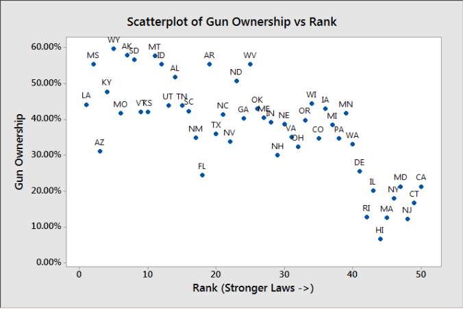
Then, just for giggles I decided to go back to the original gun law ranking I was using, and see if gun ownership percentage followed that trend:

Gun graph 6

There does appear to be a trend there, but as the Assistant Village Idiot pointed out after the last post, it could simply be that places with lower gun ownership have an easier time passing these laws.