What I’m Reading: July 2019

As always, Our World in Data provides some interesting numbers to think about, this time with food supply and caloric intake by country.

This article on chronic lyme disease and the whole “medical issue as personal identity” phenomena was REALLY good and very thought provoking.

Ever want to know where the Vibranium from Black Panther would land on the periodic table of elements? Well, now there’s a paper out to help guide your thinking. More than just a fun paper to write up, the professors involved here actually asked their students this on an exam to see how they would reason through it. I’m in favor of questions like this (provided kids know to have watched the movie) as I think it can engage some different types of critical thinking in a way that can be more fun than traditional testing.

I mentioned to someone recently that I have a white noise app on my phone, but after testing it out I found that brown noise tends to be more effective in helping me sleep than white noise. They asked what the difference was, and I found this article that explains different color noises. In my experience the noises that tend to be loudest and most likely to interfere with sleep tend to hang out at the low end of the spectrum, YMMV.

A new study “Surrogate endpoints in randomised controlled trials: a reality check” gives an interesting word of warning to the cancer world. It’s common in clinical trials to use surrogate endpoints like “progression free survival” or “response rate”to figure out if drugs are working. This is done because overall survival can take a long time to get and researchers/patients/drug companies want results faster and it seems like if the surrogate markers are good the drugs can’t possibly hurt.

Unfortunately, it appears this isn’t the case. A new drug venetoclex was studied and patients on it were eventually found to have better progression free survival, but eventually twice as many deaths as those treated with regular treatment. Ugh. The lead author has a great Twitter thread on his paper here, where he suggests this means that either the drug is a “double edge sword” with both better efficacy and higher toxicity than alternatives, or that it’s a “wolf in sheep’s clothing” that makes things look good for a while but causes changes that means relapse is swift and deadly. Lots to think about here.

Finally, SSC has a good post up on bias arguments here. I especially like his points about when they are relevant.

Fentanyl Poisoning and Passive Exposure

The AVI sent along this article this week, which highlights the rising concern about passive fentanyl exposure among law enforcement.  They have a quote from a rehab counselor who claims that just getting fentanyl on your skin would be enough to addict you, and that merely entering a room where it’s in the air could cause instant addiction. Given that it’s Reason Magazine, they then promptly dispute the idea that this is actually happening.

I was interested in this article in part because my brother’s book contained the widely reported anecdote about the police officer who overdosed just by brushing fentanyl off of a fellow police officer. This anecdote has been seriously questioned since. Tim expressed concerns afterwards that had he realized this he would have left it out. I’ll admit that since my focus was mostly on his referenced scientific studies, I didn’t end up looking up various anecdotes he included.

This whole story indicates an interesting problem in health reporting. STAT news has more here, but there’s a couple things I noted. First, the viral anecdote really was widely reported, so I’m not surprised my brother heard about it. It has never technically been disproven….outside experts have said “it almost certainly couldn’t have happened this way” but neither the police officer nor the department have commented further. This makes it hard for the “probably not” articles to gain much traction.

Second, the “instant addiction” part was being pushed by a rehab counselor, not toxicologists who actually study how drugs interact with our body. Those experts point out that it took years to create a fentanyl patch that would get the drug to be absorbed through the skin, so the idea that skin contact is as effective as ingesting or breathing it in seems suspect.

Third, looking at the anecdotes, we realize these stories are NOT being reported by the highest risk groups. Pharmacists would be far more likely to accidentally brush away fentanyl than police officers, yet we do not hear these stories arising in hospital pharmacies. Plenty of patients have been legally prescribed fentanyl and do not suffer instant addiction. The fact that the passive exposure risk seems to only be arising in those who are around fentanyl in high stress circumstances suggests other things may be complicating this picture.

While this issue itself may be small in the grand scheme of things, it’s a good anecdote to support the theory that health fake news may actually cause the most damage. While political fake news seems to have most of our attention, fake or overblown stories about health issues can actually influence public policy or behavior. As the Reason article points out, if first responders delay care to someone who has overdosed because they are taking precautions against a risk that turns out to be overblown, the concern will hurt more people than it helps. Sometimes an abundance of precaution really can have negative outcomes.

Twitter and Sundry

I finally got a vacation this week, which means I spent not a lot of time near a computer but had a decent amount of time to scroll through Twitter. A few good accounts I found:

Any other good ones I missed?

Speaking of good accounts to follow, apparently one of the first papers focused on a prominent (and anonymous) Twitter account was published, with this one on the role of Neuroskeptic in calling out scientific ethical breeches. Only paper I’ve ever seen where the conflict of interest statement included “…was banned from commenting by Leonid Schneider at his blog “forbetterscience”.

Finally, Neuroskeptic also follows up on an analysis done by Susan Fiske of who research methods blogs go after and how often.  A few years ago Fiske had caused a kerfluffle when she referred to many science/research methods bloggers as “methodological terrorists” and defended the replication crisis. Her new paper looks at 41 bloggers and categorized which other researchers they talked about most often. Interesting findings: 3 out of the top 4 talked about researchers resigned (Diederik StapelBrian Wansink and Jens Förster), , and the #1 guy is pretty notorious. Other interesting note: there was no clear gender bias in who got talked about. Men were more likely to critique other men, and men who got named were posted about more often. However, it’s not particularly clear what this means about bias, as a few large cases of misconduct got a LOT of coverage, and Bem seems to have become the go to for bad methods/good researcher examples.

Still, super interesting work and good for Fiske for doing it. Gotta respect someone who gets mad, then gets data. I look forward to this being expanded on in the future.

Vaccination Rates by County, State and Around the World

There’s a lot in the news recently about vaccination rates, both in the US and in other countries. After seeing a few comments on Twitter this week about the topic, I got curious about the exact numbers.

First off, it’s important to note that for all the press coverage of the measles outbreak, vaccine exemptions are not evenly distributed across the country. For example, here’s just my state broken down by county. The map on the left is those with exemptions, the one on the right is those without exemptions not meeting requirements. Functionally, the vaccination rate is likely 100%-(the number on the left+the number on the right).

Source.

Now not everyone on the right may be missing their vaccinations, for some it may be paperwork. The Boston suburbs probably do well because most working parents have been providing vaccination documentation to day cares for years prior to this.

So how does Massachusetts compare to the country? Well, the CDC puts together a rather awesome interactive map for Kindergarten vaccination rates here. This map shows something interesting. Per the NYTs graphic of the measles outbreak, Washington, New York and Michigan have seen the largest measles outbreaks in the country. However, New York actually has one of the highest vaccination rates in the country at 97.5%. This suggests that it’s not just having a high vaccination rate, but where the unvaccinated are located that causes outbreaks. For example, in Massachusetts the exemption rates are highest on Martha’s Vineyard, a wealthy spread out community with not many year round residents. The other counties with higher rates of exemptions are not close geographically. In New York City though, it’s groups living in close proximity with low rates that are getting hit by the outbreak. This leads to high overall vaccination rates by state, yet still record setting outbreaks in targeted communities.

Now how about worldwide? Well, after working on their childhood vaccination program for years, Mexico actually now has a higher rate of children vaccinated against measles than the US (96% vs 92%). Interestingly, a similar number of people doubt vaccination safety in both countries. According to Our World in Data, France and Russia have the most vaccine skeptics:

Using Our World in Data again though, apparently vaccine skepticism doesn’t always correlate with not getting vaccinated. Both France and Russian have >95% measles vaccination rates.

I thought all this was interesting because overall, many people believe that fewer children are vaccinated than actually are. For example, Americans estimated that only 35% of the worlds children were vaccinated against measles, when in reality 85% are. While knowing that rates are high can sometimes convince people that it doesn’t matter as much if they get their kids vaccinated, thinking many people aren’t vaccinated can sometimes convince people that it’s not important to do so. “Everybody’s doing it” is an effective slogan for a reason.


Quote for Election Season

Life is a bit chaotic this weekend, but as we head towards what looks to be a rather drawn out election season, here’s a quote to keep in mind:

“The public’s ‘opinion’ on almost any issue will be a function of the question asked.”
-Neil Postman, Technopoly (as found on Twitter)

The exact wording here is important…”a function of” does not mean the question fully makes the opinion, but rather that it transforms it in ways that can often be predicted. A good thing to remember when you see headlines saying “the public supports ______” or “low public support for _______”.

What I’m Reading: April 2019

Familiar topics in this Nature article, but a good title….the Four Horsemen of the Reproducibility Crisis. P-hacking, low power, publication bias and HARKing (oh my!).

Given my ongoing interest in YouTube search results, I found this profile of the YouTube CEO quite fascinating.

A little late to the party, but I loved the WaPo “Mueller Book Report” take.

Related to the two above, a Twitter thread about which videos about the Mueller report got recommended the most by YouTube.

This article debates the current assertion that religious affiliation is going down, and caused a lot of discussion in an email group I’m part of this week. The basic argument seems to be that the rise of the “no affiliation” label is coming mostly by way of those who previously claimed to be religious but reported they never went to church, so the core of religious sentiment remains unchanged. I’ll admit I’m unconvinced by this. The underlying paper suggests that religious behavior (going to church, etc) are holding steady among the religious, which goes counter to the idea that the label-without-participating people are the only ones who left. If they were, we’d expect to see the remaining religious people engaging in MORE religious behavior, as the lower tier wouldn’t be bringing down the average any more. Still, it isn’t wrong to point out that the typical “nones are on the rise!” story may have been oversold.

The Calling Bullshit guys posted that there’s a new entry in to the field of bullshit studies: Bullshitters, who are they and what do we know about their lives? This clever paper asked people about themselves, then asked them about their knowledge levels for 16 statistical/mathematical techniques. 3 of them (Proper Number, Subjective Scaling and Declarative Fraction) were fake. The study was done on teenagers in 9 countries. Findings: boys are much more likely to bullshit than girls in all countries, high socioeconomic status kids were more likely to bullshit than lower SES kids in all countries, immigrants are sometimes more likely to bullshit, sometimes not depending on the country, the US and Canada are huge bullshitters. Bullshitters were more to rank themselves as good in other things (popularity, mathematical ability) and interestingly, more likely to give “right” answers when asked how they would solve a problem. For example, when asked what they’d do if their cell phone broke, they say they’d first consult the manual rather than “push all the buttons to see if it turns back on”. Now to note: all countries studied were WEIRD, but still an interesting paper.


When Bad Stats Mean Good Things

As someone who has to pay attention to blood/infectious disease issues for work, I’m on a couple email lists that report current issues. I got one of these this week that really caught my eye, with a headline that stated that the incidence of hemophilia appears to be going up.

Since hemophilia is a genetic disorder, I was curious why this would be. Clicking on the article, I was surprised to find that the researchers actually believe this is a positive development caused by getting a better handle on HIV and infectious disease standards. For those unfamiliar with hemophilia, it’s a disorder that impacts your blood’s ability to clot. Though in some rare cases women can some forms of it, the disorder is almost exclusively found in men. Men with this require blood transfusions frequently, and thus were impacted when HIV in the 80s before blood and blood donors were screened with the standards we use today. Ryan White, whose case prompted many of the legal protections we have for people diagnosed with HIV today, was one such case. The first person I knew who had HIV (Norm Cataract) was another such case. He was a friend of my parents and dedicated the last few years of his life to giving public talks about how HIV was acquired and trying to reduce fear. It’s hard to remember now, but in the late 80s there was a lot of misinformation about HIV floating around, and with no treatment available it was met with a lot of hostility. I’ve never forgotten Norm’s bravery in fighting for understanding and right information. It’s a shame he didn’t live long enough to see HIV become more manageable disease.

Anyway, now that HIV is more manageable, the blood supply is cleaner, and hemophilia is a less risky disease. The less risky it is, the more likely hemophiliacs are to actually live and have children, which given the genetic nature of the disease means there will be more hemophiliacs. In other words, despite the negative connotations of “rates going up”, this is all a good thing.

A couple other examples of “bad” stats hiding good things:

  • More wounded veterans. Previously more men died on the battlefield or shortly thereafter due to a lack of medical care in the field, now 90% of men wounded in battle survive.
  • Smoking rates (possibly). Working in a cancer hospital, I have a lot of coworkers who (pretty understandably) dislike smokers. I like to remind them that smoking rates are very high among recovering addicts, so we don’t always know if the smoking was a bad choice or a good choice. Smoking isn’t healthy, but I think we can all agree it’s better than heroin.

I don’t have a clever name for this, but I’d be open to suggestions!

McDonald’s: 46 Years Later

A few years ago, James mentioned his idea for a “Follow-Up Gazette“, a news outlet that would report “All the things we found out later”. I loved this idea, particularly the thought of it having a science section. I think about this concept often, as it fascinates me how often we assume that we will never see things differently than we do right now.

I was thinking about this again this past week, because our drive to NYC and back meant I ended up eating some form of fast food 3 days in a row. We even stopped at McDonald’s AND Burger King in the same 48 hour timeframe, which is something I haven’t done in a long time. It reminded me of an article someone posted on Twitter recently: a Time magazine feature on McDonald’s written in 1973.

Written just over 2 decades after Ray Kroc joined McDonald’s and started its upward trajectory, the article is an interesting look at how complaints about McDonald’s have morphed in the last 5 decades. Now that critical statements about McDonald’s have become an industry of their own, its interesting to see how  the initial complaints hold up. The article is 9 pages long, so I’m going to take this page by page. Lets take a look, shall we?

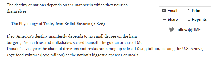
The article starts out pretty well, much the way an article about fast food would today, with this quote:

The next few paragraphs recite the key stats about McDonald’s business, most of which have obviously changed since then. It’s notable that the whole idea of mega corporations seemed much newer, as the numbers that seem sensational and the reach of McDonald’s seems more novel. The article talks about their sign reading “12 Billion Hamburgers sold”, I remember a kid noting that they’d stopped tracking around 99 billion.

Page 1 Rating: Holds up, if no longer novel. Stats were accurate at the time they were reported, though would be less impressive now.

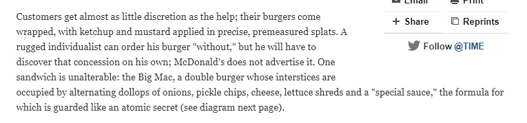
The next section starts off with an interesting complaint: that customers don’t get “discretion”.

This is followed by a few paragraphs about worker standardization, high turnover, tedious conditions, and machines taking human work…pretty current complaints. They also mention “Hamburger University”, which is apparently still around.

They then drop in an interesting tidbit about the dress code:

Page 2 Rating: Mostly holds up. Fast food restaurants are so ingrained in our culture that I’m not sure I’ve heard anyone complain about the lack of menu choices in a while. You basically know what you’re getting. Worker complaints are still being made, though the dress code has apparently loosened substantially.

Page 3 kicks off with a quote from a pop sociologist about McDonald’s, claiming that it shows America is all about blandness and sterilization, and that we’re too responsive to advertising. Then comes this paragraph, which I found fascinating:

Scurvy? You can eat it without teeth? That’s a fresh take. Of course this article was prior to the obesity crisis, so they “these seem like a bad idea nutritionally” folks didn’t have much to go on.

The architectural blight charge was also interesting, and not one I’d heard before. The rest of the page talks about about the appeal of McDonald’s (you know what you’re getting, food comes fast) and the cheap price. You know, pretty much all the things people still like about it today.

There is an interesting tidbit about how McDonald’s responded to inflation rampant in the early 70s (raised prices less than others) and the trivia that McDonald’s makes its money on the fries.

Page 3 Rating: Mixed. The nutrition complaints are wrong in details, but their spirit is now widely accepted as true. The architecture concern seems to have passed, the positives are pretty much the same.

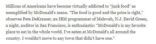
Page 4 kicks off with an amusing quote that I somehow doubt many people would say today:

In 2019, it’s both hard to imagine someone feeling this way AND finding many towns without a McDonald’s. I checked out some brand loyalty ratings, and 5 Guys is the only burger place that ranks nationally. Its interesting that while McDonald’s didn’t retain its brand loyalty, it helped change the culture enough that it and places like it still have a home.

Page 4 Rating: An interesting snapshot of the history. Those of us who grew up with these corporations already in place can’t always conceptualize that these places were once the “new thing”.

The end of page 4 and beginning of page 5 cover Ray Kroc, and his now famous issues with the McDonald’s brothers, though it doesn’t dwell on them much before moving on. They highlight his foresight in serving the suburbs (other fast food places focused on cities) and his subsequent marketing directly to children. This ranges from the obvious (Ronald McDonald as a mascot) to the less obvious (leaving napkins and straws out on the counter so children could get them).

Of course this marketing innovation has caused most of their problems for the last few decades, as more people have blamed them for increasing youth obesity and violating bans against advertising to minors.

Page 5 Rating: A little cringe-worthy.

The next section wraps up the kids marketing and then moves in to some standards that seem almost quaint in retrospect. They talk about how Ray Kroc demanded everything be clean, and used to inspect stores to make sure they were as clean as possible. While most McDonald’s I’ve been in aren’t horrible, I think the idea that they’re supposed to scrape gum off the walkways out front has gone by the wayside. McDonald’s as a paragon of high standards is an odd thought.

Page 6 Rating: Quite the throwback

Page 7 is interesting, as it talks substantially about McDonald’s dedication to charity work and the terms of their licensing agreements. While it appears the franchisee deal is still largely the same (though with a lower percentage of the profits going to corporate headquarters), it doesn’t appear the requirement to do charity work has kept up. In fact the recent controversies with McDonald’s have seemed to center around how much charity work they actually do. I couldn’t find many hard numbers about the franchisee charity work, so I’m a little mixed on this.

Page 7 Rating: Not enough data

Page 8 has some more interesting data about what it took to open a McDonald’s franchise. I was interested to find out that anyone who put up more than half the money for a franchise was actually required to work there. There’s an interesting anecdote about a former cop named Lee Dunham who opened a McDonald’s in Harlem and took on the local gangs to keep the store running. Apparently he ended up giving a bunch of gang members jobs. I Googled him and found a glowing obituary from 2011, praising his work with the community, much of which started with his McDonald’s stores.

Page 8 Rating: Glad to see this one turned out well.

Page 9 has some interesting commentary about McDonald’s expansion, particularly in to Europe. I loved this paragraph:

I’d shake my head at that, but I’m pretty sure I actually went to the McDonald’s on the Champs-Elysees. It has a marble sculpture in the middle, as one does. I also took refuge in one in Bucharest Romania after a particularly harrowing overnight ride on the train.

It continues to talk about Kroc’s aggressive plans for expansion, wondering if he can keep it up with new competitors on the horizon. Page 10 concludes with a final moment from Kroc, saying that every day was a new Broadway show.

Page 9  and 10 Rating: Good. McDonald’s expansion continued in this country until 2015, the first year in its history it closed more stores than it opened.

Overall impressions: Overall the article didn’t fair too badly, though it’s interesting to see how our norms have changed since it was written. Large multinational corporations are a standard (if not always well loved) part of our society now, and while McDonald’s survives it no longer inspires much brand loyalty in the US. However, it is still one of the most recognized brands in the world, and allegedly the golden M is more recognized than the cross.

Within the overall correctness though, it’s interesting to note that not everything has held up. Scurvy is not the big nutritional concern, workers are not really known for being the most well trained. Many previously novel things like cleanliness regressed to the mean.

Of course there’s an interesting bias in reading an article like this at all….we’re interested in articles like this solely because the growth continued and the business survived. If Time had run an article on another juggernaut that fizzled, I wouldn’t be looking it up.

One way or another, its interesting to see how people a few decades ago saw things, and to think about how our thinking may change 50 years from now about things we think today. What will fall by the wayside, what will normalize and what will prove true are always interesting questions.

On that note, I’m going to go get a hamburger.


Two Minor Points on Viral Graphs

There’s been a couple graphs trending on Twitter this week, and a couple of people have made sure to pass them on to me (thank you!). Both of them are trends over time for two of the hottest topics you can discuss: sex and religion.

The first was this one from the Washington Post, and shows the percentage of people not having sex is steadily increasing. The most stunning chart was this one:

Of course your eyes immediately go to the right of the chart. It’s rather stunning that the percent of those not having sex in their 20s is twice as high as those not having sex in their 50s. A lot has been written about that right part of the graph and the sudden change in 2008 when the economy crashed/iPhone debuted, but I’ll admit the sudden dip and jump around 1998 caught my eye. What happened?

Well, as someone in their teens at that time, I have a guess. That was right when the Bill Clinton impeachment hearing was happening, and there was a large national debate about oral sex, and whether that counted as sex. Is it possible that having the definition so nationally debated changed the way young people answered the question temporarily? I may be wildly off on that, but it’s certainly an odd hiccup.

Next up, the latest GCS data shows that those saying they have no religious affiliation has surpassed those saying they are Evangelical in the US:

This is the first time “no religion” has surpassed all the other groupings, though to be fair 4 of those are just different groups of Christians.

As I looked at this graph, I was interested in how relatively stable Black Protestant has been….until I saw 1970. Did they really have about 14% of the population then suddenly drop to 8 or 9% then stay there for almost 5 decades? That seems unlikely.

I couldn’t figure out what happened there until I realized that 1970 appears to be the year Evangelicalism started to spike. I couldn’t find any specifics, but I am guessing that there was some reshuffling around what denominations were considered “Black Protestant” and which were considered “Evangelical”. When I did my post on religious classifications a few months ago, I noted that churches with “Baptist” in the name could be counted as Evangelical, Black Protestant or Mainline. My guess is it took a bit to get that sorted out on the GCS.

Anyway, no idea if I’m right on either of these theories, but I like to look at parts of the graphs that don’t get all the attention. Sometimes you can get interesting insights in to the data gathering process by looking at the parts that aren’t under scrutiny.


Women, Equality, Work and Statistics

A reader sent along an article recently with a provocative headline “U.S. not in top 60 nations for equality for working women“, along with a request for my opinion. As a working woman I was of course immediately interested in which 60ish countries were ahead of us, so I took a look. The article itself is based on a report from the World Bank called “Women, Equality and the Law 2019” which can be found here. It looks at laws in 8 different areas that impact women’s equality in the workplace, and assigns countries a score based on whether they have them or not. The areas looked at were:

  • Going places: constraints on freedom of movement
  • Starting a job: analyzes laws affecting women’s decision to work
  • Getting paid: Measures laws and regulations affecting women’s pay
  • Getting married: Assesses legal constraints
  • Having children: Examines laws affecting women’s ability to work after having children
  • Running a business: Analyzes constraints to women starting and running businesses
  • Managing assets: Considers gender differences in property and inheritance
  • Getting a pension: Assesses laws affecting the size of a woman’s pension

Given this approach, it seems that the initial headline was a little misleading as to what this study actually found. This study looks only at the existence of laws, not whether they are enforced or not or actual equality for women. Headline writers gonna headline, I guess. The article itself was better, as it covered the basics of the report and why legal equality is important. Snark aside, I would absolutely prefer to live in a country that gave me the legal right to sign a contract or inherit property over one that didn’t have such a law, even if the law was imperfectly enforced. So where did the US fall down? Well, we had a “no” on 6 different questions, which gave us a score of 83.75. These were in three different categories:

  • Getting paid: “Does the law mandate equal renumeration for work of equal value”, the US got a “no”
  • Getting a pension: “Does the law establish explicit pension credits for periods of childcare?”, the US got a “no”
  • Having children, we had “no” on 4 questions:
    • Is there paid leave of at least 14 weeks available to women?
    • Does the government pay 100% of maternity leave benefits, or parental leave benefits (where maternity leave is unavailable)?
    • Is there paid paternity leave?
    • Is there paid parental leave?

Now this struck me as interesting. Our biggest ding was in the one category where they also asked about men’s legal rights, i.e. paternity leave. In other words, the US got marked as unequal under the law because men and women were equal under the law, but in the wrong direction. I can see where they were going with this, but it’s an interesting paradox. I was curious about their justification for putting these laws up there along with the other ones, so I read the explanation they provided. From page 6 of the report: “Women are more likely to return to work if the law mandates maternity leave (Berger and Waldfogel 2004). Though evidence on the impact of paternity and parental leave is mixed, parental leave coverage encouraged women to return to work in the United Kingdom, the United States and Japan (Waldfogel, Higuchi and Abe 1999).” To note, this was the only criteria they included where they explicitly stated the evidence was mixed. Now as part of this report, the World Bank had stated that legal equality was correlated with equal incomes and equal workforce participation, and showed this graph to support its claim: Now this graph struck me as interesting because while it does show a nice correlation (that they explicitly remind everyone may not equal causation), the correlation for countries scoring above the mid-70s is much less robust. While workforce participation for women in countries earning a perfect score is very high (left chart), it’s interesting to note that the pay ratio for men and women in those countries goes anywhere from the 50 to 80% range. I looked up the individual numbers for the 6 countries getting a perfect score (Belgium, Denmark, France, Latvia, Luxembourg and Sweden) and the US, and found this. The labor force participation ratio and the F/M pay ratio are from the reports here. I added the other metrics they put under “Economic Opportunity and Participation” just for fun.

Country USA BEL DNK FRA LVA LUX SWE
Labor Force Participation .86 .87 .93 .90 .92 .83 .95
Wage Equality .65 .71 .73 .48 .67 .71 .72
Income Ratio .65 .65 .67 .72 .70 1.0 .78
Legislators, Senior Officials,
Managers
.77 .48 .37 .46 .80 .21 .65
Professional and Technical
Workers
1.33 1.00 1.01 1.02 1.93 .93 1.09
Total Economic Participation
and Opportunity Score
.75 .73 .74 .68 .79 .75 .80

So out of the 6 countries with perfect scores in legal equality, 2 have overall economic participation/opportunity scores higher than the US, 1 is equal, and 3 are lower. Many countries that have high scores end up with high numbers of women in the workforce, but low numbers in positions of power (2nd and 3rd rows from the bottom). The US and Latvia led the pack with women in higher profile jobs, even with the US having (relatively) low workforce participation.

Oh, and in case you’re wondering how Luxembourg got a perfect income ratio score but not a perfect equal pay score: incomes for the ratio calculation were capped at $75k. Luxemborg has a very small population (600,000) and a very high average income (about $75K), so it really kinda broke the calculation. Including incomes above $75k would probably have changed that math.

Now, I want to be clear: I am not saying legal equality isn’t important. It is. But once you get beyond things like “are women allowed to legally go out at night” and in to things like “do pensions give explicit credit for child care”, the impact on participation is going to vary a lot. Different cultures have different pluses and minuses, so the same culture that gives extensive maternity leave may not end up encouraging women to go for the highest professional jobs. In cultures with low relative incomes like Latvia, women may use their legal equality to get better paying jobs more often. This confirms the pattern we see in engineering and science degrees….the most gender equal countries are not the ones producing the most female science grads.

Still, the hardest thing about calculating equality is probably relative income. While Latvia may have more women in higher level jobs, most women would prefer the US average income of $43k to the Lativian $20k. While many of the other top countries are OECD countries, some of the ones scoring the same as the US were not. Even with equal legal situations, I’d imagine that life for women in the Bahamas, Kenya, Malawi and the US are very different. That doesn’t make the metric wrong, it just means equality can be very different depending on where the overall median is.

One final thought: it struck me as I was researching these countries exactly how big the US is in comparison. If you add up the populations of the 6 countries with perfect scores, you get about 96 million people. This is less than a third of the 325 million people who live in the US. Large countries tend to be less equal than small ones, and I do wonder how much of that is simply supporting a large and disparate population. The US is the third largest country in the world by population, and the first one with a higher legal equality score than us is #10 on the list, Mexico with 38% of our population and a score of 86.25. The next one to have a higher score is #17 (Germany) then France. To test my theory, I put together a graph of population size vs WBL index. Note: it’s on a log scale because otherwise China and India just kinda dwarf everything else.

So basically no country with a population over 100 million has gotten over a score of 86. Speculating on why is a little out of my wheelhouse, but I think it’s interesting.

And with that I’ve gone on long enough for today, but suffice it to say I find global statistics and inter-country comparisons fascinating!