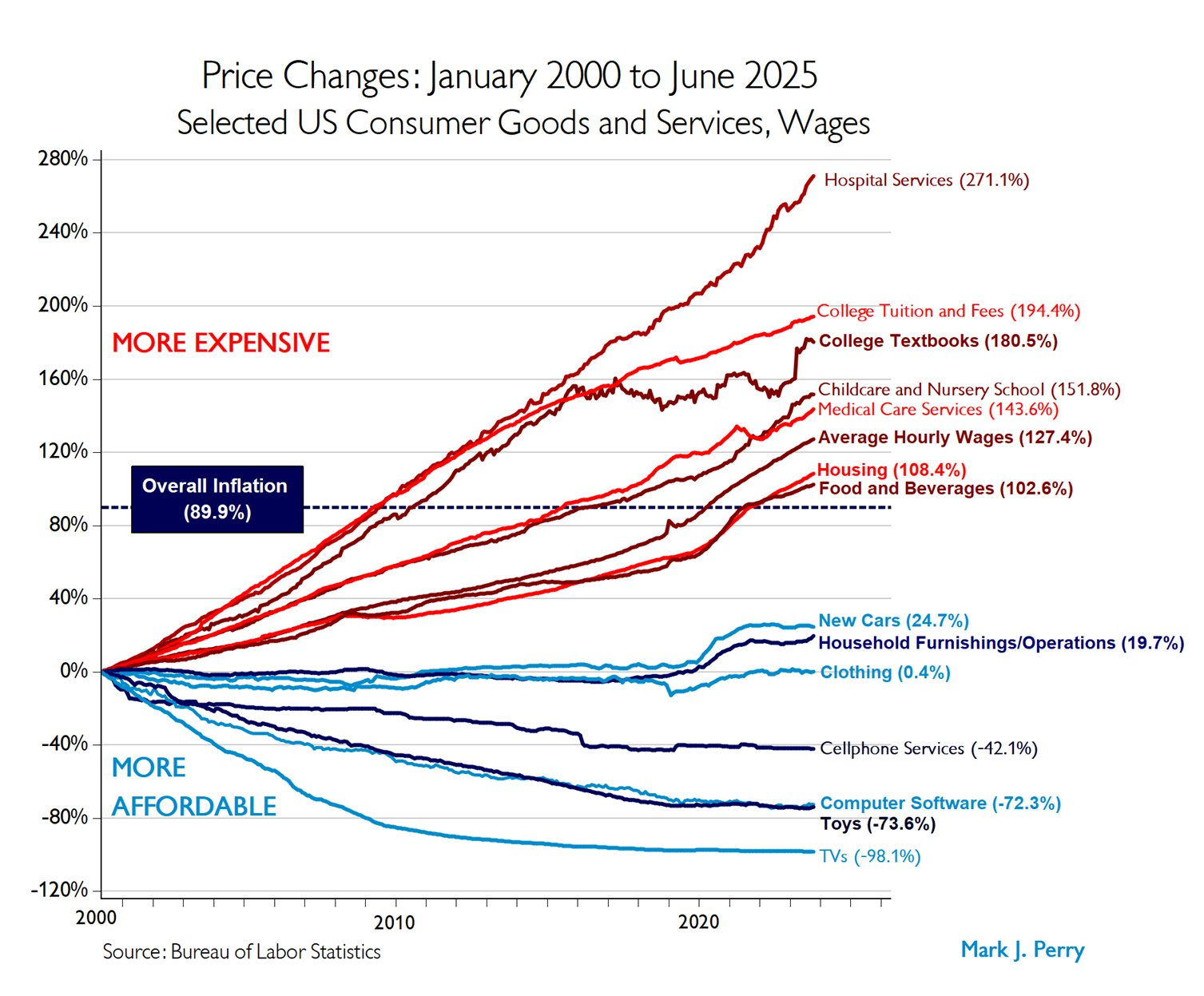
When it comes to current day financial woes, it is common to hear people focus on three things specifically: housing, higher education and health care costs. This will often be accompanied by something like Mark Perry’s “chart of the century” that shows the increase in prices vs wage increase since the year 2000:
Of the 5 categories of spending that outpaced average wage growth, 2 are in healthcare. But those healthcare categories are much trickier than the remaining 3 categories. If I bring up childcare spending, college textbooks or even college tuition and fees, you pretty much know what that covers. Even if you haven’t personally used it in a while, you probably know what a daycare or bachelors degree entails, and I think we all have the same memories of college textbooks. But how do you compare the cost of healthcare in the year 2000 to today? What are we even comparing when we say “hospital services”? How do we add in the fact that there is simply more healthcare available now than there was 25 years ago?
As it turns out, this is an incredibly tricky problem no one has quite solved. The data above comes from the BLS medical CPI data, which tracks out of pocket spending for medical services. It states that in general “The CPI measures inflation by tracking retail prices of a good or service of a constant quality and quantity over time.” But as someone who has worked in various health care facilities since just about the year 2000, I am telling you no one actually wants to revert back to the care they got then. Additionally, CPI tracks the price of something, but not how often you need it or why you needed it.
Here’s an example: when I started in oncology, all bone marrow transplants were done inpatient. Then, people started experimenting with some lower risk patients actually getting their transplants outpatient. People really love this! They sleep in hotel rooms with more comfortable beds, and walk in to clinic every day to get checked up on. However, this means that your average inpatient transplant is now more complex, the “easy” patients who were likely to have a straightforward course of care were removed from the sample. I don’t often look at what we charge, but I wouldn’t be surprised to see that the cost for an admission for bone marrow transplant has continued to trend upward. But this doesn’t mean the cost has actually gone up for most patients. In this case, comparing the exact same hospital stay for the exact same diagnosis as 25 years ago is not comparing the same thing. Innovation didn’t change that some patients need a hospital stay, it meant that fewer patients needed one.
While this is one example, I suspect rather heavily that’s a big reason why hospital services cost has gone up so much. The big push in the last 2 decades has been all about keeping people out of the hospital unless they really need to be there, which will have the effect of making hospital stays more expensive while keeping more people out of the hospital.
This run off can also increase the cost for outpatient medical services, the other category we see above. This past year for example, I got my gallbladder removed. In the year 2024, 85% of people who got a gallbladder removed went home the same day, as did I. In the year 2000 however, that was hovering at around 30%. So again, we see that the hospitals are now caring for just the sickest people, but one also assumes that outpatient follow up visits might be more complex than they were 25 years ago. Having 50% of patients change treatment strategies is a huge shift in the way care is delivered, even if it shows up as “the exact same visit type for the exact same diagnosis”. From the standpoint of CPI, a ‘gallbladder removal’ looks like the same service. From the standpoint of reality, it has become a fundamentally different care pathway.
Now this is just one graph, and it’s true there are other graphs that get passed around that show an explosion in overall healthcare spending. This is also true, but fails to reflect that the amount of healthcare available since <pick your year> has also exploded. Here’s a list of commonly used medical interventions that didn’t exist in the year 2000:
Most popular and expensive migraine drugs (CGRP inhibitors)
GLP 1s for diabetes/weight loss (huge uptick in the past 5 years)
Cancer care (CAR-T cell therapy and immune checkpoint inhibitors)
Cystic fibrosis treatment (life expectancy has gone from 26 to 66 since 2008)
HIV treatment (life expectancy was 50-60 in 2000, now is the same as the rest of the population)
ADHD medication (this one is more an expansion in diagnosis, was $758 million in 2000, now estimated at $10 to $12 billion. I bring this up as a tangential rant because for some reason I’ve seen 2 people recently mention that insurance annoyed them because they didn’t use it because they were healthy, but they or their children were on ADHD medication. If you are going to complain about healthcare costs, it’s good to make sure you are accurately assessing your own first.)
Childcare or higher education have made no similar changes in the same time period.
My point here is not that healthcare has no inflation, it almost certainly does. Rising wages, increased IT needs, increased regulatory burden and increased cost of supplies would all hit healthcare as well. But when you compare healthcare in the year 2000 and the year 2025, you are comparing two different products. Go further back with your comparison and the differences will be even more stark. We are never going to control healthcare costs as long as we are constantly adding new, cool and really desirable things to the basket. There is not a world in which we can both functionally cure cystic fibrosis AND do it for the same price as not curing cystic fibrosis. Not all cost increases are the same.
A few months ago, I wrote a post called “Gell-Mann Amnesia Applies to TikTok Too“. AAs often happens, once I wrote it, I started seeing the phenomenon everywhere. A few days ago however, I saw a fantastic example I wanted to get out there.
As you may or may not know, I am a long-time fan of the Kardashians and the various iterations of their reality show. I’d say it’s my guilty pleasure, but I don’t feel particularly guilty about it. They’re entertaining, and I’ve learned a surprising amount about what it’s actually like to be famous.
(Side note: while the money looks fun, fame looks terrible. Credit to anyone who can tolerate it.)
When the original show “Keeping Up with the Kardashians” started in 2007, the family was only mildly famous. Almost 2 decades later, they are now some of the most famous and recognizable celebrities on the planet, and the show has grown to reflect that. At least a few times a season they do a segment on various media reports/social media rumors they have seen about themselves, and how people are often entirely making things up about them just to cash in on their name. They vent their frustration that people keep posting nonsense, and complain about how hard it is to set the record straight once rumors start. This makes sense to me, and in their shoes I’d do the same thing.
Given this, I was interested to see on a recent episode that Kim Kardashian admitted she didn’t believe we really landed on the moon. When the producers pressed her to explain why, she had a few snippets of concern, but she ended it with “Go to TikTok—they explain the whole thing.”
Bam. Gell-Mann Amnesia.
As a reminder, Gell-Mann amnesia is “the tendency of individuals to critically assess media reports in a domain they are knowledgeable about, yet continue to trust reporting in other areas despite recognizing similar potential inaccuracies.”
Kim Kardashian knows – possibly better than almost anyone alive – how inaccurate media coverage can be, and how often influencers make wild or misleading claims to build attention and monetize outrage. And yet, the moment the topic shifts from something she understands intimately (herself and her family) to something she doesn’t (astrophysics), those same incentives and distortions vanish from her mental model.
Knowing the media lies in one domain does not automatically make us skeptical in others. In fact, it often makes us overconfident. We are certain we can spot nonsense, as long as it isn’t about something we already know about.
Gell-Mann amnesia applies to TikTok too. Possibly more than anywhere else.
This is an abbreviated version of my True Crime Replication Crisis series, albeit aimed towards a true crime audience rather than my usual folks here. I was pleased to see the first comment was from someone who also likes to rant about statistics. If you’re looking for that, I’m always here for you. Please see my Intro to Internet Science series for details.
When you talk about the economy and the state of young people today, you will almost always here about how young people are drowning with student debt. I took this statement at face value, until a few months ago when I saw someone make a comment that college cost creep had largely slowed down. I didn’t follow up much more on it until I saw the recent Astral Star Codex post about the Vibecession data, and he confirmed that the high water mark for student loan debt was actually 2010 (Note that this is debt per enrolled student, so those numbers aren’t impacted by changes in enrollment):
His theory is that 2010 is around when large numbers of people first started maxing out the $31k cap on many government loans, and that that cap hasn’t moved. I think there’s two other things going on:
The youth (16-24) unemployment rate was above 15% for about 4 solid years after the 2008 crash: 2009-2013. This is the worst youth unemployment since the early 80s and it actually hasn’t been replicated. The COVID unemployment spike lasted about 5 months (April-August 2020). It dropped back below 15% by September 2020 and was below 10% by June 2021. 4 years of bad job prospects leads to a “well may as well finish my degree/go back to grad school” type thinking in a way 5 months of bad job prospects don’t.
2012 is generally considered the inflection point for smartphones/internet adoption, and this opened up a lot of low cost options for online college. I don’t have good comparison numbers, but today in 2025 you can get a bachelor’s degree for $10k/year at Southern New Hampshire University, and they helpfully point out some of their “pricey” competitors are $15k/year. Adjust for inflation, that would be the equivalent of a 2010 student being able to get tuition for about $6800/year. I was not shopping for a degree at that time, but Google tells me you would have paid triple that for my state school that year.
Now you can find websites that say student loan debt is going up, but from what I can find these graphs don’t inflation adjust their data. The complaints about how a $100,000 salary isn’t what it used to be are accurate, but by the same token a $100,000 debt isn’t what it used to be. Looking at the top graph on this website for example, you wouldn’t know that a $17.5k loan in the year 2000 is actually about $34k today, remarkably close to the $35k they say 2025 graduates are taking out.
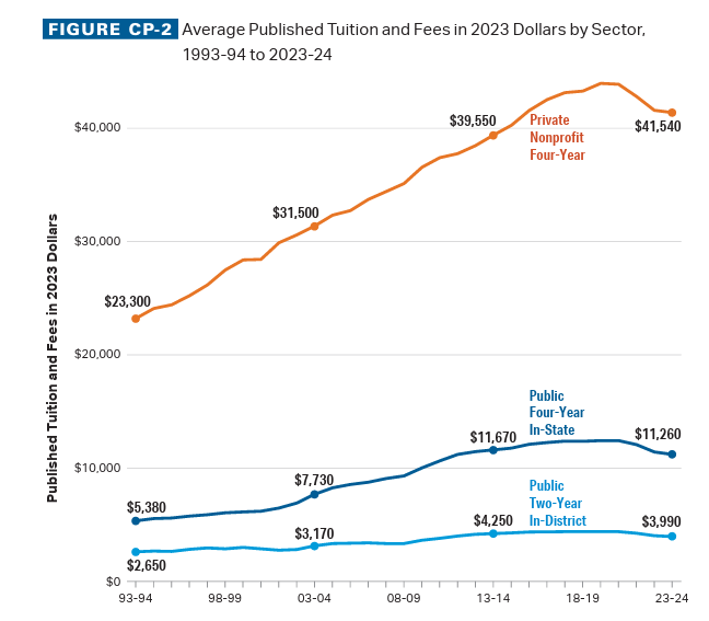
For public universities, we see a slow down in tuition increases starting about a decade ago, and for private schools the change happens about 5 years ago. For all schools we see the inflation adjusted cost is currently lower than it was a decade ago. But wait, there’s more!
The above graphs are just the sticker price. The College Board also tracks the “real cost” after factoring in grants. Here’s the data for private 4 year colleges:
Note the “grant aid” line, which slowed during the 2008 crash, but then has been ticking upward starting in 2013 and hasn’t stopped. To emphasize, those are grants, not loans. That’s just money off the sticker price. According to the College Board, the net cost of attendance of a college in 2024 was less than in 2006. I won’t keep pummeling you with graphs, but for private 4 year, public 4 year and public 2 year colleges, the “real” cost peaked in 2016.
I am not an economist, but the numbers suggest a pretty clear story to me. When unemployment for those under 25 was high in 2009-2013, going to college, any college, seemed like a good financial move. For many, it probably was. Then, as employment picked up, students were able to get choosier and consider the cost of student loan debt in their choices. Very quickly colleges started upping the amount of grants offered, and then stopped increasing the sticker price. With recent inflation, the price increases actually dropped below the inflation line and now the real cost of college is dropping.
Additionally, technology improvements allowed online schools to start offering cheaper tuition at a large scale. This might have only made a small dent, except then the pandemic happened and traditional campus life was upended. This made the difference between going to a traditional college and an online college much smaller, and based on those I know with kids that age a lot of kids opted for at least a year or two at a cheaper online school rather than pay through the nose to sit in their dorm room all day. This put additional cost pressure on schools, and we see the prices tick down further.
All that being said, there is a not-small group of people who were pretty slammed by college costs: those who were coming of age during the 2008 financial crash and it’s aftermath. However, most of those people are actually in their late 30s now, and it’s important to note that state of affairs did not persist for those who came after them. Times change, sometimes for the better.
As 2025 comes to a close and we careen towards Christmas and giving season, I wanted to put in a plug for my favorite book of the year. The book is The Age of Diagnosis: How Our Obsession with Medical Labels Is Making Us Sicker, and I enjoyed it immensely. I found it originally when Jesse Singal did a Substack post called “Long Covid can be both Psychosomatic and Real”, and immediately forwarded it to my sister (an NP), who promptly got the book and then immediately called me to talk about it. She was annoyed I hadn’t actually read it yet, so I got the book and could see why she was calling. This is a book you want to talk about with people.
The author is a UK neurologist and a skilled writer, and she dares to ask the question “what is the point of diagnosing people with things”. She points out that diagnosis is supposed to be used strictly to inform treatment options, but we’ve completely overlooked the psychological impact a diagnosis can have. She starts with the example of Huntington’s disease, a fatal genetic disease that you can test for and diagnose, but for which there is currently no cure. Prior to the advent of testing, 90% of patients and their families said they would love to have a test. Once one was developed however, the decision to test or not proved a lot harder for people than they had expected.
She goes on to cover many other areas of medicine: COVID, chronic Lyme, autism, ADHD, cancer screenings, and points out repeatedly that there are two ways to be wrong. Missing a diagnosis you could have treated is obviously bad, but giving someone a diagnosis they may not have also carries a risk. It’s that second risk she explores for both physical and psychological illnesses. What does happen if you think you have a disorder that you don’t? Does disorder creep carry a cost? If your diagnosis makes you feel better about yourself but actually doesn’t improve your objective functioning or even worsens it, should it really have been given? Shouldn’t we be, you know, studying some of these questions?
I liked this book because I’ve spent a lot of time in the last 7 years or so thinking about the purpose of diagnoses and what they’re good for. Back in 2019 I wrote about my lengthy journey to getting diagnosed with chronic migraines (they had an atypical presentation at first), and it was a great relief to finally getting a name to my issue. However, it still took years to get a treatment regimen that worked, and I still have problems. I also have a new appreciation for psychosomatic illness because the migraines have messed up my sense of pain quite a bit. I now have to let every health care provider I have know that my sense of pain is not a great guiding light, in either direction. I have felt pain in places that appeared to have nothing actually wrong with them, and failed to recognize pain in other places because I thought it was part of the regular pain I have. Not having your senses work predictably is a huge disadvantage in diagnosis, but there are more people this happens to than you think. One highlight of the book was when she notes many people experience psychological pain as physical pain, and get slapped with every escalating numbers of diagnoses while trying to treat it. This isn’t good for anyone.
A related read this week was Accommodation Nation in the Atlantic, which points out that now over 20% of students at elite universities have a disability on file. This is a rate far higher than less elite universities, and the disabilities are primarily autism, ADHD and anxiety, and again makes us wonder what a diagnosis is really for. If the best and brightest are claiming to be disproportionately impaired, what are we really looking at here?
What The Age of Diagnosis highlights, sometimes uncomfortably, is that our institutions haven’t caught up to the psychological and social power of a label. In an era where traditional communities seem to be shrinking, we run the risk of allowing diagnoses to take a disproportionate role in the way we define ourselves. Books like this don’t offer easy answers, but they do give us the vocabulary to ask better questions about how we allocate care, how we define impairment, and what we actually want our diagnostic categories to accomplish in a world where they shape so much of public and private life.
There’s a Bret Weinstein speech going around on Twitter where he makes a comment about how birth control and abortion changed the game around sex, commonly known as the sexual revolution that occurred in the 1950s-1970s. I have not listened to his speech so I have no comment on what he was saying specifically, but in reading some of the comments I was interested that when people discuss “what changed” during the 1950s through the 1970s, they seem to focus on just abortion and birth control on repeat. Even the Wikipedia page for the sexual revolution only mentions these two. Those things absolutely changed behavior, but I think there’s two more things that need to be a bigger part of the discussion:
Paternity testing
Antibiotics
Paternity testing started out with blood testing in the 1920s, but hit it’s stride in the 1960s with HLA testing. Prior to that, you had to use social rules and general vibes to determine paternity. It largely relied on people’s own truthfulness. Prior to paternity testing, marriage was the most surefire way to ensure no one questioned whose kids were whose, but after we got a better method the number of kids born to single moms went from 5% to 40%. You can see that as good/bad/neutral, but that almost certainly doesn’t happen without the ability to identify a father accurately.
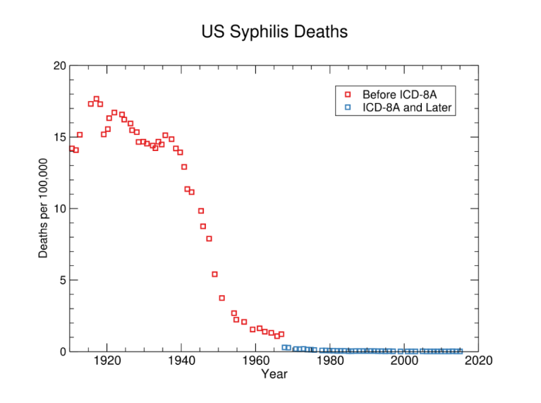
As for antibiotics Penicillin was discovered in 1928, but WWII sped up the perfection of antibiotics for treatment of bacterial infections, and widespread for the public use came in during the 1950s. From 1935 to 1968, 12 new classes of antibiotics were launched. Prior to this, basic STDs like syphilis were actually killing people at a rate similar to suicide today:
And that’s just deaths from syphilis, not cases. That figure comes from this analysis, which notes that prior treatment methods may have been as effective, but they were expensive and time consuming, and penicillin just made everything easier. Of course, syphilis is just one of the diseases people were dodging, chlamydia and gonorrhea also would have been issues. Antibiotics changed the game here.
I bring these up not to take any particular stance on any issue, but to point out that the past was very different in ways we don’t often think about. Even if somehow birth control and abortion were wiped off the face of the planet today, antibiotics and paternity testing would still ensure our population level practices around sex were different than they were 100 years ago. Sexual mores were never just about pregnancy, they were also about ensuring you could establish paternity and avoid STDs.
I think this is important for both cultural conservatives and cultural liberals to remember, as at times we can look at the past as either a golden era of morality or a deep pit of oppression. But in prior “moral” eras, a lot of sexual behavior was kept in check by people lying or threatening to lie about true things, and paternity testing stopped that. Conversely, things like religion may never have had quite the level of influence we attribute to them, they were often coping with very real issues around STD control in an era when the medical community couldn’t help much. When those things changed, behavior changed. It’s a good reminder that most social changes have several causes, and are not just related to one thing.
To note: the things I mention above are those I believe had a direct impact on sexual issues in the 1950s-1970s specifically. There’s a few other advances that probably changed sexual behavior in a slightly less direct fashion: cars (teenagers could go see each other more easily), at home pregnancy tests (earlier identification of pregnancy, no doctor needed), mass distribution of porn (TBD), dating apps (thank God I missed that era).
Earlier this week, the Assistant Village Idiot tagged me in one of his link roundups:
Off With Her Hair Women tell attractive women to cut their hair. The study’s authors are all female. I wonder what it is like for women studying female intrasexual competition. Is it harder to get along, or easier? Bethany, you need to get in on researching the women who research women.
I’ll admit I got a kick out of this, in part because I love a good gender study, and in part because I have REALLY long hair. I mostly wear it up, but it’s the kind of hair that people actually say “whoa, I had no idea it was that long” if I take it down. I call it homeschool hair. The last time I wore it down for an extended period of time, someone (who I knew) stopped me and asked if she could take a picture of it. I have no particular attachment to this style, but I actually don’t like haircuts, so here we are.
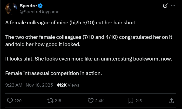
I hadn’t yet had a chance to dive in to the study, when a Tweet popped up on a similar topic:
It actually came to my attention because a few people immediately pointed out that these women were in a no win situation: if they’d told their coworker “she looked like shit” they would be considered catty, but if they tell her it looks good they are intrasexually competitive. Additionally, they were coworkers of hers, not friends, and it’s pretty weird to expect that all women at all moments must be aiding every other woman they know with her appearance. I suppose there’s an option where they could have tried to be pleasant but not endorse the haircut, but that’s a very hard tone to hit correctly and honestly? I’ve also seen plenty of male coworkers say things “looked great” when other males came in proud of some new thing they did/purchased/whatever. Why start conflict with a coworker for no reason?
All of this prompted me to deep dive in to this study, to see what they found. Ready? Let’s go!
Study Set Up
So the basic set up of the study is that 200ish (mostly college aged) women were recruited for a series of two studies. In both, they had a series of female faces cropped to the shoulders like this:
The women studied were supposed to suggest how many centimeters (they were Australian) they were supposed to cut off. They were given the picture of the woman, an assessment of the hair’s condition and then how much hair the woman was comfortable cutting off. Those last two were a binary: hair condition was either good/damaged and the requested length of cut was either as much as needed/as little as possible. After that they asked women to rank themselves on a few different scales, including one that measured intrasexual competitiveness.
What’s intrasexual competitiveness you might ask? Well, it’s apparently a 12 question measure that asks you stuff about how you feel about those of your gender who might be better than you on some level. The questions they mention are things like asking you to agree/disagree with statements like “I just don’t like very ambitious women” or “I tend to look for negative characteristics in attractive women”. Highly intrasexually competitive women are those who answer that they strongly agree with questions like that.
They hypothesized that women who scored high on this scale might be more aggressive with their recommendations to other women about how much hair the should cut off, under the idea that men like long hair and this would be sabotaging other women who might be competitors to them. And to be honest, this sounds like a pretty plausible hypothesis to me! These are women who just answered a bunch of questions reiterating that they really didn’t particularly like other women, I would imagine they’d actually end up being meaner to other women than people who disagreed with those statements. It reminded me of someone who recently pointed this out about introvert/extravert tests: they will ask a bunch of people if they like big groups of people, and then you call those who said “no” introverts, then we declare that we found introverts don’t really like parties. I mean, that makes sense! But it does at times seem like most of the sorting already took place before we even got to the study itself. But I digress, let’s keep going.
The Findings
Ok, so the first thing that caught my eye is that the primary finding of the study is that all women, regardless of scale ranking, first and foremost based their haircut recommendations on two things:
The condition of the woman’s hair (those with damaged hair were told to get more cut off)
The hypothetical client’s stated preference (it was followed).
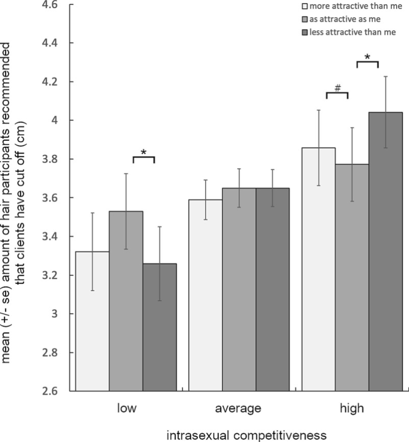
So to be clear, it was found that even women who stated they didn’t much like other women primarily based their recommendations on what was best for the other woman and what they other woman wanted. And it wasn’t even close. Every other effect we are going to talk about was much smaller both in absolute value and in statistical significance. Here’s the graph:
To orient you, the top panel is the recommendations for healthy hair, the bottom is the recommendations for unhealthy hair. As you can see, in general the difference in recommendations based on that condition alone is quite large, around the 2cm (a bit under inch for us USA folks) range for all conditions. The second biggest impact was what women wanted, which made a difference of about 1-1.5cm in the recommendations. Then we get to everything else.
It’s important to note that despite how this topic often gets introduced, there was no significant effect found based on attractiveness in general. This is notable because like the Tweet above shows, this stuff is often portrayed in popular culture as something “women” do, and we don’t have much proof that it is! They did find an attractiveness effect for the women with healthy hair being judged by regular and highly competitive women, but it went the opposite way: it was actually unattractive women who got the recommendation to cut off more hair. And again, the difference was a fraction of the impact of the other two factors: somewhere between .1-.2cm. For those of us in the US, that’s less than 1/10 of an inch. A quick Google suggests that’s less than a weeks worth of hair growth, and certainly not enough for anyone to notice.
I think it’s good to hammer on this because if I told you someone was out to sabotage you, you might be worried. But if I told you someone was out to sabotage you but they’d first do what was best for you, then follow what you wanted, then would sabotage you so subtly it would be imperceptible to the naked eye…..well, you’d probably calm down substantially. Much like when we see studies like “eating eggs will double your risk of heart disease in your 50s (from .001 to .002 per thousand)”, we need to be careful when we are quoting results like this that find a near imperceptible difference that can be fixed with 5 days of regularly hair growth.
But back to the finding that attractive women didn’t actually get penalized and instead the slight increase in hair cut recommendation was aimed the other direction, the study authors conclude the following:
This suggests that appearance advice may act as a vector for intrasexual competition, and that such competition (in this scenario at least) tends to be projected downward to less attractive competitors.
I will admit that annoyed me a bit, because this means that ANY variation is now considered to prove the thesis. They stated this was ok because there was no active “mate threat”, so they would expect it to go this way, but I will point out if attractive women had been penalized it would have also been considered proof. Having just finished our series on the replication crisis, I will point out that explaining every finding as proving your original thesis is a big driver of non-replicated findings.
Moving on to the second study though, the study authors did a few really smart changes to their set up. First, they provided participants with a picture of a ruler and a credit card up front so they’d actually have a reminder of what different lengths meant. They also changed from using a text box for the answers to “how much hair would you recommend they cut off” to using a Likert scale type set up where you had to recommend a whole number 1-10 cm. I liked that these changes were there because it showed a good faith effort to improve the results. In this condition, they added faces that were considered “average” to the mix and repeated most of the same experiment.
The findings were similar. The biggest variations were based on hair damage and client wishes, with relatively small differences .1-.2cm appearing across different individual groups. The graph that got the headline though is this one:
This is the graph they used for the title of the study, and it comes from dropping the whole clients wishes/hair damage thing and just looking at the overall amount of hair these women suggested be removed for anyone. You will note again the variation across attractiveness levels is .1-.2cm, but indeed the “high” intrasexual competitiveness women recommend more than the other two groups. The highest recommendation is about .8cm higher than the lowest value. That’s about 1/3 of an inch. Not enough for you to visually notice, but still something.
What caught my eye though was that we only really saw variation with the high and low group, which got me wondering how many women were in each category. And that’s where I found something interesting. In the first study, they defined “high” and “low” intrasexual competitiveness as being 1 SD from the mean. Assuming a normal distribution, that would mean about 16% of the sample were in the high/low groups, and the remaining 68% were in the average group. For this study though, they changed it to 1.5 SD, which means a little less than 7% of the group are in the high/low groups. Given the sample size of around 250, we’re looking at about 17 people in both the high and low group (34 people total) and 216 or so in the average group. By itself that will lead to higher variation in the groups with smaller sample sizes. You will note there is very little variation in what the group with most of the participants answered.
My thoughts
So like I said at the beginning, I find this study’s conclusion fairly plausible. The idea that women who specifically state they don’t like other women will give other women worse advice just kind of makes sense. But a few thoughts:
The main findings weren’t mentioned. The title and gist of this study was presented as “intrasexually competitive women advise other women to cut more hair off”, but it could just as easily have been “intrasexually competitive women primarily take other women’s best interest and preferences in to account” and it would be just as (if not more) accurate. The extra hair cut is presented as a primary driver of haircut recommendations, but really it’s in a distant third to the other two. This is fine for academic research, but if you’re trying to talk about how this applies to real life, it’s probably good to note that women actually gave quite reasonable advice, with slight variation around the edges.
The absolute value was never discussed. I was curious if the authors would bring up the small absolute findings as part of their discussion, and alas, they did not. The AVI let me know he found the link in Rob Henderson’s post here, and I was amused to find this line one paragraph before his discussion of this study: This is why reproductive suppression is primarily a female phenomenon. Of course, there have been cases of male suppression (e.g., eunuchs). Or men raiding a village and simply slaughtering all of the males and abducting the women as wives and concubines. But suppression among women is subtler. If by subtler you mean 2mm of extra hair, then yes. If I had to pick between that and murder and castration, I admit I’m feeling women got the better end of the deal here. If you would keep eating eggs (or whatever other food) that was associated with a tiny increase in cancer, then you probably can’t take this hair cutting study as a good sign of intrasexual competition. How are women sabotaging other women if they are doing so at a level most men wouldn’t notice? I suspect there’s an assumption this effect is magnified in real life, but again, this study doesn’t prove that.
Motives are assumed. Much like in the critiques of the Tweet above, I noticed that through the paper the authors explained why targeting attractive women, average women and unattractive women would all be intrasexual competition. What I did not see was any attempt to consider non-intrasexual competition reasons. Maybe people suggest unattractive people cut more hair off because they think they should try a different look? Maybe scoring high on a intrasexual competition survey is an indication of aggressiveness, and aggressiveness correlates to more aggressive hair cutting? Unclear, but I will note the idea that all variances could only be explained by intrasexual competition surprised me, particularly when we’re discussing effects that are likely too subtle to be spotted by the opposite sex.
We don’t know this is a female only phenomena. Despite Rob Henderson’s claim above, you will be unsurprised to hear no one (that I could find) has ever done this study on men. I actually would have been interested to see that study, even if it was men making suggestions for female hair. One reason I’d like to see this is because I heavily suspect men would be somewhat more erratic in their rankings, which would actually increase the risk of spurious findings. Frankly, that would amuse me to watch people have to explain why their statistically significant findings were still meaningful, or to have to admit sometimes that just happens and it doesn’t mean anything at all. But still, we’re told constantly that “subtle” sabotage is a woman thing, but I actually couldn’t find any studies suggesting people were looking at this. Might be interesting.
Ok, well that’s all I have! Thanks for reading, and I’m going to go consider cutting my hair an amount no one will notice, just for fun.
I unfortunately have a packed weekend and have not been feeling well, so no True Crime post today. Instead, I would like to mention something I was wrong about.
For years I have disliked the whole “science for girls” thing, believing that it was fairly condescending to slap pink on something sciencey and to declare it “for girls”. I believed this right up until I had to buy a present for a precocious 4 year old girl I know who is obsessed with all things pink, sparkly, and unicorn adorned. It had been requested I try to find something sciencey, so I decided to take a chance with, well, a pink sparkle unicorn science kit for girls.
She loved it. Last I heard she had told one of her parents to “go away, I’m doing scientist things”.
I was on Twitter/X recently and ended up following two rather interesting conversations started by Tweets with strong claims. Of course I can’t find them again, but one asserted that teachers unions were the cause of our educational problems in this country, and the other asserted that the only way to fix the falling birth rate was to raise the status of men in this country. Both of these were interesting enough for me to start following the thread, and people quickly countered them both.
For the teacher’s union claim, it was pointed out that there are 5 states where teachers can unionize, but they are not allowed to do any collective bargaining: Texas, Georgia, North Carolina, Virginia, and South Carolina. One would assume without this power, these unions are pretty weak and indeed that’s what we see. So are these the areas with the best educational outcomes? No. According to this ranking they are 40th, 30th, 34th, 9th and 38th respectively. Those rankings are all over the place, but it’s hard to see a compelling case in that data that defanging a union is a simple solution to our educational woes.
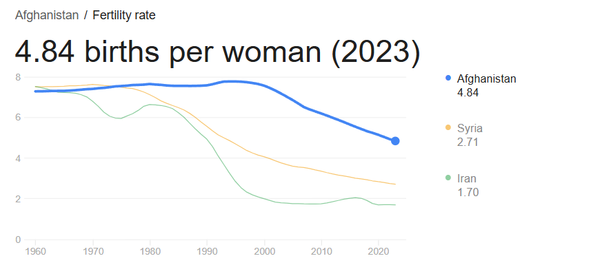
Now while these birthrates are higher than the US, it’s hard to miss that they are also falling. Even if one could overthrow the US and install Afghanistan style gender relations, it’s not clear that line would stop falling at all.
Now none of this is to say these hypotheses had no value, changes to unions or to male status might actually help the intended issues, but it’s important to be aware of their limitations from the jump. In both of these tweets these solutions were presented as clear and obvious with no caveats, but a quick look at real world data suggests they are not going to be silver bullets. For example, you say that Afghanistan is confounded by the unrest there, but how do you suggest you boost male status more effectively than the Taliban with less unrest? What damage are you suggesting unions are doing outside of their collective bargaining? Whatever your hypothesis is, let’s find a place that’s already doing it and see if it worked. If a strong effect doesn’t jump out at you, you have to temper your expectations.
We see this all over the place too, to the point where it’s a good first test for any hypothesis you have. Do you think people aren’t having babies because we don’t have a generous social safety net, free daycare or ample maternity leave? Let’s find some countries that have those things already:
Uh oh, that’s lower than the US. Again, maybe those things will help, but they clearly can’t be the full problem.
The Assistant Village Idiot recent put up a post about the belief by RFK Jr and others that psychiatric meds. The countries with the top anti-depressant consumption are Belgium, Greece, Spain, Iceland and Canada. These countries don’t come anywhere near the US for public mass shootings. We have 8-9 times Canada’s population and 27 times the number of public mass shootings. So we now have to explain why these medications would have a large impact in one country but not another. It’s possible! But it does involve invoking a bunch of other factors not part of the original statement.
Got time for one more example? I’ve spent the past 2+ years hearing that my state (Massachusetts) had a super corrupt police force and an aggressive justice system based on one high profile case that happened in my town. It might surprise you to hear then that Massachusetts actually has the lowest incarceration rate in the country. We incarcerate 241 people per 100,000 residents. I’ve had to talk about this with people from Virginia (679 per 100k), Alaska (744 per 100k) and Illinois (433 per 100k). None of them were aware how high their incarceration rates were, comparatively speaking. Can we come up with a story where Massachusetts has an incredibly corrupt police force and aggressive justice system that only incarcerates people at a fraction of the rate of other states? Maybe, but it’s challenging. Add in the fact that we are bottom 5 for police involved killings, and your job gets even harder.
Like I said, state and country level data may not entirely disprove a hypothesis, but it does give a good first glance in to how compelling your case is. When I’ve pointed this out to people in various situations in real life, the first response I often get is “oh well of course there are other factors”. But normally we started this whole conversation because they made a statement that there was just one compelling factor. We can certainly back off to “it’s a bunch of things”, but that’s not typically where the conversation started. I understand in the social media age declarative statements are king, but state and country comparisons are pretty good at moderating conversations rather rapidly. Highly recommended.
I am now at the age where I, along with most of my friends, have retired parents. This has led to a natural increase in the discussions of the problems of aging, some of which I expected and some of which I did not. One thing I’ve been surprised by is the number of people I’ve had mention to me recently that their parent(s) have a problem with hoarding. This piqued my interest because I have no direct experience with this (my parents have made a big point of continuously going through their stuff), but when I started to mention that I was hearing this a lot more, I started to get more stories of people’s parents or friends parents who were struggling with this. And these stories were bad. This wasn’t “moms house is a little more cluttered than I’m comfortable with”, these were stories of rooms being rendered fully unusable, important things going missing, and fears of having to be the one to clean it up after they pass away. So what’s going on here? Is this a case of increased awareness, expanded definitions or a real uptick? Turns out it might be all three! Let’s dig in.
What is Hoarding Disorder?
Hoarding disorder is actually a fairly new diagnosis, first introduced in to the DSM in 2013. Prior to that it was considered a subset of obsessive compulsive disorder. The full criteria is here, but it’s basically the psychological inability to get rid of stuff in a way that ends up negatively impacting your life or health. People keep accumulating stuff whether through compulsive overbuying or just refusal to discard anything in such a way that their homes fill up. The estimates are that about 19 million Americans reach the criteria. It’s estimated about a quarter of all preventable fire deaths happen due to hoarding.
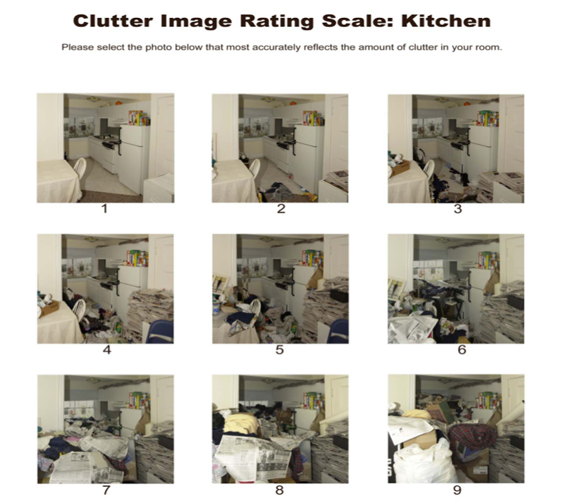
One of the more interesting things I found while looking in to this is that a group called Hoarding UK actually publishes something called the “Clutter Index Rating“, a visual guide to what level of clutter might require help or intervention. They recommend that a 4 or above might require help. Here’s an example of their visual for the kitchen:
I was relieved to discover my house does not fall in the problem zone.
Why are we hearing more about this now?
Well, a few reasons. Between the reality show “Hoarders” debuting in 2009 and the new diagnosis being added in 2013, the public did start having a new level of awareness of this disorder. This led to more people talking about it, which tends to lead to more people identifying that their dads inability to throw out any newspaper he’d ever gotten had a real name.
Next, there’s the obvious issue that stuff is easier to accumulate now than ever before. Could you fill up a house with random stuff back in 1900? Sure but it would have taken a lot longer. Interestingly this post was inspired by someone encountering a (likely) hoarder who tried to pick up some stuff they’d left our for free by the side of the road, and despite her whole car being full of random stuff, she started asking if they had anything else laying around she could look at.
But finally, hoarding is not evenly distributed across the lifespan: it is far more common in those over 65. People who just had a clutter problem in their younger years may turn in to full blown hoarders later in life, so as the baby boomers cross age 65 we can expect to see an increase in those impacted. Interestingly despite the initial link to OCD, it actually seems it’s more closely linked to depression. People who have divorced, lost a spouse or are otherwise isolated may be even more vulnerable. Unsurprisingly, this also means that the pandemic boosted the problem, though it’s not clear if that persisted. Sadly, some major cases of hoarding aren’t discovered until the affected person passes away.
So what do we do about this?
Well, much like any difficult psychological problem, there’s not one clear answer. My local council on aging has resources and my state also supplies support, particularly to landlords who may need to evict a hoarder. There are 12 step programs and traditional therapy options, there are services that will clean your house out. However, it is noted that cleaning the house out has a 100% recidivism rate if no other support is given. My state provided this interesting little decision tree, which I appreciated:
But overall this will depend a lot on local resources and exact circumstances. Not an easy spot to be in if you’re a loved one.