I was on Twitter/X recently and ended up following two rather interesting conversations started by Tweets with strong claims. Of course I can’t find them again, but one asserted that teachers unions were the cause of our educational problems in this country, and the other asserted that the only way to fix the falling birth rate was to raise the status of men in this country. Both of these were interesting enough for me to start following the thread, and people quickly countered them both.
For the teacher’s union claim, it was pointed out that there are 5 states where teachers can unionize, but they are not allowed to do any collective bargaining: Texas, Georgia, North Carolina, Virginia, and South Carolina. One would assume without this power, these unions are pretty weak and indeed that’s what we see. So are these the areas with the best educational outcomes? No. According to this ranking they are 40th, 30th, 34th, 9th and 38th respectively. Those rankings are all over the place, but it’s hard to see a compelling case in that data that defanging a union is a simple solution to our educational woes.
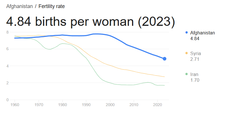
Now while these birthrates are higher than the US, it’s hard to miss that they are also falling. Even if one could overthrow the US and install Afghanistan style gender relations, it’s not clear that line would stop falling at all.
Now none of this is to say these hypotheses had no value, changes to unions or to male status might actually help the intended issues, but it’s important to be aware of their limitations from the jump. In both of these tweets these solutions were presented as clear and obvious with no caveats, but a quick look at real world data suggests they are not going to be silver bullets. For example, you say that Afghanistan is confounded by the unrest there, but how do you suggest you boost male status more effectively than the Taliban with less unrest? What damage are you suggesting unions are doing outside of their collective bargaining? Whatever your hypothesis is, let’s find a place that’s already doing it and see if it worked. If a strong effect doesn’t jump out at you, you have to temper your expectations.
We see this all over the place too, to the point where it’s a good first test for any hypothesis you have. Do you think people aren’t having babies because we don’t have a generous social safety net, free daycare or ample maternity leave? Let’s find some countries that have those things already:
Uh oh, that’s lower than the US. Again, maybe those things will help, but they clearly can’t be the full problem.
The Assistant Village Idiot recent put up a post about the belief by RFK Jr and others that psychiatric meds. The countries with the top anti-depressant consumption are Belgium, Greece, Spain, Iceland and Canada. These countries don’t come anywhere near the US for public mass shootings. We have 8-9 times Canada’s population and 27 times the number of public mass shootings. So we now have to explain why these medications would have a large impact in one country but not another. It’s possible! But it does involve invoking a bunch of other factors not part of the original statement.
Got time for one more example? I’ve spent the past 2+ years hearing that my state (Massachusetts) had a super corrupt police force and an aggressive justice system based on one high profile case that happened in my town. It might surprise you to hear then that Massachusetts actually has the lowest incarceration rate in the country. We incarcerate 241 people per 100,000 residents. I’ve had to talk about this with people from Virginia (679 per 100k), Alaska (744 per 100k) and Illinois (433 per 100k). None of them were aware how high their incarceration rates were, comparatively speaking. Can we come up with a story where Massachusetts has an incredibly corrupt police force and aggressive justice system that only incarcerates people at a fraction of the rate of other states? Maybe, but it’s challenging. Add in the fact that we are bottom 5 for police involved killings, and your job gets even harder.
Like I said, state and country level data may not entirely disprove a hypothesis, but it does give a good first glance in to how compelling your case is. When I’ve pointed this out to people in various situations in real life, the first response I often get is “oh well of course there are other factors”. But normally we started this whole conversation because they made a statement that there was just one compelling factor. We can certainly back off to “it’s a bunch of things”, but that’s not typically where the conversation started. I understand in the social media age declarative statements are king, but state and country comparisons are pretty good at moderating conversations rather rapidly. Highly recommended.
I am now at the age where I, along with most of my friends, have retired parents. This has led to a natural increase in the discussions of the problems of aging, some of which I expected and some of which I did not. One thing I’ve been surprised by is the number of people I’ve had mention to me recently that their parent(s) have a problem with hoarding. This piqued my interest because I have no direct experience with this (my parents have made a big point of continuously going through their stuff), but when I started to mention that I was hearing this a lot more, I started to get more stories of people’s parents or friends parents who were struggling with this. And these stories were bad. This wasn’t “moms house is a little more cluttered than I’m comfortable with”, these were stories of rooms being rendered fully unusable, important things going missing, and fears of having to be the one to clean it up after they pass away. So what’s going on here? Is this a case of increased awareness, expanded definitions or a real uptick? Turns out it might be all three! Let’s dig in.
What is Hoarding Disorder?
Hoarding disorder is actually a fairly new diagnosis, first introduced in to the DSM in 2013. Prior to that it was considered a subset of obsessive compulsive disorder. The full criteria is here, but it’s basically the psychological inability to get rid of stuff in a way that ends up negatively impacting your life or health. People keep accumulating stuff whether through compulsive overbuying or just refusal to discard anything in such a way that their homes fill up. The estimates are that about 19 million Americans reach the criteria. It’s estimated about a quarter of all preventable fire deaths happen due to hoarding.
One of the more interesting things I found while looking in to this is that a group called Hoarding UK actually publishes something called the “Clutter Index Rating“, a visual guide to what level of clutter might require help or intervention. They recommend that a 4 or above might require help. Here’s an example of their visual for the kitchen:
I was relieved to discover my house does not fall in the problem zone.
Why are we hearing more about this now?
Well, a few reasons. Between the reality show “Hoarders” debuting in 2009 and the new diagnosis being added in 2013, the public did start having a new level of awareness of this disorder. This led to more people talking about it, which tends to lead to more people identifying that their dads inability to throw out any newspaper he’d ever gotten had a real name.
Next, there’s the obvious issue that stuff is easier to accumulate now than ever before. Could you fill up a house with random stuff back in 1900? Sure but it would have taken a lot longer. Interestingly this post was inspired by someone encountering a (likely) hoarder who tried to pick up some stuff they’d left our for free by the side of the road, and despite her whole car being full of random stuff, she started asking if they had anything else laying around she could look at.
But finally, hoarding is not evenly distributed across the lifespan: it is far more common in those over 65. People who just had a clutter problem in their younger years may turn in to full blown hoarders later in life, so as the baby boomers cross age 65 we can expect to see an increase in those impacted. Interestingly despite the initial link to OCD, it actually seems it’s more closely linked to depression. People who have divorced, lost a spouse or are otherwise isolated may be even more vulnerable. Unsurprisingly, this also means that the pandemic boosted the problem, though it’s not clear if that persisted. Sadly, some major cases of hoarding aren’t discovered until the affected person passes away.
So what do we do about this?
Well, much like any difficult psychological problem, there’s not one clear answer. My local council on aging has resources and my state also supplies support, particularly to landlords who may need to evict a hoarder. There are 12 step programs and traditional therapy options, there are services that will clean your house out. However, it is noted that cleaning the house out has a 100% recidivism rate if no other support is given. My state provided this interesting little decision tree, which I appreciated:
But overall this will depend a lot on local resources and exact circumstances. Not an easy spot to be in if you’re a loved one.
On my last post, I gave a few scattered thoughts about the UKs healthcare system vs the US system. In the comments, a very astute commenter mentioned that life expectancy was not a great way of measuring how well your health care system was working. This is an excellent point that I think deserves some discussion.
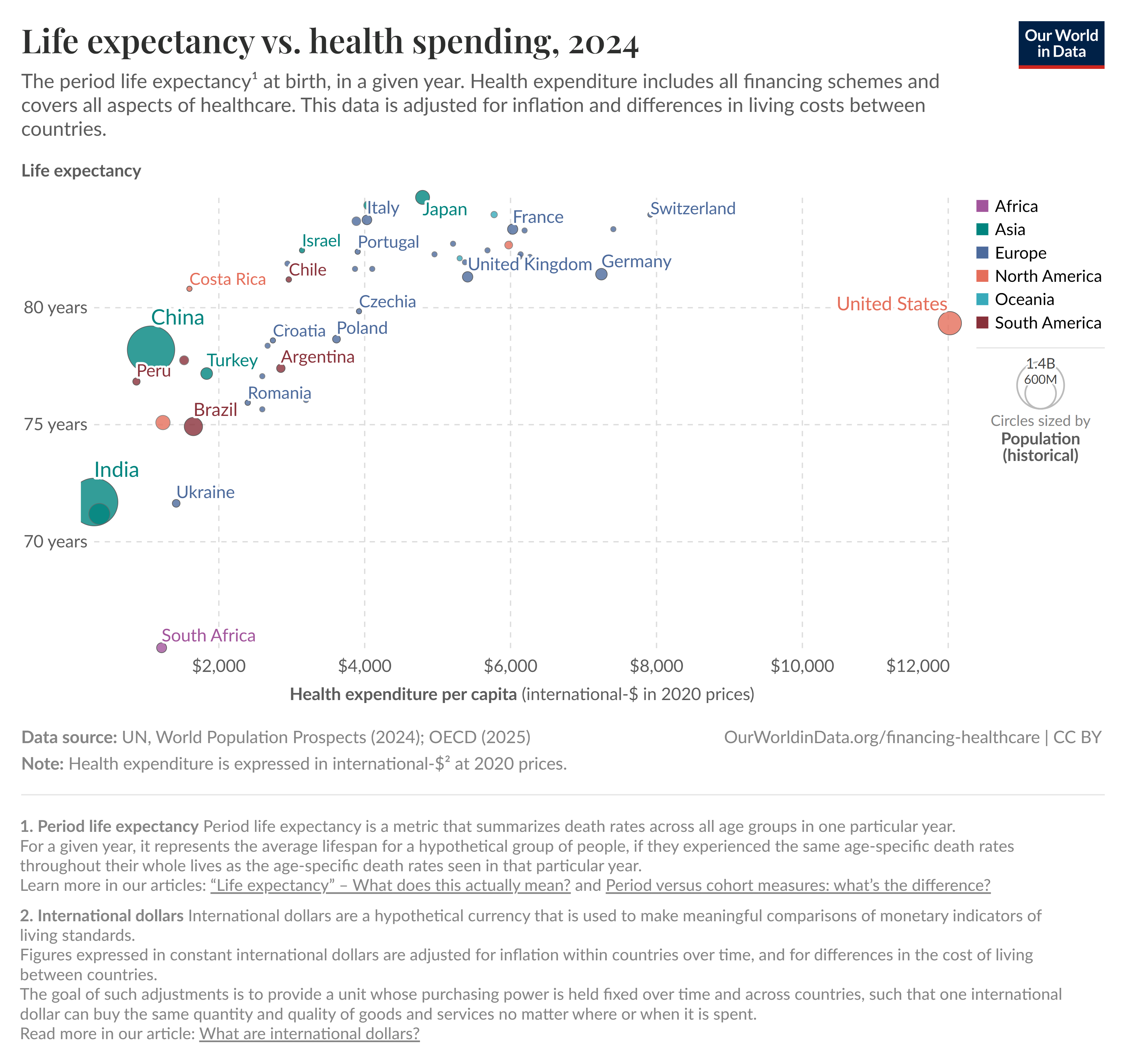
If you start looking in to the US healthcare system, you will very quickly run across a graph like this one that shows health care spending vs life expectancy:
There’s a variety of these charts but they all show the same thing: the US spends the most on health care per capita by a good margin, but does not have the highest life expectancy in the world. We’re about 5 years behind a country like Japan (84.7 years vs US 79.3 years), despite us spending 3 times what they do ($4k vs $12k per capita). I think it’s worth diving in to why this is, and why it may or may not be an accurate measure of how our healthcare system is doing.
Life Expectancy Calculations
There’s a actually a few different ways to calculate life expectancies, and the exact details of what you’re trying to do matter quite a bit. But one thing most ways of calculating it have in common is that they are all impacted quite a bit by people who die young. This is an issue a lot of us are familiar with when looking at historic life expectancies, which tend to be weighed down by the high number of children who died before their 5th birthday. This is a big enough issue that the UN actually looks at both life expectancy from birth and life expectancy at age 15, just to account for both child mortality and mortality at older ages.
So the point is, if you’re in a developed country and you want to understand why your life expectancy looks like it does, the first thing to take a look at is what kills your young people. So what kills young people in the US? Guns, drugs and cars.
Guns, Drugs and Cars
Ok, so before we go any further, I want to acknowledge that the topics of guns, drugs and cars tend to get people a little worked up. Given this, I want to clarify why I’m going in to this. I am NOT attempting to recommend any particular policy solution to the things I’m talking about below. I’ve done some of that in other posts over the years, but in this post I am specifically focusing on 1. If guns, drugs and cars kill people in the US at rates higher than in other countries and 2. If those deaths can be stopped by healthcare spending. This is important because again, that graph above gets used All. The. Time.
If life expectancy has some factors going in to it that cannot be fixed with healthcare spending, then that is a reason to take that graph a little less seriously next time you see it. Alright, with that out of the way, let’s look at some data!
Since 1981, the single largest killer of those under age 44 in the US has been “unintentional injuries”. This is a large category that includes drowning, poisoning, falls, motor vehicle accidents and “other” accidents. 90% of them are motor vehicle accidents or poisoning, and “poisoning” is the broad category that includes (and indeed is dominated by) recreational drug overdoses. Here’s a quick comparison of the top causes of death for those age 1-44 in 1981 vs 2023. Note: these are raw numbers, not population adjusted. ChatGPT suggests the under 44 population probably went up by 22 million people during the 42 years covered here.
1981
2023
Unintentional injuries
58,500
83,300
Malignant neoplasms
22,000
17,400
Homicide
17,900
16,900
Heart Disease
16,400
16,100
Suicide
15,900
23,400 (now #2 cause)
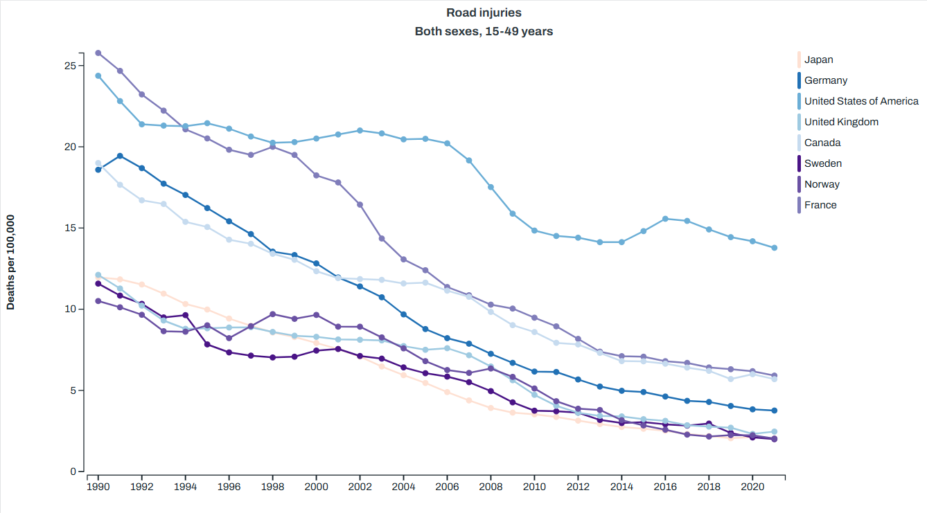
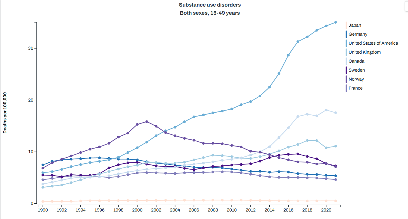
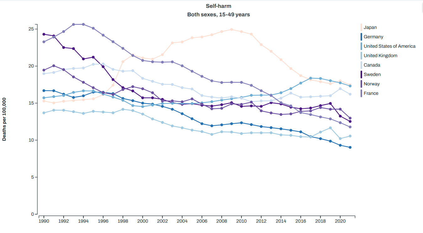
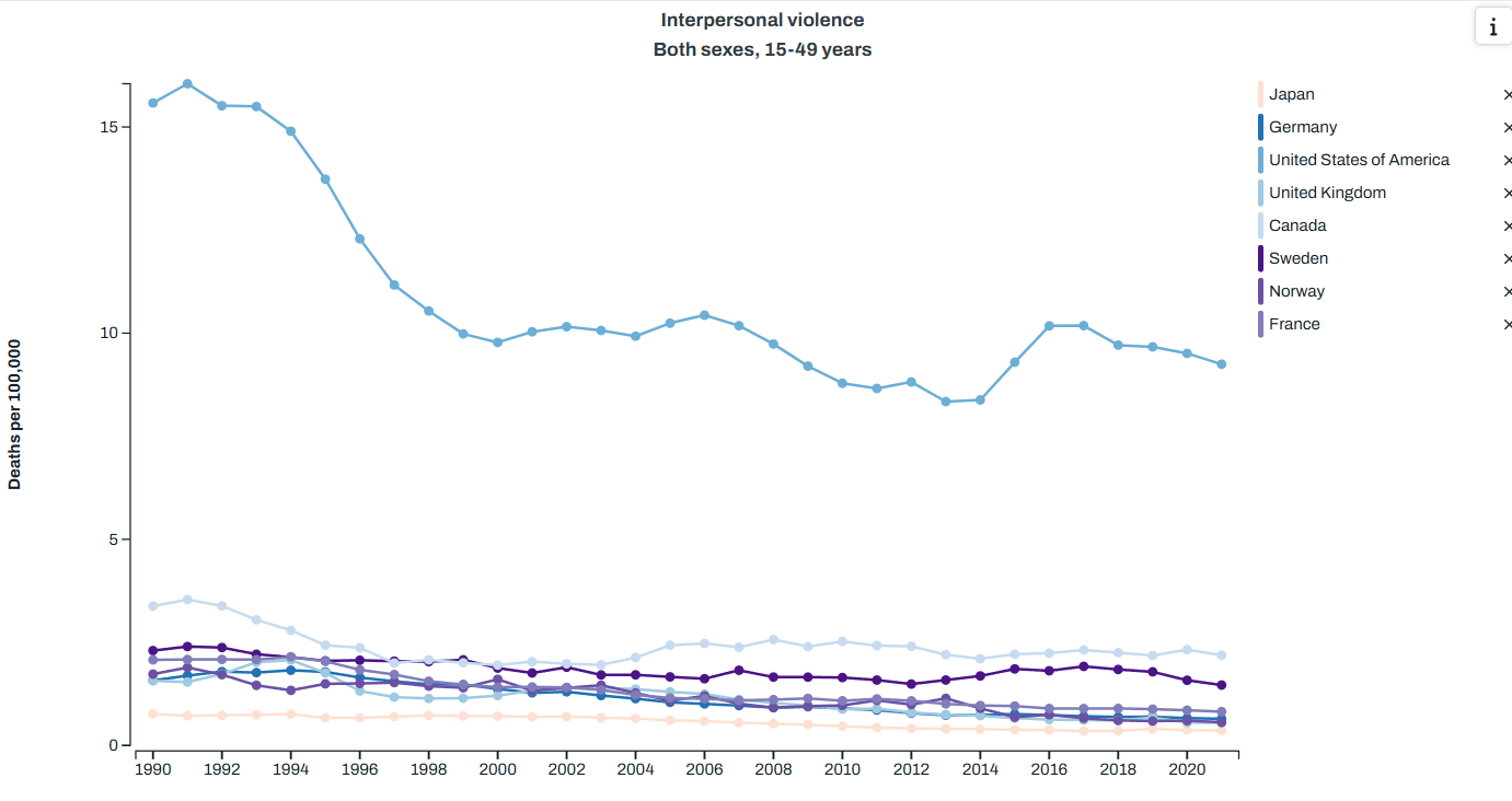
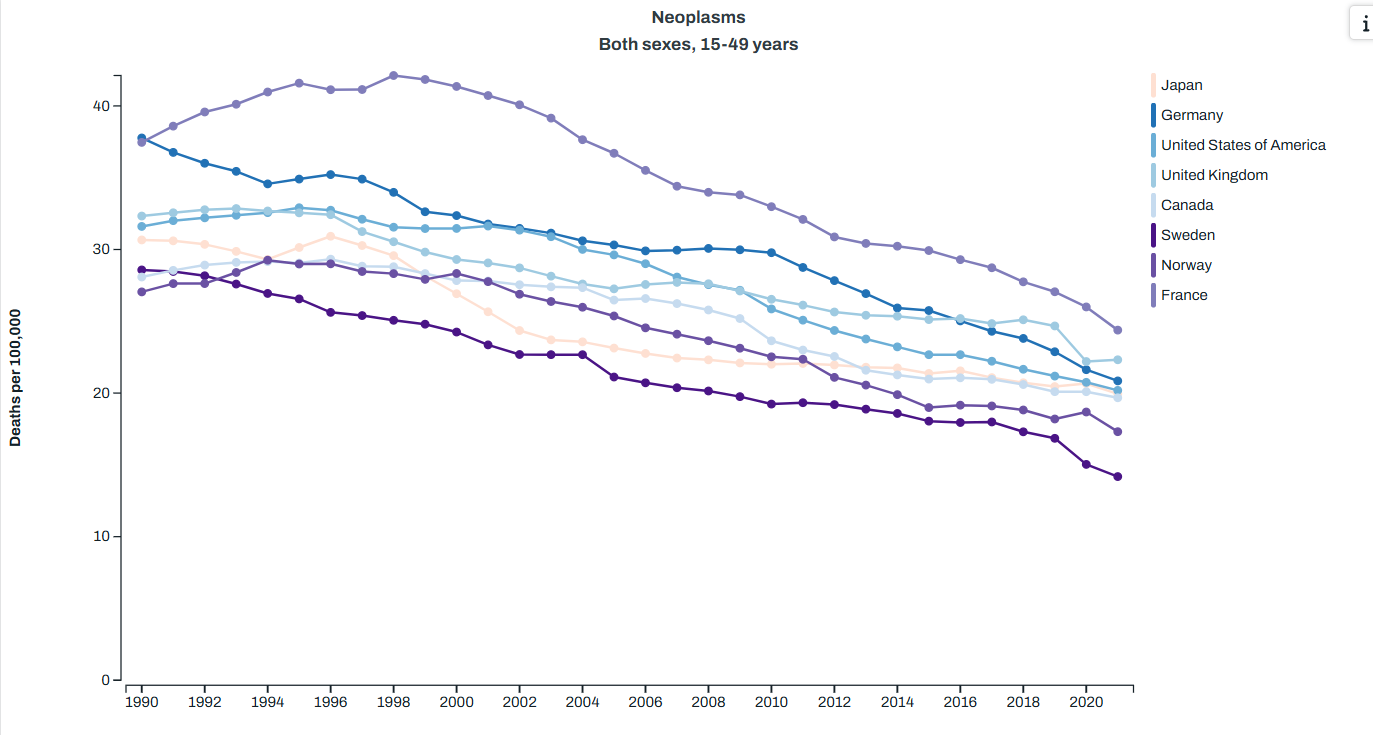
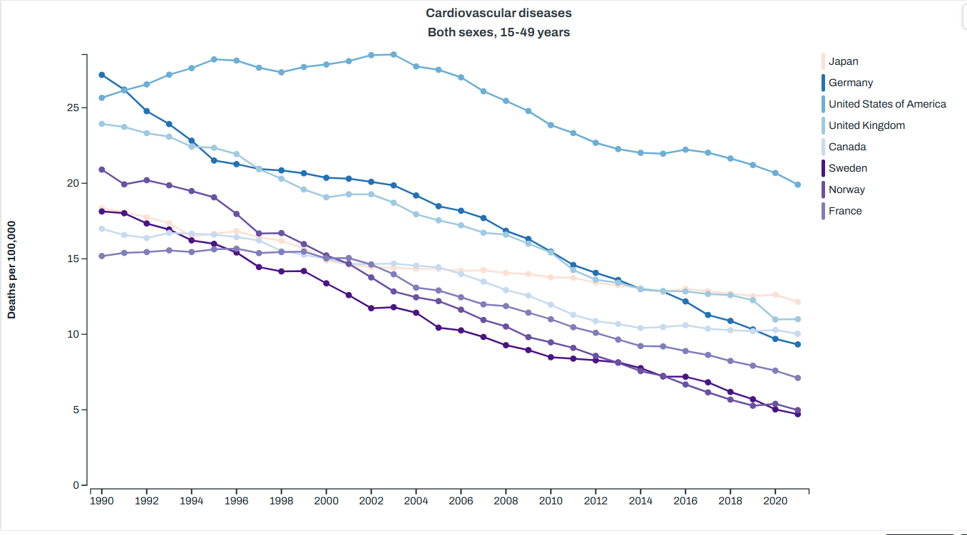
You can quickly note that the two categories here that the healthcare system has the most control over malignant neoplasms (cancer) and heart disease both went down during the timeframe we’re looking at here. Homicides also went down, but suicide and injury deaths went up. Given that in the US suicides are about 50% firearm deaths and homicides are about 80%, we can pretty accurately sum up the top killers of young people as “guns, drugs and cars” So how does this compare to other countries? Well the Global Health Data Exchange visualization tool can help us there. I picked a few countries that show up as having higher life expectancies than the US for less money to compare us to on the top causes of death, and here’s what I got. Note: I had to pick one age category for the visualization, and they didn’t have exactly the age 1-44 used above, so I used 15-49. We’re just getting a sense of the differences here. Anyway, here’s what I got:
Road injuries: the US sees twice as many deaths per capita as the next closest country, and substantially more than the lowest comparison countries I picked.
Drug abuse deaths (aka overdoses): again, we lead substantially here.
Suicide: we are one of the top here, but are much closer to other countries
Homicide (aka “interpersonal violence”): again, we are top
Cancer (aka “neoplasms”): we are middle of the pack
Heart disease: back at the top
So again, guns, drugs and cars appear to have a rather substantial impact on our mortality in younger people, and it’s not clear what our healthcare system could do differently to stop this. For motor vehicle accidents and murders, the health care system is mostly involved after the fact. There’s some argument that we could maybe improve our care of severely wounded people, but I don’t think anyone is really making the argument that our trauma care in the US isn’t as effective as that in Japan. It seems more likely that there’s just a lot more car accidents and violent incidents here. Healthcare spending can’t stop that.
For suicides and drug overdoses, one can argue perhaps that a better funded mental health/rehab system could help things, but as anyone who has dealt with a suicidal or addicted family member knows that it’s not quite as simple as that.
I will note that I often hear obesity thrown out there as another issue the US faces, and I think this is true based on the cardiovascular disease numbers. The only reason I don’t include it in “the big three” is because it is mostly taking out people in later years, and while we are above most other countries, our problem isn’t twice as bad like it is with road deaths, homicides or overdoses. We could definitely add it in though, and we’d still get back to healthcare spending not changing much. New medications like Ozempic might change that math, but up until recently that was pretty true.
I also leave it out because honestly I’ve heard waaaaaaaaaaaaay too much “if we stopped spending money on medication and let everyone go to the farmers market, we’d be great!” type stuff. That’s a nifty idea but it’s still not gonna change car crash deaths, overdoses or homicides, and so the bulk of our problem remains.
Impact on Life Expectancy
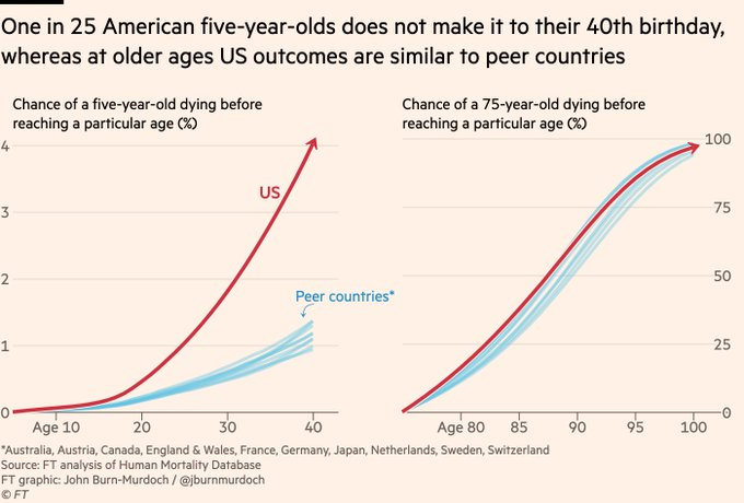
Ok, so what does this do to life expectancy, and how do we know this is the major driver? Well the Financial Times did an interesting analysis here. It’s paywalled, but the author did a Twitter thread here. Some graphs were included, like this one that shows that US citizens over 75 basically have the same life expectancy as our peer countries, whereas those under 40 have a much greater chance of dying:
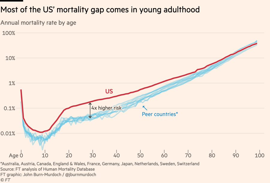
This graph shows a similar thing, the probability of dying at a particular age is much higher for young people in the US vs peer countries, and similar for older ages:
If you look at the actuarial tables from the Social Security Administration, you can see this as well. Those tables look at a hypothetical cohort of 100,000 people born in the same year and show how many will still be living at each age. The UK releases similar data:
US – male
UK – male
US – female
UK – female
Age at which 1 in 100 of the cohort are deceased
16
24
21
34
1 in 20
35
50
49
57
1 in 10
50
60
59
66
1 in 5
62
69
69
74
People in the US are just more likely to know someone who died young.
Other Causes
I actually couldn’t find a comprehensive source for top issues with our life expectancy in the US, but I did finally think to use ChatGPT to ask, a resource I’m still not used to. I was pleased that despite not using it until this point in the post, the top causes it listed that are making the biggest impact are drugs, cars and guns. I asked it a few different ways how much we could add to our national life expectancy if those were closer to peer nations, and it suggested we’d add 2-5 years, which if you’ll recall would put us up much closer to the top.
After it listed those causes, we got in to a few (cardiovascular and metabolic disorders) which can be tied to obesity. It also added in smoking, maternal health, and general mental health. Racial differences, socioeconomic status and access to healthcare were listed last, with an estimate we could get back about a year of life expectancy if we fixed all of that.
To reiterate the point that things that impact young people count a lot more than things that impact older people, ChatGPT estimated that “solving” the opioid crisis would give us back about a year of life expectancy for our entire population. “Solving” obesity? About half a year. Stunning when you consider how many more obese people there are than opioid addicts, but again, one death of a 22 year old takes off 56 life years, as much as 11 people dying at 74 rather than 79.
Immigration?
One weird data point I encountered while doing this work is the differences in how countries count non-citizens. I couldn’t verify how each country counted immigrants/illegal immigrants/refugees, but it seems likely that how they do that counting could impact their overall numbers. I don’t know for sure but I would guess that those raised in third world without adequate access to nutrition or health care may always have higher medical needs (including translation services) and lower life expectancies than those who have always lived in a first world country. Differences in counting is going to matter quite a bit here.
Impact on Healthcare Spending
So finally we loop back to the ultimate topic: are we really spending more money for worse outcomes? Well yes, sort of! But it’s not really the healthcare systems fault. If you have two countries with the same exact health care system but one country has people who get in lots of car accidents and the other doesn’t, life expectancy will be lower and costs will be higher. External injury deaths are a huge driver of mortality in the young, and if they are not equal across populations their outcomes will be unequal. The healthcare system mostly cannot prevent these deaths, they are just dealing with what comes across their door.
It’s worth noting that in addition to the deaths counted above, there are also going to be a bunch of people impacted by car crashes, drugs and guns who won’t die but will end up with health problems that will both cost money and shorten their lifespan. Many people I know who were in bad car accidents when they were younger end up with early arthritis in the impacted joints or other issues. Former drug users also may carry long term issues like Hepatitis C or HIV infections. Basically the pool of people who died under 50 is just the center of a much larger group of those injured early on who may have issues. These will also run up healthcare costs.
Again, none of this is to say what, if anything, we should do about these risks. But it is important to know when you see the spending/life expectancy graph exactly what we’re dealing with, and what can or can’t be fixed simply by throwing healthcare dollars at it.
I’m sure this is obvious to most of my readers, but it makes me feel better to put it in writing.
If you’re not familiar with Gell-Mann amnesia, it’s a cognitive bias described as “the tendency of individuals to critically assess media reports in a domain they are knowledgeable about, yet continue to trust reporting in other areas despite recognizing similar potential inaccuracies.”
The original statement about it was about newspapers, and yet I now see people doing this all the time with TikTok. “They saw it on TikTok” is used in most of my circles with an eyeroll and an obvious implication that whatever opinion was offered was uninformed (at best), and (at worst) completely made up. Now wait 5 minutes and change topics and some of those same people will turn around and seriously cite TikTok as an authority on different topics they know much less about.
So here’s my PSA: if you do not think topics you care about can be adequately summed up on TikTok in 2 minutes, assume that things you know less about can also not be summed in 2 minutes. If you think TikTok is rife with misinformation on topics you care about, assume it is also rife with misinformation on topics you are unfamiliar with.
Newspapers were never perfect, but in general they had more to lose when publishing incorrect or defamatory information. TikTokers can hide their identity, delete videos, and individual creators often are “judgment proof” or have too little money to sue. While there is good information on TikTok, always do the due diligence you’d want others to do if they came across a video in your field of interest.
I got my gallbladder out recently. This came as a bit of a surprise, as it started with a day of what I (incorrectly) assumed was norovirus back in February, and ended with surgery at the beginning of June. All together it was about a 3.5 month process: about a week before I decided to go see my doctor, a week before I could get all the testing to rule out other things, 7 weeks for a surgical consult, a few days to coordinate the surgical date and then about 5 weeks to surgery. I was feeling pretty miserable by the end there, but I was able to squeeze an eye surgery in to the wait time so it wasn’t all wasted.
Since I had some time to ponder what I was doing, I decided to peruse Reddit to see what other people in my situation had done. For those of you who haven’t been on Reddit for various health conditions, it can be an experience. There a lot of useful information, some really not useful information, and some unexpected information. One of the more interesting things I’ve found over the years is that because most subreddits are in English, they can give you a really good sense about how medical care for specific conditions differs between English speaking countries. We are constantly told that the US healthcare system is broken, and maybe it is. But I think there’s some really interesting information when you stop looking at healthcare in general and switch to looking at a specific condition, so you can see how you in particular would do under the Canadian or British healthcare systems vs the US.
For gallbladders, I quickly discovered the wait times in the NHS are over a year once you’ve been recommended for surgery, and in some places they won’t even put you on the list until your liver or pancreas start to go. The wait times got so bad post COVID that they published a paper on how to help clear the queue, which started at around 452 day wait time. It got so bad the general recommendation was to pay an extra $7,000 out of pocket to get it done privately. Someone who had almost my exact surgery date had been waiting over a year and then got theirs cancelled randomly with no reschedule. I can say I would not have been able to keep working if I had to wait over a year, and I was considered a mild case. It reminds me of the iron triangle: you can have something that’s good, fast or cheap, but you can’t have all three.
This is not the first time I’ve discovered I would have been substantively worse off in the UK. Back in 2020 my migraines were wildly out of control, and my doctor suggested a newly approved medication called Nurtec. This worked wonderfully for me, and still does. I found out recently it took almost 4 extra years to be approved in the UK for treatment of acute migraines. People were paying privately for years (at about $100 a pill) because it was working so well for others around the world, but was completely unavailable through the NHS. Finally, I’m in a Facebook group for those with my eye condition, and they routinely say it takes a year+ to get a cornea specialist appointment in England. I got mine in 3 weeks.
I will not draw grand conclusions from solely my own experience, but it is notable to me that of my three major health problems, all would have required me to spend a lot of money on private care if I wanted the level of service I got here in the US. If you also have health conditions and are dealing with health insurance, it’s a fun exercise to see how that would go in other countries. I recommend it as a data gathering exercise.
Oh hi friends! It’s been a minute since I posted here, but I’ve appreciated the various well wishes/comments people have continued to send me. A lot has gone on personally since last I posted but I’ve had a lot of random data related thoughts kicking around in my head recently, and I’ve gotten a few nice comments in the past couple weeks of people suggesting I should do a post about various topics. These include: the replication crisis as applied to true crime, UK and Canadian healthcare systems vs the US, medications for substance abuse cessation, and possibly something about eye conditions. Since I’m out of practice writing posts I figured a brief life update might help me get some of the rust out and motivate me further. So what have I been up to in the last three years? Well here’s a brief overview:
The potato diet I mentioned in the prior post didn’t work out. I get pretty bad migraines and about a week in I got one that last several days. It stopped when I changed my diet. Ah well.
We had a third major death in the family, after the two I mentioned in this post, the third in 14 months. I now have an unfortunate amount of experience with planning funerals and eldercare.
About 2 years ago, I started experiencing some eye problems in addition to my pre-existing migraines. It took about 8 months to sort out what was going on, but it turns out I had a previously unidentified genetic eye condition (epithelial basement membrane dystrophy) which had caused a condition called recurrent corneal erosions. I would suggest not reading that Wiki page if you’re squeamish, but suffice it to say the second sentence in the description calls it an “excruciatingly painful” disorder, and I can personally verify that is correct.
Because of #3 I’ve had 2 eye surgeries in the past year, and then my gallbladder decided to get in on the action and I had to get that removed. I’m pretty much ready to be done with surgeries, thank you very much. The one plus side is it appears my eyes may have been causing some large portion of my migraine problems, so things seem improved on that front. We’ll see if that holds, but so far I’m hoping the second half of 2025 is better than the first.
So that’s the news from Lake Wobegon! Let me know how you all are doing and any particular posts you’d like to see if I get some posting up and running again.
Back in July, I put up a post about some possible interesting ideas about the obesity crisis, which included a lot of discussion about potatoes. At the time the blog Slime Mold Time Mold was running a trial for people interested in eating nothing but potatoes for a month, and they’ve now published the results. The results were intriguing, and the post about it is long. I appreciate that they posted successes as well as failures.
While I was interested in the discussion, I knew that I would likely not attempt to eat nothing but potatoes for 28 days. I have a few health conditions that seem to contraindicate this, and also it just doesn’t sound that fun. I figured this was just an interesting note until I saw someone Tweet about trying the “minimum viable potato diet” to great effect. Basically this person ate an extra 100g of potatoes (about 3.5 oz) per day with no other restrictions and lost 8lbs in 6 weeks.
Given my success with improving my glucose control via potato starch, I loved this idea. Most clinical trials for drugs try to establish a minimum effective dose of the substance in question, why not do this with potatoes? Every substance can have some bad effect if you take enough of it, so restricting your intake to the minimum effective dose helps maximize the impact while minimizing the side effects. While potatoes aren’t going to kill you, that still seemed like a good strategy. Additionally, there are multiple theories for why the potato diet might work well outlined in the SMTM post. Some of them (like monotony) would require a 100% potato based diet to work well, but others (some intrinsic property of potatoes themselves) wouldn’t need you to eliminate all other foods to work.
So basically, I’m going to try this out. I already use 4 tbsp of potato starch at breakfast, and while it has improved my glucose control, I have not seen notable weight loss. For the next 8 weeks I am going to vary the level of cold boiled potatoes I eat per day, and take daily measurements of a few endpoints from the SMTM study spreadsheet:
Daily weight
Compliance (actual)
Energy
Mood
Ease of Diet (subjective)
Any other events of note
My current plan is to test various amounts in 2 week blocks, and I will admit I actually started on 9/5/22. So here’s the schema (adding the potato starch in, though I have been doing that for 2 months already):
Weeks
Cold Boiled Potatoes (ounces per day)
Potato Starch
9/5 9/12
5 oz
4 tbsp
9/19 9/26
10 oz
4 tbsp
10/3 10/10
15 oz
4 tbsp
10/17 10/24
20 oz
4 tbsp
This will take me from about 250 calories/day of potato based things to about 550 calories/day. Given that I am a short not-terrifically active female, this would be anywhere from 15-35% of my daily calories. So by the end it will be a substantial chunk of my intake, but nowhere near the 100% done in the SMTM trial.
I plan on posting results. A few notes that I’m also thinking of:
I plan on spreading the potatoes out throughout the day. I started the 5 oz at lunch only, as I have the potato starch with breakfast already. When I go to 10 oz I will add 5 oz to dinner. I do not plan on doing one meal of 20 oz of potatoes or anything like that.
My primary endpoints will be weight loss, mood and energy. Ease of compliance and actual compliance will be secondary. My rationale is that if I have higher weight loss/energy/mood with imperfect compliance to 20oz than I do at perfect compliance with 10oz, I will stick with 20 oz most days.
I reserve the right to stop a phase if I feel terrible. If that happens I will drop to a lower phase until things improve.
Once I find an effective dose, my hope is to continue for 30 days at just that dose to track those results.
I will make no other intentional dietary or activity changes. However, my energy is low so if I start feeling like being more active, I’m not going to intentionally restrict activity either. If all this does is send my energy up and I am more active, that’s a valid finding.
I’m going to try to post updates. We’ll see how often that happens, but I think at least a 4 week, 8 week and 12 week update would be good. Sustainability is another factor for me, so I would like to see how this plays out over several months.
So far week one is going well, so we’ll see how this goes! Looking forward to it. If anyone else would like to try something similar btw, let me know and happy to post your results as well and/or provide more details.
Alright folks! It’s been a good summer but it went by too quickly and I’m realizing it has yet again been too long since I’ve posted an update. And this is still a pretty good update! When I posted for 6/1, we were at 1.125 million excess deaths. Now 3 months later we are at 1.18 million excess deaths. That’s is not bad at all!
We also confirmed that from around Feb-April country-wide we actually had no excess mortality at all, the first time we’ve been there for that long since the pandemic hit. Pretty good! So how does this look on a state level? Let’s see!
Excess Mortality Above Average
First up, the map. When I posted on 6/19, the range at the bottom was 1047-5823 deaths/million residents. Now it’s 1188-6139 deaths/million.
A quick eyeball suggests we are not seeing substantial changes in relative position. Will this play out when we look at the numbers? Let’s see!
State
Total Excess Mortality per million 2/1/20-9/1/22
Change from 6/1/22
Change in Rank
Mississippi
6139
316
0
West Virginia
5856
234
0
Arizona
5353
200
0
New Mexico
5115
267
0
Alabama
4979
138
0
South Carolina
4708
421
+4
Arkansas
4704
237
+1
Louisiana
4651
145
-2
Tennessee
4622
142
-2
Wyoming
4610
257
-1
Not a lot of change in rank going on! I took a look and out of the 52 regions listed (50 states + Puerto Rico and DC), 40 were within +/- 2 spots of where they were 3 months ago. So basically we are no longer seeing the strong swings we saw before, it seems like things have settled in to somewhat of a pattern
This raises an interesting point Henry Willmore raised to me a few weeks ago: how well correlated are vaccination rates and things like obesity by state? And if we can get both of those teased out, how much excess mortality seems to be explained by both? I had looked at obesity vs excess mortality about a year ago, but it seems like a good time to look at it again, huh? Let’s go!
Excess Mortality, Obesity and Vaccination
So first up, when I looked at state level obesity rates vs excess mortality a year ago, the correlation was pretty weak. Some high obesity states (like Alaska) still had low excess mortality then, so it wasn’t clear how much this was impacting things. Now the correlation is much higher. Here are the graphs of obesity rate and vaccination rate next to each other. To save you the math, correlation for obesity vs excess mortality is r=.57 and for vaccination rate vs excess mortality it’s r=-.63. Vaccination rates by state pulled from here, obesity rates pulled from here.
So how well correlated are obesity and vaccination rates with each other? Even more strongly correlated than either are with excess mortality, r = -.71:
So can we predict approximate excess mortality using obesity rates and vaccination rates? Well, setting up a model here is a little tricky because our two independent variables are correlated (multicollinearity), but we should end up with a model that looks something like this:
So a percent drop in obesity is better than a percent increase in vaccination (58 vs 50), though of course vaccination rates have changed quite a bit since 2/1/20.
Testing the model out for MA, we get:
=5045+5876(.24)+5016(.81)
=5045+1410-4062
=2393
Which is not too far from our actual total of 2063!
Now this model is only moderately well fit. Some states outperformed this by quite a bit: New Hampshire, Hawaii, Nebraska, Iowa, Utah, and Minnesota all had far fewer deaths than this model would predict. On the other end, New Mexico, Arizona, West Virginia, Mississippi, Vermont and New York all had quite a bit more excess mortality than this model would predict. I don’t have a lot of theories for what these particular states have going on, but it is interesting to note that in general those two factors do a moderately job at predicting all cause excess mortality.
Alright, that’s all I have for now! Stay safe our there.
Well hello again! Apparently I’m just falling behind all over the place with this. An update a month was a nice aspiration, but not one I’m managing. Moving on! Last time I posted we were just under 1.1 million excess deaths since 2/1/20, and as of 6/1, we are at 1.125 million. That actually seems….pretty good comparatively? I only have the numbers from 6/1 because the CDC is doing some sort of work on their database and won’t have updated numbers until next week. We’ll see when I get around to looking at those.
Alright, on with what we have!
Excess Mortality Above Average
First up, the map. When I posted on 3/23, the range at the bottom was 1020-5729 deaths/million residents. Now it’s 1047-5823 deaths/million. For a 10 week gap that is….not a bad change. Certainly better than we’ve seen since I’ve been doing this. So where are the bad states?
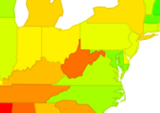
Interesting. West Virginia is….not doing well? I don’t remember it popping out like that before. Sure enough, here’s what it looked like in my last map:So where are they at numbers-wise? Well, here’s our top 10:
State
Excess Deaths Above Average 2/1/20-6/1/22
Change from 3/23/22
Change in Rank
Mississippi
5823
+94
No change
West Virginia
5622
+912
+2
Arizona
5153
+205
+1
New Mexico
4848
+206
+1
Alabama
4841
+73
-2
Louisiana
4506
+237
+2
Tennessee
4480
+80
+1
Arkansas
4467
+104
-1
Wyoming
4353
+186
+2
South Carolina
4287
+85
-1
Wow…so that was a jump. They jumped last time as well, so they are moving quite rapidly. What other big movers were there?
State
6/1/22 Excess
3/23/22 Excess
Change
June Rank
March Rank
West Virginia
5622
4710
912
2
4
North Carolina
3369
2556
813
24
42
Puerto Rico
1972
1407
565
48
51
Alaska
3208
2927
281
28
34
Louisiana
4506
4269
237
6
8
New Mexico
4848
4642
206
4
5
Arizona
5153
4948
205
3
2
Oklahoma
4267
4077
190
11
12
Wyoming
4353
4167
186
9
11
Kentucky
4155
3971
184
13
13
Interesting, so West Virginia and North Carolina are our two big jumpers here. I’m not clear why that is, but it’s worth noting that North Carolina had been outperforming it’s neighbors for quite some time, and is still outperforming them now. Peurto Rico was also doing very well and it’s jump has it doing only slightly less well.
It’s also worth noting that 9 states lost excess deaths in the last 10 weeks. We had wondered if we were going to see this effect start to happen, as this is something that could occur if some of the people who died initially were those who were close to death already. These states were: Rhode Island (-205), Ohio (-72), Maryland (-62), New Jersey (-52), Massachusetts (-34), Michigan (-31), Illinois (-20), Idaho (-19) and Pennsylvania (-17).
It will be interesting to see if more states start to slip backward as the summer goes on.
Percent Excess Mortality – 2020 and 2021
Alright, so hopefully most states are done updating their numbers from 2020 and 2021 by this point right? Who’s still at it? Well, really only Alaska (+2%), North Carolina (+7%), North Dakota (+8%) and West Virginia (+4%). All other states have very small changes or no change in the last 10 weeks. Top 10 states for each year are highlighted and bolded below, though 2021 had a 3 way tie for 10th so there are actually 12 states there.
State
2020 deaths – expected
2020 deaths – actual
% change
2021 deaths – expected
2021 deaths – actual
% change
Alabama
54839
62550
14%
55036
67508
23%
Alaska
4462
4971
11%
4552
6037
33%
Arizona
62622
75955
21%
63797
82520
29%
Arkansas
33424
37432
12%
33406
40015
20%
California
284264
315430
11%
275238
336534
22%
Colorado
41621
47161
13%
41289
48912
18%
Connecticut
32416
37730
16%
32910
34479
5%
Delaware
10016
10862
8%
10247
11295
10%
District of Columbia
6959
7378
6%
6495
7130
10%
Florida
213923
240765
13%
219931
264812
20%
Georgia
87875
102464
17%
89319
112573
26%
Hawaii
11893
11990
1%
12343
12839
4%
Idaho
15138
16340
8%
15282
18299
20%
Illinois
108823
127440
17%
108444
120592
11%
Indiana
69474
78293
13%
69171
79198
14%
Iowa
30946
35418
14%
31547
33809
7%
Kansas
26882
30773
14%
27392
30975
13%
Kentucky
50994
55145
8%
50136
60206
20%
Louisiana
47208
56320
19%
48057
57469
20%
Maine
15070
15504
3%
15347
17045
11%
Maryland
53119
59048
11%
53311
57396
8%
Massachusetts
61009
68390
12%
62383
63748
2%
Michigan
98748
114510
16%
100176
115524
15%
Minnesota
46084
51732
12%
47005
51225
9%
Mississippi
32284
38825
20%
32315
40348
25%
Missouri
66643
75514
13%
68207
76413
12%
Montana
10651
11903
12%
10400
12771
23%
Nebraska
17173
19547
14%
17863
19052
7%
Nevada
28547
31006
9%
27546
33974
23%
New Hampshire
13127
13435
2%
13464
13775
2%
New Jersey
76686
94621
23%
78694
83497
6%
New Mexico
19180
22842
19%
19616
24433
25%
New York
101705
118274
16%
103179
115838
12%
New York City
54870
81660
49%
55622
63259
14%
North Carolina
99977
108916
9%
100298
118893
19%
North Dakota
7233
8793
22%
7508
8065
7%
Ohio
130487
142211
9%
130056
147109
13%
Oklahoma
40731
45814
12%
41086
49214
20%
Oregon
37707
39947
6%
37171
44825
21%
Pennsylvania
140989
154622
10%
139294
156273
12%
Puerto Rico
30574
32056
5%
30695
33090
8%
Rhode Island
10399
12054
16%
10877
11598
7%
South Carolina
51380
59676
16%
52784
64260
22%
South Dakota
8456
10052
19%
8447
9362
11%
Tennessee
78370
87418
12%
78956
95155
21%
Texas
212670
250917
18%
214835
271773
27%
United States
2956302
3353789
13%
2958796
3468553
17%
Utah
20042
22027
10%
20069
23454
17%
Vermont
5853
6116
4%
5791
6617
14%
Virginia
71636
78680
10%
72781
84878
17%
Washington
59364
62558
5%
59889
68415
14%
West Virginia
23033
25323
10%
23605
28679
21%
Wisconsin
54583
61940
13%
55622
60532
9%
Wyoming
4324
5497
27%
4867
5951
22%
So there we go! The good news is things actually do look to be finally slowing down quite substantially in most places. A few states still look to be struggling, though at this point it’s unclear what’s driving that.
As always, add any questions in the comments or shoot me a message!
Well hello again! Paid work delayed this post for a little bit, so I’m interested to see after 7 weeks where we’re going to land. Last time I posted we had just gone over 1 million excess deaths since 2/1/20, and as of this week we are just under 1.1 million. Hopefully things are settling down now, and I’ll be interested to see where the 2021 numbers are as well. I’m also going to throw in an extra bit about official COVID deaths vs excess mortality, as my state made some major adjustments to the official numbers this month.
Ready? Let’s go!
Excess Mortality Above Average
First up, the map. When I posted 7 weeks ago, the range at the bottom was 881-5245 deaths/million residents. Now it’s 1020-5729 deaths/million. The top states continue to rise faster than the bottom ones. It’s amazing to think that in the top states one out of every 200 people who was alive at the beginning of the pandemic is now an excess death. As always, that’s in addition to those expected to die anyway.
I was surprised to see West Virginia suddenly sticking out more than previously, and was curious to see how that showed up in the numbers. The difference was pretty clear:
State
Excess Deaths Above Average 2/1/20-3/23/22
Change from 2/2/22
Change in Rank
Mississippi
5729
+484
No change
Arizona
4948
+328
No change
Alabama
4768
+463
No change
West Virginia
4710
+1081
+6
New Mexico
4642
+455
-1
Tennessee
4400
+454
+1
Arkansas
4363
+390
-2
Louisiana
4269
+299
-2
South Carolina
4202
+833
+10
Montana
4172
+293
-2
West Virginia and South Carolina had a lousy winter it appears. They were the two states that gained the most excess deaths in the last 7 weeks. Here are the rest of the top 10:
State
3/23/22 Excess
2/2/22 Excess
Difference
Mar Rank
Feb Rank
West Virginia
4710
3629
1081
4
10
South Carolina
4202
3369
833
9
19
North Carolina
2556
2027
529
42
45
Oklahoma
4077
3575
502
12
11
Kentucky
3971
3480
491
13
15
Mississippi
5729
5245
484
1
1
Alabama
4768
4305
463
3
3
New Mexico
4642
4187
455
5
4
Tennessee
4400
3946
454
6
7
Rhode Island
3033
2593
440
31
34
Looking back at my old post, I had noted that West Virginia reporting had been quite sparse since Thanksgiving 2021, so it’s likely some of that jump is them catching up with deaths they should have filed much earlier. Let’s see if that shows up in the 2021 totals.
Percent Excess Mortality – 2020 and 2021
Looks like some of them did! North Carolina, South Carolina and West Virginia added 10+ percentage points to their 2021 excess mortality total since 7 weeks ago. Seems like a data dump. Again, the asterisked states added 2% or more to their total, and the ones highlighted in green are in the top 10.
State
2020 deaths – actual
2020 deaths – expected
Percent Increase 2020
2021 deaths – reported
2021 deaths – expected
Percent Increase 2021
Alabama
62550
54731
14%
67387
55022
22%
Alaska
4971
4434
12%
5996
4574
31%*
Arizona
75955
64271
18%
82437
63789
29%
Arkansas
37432
33452
12%
39979
33472
19%
California
315430
282704
12%
336042
274992
22%
Colorado
47161
41404
14%
48780
41279
18%
Connecticut
37730
32422
16%
34404
32884
5%*
Delaware
10862
10067
8%
11263
10117
11%
District of Columbia
7378
6881
7%
7116
6369
12%
Florida
240765
218159
10%
264692
219282
21%
Georgia
102464
88601
16%
112058
89429
25%
Hawaii
11990
11918
1%
12825
12352
4%
Idaho
16340
15131
8%
18298
15196
20%
Illinois
127440
108670
17%
120570
108118
12%
Indiana
78293
69227
13%
79056
68943
15%
Iowa
35418
31004
14%
33763
31542
7%
Kansas
30773
26895
14%
30960
27472
13%
Kentucky
55145
50678
9%
60046
50066
20%
Louisiana
56320
47296
19%
57085
48014
19%
Maine
15504
14990
3%
17044
15430
10%
Maryland
59048
52747
12%
57353
53122
8%
Massachusetts
68390
60979
12%
63725
62238
2%
Michigan
114510
98954
16%
115364
100018
15%
Minnesota
51732
46104
12%
51101
47016
9%
Mississippi
38825
32248
20%
40303
32460
24%
Missouri
75514
66833
13%
76225
67972
12%
Montana
11903
10533
13%
12771
10458
22%
Nebraska
19547
17215
14%
19034
17876
6%
Nevada
31006
28192
10%
33958
27462
24%
New Hampshire
13435
13115
2%
13766
13339
3%
New Jersey
94621
76824
23%
83181
78212
6%
New Mexico
22842
19254
19%
24238
19611
24%*
New York
118274
101635
16%
115802
103080
12%
New York City
81660
54889
49%
63113
55568
14%
North Carolina
108916
99853
9%
112026
100382
12%*
North Dakota
8793
7214
22%
7464
7566
-1%
Ohio
142211
130067
9%
146997
129444
14%
Oklahoma
45814
40777
12%
49083
41076
19%
Oregon
39947
37412
7%
44758
37387
20%
Pennsylvania
154622
140393
10%
155651
138546
12%
Puerto Rico
32056
30482
5%
32959
30526
8%
Rhode Island
12054
10439
15%
11566
10926
6%
South Carolina
59676
51517
16%
64215
52711
22%*
South Dakota
10052
8398
20%
9348
8489
10%
Tennessee
87418
78021
12%
95112
79012
20%
Texas
250917
212205
18%
271402
214961
26%
United States
3353789
2943069
14%
3454320
2955004
17%
Utah
22027
19974
10%
23414
20023
17%
Vermont
6116
5861
4%
6617
5741
15%
Virginia
78680
71488
10%
84412
72760
16%
Washington
62558
59323
5%
68359
60032
14%
West Virginia
25323
23028
10%
27713
23629
17%*
Wisconsin
61940
54672
13%
60498
55573
9%
Wyoming
5497
4386
25%
5950
4921
21%
Now one more analysis before we go!
Excess Mortality vs Official COVID deaths and Vaccination Rates
So on this blog, we’ve been talking strictly about excess mortality. I started using this metric because I found the discrepancies between state death definitions a bit annoying. Two weeks ago, I heard that Massachusetts was revising their official COVID death count downward by about 3,700. Massachusetts had long been one of the states that appeared to be overcounting COVID deaths, so I was not concerned about this change. While MA has been hanging out in the bottom 5 for excess mortality for months, in terms of official COVID deaths they had been top 10-15 for 2 years now. With this change our official count has dropped to #32, much more in line with the likely true count. I decided to do a quick correlation between states to see how excess mortality lined up with official COVID death counts. The correlation is a stunning r = .83 between reported COVID deaths and excess mortality. Massachusetts highlighted in yellow, suggesting even with the reduction we are still slightly over counting:
That outlier of undercounting is Vermont btw, not sure what they’re up to.
So then, since this question comes up a lot, I decided to do a correlation between vaccine uptake by state and excess mortality since 2/1/20. Even with no vaccines in 2020, we still see a moderately strong negative correlation r = -.65. In general something is called strong at r = .7 or .75: