I mentioned a few posts ago that I’m finally (finally!) working on my final capstone project for my degree. It’s going well so far, but it struck me this weekend exactly how much my process of wading through data resembles my process of cleaning out my closets:
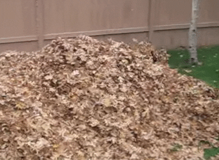
- Step 1: Take everything out and throw it all in a pile. For this project, my pile is 21,000 response sets from the American Time Use Survey. For my closet, well, it’s a little bit of everything, possibly including a request to participate in the American Time Use Survey (sorry BLS!). Once everything’s in a pile, frolic around a bit feel good about myself for taking such a large and productive step.
- Step 2: Stare at the pile I just created. Poke around at it a bit. Wonder suddenly if I’ve bitten off more than I can chew, or if perhaps I should have taken things more slowly. Swear quietly while maintaining outward calm.

- Step 3: Start spreading things out to see what I’ve got. Decide to start with getting rid of what I KNOW I don’t need and can throw out.
 Hope fervently the reduced pile size will quell my growing sense of panic.
 - Step 4: Start sorting things in to a few broad categories . Figure out if there are any core assumptions I need to validate like “can we assume a normal distribution of the data” or “realistically will I ever be able to pull off carrying a bright pink sparkle purse with a tassel”?
 I mean, it seemed like a good idea at the time.
 - Step 5: I don’t actually know how to describe this step (for my closet or my data) but this is the part where I start sort of communing with the data. I basically plop myself in the middle of it, and examine whatever catches my interest. I set up analysis schemes, then decide I don’t like them and rearrange things again. Much work and rework occurs, but I’m going where my gut takes me. I probably have one or more glasses of wine to maintain proper zen. If my energy begins to flag, I explore remote corners of Stack Exchange or, uh, Pinterest I guess, for inspiration. Nothing in this part makes sense to anyone else, but that’s okay. Data, like art, sometimes takes a little time.

- Step 6: This step has changed over the years, for both my house cleaning and my work habits. This used to be where I looked up from my data cleaning/bopping around and realized I was now running short on time and everything was still a mess. Fortunately I have now learned to set a reminder on my phone that alerts me when I need to wrap up the play/go with my gut part and start freaking writing things down/putting things away. Gotta be stern with myself or I’ll never get there.

- Step 7: Write a bad first draft. Part of why I used to delay so much on #6 is I was worried that I had to write a good first draft. Now I purposely write a bad one. Since there’s not a lot intimidating about doing shoddy work, it gets me moving faster and makes sure I have SOMETHING down on paper when I’m out of time. Not fun, but I get through it.

- Step 8: Revise and perfect details as time allows. Does that graph need a new label/color scheme? Should I order my shoes by color? Once the dust has settled, I work on these details until I am either out of time, or totally sick of everything. When “careful tweaking” moves in to “reckless rearrangement” I take it as a sign I need to call it quits.

The end.

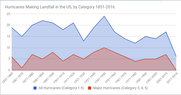
 On this graph you can draw lines to show not just “is it different” but also “when do we really care”. I think this is easier to show kids than just a p-value by itself, as there’s no equivalent visual to show p-values.