I’ve been thinking a lot about surveys this week (okay, I’m boring, I think a lot about them every week), but this week I have a particularly good reason. A few years ago, I wrote about a congressman named Daniel Webster and his proposal to eliminate the American Community Survey. I’ve been a little fascinated with the American Community Survey ever since, and last week I opened my mailbox to discover that we’d been selected to take it this year.
For those unfamiliar with the American Community Survey, it’s an ongoing survey by the Census Bureau that asks people lots of information about their houses, income, disability and employment status. Almost every time you see a chart that shows you “income by state” or “which county is the richest” or “places in the US with the least internet access”, the raw data came from the American Community Survey. This obviously provides lots of good and useful information to many people and businesses, but it’s not without it’s critics. People like Congressman Webster object to the survey for reasons like government overreach, the cost and possible privacy issues with the mandatory* survey.
While I’ve written about this for years, I actually had never taken it so I was fairly excited to see what all the fuss was about. Given the scrutiny that’s been placed on the cost, I was interested to see that the initial mailing strongly encouraged me to take the survey online (using a code on the mailing) and cited all the cost savings associated with me doing so. Filling out surveys online almost certainly reduces cost, but in this day and age it also tends to increase the possible privacy issues. While the survey doesn’t ask for sensitive information like social security numbers, it does ask lots of detailed information about salary, work status, the status of your house, mortgage payments and electricity usage. I wouldn’t particularly want a hacker getting a hold of this, nor would most others I suspect.
I don’t particularly know how the Census Bureau should proceed with this survey or what Congress will decided to do, but it did get me thinking about privacy issues with online surveys and how to balance the need for data with these concerns. I work in an industry (healthcare) that is actually required by regulations to get feedback on how we’re doing and make changes accordingly, yet we also must balance privacy concerns and people who don’t want to give us information. Many people who have no problem calling you up and lecturing you about everything that went wrong while they were in the hospital absolutely freeze when you ask them to fill out a survey: they find it invasive. It’s a struggle. One of my favorite post election moments actually reflected this phenomena, in the form of a Chicago Tribune letter to the editor from a guy who said he’d never talked to a pollster in the run up to the election. His issue? He hates pollsters because they want to capture your every thought AND they never listen to people like him. While many people like and appreciate services that reflect their perspective, are friendlier, more usable, and more tailored to their needs, many of us don’t want to be the person whose data gets taken to get there. For good reason too: our privacy is disappearing at an alarming rate, and data hacks are pretty much weekly news.
My favorite of the techniques is something called “noise injection” where fake results are inserted in to the sample at a known level. For example: a survey asks you if you’ve ever committed a crime. Before you answer, you are told to flip a coin. If the coin says heads, you answer truthfully. If the coin says tails, you flip the coin again. If the coin says heads this time, you say “yes, I’ve committed a crime”. Tails, you haven’t. When the researchers go back in, they can take out the predicted fake answers and find the real number. For example, let’s say you started with 100 people. At the end of the test, you find that 35 say they committed a crime, and 65 say they haven’t. You know that 25 of those 35 should have answered “yes” due to coin flip, so you have 10 who really said “yes”. You can also subtract 25 from the 65 to get 40.
They now know the approximate real percentage of those who have committed a crime (20% in this example), but you can’t know if any individual response is true or not. This technique has possible holes in it (what if people don’t follow instructions?) and you have to cut your sample size in half, but just asking people to admit to a crime directly with a “we promise not to share your data” actually doesn’t work so well either. Additionally, the beauty of this technique is that it works better the larger your sample is.
Going forward we may see more efforts like this, even within the same survey or data set. While 20 years ago people may have been annoyed to fill out a section of a survey with fake data, today’s more privacy conscious consumers may be okay with it if it means their responses can’t be tied to them directly. I don’t know that the Census Bureau would ever use anything like this, but as we head towards the 2020 census, there will definitely be more talk about surveys, privacy and methodology.
*The survey is mandatory, but it appears the Census Bureau is prohibited by Congress from actually enforcing this.
Well hello hello! A few weeks ago, someone forwarded me a syllabus for a new class at being offered at the University of Washington this semester Info 198: Calling Bullshit. The synopsis is simple: “Our world is saturated with bullshit. Learn to detect and defuse it. Obviously I was intrigued. The professors ( Carl T. Bergstrom and Jevin West) have decided to put their entire syllabus online along with links to weekly readings, and are planning to add some of the lectures when they conclude the semester. Of course this interested me greatly, and I was excited to see that they pointed to some resources I was really familiar with, and some I wasn’t.
Given that I’m in the middle of a pretty grueling semester of my own, I thought this might be a great time to follow along with their syllabus, week by week, and post my general thoughts and observations as I went along. I’m very interested in how classes like this get thought through and executed, and what topics different people find critical in sharpening their BS detectors. Hopefully I’ll find some new resources for my own classroom talks, and see if there’s anything I’d add or subtract.
I’ll start with their introduction next week, but I’ll be following the schedule of lectures posted in the syllabus for each week:
I’ll be reading through each of the readings associated with each lecture, summarizing, adding whatever random thoughts I have, and making sure the links are posted. I’ll be adding a link for the next week’s reading as well. Anyone who’s interested can of course read along and add their own commentary, or just wait for my synopsis.
Welcome to “From the Archives”, where I dig up old posts and see what’s changed in the years since I originally wrote them.
I’ve had a rather interesting couple weeks here in my little corner of the blogosphere. A little over a year ago, a reader asked me to write a post about a video he had seen kicking around that used gumballs to illustrate world poverty. With the renewed attention to immigration issues over the last few weeks, that video apparently went viral and brought my post with it. My little blog got an avalanche of traffic and with it came a new series of questions, comments and concerns about my original post. The comments on the original post closed after 90 days, so I was pondering if I should do another post to address some of the questions and concerns I was being sent directly. A particularly long and thoughtful comment from someone named bluecat57 convinced me that was the way to go, and almost 2500 something words later, here we are. As a friendly reminder, this is not a political blog and I am not out to change your mind on immigration to any particular stance. I actually just like talking about how we use numbers to talk about political issues and the fallacies we may encounter there.
Note to bluecat57: A lot of this post will be based on various points you sent me in your comment, but I’m throwing a few other things in there based on things other people sent me, and I’m also heavily summarizing what you said originally. If you want me to post your original comment in the comments section (or if you want to post it yourself) so the context is preserved, I’m happy to do so.
Okay, with that out of the way, let’s take another look at things!
First, a quick summary of my original post: The original post was a review of a video by a man named Roy Beck. The video in question (watch it here) was a demonstration centered around whether or not immigration to the US could reduce world poverty. In it, pulls out a huge number of gumballs, with each one representing 1 million poor people in the world, defined by the World Bank’s cutoff of “living on less than $2/day” and demonstrates that the number of poor people is growing faster than we could possibly curb through immigration. The video is from 2010. My criticisms of the video fell in to 3 main categories:
The number of poor people was not accurate. I believe it may have been at one point, but since the video is 7 years old and world poverty has been falling rapidly, they are now wildly out of date. I don’t blame Beck for his video aging, but I do get irritated his group continues to post it with no disclaimer.
That the argument the video starts with “some people say that mass immigration in to the United States can help reduce world poverty” was not a primary argument of pro-immigration groups, and that using it was a strawman.
That people liked, shared and found this video more convincing than they should have because of the colorful/mathematical demonstration.
My primary reason for posting about the video at all was actually point #3, as talking about how mathematical demonstrations can be used to address various issues is a bit of a hobby of mine. However, it was my commentary on #1 and #2 that seemed to attract most of the attention. So let’s take a look at each of my points, shall we?
Point 1: Poverty measures, and their issues: First things first: when I started writing the original post and realized I couldn’t verify Beck’s numbers, I reached out to him directly through the NumbersUSA website to ask for a source for them. I never received a response. Despite a few people finding old sources that back Beck up, I stand by the assertion that those numbers are not currently correct as he cites them. It is possible to find websites quoting those numbers from the World Bank, but as I mentioned previously, the World Bank itself does not give those numbers. While those numbers may have come from the World Bank at some point he’s out of date by nearly a decade, and it’s a decade in which things have rapidly changed.
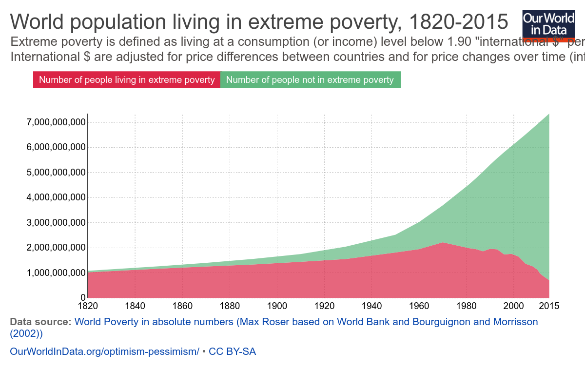
Now this isn’t necessarily his fault. One of the reasons Beck’s numbers were rendered inaccurate so quickly was because reducing extreme world poverty has actually been a bit of a global priority for the last few years. If you were going to make an argument about the number of people living in extreme poverty going up, 2010 was a really bad year to make that argument:
Basically he made the argument in the middle of an unprecedented fall in world poverty. Again, not his fault, but it does suggest why he’s not updating the video. The argument would seem a lot weaker starting out with “there’s 700 million desperately poor people in the world and that number falls by 137,000 people every day”.
Moving on though…is the $2/day measure of poverty a valid one? Since the World Bank and Beck both agreed to use it, I didn’t question it much up front, but at the prompting of commenters, I went looking. There’s an enormously helpful breakdown of global poverty measures here, but here’s the quick version:
The $2/day metric is a measure of consumption, not income and thus is very sensitive to price inflation. Consumption is used because it (attempts to) account for agrarian societies where people may grow their own food but not earn much money.
Numbers are based on individual countries self-reporting. This puts some serious holes in the data.
The definition is set based on what it takes to be considered poor in the poorest countries in the world. This caused it’s own problems.
That last point is important enough that the World Bank revised it’s calculation method in 2015, which explains why I couldn’t find Beck’s older numbers anywhere on the World Bank website. Prior to that, it set the benchmark for extreme poverty based off the average poverty line used by the 15 poorest countries in the world. The trouble with that measure is that someone will always be the poorest, and therefore we would never be rid of poverty. This is what is known as “relative poverty”.
Given that one of the Millennium Development Goals focused on eliminating world poverty, the World Bank decided to update it’s estimates to simply adjust for inflation. This shifts the focus to absolute poverty, or the number of people living below a single dollar amount. Neither method is perfect, but something had to be picked.
It is worth noting that country self reports can vary wildly, and asking the World Bank to put together a single number is no small task. While the numbers presented, it is worth noting that even small revisions to definitions could cause huge change. Additionally, none of these numbers address country stability, and it is quite likely that unstable countries with violent conflicts won’t report their numbers. It’s also unclear to me where charity or NGO activity is counted (likely it varies by country).
Interestingly, Politifact looked in to a few other ways of measuring global poverty and found that all of them have shown a reduction in the past 2 decades, though not as large as the World Bank’s. Beck could change his demonstration to use a different metric, but I think the point remains that if his demonstration showed the number of poor people falling rather than rising, it would not be very compelling.
Edit/update: It’s been pointed out to me that at the 2:04 mark he changes from using the $2/day standard to “poorer than Mexico”, so it’s possible the numbers after that timepoint do actually work better than I thought they would. It’s hard to tell without him giving a firm number. For reference, it looks like in 2016 the average income in Mexico is $12,800/year . In terms of a poverty measure, the relative rank of one country against others can be really hard to pin down. If anyone has more information about the state of Mexico’s relative rank in the world, I’d be interested in hearing it.
Point 2: Is it a straw man or not? When I posted my initial piece, I mentioned right up front that I don’t debate immigration that often. Thus, when Beck started his video with “Some people say that mass immigration in to the United States can help reduce world poverty. Is that true? Well, no it’s not. And let me show you why…..” I took him very literally. His demonstration supported that first point, that’s what I focused on. When I mentioned that I didn’t think that was the primary argument being made by pro-immigration groups, I had to go to their mission pages to see what their argument actually were. None mentioned “solving world poverty” as a goal. Thus, I called Beck’s argument a straw man, as it seemed to be refuting an argument that wasn’t being made.
Unsurprisingly, I got a decent amount of pushback over this. Many people far more involved in the immigration debates than I informed me this is exactly what pro-immigration people argue, if not directly then indirectly. One of the reasons I liked bluecat57’s comment so much, is that he gave perhaps the best explanation of this.To quote directly from one message:
“The premise is false. What the pro-immigration people are arguing is that the BEST solution to poverty is to allow people to immigrate to “rich” countries. That is false. The BEST way to end poverty is by helping people get “rich” in the place of their birth.
That the “stated goals” or “arguments” of an organization do not promote immigration as a solution to poverty does NOT mean that in practice or in common belief that poverty reduction is A solution to poverty. That is why I try to always clearly define terms even if everyone THINKS they know what a term means. In general, most people use the confusion caused by lack of definition to support their positions.”
Love the last sentence in particular, and I couldn’t agree more. My “clear definitions” tag is one of my most frequently used for a reason.
In that spirit, I wanted to explain further why I saw this as a straw man, and what my actual definition of a straw man is. Merriam Webster defines a straw man as “a weak or imaginary argument or opponent that is set up to be easily defeated“. If I had ever heard someone arguing for immigration say “well we need it to solve world poverty”, I would have thought that was an incredibly weak argument, for all the reasons Beck goes in to….ie there are simply more poor people than can ever reasonably be absorbed by one (or even several) developed country. Given this, I believe (though haven’t confirmed) that every developed/rich country places a cap on immigration at some point. Thus most of the debates I hear and am interested in are around where to place that cap in specific situations and what to do when people circumvent it. The causes of immigration requests seem mostly debated when it’s in a specific context, not a general world poverty one.
For example, here’s the three main reasons I’ve seen immigration issues hit the news in the last year:
Illegal immigration from Mexico (too many mentions to link)
Now there are a lot of issues at play with all of these, depending on who you talk to: general immigration policy, executive power, national security, religion, international relations, the feasibility of building a border wall, the list goes on and on. Poverty and economic opportunity are heavily at play for the first one, but so is the issue of “what do we do when people circumvent existing procedures”. In all cases if someone had told me that we should provide amnesty/take in more refugees/lift a travel ban for the purpose of solving world poverty, I would have thought that was a pretty broad/weak argument that didn’t address those issues specifically enough. In other words my characterization of this video as a straw man argument was more about it’s weakness as a pro-immigration argument than a knock against the anti-immigration side. That’s why I went looking for the major pro-immigration organizations official stances….I actually couldn’t believe they would use an argument that weak. I was relieved when I didn’t see any of them advocating this point, because it’s really not a great point. (Happy to update with examples of major players using this argument if you have them, btw).
In addition to the weaknesses of this argument as a pro-immigration point, it’s worth noting that from the “cure world poverty” side it’s pretty weak as well. I mentioned previously that huge progress has been made in reducing world poverty, and the credit for that is primarily given to individual countries boosting their GDP and reducing their internal inequality. Additionally, even given the financial situation in many countries, most people in the world don’t actually want to immigrate. This makes sense to me. I wouldn’t move out of New England unless there was a compelling reason to. It’s home. Thus I would conclude that helping poor countries get on their feet would be a FAR more effective way of eradicating global poverty than allowing more immigration, if one had to pick between the two. It’s worth noting that there’s some debate over the effect of healthy/motivated people immigrating and sending money back to their home country (it drains the country of human capital vs it brings in 3 times more money than foreign aid), but since that wasn’t demonstrated with gumballs I’m not wading in to it.
So yeah, if someone on the pro-immigration side says mass immigration can cure world poverty, go ahead and use this video….keeping in mind of course the previously stated issue with the numbers he quotes. If they’re using a better or more country or situation specific argument though (and good glory I hope they are), then you may want to skip this one.
Now this being a video, I am mindful that Beck has little control over how it gets used and thus may not be at fault for possible straw-manning, any more than I am responsible for the people posting my post on Twitter with Nicki Minaj gifs (though I do love a good Nicki Minaj gif).
Point 3 The Colorful Demonstration: I stand by this point. Demonstrations with colorful balls of things are just entrancing. That’s why I’ve watched this video like 23 times:
Welp, this went on a little longer than I thought. Despite that I’m sure I missed a few things, so feel free to drop them in the comments!
Well hi! Welcome back to our review of how scientific popularity influences the reliability of results. When last we left off we had established that the popularity of protein interactions did not effect the reliability of results for pairings initially, but did effect the reliability of results involving those popular proteins. In other words, you can identify the popular kids pretty well, but figuring out who they are actually connected to gets a little tricky. People like being friends with the popular kids.
Interestingly, the overall results showed a much stronger effect for the “multiple testing hypothesis” than the “inflated error effect” hypothesis, meaning that many of the false positive results seem to be coming from the extra teams running many different experiments and getting a predictable number of false positives. More overall tests = more overall false positives. This effect was 10 times stronger than the inflated error effect, though that was still present.
So what do should we do here? Well, a few things:
Awareness Researchers should be extra aware that running lots of tests on a new and interesting protein could result in less accurate results.
Encourage novel testing Continue to encourage people to branch out in their research as opposed to giving more funding to those researching more popular topics
Informal research wikis This was an interesting idea I hadn’t seen before: use the Wikipedia model to let researchers note things they had tested that didn’t pan out. As I mentioned when I reviewed the Ioannidis paper, there’s not an easy way of knowing how many teams are working on a particular question at any given time. Setting up a less formal place for people to check what other teams were doing may give researchers better insight in to how many false positives they can expect to see.
Overall, it’s also important to remember that this is just one study and that findings in other fields may be different. It would be interesting to see a similar thing repeated in a social science type filed or something similar to see if public interest makes results better or worse.
Got another paper you’re interested in? Let me know!
A few weeks back I blogged about what I am now calling “The Perfect Metric Fallacy“. If you missed it, here’s the definition
The Perfect Metric Fallacy: the belief that if one simply finds the most relevant or accurate set of numbers possible, all bias will be removed, all stress will be negated, and the answer to complicated problems will become simple, clear and completely uncontroversial.”
As I was writing that post, I realized that there was an element I wasn’t paying enough attention to. I thought about adding it in, but upon further consideration, I realized that it was big enough that it deserved it’s own post. I’m calling it “The White Collar Paradox”. Here’s my definition:
The White Collar Paradox: Requiring that numbers and statistics be used to guide all decisions due to their ability to quantify truth and overcome bias, while simultaneously only giving attention to those numbers created to cater to ones social class, spot in the workplace hierarchy, education level, or general sense of superiority.
Now of course I don’t mean to pick on just white collar folks here, though almost all offenders are white collar somehow. This could just as easily have been called the “executive paradox” or the “PhD paradox” or lots of other things. I want to be clear who this is aimed at because plenty of white collar workers have been on the receiving end of this phenomena as well, in the form of their boss writing checks to expensive consulting firms just to have those folks tell them the same stuff their employees did only on prettier paper and using more buzzwords. Essentially, anyone who prioritizes numbers that make sense to them out of their own sense of ego despite having the education to know better is a potential perpetrator of this fallacy.
Now of course wanting to understand the problem is not a bad thing, and quite frequently busy people do not have the time to sort through endless data points. Showing your work gets you lots of credit in class, but in front of the C-suite it loses everyone’s attention in less than 10 seconds (ask me how I know this). There is a value in learning how to get your message to match the interests of your audience. However, if the audience really wants to understand the problem, sometimes they will have to get a little uncomfortable. Sometimes the problem is arising precisely because they overlooked something that’s not very understandable to them, and preferring explanations that cater to what you already know is just using numbers to pad the walls of your echo chamber.
A couple other variations I’ve seen:
The novel metric preference As in “my predecessor didn’t use this metric, therefore it has value”.
The trendy metric “Prestigious institution X has promoted this metric, therefore we also need this metric”
The “tell me what I want to hear” metric Otherwise known as the drunk with a lamp post…using data for support, not illumination.
The emperor has no clothes metric The one that is totally unintelligible but stated with confidence and no one questions it
That last one is the easiest to compensate for. For every data set I run, I always run it by someone actually involved in the work. The number of data problems that can be spotted by almost any employee if you show them your numbers and say “hey, does this match what you see every day?” is enormous. Even if there’s no problems with your data, those employees can almost always tell you where your balance metrics should be, though normally that comes in the form of “you’re missing the point!” (again, ask me how I know this).
For anyone who runs workplace metrics, I think it’s important to note that every person in the organization is going to see the numbers differently and that’s incredibly valuable. Just like high level execs specialize in forming long term visions that day to day workers might not see, those day to day workers specialize in details the higher ups miss. Getting numbers that are reality checked by both groups isn’t easy, but your data integrity will improve dramatically and the decisions you can make will ultimately improve.
I’ve been a bit busy with an exam, snow shoveling and a sick kiddo this week, so I’m behind on responding to emails and a few post requests I’ve gotten. Bear with me.
I did want to mention that Hans Rosling died, which is incredibly sad. If you’ve never seen his work with statistics or his amazing presentations, please check them out. His one our “Joy of Stats” documentary is particularly recommended. For something a little shorter, try his famous “washing machine” TED talk.
I also wanted to note that due to some recent interest, I have updated my “About” page with a little bit more of the story about how I got in to statistics in the first place. I’ve mentioned a few times that I took the scenic route, so I figured I’d put the story all in one place. Click on over and find out how the accidental polymath problems began.
As an added bonus, there are also some fun illustrations from my awesome cousin Jamison, who was kind enough to make some for me. This is my favorite pair:
Finally, someone sent me this syllabus for a new class called “Calling Bullshit” that’s being offered at the University of Washington this semester. I started reading through it, but I’m thinking it might be more fun as a whole series. It covers some familiar ground, but they have a few topics I haven’t talked about much on this blog. I’ll likely start that up by the end of February, so keep an eye out for that.
I’ve had a couple interesting stats related news articles forwarded to me recently, both of which are worth a look for those interested in the way data and stats shape our lives.
First they came for the guys with the data
This one comes from the confusing world of European economics, and is accompanied by the rather alarming headline “Greece’s Response to Its Resurgent Debt Crisis: Prosecute the Statistician” (note: WSJ articles are behind a paywall, Google the first sentence of the article to access it for free). The article covers the rather concerning story of how Greece attempted to clean up it’s (notoriously wrong) debt estimates, only to turn around and prosecute the statistician they hired to do so. Unsurprisingly, things soured when his calculations showed they looked even worse than they’d said and were used to justify austerity measures. He’s been tried 4 times with no mathematical errors found, and it appears that he adhered to general EU accounting conventions in all cases. Unfortunately he still has multiple cases pending, and in at least one he’s up for life in prison.
Now I am not particularly a fan of economic data. Partially that’s because I’m not trained in that area, and partially because it appears to be some of the most easily manipulated data there is. The idea that someone could come up with a calculation standard that was unfair or favored one country over others is not crazy. There’s a million ways of saying “this assumption here is minor and reasonable but that assumption there is crazy and you’re deceptive for making it”. There’s nothing that guarantees that the EU recommended way of doing things was fair or reasonable, other than that they claim they are. Greece could have been screwed by German recommendations for debt calculations, I don’t know. However, prosecuting the person who did the calculations as opposed to vigorously protesting the accounting tricks is NOT the way to make your point….especially when he was literally hired to clean up known accounting tricks you never prosecuted anyone for.
Again, no idea who’s right here, but I do tend to believe (with all due respect to Popehat) that vagueness in data complaints is the hallmark of meritless thuggery. If your biggest complaint about a statistic is it’s outcome, then I begin to suspect your complaint is not actually a statistical one.
Safety and efficacy in Phase 1 clinical trials
The second article I got forwarded was an editorial from Nature, and is a call for an increased focus on efficacy in Phase 1 clinical trials. For those of you not familiar with the drug development world, Phase 1 trials currently only look at drug safety without having to consider whether or not they work. Currently about half of all drugs that proceed to phase 2 or phase 3 end up failing to demonstrate ANY efficacy.
The Nature editorial was spurred by a safety trial that went terribly wrong and ended up damaging almost all of the previously healthy volunteers. Given that there are a limited number of people willing to sign up to be safety test subjects, this is a big issue. Previously the general consensus had been to leave this up to companies to decide what was and was not worth proceeding with, believing that market forces would get companies to screen the drugs they were testing. However, given some recent safety failures and recent publications showing how often statistical manipulations are used to push drugs along have called this in to question. As we saw in our “Does Popularity Influence Reliability” series, this effect will likely be worse the more widely studied the topic is.
It should be noted that major safety failures and/or damage from experimental drugs is fairly rare, so much of this is really a resource or ethics debate. Statistically though, it also speaks to increasing the pre-study odds we talked in the “Why Most Published Research Findings are False” series. If we know that low pre-study odds are likely to lead to many false positives, then raising the bar for pre-study odds seems pretty reasonable. At the very least the company’s should have to submit a calculation, along with the rationale. I still maintain this should be a public function of professional associations.
Okay, so when we left off last time, we were discussing the idea that findings in (scientifically) popular fields were less likely to be reliable than those in less popular fields. The theory goes that popular fields would have more false positives (due to an overall higher number of experiments being run) or that increased competition would increase things like p-hacking and data dredging on the part of research teams, or both.
Methods: To test this hypothesis empirically, the researchers decided to look at the exciting world of protein interactions in yeast. While this is not what most people think about when they think of “popular” research, it’s actually a great choice. Since the general public probably is mostly indifferent to protein interactions, all the popularity studied here will be purely scientific. Any bias the researchers picked up will be from their scientific training, not their own pre-conceived beliefs.
To get data on protein interactions, the researchers pulled large data sets that were casting a wide net and smaller data sets that were looking for specific proteins and compared the results between the two. The thought was that the large data sets were testing large numbers of interactions all using the same algorithm and would be less likely to be biased by human judgement and could therefore be used to confirm or cast doubt on the smaller experiments that required more human intervention.
Thanks to the wonders of text mining, the sample size here was HUGE – about 60,000 statements/conclusions made about 30,000 hypothesized interactions. The smaller data sets had about 6,000 statements/conclusions about 4,000 interactions.
Results: The overall results showed some interesting differences in confirmation rates:
Basically, the more popular an interaction, the more often the interaction was confirmed. However, the more popular an interaction partner was, the less often it was confirmed. Confused? Try this analogy: think of protein interactions as the popular kids in school. The popular kids were fairly easy to identify, and researchers got the popular kids right a lot of the time. However, once they tried to turn that around and figure out who interacted with the popular kids later, they started getting a lot of false positives. Just like the less-cool kids in high school might overplay their relationship to the cooler kids, many researchers tried to tie their new findings to previously recognized popular findings.
This held true for both the “inflated error effect” and the “multiple testing effect”. In other words, having a popular protein involved made both the individual statements or conclusions less likely to be validated, and ended up with more interactions that were found once but then never replicated. This held true across all types of experimental techniques, and it held true across databases that were curated by experts vs broader searches.
We’ll dive in to the conclusions we can draw from this next week.
I had thought this was just random bluster (on Twitter????? Never!), but then someone sent me this article. Apparently that comment was presumably based on an actual study, and the study author is now giving interviews. It turns out he’s pretty unhappy with everyone….not just with Trump, but also with Trump’s opponents who claim that no non-citizens voted. So what did his study actually say? Let’s take a look!
Some background: The paper this is based on is called “Do Non-Citizens Vote in US Elections” by Richman et all and was published back in 2014. It took data from a YouGov survey and found that 6.4% of non-citizens voted in 2008 and 2.2% voted in 2010. Non-citizenship status was based on self report, as was voting status, though the demographic data of participants was checked with that of their stated voting district to make sure the numbers at least made sense.
So what stood out here? A few things:
The sample size While the initial survey of voters was pretty large (over 80,000 between the two years) the number of those identifying themselves as non-citizens was rather low: 339 and 489 for the two years. There were a total of 48 people who stated that they were not citizens and that they voted. As a reference, it seems there are about 20 million non-citizens currently residing in the US.
People didn’t necessarily know they were voting illegally One of the interesting points made in the study was that some of this voting may be unintentional. If you are not a citizen, you are never allowed to vote in national elections even if you are a permanent resident/have a green card. The study authors wondered if some people didn’t know this, so they analyzed the education levels of those non-citizens who voted. It turns out non-citizens with less than a high school degree are more likely to vote than those with more education. This actually is the opposite trend seen among citizens AND naturalized citizens, suggesting that some of those voters have no idea what they’re doing is illegal.
Voter ID checks are less effective than you might think If you’re first question up on reading #2 was “how could you just illegally vote and not know it?” you may be presuming your local polling place puts a little more in to screening people than they do. According to the participants in this study, not only were non-citizens allowed to register and cast a vote, but a decent number of them actually passed an ID check first. About a quarter of non-citizen voters said they were asked for ID prior to voting, and 2/3rds of those said they were then allowed to vote. I suspect this issue is that most polling places don’t actually have much to check their information against. Researching citizenship status would take time and money that many places just don’t have. Another interesting twist to this is that social desirability bias may kick in for those who don’t know voting is illegal. Voting is one of those things more people say they do than actually do, so if someone didn’t know they couldn’t legally vote they’d be more likely to say they did even if they didn’t. Trying to make ourselves look good is a universal quality.
Most of the illegal voters were white Non-citizen voters actually tracked pretty closely with their proportion of the population, and about 44% of them were white. The next most common demographic was Hispanic at 30%, then black, then Asian. In terms of proportion, the same percent of white non-citizens voted as Hispanic non-citizens.
Non-citizens are unlikely to sway a national election, but could sway state level elections When Trump originally referenced this study, he specifically was using it to discuss national popular vote results. In the Wired article, they do the math and find that even if all of the numbers in the study bear out it would not sway the national popular vote. However, the original study actually drilled down to a state level and found that individual states could have their results changed by non-citizen voters. North Carolina and Florida would both have been within the realm of mathematical possibility for the 2008 election, and for state level races the math is also there.
Now, how much confidence you place in this study is up to you. Given the small sample size, things like selection bias and non-response bias definitely come in to play. That’s true any time you’re trying to extrapolate the behavior of 20 million people off of the behavior of a few hundred. It is important to note that the study authors did a LOT of due diligence attempting to verifying and reality check the numbers they got, but it’s never possible to control for everything.
If you do take this study seriously, it’s interesting to note what the authors actually thought the most effective counter-measure against non-citizen voting would be: education. Since they found that low education levels were correlated with increased voting and that poll workers rarely turned people away, they came away from this study with the suggestion that simply doing a better job of notifying people of voting rules might be just as effective (and cheaper!) than attempting to verify citizenship. Ultimately it appears that letting individual states decide on their own strategies would also be more effective than anything on the federal level, as different states face different challenges. Things to ponder.
Well hi there! Welcome to the next edition of “Papers in Meta Science” where I walk through interesting papers that use science to scrutinize science. During the first go around we looked at the John Ioannidis paper “Why Most Published Research Findings Are False”, and this time we’re going to look at a paper that attempted to prove one of that papers key assertions: that “hot” scientific fields produce less trustworthy results than less popular fields. This paper is called “Large-Scale Assessment of the Effect of Popularity on the Reliability of Research“, and was published on PlosOne by Pfeiffer and Hoffmann in 2009. They sought to test empirically whether or not this particular claim was true using the field of protein interactions.
Before we get to the good stuff though, I’d expect this series to have about 3 parts:
The Introduction/Background. You’re reading this one right now.
Methods and Results
Further Discussion
Got it? Let’s go!
Introduction: As I mentioned up front, one of the major goals of this paper was to confirm or refute the mathematical theory put forth by John Ioannidis that “hot” fields were more likely to produce erroneous results than those that were less popular. There are two basic theories as to why this could be the case:
Popular fields create competition, and competitive teams are more likely to be incentivized to cut corners or do what it takes to get positive results (Ioannidis Corollary 5)
Lots of teams working on a problem means lots of hypothesis testing, and lots of tested hypotheses means more false positives due to random chance (Ioannidis Corollary 6).
While Pfeiffer and Hoffman don’t claim to be able to differentiate between those two motives, they were hopeful that by looking at the evidence they could figure out if this effect was real and if it was perhaps estimate a magnitude. For their scrutiny, they chose the field of protein interactions in yeast.
This may seem a little counter-intuitive, as almost no definition of “popular science” conjures pictures of protein interactions. However, it is important to remember that the point of this paper was to examine scientific popularity, not mentions in the popular press. Since most of us probably already assume that getting headline grabbing research can cause it’s own set of bias problems, it’s interesting to consider a field that doesn’t grab headlines. Anyway, despite it’s failure to lead the 6 o’clock news, it turns out that the world of protein interactions actually does have a popularity issue. Some proteins and their corresponding genes are studied far more frequently than others, and this makes it a good field for examination. If a field like this can fall prey to the effect of multiple teams, than we can assume that more public oriented fields could as well.