Welcome to the Calling Bullshit Read-Along based on the course of the same name from Carl Bergstorm and Jevin West at the University of Washington. Each week we’ll be talking about the readings and topics they laid out in their syllabus. If you missed my intro and want the full series index, click here or if you want to go back to Week 2 click here.
Well hi there! It’s week 3 of the read-along, and this week we’re diving in to the natural ecology of bullshit. Sounds messy, but hopefully by the end you’ll have a better handle on where bullshit is likely to flourish.
So what exactly is the ecology of bullshit and why is it important? Well, I think it helps to think of bullshit as a two step process. First, bullshit gets created. We set the stage for this in week one when we discussed the use of bullshit as a tool to make yourself sound more impressive or more passionate about something. However, the ecology of bullshit is really about the second step: sharing, spreading and enabling the bullshit. Like rumors in middle school, bullshit dies on the vine if nobody actually repeats it. There’s a consumer aspect to all of this, and that’s what we’re going to cover now. The readings this week cover three different-but-related conditions that allow for the growth of bullshit: psuedo-intellectual climates, psuedo-profound climates, and social media. Just like we talked about in week one, it is pretty easy to see when the unintelligent are propagating bullshit, but it is a little more uncomfortable to realize how often the more intelligent among us are responsible for their own breed of “upscale bullshit”.
And where do you start if you have to talk about upscale bullshit? By having a little talk about TED. The first reading is a Guardian article that gets very meta by featuring a TED talk about how damaging the TED talk model can be. Essentially the author argues that we should be very nervous when we start to judge the value of information by how much it entertains us, how much fun we have listening to it, or how smart we feel by the end of it. None of those things are bad in and of themselves, but they can potentially crowd out things like truth or usefulness. While making information more freely available and thinking about how to communicate it to a popular audience is an incredibly valuable skill, leaving people with the impression that un-entertaining science is less valuable or truthful is a slippery slope.1
Want a good example of the triumph of entertainment over good information? With almost 40 million views, Amy Cuddy’s Wonder Woman/power pose talk is the second most watched TED talk of all time. Unfortunately, the whole thing is largely based on a study that has (so far) failed to replicate. The TED website makes no note of this [Update: After one of the original co-authors publicly stated they no longer supported the study in Oct 2016, TED added the following note to the summary of the talk “Note: Some of the findings presented in this talk have been referenced in an ongoing debate among social scientists about robustness and reproducibility. Read Amy Cuddy’s response under “Learn more” below.”], and even the New York Times and Time magazine fail to note this when it comes up. Now to be fair, Cuddy’s talk wasn’t bullshit when she gave it, and it may not even be bullshit now. She really did do a study (with 21 participants) that found that power posing worked. The replication attempt that failed to find an effect (with 100 participants) came a few years later, and by then it was too late, power posing had already entered the cultural imagination. The point is not that Cuddy herself should be undermined, but that we should be really worried about taking a nice presentation as the final word on a topic before anyone’s even seen if the results hold up.
The danger here of course is that people/things that are viewed as “smart” can have a much farther reach than less intellectual outlets. Very few people would repeat a study they saw in a tabloid, but if the New York Times quotes a study approvingly most people are going to assume it is true. When smart people get things wrong, the reach can be much larger. One of the more interesting examples of the “how a smart person gets things wrong” vs “how everyone else gets things wrong” phenomena I’ve ever seen is from the 1987 documentary “A Private Universe”. In the opening scene Harvard graduates are interviewed at their commencement ceremony and asked a simple question quite relevant to anyone in Boston: why does it get colder in the winter? 21 out of 23 of them get it wrong (hint: it isn’t the earth’s orbit)….but they sound pretty convincing in their wrongness. The documentary then interviews 9th graders, who are clearly pretty nervous and stumble through their answers. About the same number get the question wrong as the Harvard grads, but since they are so clearly unsure of themselves that you wouldn’t have walked away convinced. The Harvard grads weren’t more correct, just more convincing.
Continuing with the theme of “not correct, but sounds convincing”, our next reading is the delightfully named “On the reception and detection of pseudo-profound bullshit” from Gordon Pennycook. Pennycook takes over where Frankfurt’s “On Bullshit” left off and actually attempts to empirically study our tendency to fall for bullshit. His particular focus is what others have called “obscurantism” defined as “[when] the speaker… [sets] up a game of verbal smoke and mirrors to suggest depth and insight where none exists”…..or as commenter William Newman said in response to my last post “adding zero dollars to your intellectual bank”. Pennycook proposes two possible reasons we fall for this type of bullshit:
- We generally like to believe things rather than disbelieve them (incorrect acceptance)
- Purposefully vague statements make it hard for us to detect bullshit (incorrect failure to reject)
It’s a subtle difference, but any person familiar with statistics at all will immediate recognize this as a pretty classic hypothesis test. In real life, these are not mutually exclusive. The study itself took phrases from two websites I just found out existed and am now totally amused by (Wisdom of Chopra and the New Age Bullshit Generator), and asked college students to rank how profound the (buzzword filled but utterly meaningless) sentences were2. Based on the scores, the researchers assigned a “bullshit receptivity scale” or BSR to each participant. They then went through a series of 4 studies that related bullshit receptivity to other various cognitive features. Unsurprisingly, they found that bullshit receptivity was correlated with belief in other potentially suspect beliefs (like paranormal activity), leading them to believe that some people have the classic “mind so open their brain falls out”. They also showed that those with good bullshit detection (i.e. those who could rank legitimate motivational quotes as profound while also ranking nonsense statements as nonsense) scored higher on analytical thinking skills. This may seem like a bit of a “well obviously” moment, but it does suggest that there’s a real basis to Sagan’s assertion that you can develop a mental toolbox to detect baloney. It also was a good attempt at separating out those who really could detect bullshit from those who simply managed to avoid it by saying nothing was profound. Like with the psuedo-intellectualism, the study authors hypothesized that some people are particularly driven to find meaning in everything, so they start finding it in places that it doesn’t exist.
Last but not least, we get to the mother of all bullshit spreaders: social media. While it is obvious social media didn’t create bullshit, it is undeniably an amazing bullshit delivery system. The last paper “Rumor Cascades“, attempts to quantify this phenomena by studying how rumors spread on Facebook. Despite the simple title, this paper is absolutely chock full of interesting information about how rumors get spread and shared on social media, and the role of debunking in slowing the spread of false information. To track this, they took rumors found on Snopes.com and used the Snopes links to track the spread of their associated rumors through Facebook. Along the way they pulled the number of times the rumor was shared, time stamps to see how quickly things were shared (answer: most sharing is done within 6 hours of a post going up), and if responding to a false rumor by linking to a debunking made a difference (answer: yes, if the mistake was embarrassing and the debunking went up quickly). I found this graph particularly interesting, as it showed a fast linking to Snopes (they called it being “snoped”) was actually pretty effective in getting the post taken down:
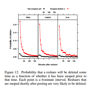 In terms of getting people to delete their posts, the most successful debunking links were things like “those ‘photos of Trayvon Martin the media doesn’t want you to see’ are not actually of Trayvon Martin“. They also found that while more false rumors are shared, true rumors spread more widely. Not a definitive paper by any means but a fascinating initial look at the new landscape. Love it or hate it, social media is not going away any time soon, and the more we understand about how it is used to spread information, the better prepared we can be3.
Okay, so what am I taking away from this week?
- If bullshit falls in the forest and no one hears it, does it make a sound? In order to fully understand bullshit, you have to understand how it travels. Bullshit that no one repeats does minimal damage.
- Bullshit can grow in different but frequently overlapping ecosystems Infotainment, the psuedo-profound, and close social networks all can spread bullshit quickly.
- Analytical thinking skills and debunking do make a difference The effect is not as overwhelming as you’d hope, but every little bit helps
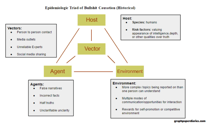
I think separating out how bullshit grows and spreads from bullshit itself is a really valuable concept. In classic epidemiology disease causation is modeled using the “epidemiologic triad“, which looks like this (source):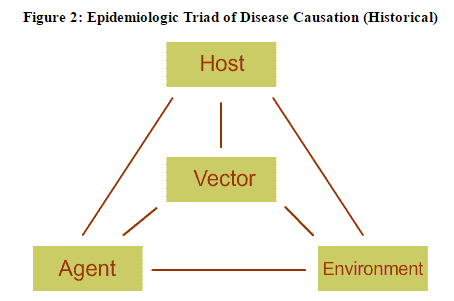
If we consider bullshit a disease, based on the first three weeks I would propose its triad looks something like this:
And on that note, I’ll see you next week for some causality lessons!
Week 4 is up! If you want to read it, click here.
1. If you want a much less polite version of this rant with more profanity, go here.↩
2. My absolute favorite part of this study is that part way through they included an “attention check” that asked the participants to skip the answers and instead write “I read the instructions” in the answer box. Over a third of participants failed to do this. However, they pretty much answered the rest of the survey the way the other participants did which kinda calls in to question how important paying attention is if you’re listening to bullshit.↩
3. It’s not a scientific study and not just about bullshit, but for my money the single most important blog post ever written about the spread of information on the internet is this one right here. Warning: contains discussions of viruses, memetics, and every controversial political issue you can think of. It’s also really long.↩

 Time to run