Welcome to Grade the Infographic, which is pretty much exactly what it sounds like: I take an infographic and grade the data in it. I have three criteria I’m looking for in my grading: source of data, accuracy of data and accuracy of visuals. While some design choices annoy me, I’m not a designer, couldn’t do any better, and won’t be commenting unless I think it’s skewing the perception of the information. I’m really only focused with what’s on the graphic, so I also don’t assess stats that maybe should have been included but weren’t. If you’d like to submit an infographic for grading, go here. If you’d like to protest a grade for yourself or someone else, feel free to do so in the comments or on the feedback page.
Welcome to Grade an Infographic and Happy St Patrick’s Day! I thought I’d go with a bit of a theme this month. A quick look around the web led me to this infographic from the History Channel:
Okay, to start things off, let’s take a look at the references.
Oof. History Channel, really? Not good. You give me the edition for the Holidays Festivals and Celebrations of the World Dictionary, but not a specific link for information? Some of those looked slightly useful so I didn’t do a full 10 points off, but not a great start.
This is one of the problems when big groups put out infographics with no sources. I don’t know where this came from, and now the first 2 pages of google results cite this infographic as a source.
Okay, not bad. As with any historical figure, these are somewhat in dispute. However, these seem to be the most commonly agreed upon ones.
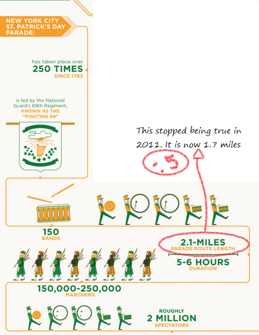
So the parade length changed in 2011, and since there’s not a date on this infographic I took half a point off. By the way….best line from the parade FAQ: “The Parade has not been cancelled due to bad weather. That said, the Parade has marched in a variety of meteorologic conditions that have included various examples of inclemency.”
So apparently greenchicagoriver.com let its domain registration lapse last year and it’s now a site in a language I don’t read. Still, I found some data here and baby names here. The crowd number discrepancy confused me until I realized the 100,000 is probably an estimate of those who watch the dye go in, and 400,000 is the estimate of those who see it throughout the day.
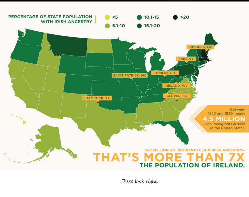
These all look about right, based on what’s listed here. Digging a little, it looks like they may be 2011 numbers?
Okay, and there we go! Based on the Census Bureau table here, this looked about right.
Overall, a pretty nice effort from the History Channel. The only downside was a lack of useful sources and a lack of a year. With the internet being what it is, ALL infographics should really have a year of creation so people don’t continue to quote things past the dates they are valid. This goes double for large websites that know they get a lot of traffic.
Working with Ben always gets me thinking about movies, so this month I decided to poke around at some of the research studies done on film in general. I was pretty interested when I found this study called “The Emotional Movie Database (EMDB): A Self-Report and Psychophysiological Study“. The Internet Movie Database is one of the best known resources for movie information online, so I was curious what the Emotional Movie Database would be.
Basically it’s a database of movie clips tested and validated to generally produce specific emotions in people. Attempting to induce certain emotional states in people is common in psychological research, but normally people use just still pictures. These researchers thought audio free movie clips might be helpful, as they can sustain the emotion for a bit of time. Here’s the study:
I wasn’t able to fit all the particular movies in the sketchnote, but here they are. I didn’t include the exact scenes because the horror ones were kinda gross, but they are in the paper itself. The researchers were from Spain (edit: and Portugal), so not all are American movies:
Horror:
The Ruins
Texas Chainsaw Massacre: The Beginning (2 scenes)
Midnight Meat Train
Hostel
Hostel 2
Midnight Meat Train (2 scenes)
Cannibal Holocaust
The Rest Stop
Erotic:
Underworld: Evolution
Playboy’s Clip
9 Songs (2 scenes)
Killing Me softly
Kama Sutra: the sensual art of lovemaking (2 scenes)
Monamour
Diary of a Nymphomaniac (2 scenes)
Negative Social Interactions:
Boogeyman
The descent
The Pianist
Diary of a Nymphomaniac
Mystic River (2 scenes)
Boogeyman 2
Bridge to Terabithia
American Beauty (2 scenes)
Social positive interactions:
This Girls Life
My Best Friend’s Girls
Good Luck Chuck
Ruins (2 scenes)
Lie With Me
Last Chance Harvey
Diary of a Nymphomaniac (2 scenes)
The Rest Stop
Scenery: Disney’s Earth
Objects: Researchers filmed their hands fiddling with objects.
The most interesting part of this list is that some of the most consistently rated happy social scenes actually come from the beginnings of horror movies:The Ruins and The Rest Stop. That puts an interesting spin on what the film makers actually are doing….heightening tension by unequivocally showing happiness first.
To note, the subjects rating these clips were all college students from Spain or Portugal. YMMV.
Well hi there! Ben and Bethany here, and we’re counting down the top science references in popular music. Last week we went over the rules and introduced Ben, so go check that out first if you’re at all confused. We’re going to start off the rankings nice and slow, beginning with 10 songs that get science right. These are the good guys.
“Sounds of Science” by the Beastie Boys Nominated Line: “Dropping Science like Galileo dropped the orange” (3:08 mark)
Bethany: Ooh, we’re starting off with a good one here. Can I just say I love this line? And not just because Neil Degrasse Tyson uses it in his show intro for Star Talk. No, I love it because 1. the reference is not the obvious fruit based scientist one* and 2. it’s being used accurately and describes something not quite intuitive. The reference here is to the Leaning Tower of Pisa experiment. While the details are probably apocryphal, the legend goes that Galileo went to the top of the Leaning Tower of Pisa, dropped an orange and a grape off the side, and used it to prove that gravity was not dependent on the mass of the object. Nice high school physics callback there.
*I mean, good job on the gravity thing and all Newton, but you’re getting a little cliche don’t you think?
Ben: Bethany, thanks again for having me. This is basically everything I like to do, put together in one blog post, and the best part is I get to hand off all the tricky research parts of it to someone much more qualified than me. I’m not even certain what my Google search history would look like if I were in charge of both jobs, but my first search would probably be, “what IS science?” and that’s probably a rough place to start.
“Sounds of Science” is a collection of everything I like about the Beastie Boys – showboating rapping, frenetic changes of pace, ludicrous levels of hyperbole. They make sure to brag about their prowess in… every possible context, compare themselves to Jesus Christ, then sing a Simon and Garfunkle chorus on top of a Beatles sample. They don’t lack for confidence.
As for the science, all of it seems fair – after all, “with my nose I knows and with my scopes I scope” is certainly factually accurate. I’m glad Bethany’s here, though, because I could use an explanation of what, exactly, “the radium, EMD squared” means.
Bethany: Well in addition to rhyming with “Shea Stadium”, the radium thing appears to be an incredibly clever reference. Paul’s Boutique, the album this song was on, came out in mid-1989. We can assume most of the songs on it were written or recorded in 1988, and the atomic number of radium is…..88. Thank God they didn’t record it earlier or later, because Francium and Actinium just don’t roll of the tongue quite as well.
Based on my research, the EMD squared thing actually should have been your wheelhouse. EMD was the distribution arm of Capitol Records, their label. The squared part of course is a reference to Einstein’s mass/energy equivalence formula.
Ben: That’s a pretty classic Beastie Boys move – it’s clever, it scans, it’s a little sloppy and doesn’t quite fit – but you can’t stop and look at it too closely, because by then the boys are three verses ahead of you.
“We Didn’t Start the Fire” by Billy Joel Nominated line: Multiple mentions but I like “children of thalidomide” (1:50 mark)
Bethany: How do you pick a reference out of a song that is literally all references? Arbitrarily, that’s how. Actually, this isn’t totally arbitrary. Joel’s song here is an anthem covering lots of major world shaping events, and I actually really appreciated him throwing a medical reference. Thalidomide was a drug given as a sedative that was also prescribed to pregnant women for morning sickness. Despite assurances from the company that it was “completely safe” it was actually quite dangerous and resulted in children with deformities…most notably limbs that never grew and a 50% mortality rate. It’s an incredibly depressing story, but it helped push forward drug regulation and the role of the FDA in monitoring drug development. I give Joel full credit here for recognizing the importance of this historic event.
Ben: Well, this is a bummer. I hadn’t known any of this.
You wouldn’t know how dark the lyrics are from listening to the song. I’d always been aware that “We Didn’t Start the Fire” was supposed to be a protest song, but actually experiencing the song means listening to an aggressively upbeat number that is supposed to ironically contrast with the song’s content, but mostly just turns it into a catchy can-you-sing-along? contest.
As I think will become a continual theme for my responses, I highly recommend watching the entire music video, if only for the surreal moment of watching Billy Joel play an imaginary pair of bongos in front of a flaming picture of the execution of Nguyễn Văn Lém. In fact, Joel is playing imaginary bongos a fair bit during this song, as I guess that’s his go-to motion when he gets nervous. I get you, bro.
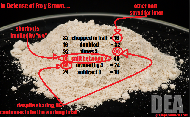
“Affirmative Action” by Foxy Brown Nominated line: “32 grams raw, chop it in half, get 16, double it times three/We got 48, which mean a whole lot of cream/Divide the profit by four, subtract it by eight/We back to 16.” (3:34 mark)
Bethany: Ms Brown’s lyrics have caused quite a stir, and got her voted the all time 5th worst rap line of all time by About.com. This line reminds me of one of those stupid Facebook math problems where someone makes an equation purposefully unclear then everyone argues over order of operations like that’s a thing we really all care about. However, let it never be said that I’m not willing to take sides in an argument I find stupid. Thus, here you go:
The only slight ding I give her is changing units half way through the problem, from grams to profits.
Ben: I like how you used an actual DEA photograph of heroin for the picture. Make sure everyone knows you didn’t just have that lying around.
I think Ms. Brown is significantly mistreated for her honesty in this song. This is actually not a Foxy Brown song, but a Nas song featuring remaining members of “The Firm” (AZ, Cormega, Brown), bragging about their heroin and coke-dealing exploits. The first three rappers spend their verses explaining what kind of cars they’ve purchased, except for Nas, who seems to have a bit of a death wish and spends half his verse on the reality of response killings.
It’s clear that Ms. Brown is in charge of the day-to-day business operations, and if she’s got to cut into the purity of her product in order to make a profit, that’s something she’s willing to do. She’s a business, man. And she doesn’t mind telling you how she goes about it.
Though it does seem like it would cut into any future profits to admit that you’re not giving out top-of-the-line material. This song is basically “The Big Short,” but for drug dealing.
Bethany: Reading your explanation makes me remember all the math problems I did in high school where they irritated me by adding superfluous words to “challenge” us. I DON’T CARE WHY SUZY AND JOHNNY WANT ORANGES JUST GIVE ME THE NUMBERS.
Ben: I was always the opposite, I wanted more backstory. WHAT’S GOING TO HAPPEN WHEN THE TRAINS PASS? IS THERE SOMETHING WRONG WITH THE TRACKS? HOW MUCH TIME DO WE HAVE BEFORE THIS WHOLE THING IS BLOWN TO HELL? *furious hacking motion on imaginary keyboard* GET OUTTA THERE, JIMMY, YOU’RE NOT NOT GONNA MAKE IT!
“Why Does the Sun Shine?” by They Might Be Giants Nominated Lyric: Whole Song
Bethany: They Might Be Giants has a whole album of kids songs called “Here Comes Science” and this is one of the most popular songs off that album. While it plays slightly fast and loose with describing the exact composition of the sun, they retain full credit because they wrote their own rebuttal song clarifying where they’d simplified things. That actually puts them ahead of at least 30% of practicing scientists.
Ben: Guys. Guys. I learned so much from this song. Copper can be a gas?
History of Everything (Big Bang Theory theme song) by Barenaked Ladies Nominated line: Whole Song
Bethany: If you’re a science geek, hold Sheldon Cooper up as a hero, and have an hour or two to kill, go read this post and thread to get excruciating detail on how accurate this song is. For everyone else, don’t cite it in your PhD thesis, but it’s actually pretty close. Plus, it’s popular and admire any band that can make a song with that level of detail catch on.
Ben: To all the Barenaked Ladies haters out there, you should know that I’m basically these people whenever someone takes any shots at BNL.
I’d never actually listened to the entire song before, just the short bit that plays before “Big Bang Theory” episodes, and I enjoyed yet again learning things. Our universe is going to start contracting? Guys, I have not been paying attention to anything. My mind was blown before Kevin Hearn* had even started his keyboard solo.
*Yes, I do know the name of Barenaked Ladies’ keyboardist. Don’t step to me.
Bringing up BNL actually brings up some me-and-Bethany ties, because when I was in 8th grade, my dad took me and her younger brother Tim to a massive outdoor festival in downtown Boston, dropped us off, and arranged to meet us in about 8 hours* at a Dunkin Donuts about a mile away. This was before the age of cell phones. I have literally no idea what would have happened if we hadn’t shown up. Bethany was justifiably furious, as she had been denied going to go see Ani DiFranco earlier that month with friends, and she was a high school junior at the time.
* It was a long concert. The show’s lineup was: The Corrs, Edwin McCain, Sister Hazel, BNL, and Hootie and the Blowfish. My first concert was the most 90’s concert of all time.
Bethany: Thanks for reminding me of this incident. I haven’t harassed my parents about this injustice in years. They’re due for another round. Also, Barenaked Ladies haters only exist in highly controlled lab experiments, not in the wild.
Ben: Oh, phew. I’ll put my Internet Comment Gun back in its holster, then.
In the least shocking development ever, we appear to be going a bit long here. The next 5 songs will be split off into Part 2, going up next week. Don’t wait until then to complain to us about what we missed, feel free to start now.
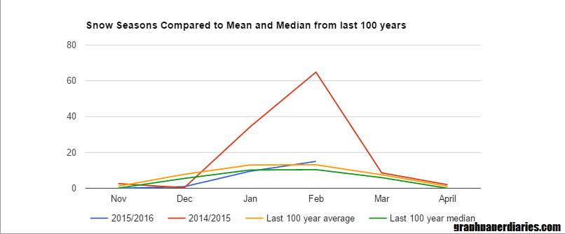
Mid-March is here, and all of Boston is breathing a sigh of relief that this winter was more “normal” than last winter. Last winter was completely record breaking in terms of snow, and we all have a bit of a hangover from it. I was discussing this with a few people at work, and we started to wonder what “normal” really looks like for this area. Obviously this meant I needed a graph! I wanted to check out what the snow curve normally looks like for each winter, and I found some decent looking data here. A few notes:
The data is almost 100 years worth….1920 through 2016
After 1936, measurements are from Boston Logan Airport. Apparently that’s when the weather station opened there. I’m not completely sure where they came from prior to that, but presumably it was somewhere in the area.
For all data, the year means “season ending in”. So my 2016 totals include November and December of 2015.
I only looked at November-April. October and May have both had snow, but the snow that fell in those months has never gone over 1.5 inches for any season.
Okay, so what’s normal? First I took a look by month. The blue box represents the middle two quartiles, or where half of all years fall. The lines on either end are the top/bottom 25% of years:
So it appears January and February are approximately equal for most years, but February can pack a bigger punch.
But let’s just look at averages for the months, then see where last year and this year fall:
Interesting. This shows that this year we actually had a slightly above average February, we just didn’t notice because last year was insane.
Okay, but what about total snowfall? Where are we so far?
Well, since 1920, here’s what it takes to make each quartile:
Min
8 inches
25% of winters
< 28 inches
Median
< 39 inches
75% of winters
< 53 inches
Maximum
112 inches
As it stands right now, Boston has gotten about 25 inches of snow so far this winter. That puts us in the lowest quartile for snowfall. We’re not quite the least snowy winter in recent memory (2012, 2007 and 2002 all had less snow), but we’re certainly on the lower end. Only 18 years (since 1920)
So basically we have a year with legitimately low snow totals that was preceeded by a year with outrageous snow totals.Kind of explains the whiplash.
But where are we on the whiplash scale? Is this the biggest year to year change in snow totals ever?
Well, we hit a record for that this year for sure. An 87 inch difference in snowfall totals for consecutive years is pretty record breaking. Interestingly though, there were two streaks I found that actually gave people whiplash for 4 years in a row. The 1994-1997 run, where the snow totals swung up to almost 100 inches for two winters (1994 and 1996) and then hit low totals on the alternating years (16 inches and 30 inches in 1995 and 1997, respectively). 2002-2006 was similar, though less dramatic. In order to compete, 2017 will have to hit 90 inches or more of snow.
Hi everyone! After 10 weeks on basic internet science, I thought it might be fun to switch things up a bit. For the next few weeks (more if we get inspired), I’ve invited a very special collaborator to help me put together a definitive guide to the good, the bad and the ugly of science/math references in popular music.
Say hi to Ben!
Ben is a childhood friend of mine who runs ten-four films, his own blog, is funny on Twitter, and he watches movies. He grew up without a TV, so of course he rebelled and became a professional film maker. He’s a font of knowledge on music in general and indie rock in particular, and is the kind of person that responds to emails like “what’s up with Rivers Cuomo?” with multi-page missives that are just a few citations short of being a media studies doctoral thesis. Since that kind of brilliant obsessiveness is one the traits I most value in others, Ben has always been one of my go tos for all things pop culture. If you want to get a sense of where he’s coming from, check out his favorite albums, TV shows, songs, and movies of 2015.
Anything else you’d like to tell the nice people Ben?
Ben: Hello! And thanks for having me. As Bethany mentioned, this is the sort of thing I do when only vaguely prompted, or sometimes entirely unprompted, and for an audience that often consists of only myself. As Dante once noted, you have to follow your own star.*
*I’m mostly sure this is a Dante quote, but the Internet might be fooling me again.
I like appearing on this site, because it gives me a veneer of intellectual robustness, which is somewhat undercut by the fact that I had to use a thesaurus site right there because I couldn’t remember the word “robust.”
Okay, so what are the rules here?
Both Ben and I have a healthy dose of petty despot in us, so everything’s subject to change at our whim. However, here’s how we started:
We kept the definition of “science songs” pretty broad. We decided to include things that referenced math, scientists and medicine, in addition to more general science stuff.
We drew the line at “science”. Some people try to sneak what are basically “geek” references on to science lists. Dungeons and dragons, while geeky, is not actual science.
The whole song didn’t have to be about science. I’m a pretty big fan of the one line reference, so sometimes that’s all it took to make the list.
I classified how good the science was according to my own whims, Ben classified how good the song was according to his. Ben’s a filmmaker, my taste in music is terrible. It works better this way. Basically, if you don’t think the song should have made the list it did, complain to me. If you don’t like it’s order on the list, complain to Ben.
Wait, Ben, did I just make those rules up or is that how you did things too?
Ben: You made all those rules up. I just followed your lead. But I think we ended up contributing a roughly equal amount of songs to this endeavor, and I think it’s pretty telling we both had mental lists of songs in which we had either applauded or been irked by the science displayed.
Frankly, this is a pretty ideal setup, with you placing the ball on the tee for me here. I’m glad to be Waldorf to your Statler.
Now that you’re all up to speed, we’ll see you next Sunday for “Ten Songs that Got Science Right”.
Well hi! If you got here via Google, this is probably not the type of post you are looking for. This one has math, and the only pictures are graphs. Sorry about that.
For everyone else, welcome to “From the Archives” where I revisit old posts to see where the science (or my thinking) has gone since I put them up originally.
Back in 2013, a concerned reader had sent me a headline that warned men about a terrible scourge depriving them of all that was good in life. Oh yes, I’m talking about housework. The life advice started from the headline “Want to Have More Sex? Men, stop helping with chores.” The article covered at study that had devised a mathematical model of a couples sexual frequency vs the number of chores they did. I couldn’t resist, and ended up writing a post called “Sex, Models and Housework“. It’s still one of my most viewed posts, though probably not the most read.
A few things to know about the original study (found here):
That headline was pretty misleading. The study never said that men who didn’t do chores had more sex, the study said that men who did more traditionally female chores had less sex. Men who did more traditionally male chores actually had more sex.
Despite being released in 2013, the data the study used was from 1992. The people in the study had an average age of early to mid 40s at that time, so this is a study looking at Baby Boomers and their relationships in the early 90s. With shifting culture, this is important to keep in mind.
The model extrapolated out to men who do 100% of the traditionally female housework. One of my core concerns was how many data points they had in that range, or if they extrapolated beyond the scope of the model. Men reported doing an average of 25% of the “traditionally female chores” at baseline, with a standard deviation of .19. It does not look likely they had many men in the 100% range, and those relationships may have had something else unusual going on.
Given #3, you’ll excuse me if I doubt that this model really should have been perfectly linear:
Those were my original thoughts, and rereading the paper I wanted to add a few more:
One point I can’t believe I didn’t mention the first time around is the inherent selection bias in this data. You had to be a married couple to be included in the data. So a hypothetical couple who had an uneven distribution of housework and divorced was not counted. To be perfectly fair, they did take a bit of a look at this. These respondents were surveyed in 1988 and then again in 1992-1994. They did look at those who were married in 1988 but divorced by 1992 to see if the chore distribution/sexual frequency was different. It wasn’t. However, given the ages of the respondents (born in the 40s-60s) many of them could have actually already been divorced before 1988 rolled around1. Additionally, those who are going through a divorce or in an otherwise rocky marriage likely didn’t take part in the survey. We don’t know if those numbers would have changed things, but I think we have reason to suspect that those most bothered by chore arrangements would be more likely to divorce.
The women in the study worked an average of 15 hours fewer per week than men at paid labor. The women in the study spent 18 more hours per week than men at household chores. It’s worth noting that an “average” man in this study doing half of the chores would have actually been doing more labor for the house than the “average” woman. It would have been interesting to see a total on “labor for household” to see what the effect of an even vs uneven total workload was. This is important to rule out that it’s not the “gender” of the chores, but potential perceived unfairness that drives the decrease in sex.
Child care hours were not included anywhere for either partner.
Other than that, how has this research fared?
Well, as you can imagine, it caused a stir in academic circles. There was a New York Times Magazine cover story about it provocatively asking “Do More Equal Marriages Mean Less Sex?” based heavily on the study. Many people walked away concerned about the age of the data, and how applicable it was to people over 20 years later. Researchers from Georgia State University were able to (somewhat) replicate the study (pre-published copy) using data from 2006. A few things about that study:
The study population was younger by about a decade and less wealthy than the original study population, and they had more sex overall
Cohabiting but not married couples were included, but couples without children were not.
They tossed 10 respondents who said they had sex 50 times a month
This study ended up with three categories of couples: traditional, egalitarian, and counter-conventional. Of those
Egalitarian: Divided housework approximately evenly, with anywhere from a 35%-65% split. This group was 30% of the sample size had the most sex and highest satisfaction.
Traditional: The woman did more than 65% of the housework. This was about 63% of the sample, and had slightly less sex and women had slightly less satisfaction than the egalitarian couples.
Counter-cultural: The man did more than 65% of the housework. This was only 5% of the sample size, and did not work out well. These couples had a lower sexual frequency than either of the first two groups, and were less satisfied overall.
I felt thoroughly vindicated by this line “No research, however, has considered the possibility that the observed effect of men’s shares of domestic labor on sexual frequency and satisfaction could be non-linear.”
So I was at least correct in my concerns. Presuming that this data holds, the line is likely fairly straight until it hits the extreme on one end, then plummets. Interestingly, this study still didn’t compare total labor, and the women in this study worked 20 hours fewer at paid labor than the men, and about 15 hours more per week in housework. Again, child care was not included in the work totals. Since this group was younger, it’s likely at least some of that discrepancy is child care.
So where does this leave us?
Well, it looks like my concerns about assuming a linear model are valid, and that assuming relationships haven’t changed between Baby Boomers and Gen Xers is not a great idea. While some changes to marital set ups can have a negative effect (say a wife working longer hours) they are frequently immediately offset by a positive effect (increased income). This paper here has some interesting examples of these sorts of trade offs. I’m increasingly convinced that the details of the division of labor matter much less than sufficient and equally divided labor.
I would love to see a break down of just the couples on the “man doing all the housework” end. In the second study that was only 24 couples, and we don’t know if the arrangement was through conscious choice or because of circumstances such as unemployment. In fact, I think further research should ask people “how much does your current relationship reflect your expectations prior to the relationship?”. That might catch some of the effect of cultural script changes better than just asking people what they are doing.
Regardless, I have to go do some dishes.
1. According to this the median age at first marriage in 1975 was 21. If you got married in 1975, your chance of being divorced 13 years later was about 30%. This is not a negligible amount of people ↩
And one more thing about bullshit and rage….for anyone who is overwhelmed or perplexed by the current state of politics, I read this blog post once a month to keep myself grounded: The Toxoplasma of Rage. It’s a great reminder that your ingroup is persecuting my ingroup, and that you really need to stop. My ingroup is far too busy enumerating the faults of your ingroup to have time to deal with this crap.
These are some interesting numbers on growing American commute times. Apparently I spend 20.8 days a year commuting. I resent the “wasted life” part though. Between the train and the bus I get a lot of reading and thinking done. That’s pretty much what I would have done with that time if I had my druthers anyway.
This was an interesting piece about how to make science fairs better. I like the idea of a myth busters style fair. That could get fun.
There’s an interesting Vox piece about health/science journalism and how it’s a good way of losing friends. I liked the piece, but I think she left out the issue of policy recommendations. It’s one thing to talk about evidence for a problem, and it’s another thing to talk about policy recommendations. Very often we see people start with the former, end with the latter, then claim all criticism is because people “don’t like evidence”. At work when this happens, we have one doctor who will immediately announce “you realize we just all wandered in to an evidence free zone right?”. I like him. Anyway, describing a problem and prescribing solutions are two different things, and if you mix them up you are DEFINITELY going to lose some folks.
All right, we did it! 10 topics, 10 weeks, and a whole slew of examples. I’ve had a lot of fun, gotten some great feedback, and had some very kind comments from some very lovely teachers. It’s also given me some good ideas for some ongoing posts. In the talks I give I almost never have time to get in to any actual math, but hey, what’s the point of having a blog if you can’t go on and on about the stuff you like? I’ll probably be calling that “crazy stats tricks” and at a minimum I’ll cover some of the topics I complained about in Part 7. Any suggestions for that series, or feedback on this series is welcome either in the comments or on the feedback page.
Now that I have that out of the way, lets take a moment to reflect on what we’ve learned, eh? Overall, there are four P’s:
Proof: Using Facts to Deceive
In Parts 5, 6, and 7, we covered “the truths people use to lie with”. Here we covered information that is true, but used to give false impressions. We started with stories and anecdotes, which are often used to humanize and emphasize various points. Next we moved on to experts and balance, and how we need to be careful who we listen to and who we dismiss. Finally I gave a woefully short and incomplete overview of some statistical tricks that get used a lot.
This will likely not be of interest to anyone who hasn’t taken a probability theory class, but I’ve been a little obsessive about probability distributions and how they relate to each other. This is my way of dealing with that.
Meet Mr Uniform Distribution, the continuous one that is. A continuous uniform probability distribution is one that has a continuous probability for all points from “a” to “b”. You can learn the technical piece here or the Wikipedia version here, but I’m mostly focused on what he would look like as a cartoon character.