Quite some time ago I did a blog post about some research out of Israel on personalized glucose responses. The study helped people test their own unique glucose response to various types of foods, then created personalized diet plans based on those foods. They found that some foods that were normally considered “healthy” caused extreme responses in some people, while some foods often deemed “unhealthy” were fine. I had mentioned that I wanted to try a similar experiment on myself, and yet I never did…..until now.
Recently the authors of the study came out with a book called “The Personalized Diet” which goes over their research and how someone could apply it to their life. While they recommend testing various meals, I decided to start testing specific carbohydrates sources from fruit, grains or starches to see what things looked like. I adhered to a few rules to keep things fair:
- I tested all of these at midday, noon or 2pm. Glucose response can vary over the course of the day, so I decided to try midday on weekends. The tests below happened over a series of weeks, but all at the same time of day.
- Each serving was 50g of carbohydrates. I’ve seen people do this with “effective carbs” (carbs-fiber) or portion size, but I decided to do this with just plain old carbs.
- I ate all the food in 15 minutes. The times below represent “time from first bite” but I tried to make sure I had finished off the portion at around the 15 minute mark.
- I tried not to do much for the first 60 minutes, just to make sure the readings wouldn’t be changed by exercise/movement.
- I’ve only tried each food item once. Technically I should do everything twice to confirm, but I haven’t had time yet.
Now some results! I don’t have a ton of data yet, but I thought my haul so far was pretty interesting. Note: my fasting glucose is running a bit high, which is why I’m interested in this experiment to begin with. First, my fruit experiments:
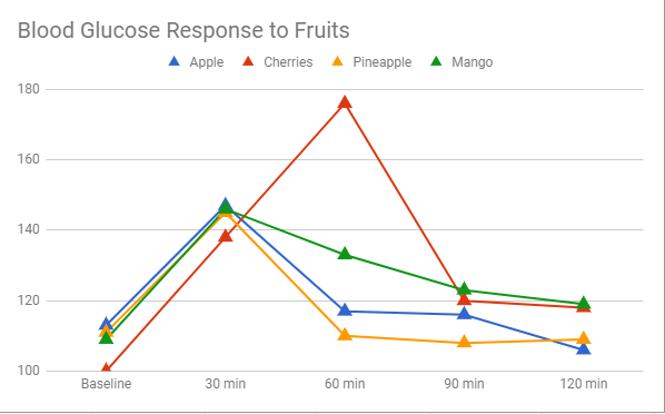
Wow, cherries, what did I ever do to you? I was interested to see that so many fruits were identical, with one major outlier. I would never have thought something like pineapple would be so different from cherries. While I should probably repeat the measurement, it kind of supports the idea that some food responses are a bit unusual.
Next, my starches/grains. Note the shift of the peak from 30 minutes for fruit, to 60 minutes for most of these foods:
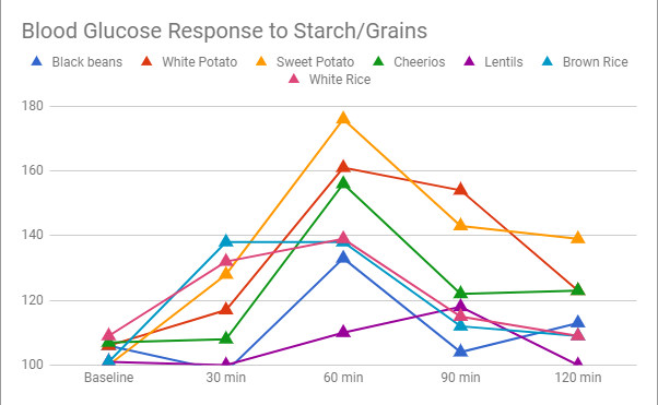
A couple of interesting things here:
- I was surprised how much higher the variability was.
- Sweet potatoes apparently are not my friend
- Kind of surprising that white rice and brown rice were almost exactly the same
- Beans and lentils were the lowest reaction of any food I tested
Overall I thought these results were very interesting, and I’ll have to consider how to use them going forward. My next step is going to be to try to expand this list, and then move on to some junk food/fast food/takeout meals to see if my response is significantly different to things like burgers and fries vs pizza. That should be interesting. I’ll probably base that on a serving (or at least the serving I eat) as opposed to carb count. If I get really crazy I may try some desserts or maybe some alcohol. You know, for science.
Let it never be said I’m not willing to suffer for my art.
/cdn.vox-cdn.com/uploads/chorus_asset/file/9999425/chart2.png)


