6 Examples of Correlation/Causation Confusion

When I first started blogging about correlation and causation (literally my third and fourth post ever), I asserted that there were three possibilities whenever two variables were correlated. Now that I’m older and wiser, I’ve expanded my list to six:

  1. Thing A caused Thing B (causality)
  2. Thing B caused Thing A (reversed causality)
  3. Thing A causes Thing B which then makes Thing A worse (bidirectional causality)
  4. Thing A causes Thing X causes Thing Y which ends up causing Thing B (indirect causality)
  5. Some other Thing C is causing both A and B (common cause)
  6. It’s due to chance (spurious or coincidental)

The obvious conclusion is that years spent blogging about statistics directly correlates to the number of possible ways of confusing correlation and causation you recognize.

Anyway, I’ve talked about this a lot over the years, and this lesson is pretty fundamental in any statistics class…though options #3 and #4 up there aren’t often covered at all. It’s easily forgotten, so I wanted to use this post to pull together an interesting example of each type.

  1. Smoking cigarettes cause lung cancer (Thing A causes Thing B): This is an example I use in my Intro to Internet Science talk I give to high school students. Despite my continued pleading to be skeptical of various claims, I like to point out that sometimes disbelieving a true claim also has consequences. For years tobacco companies tried to cast doubt on the link between smoking and lung cancer, often using “correlation is not causation!” type propaganda.
  2. Weight gain in pregnancy and pre-eclampsia (Thing B causes Thing A): This is an interesting case of reversed causation that I blogged about a few years ago. Back in the 1930s or so, doctors had noticed that women who got pre-eclampsia (a potentially life threatening condition) also had rapid weight gain. They assumed the weight gain was causing the pre-eclampsia, and thus told women to severely restrict their weight gain. Unfortunately it was actually the pre-eclampsia causing the weight gain, and it is pretty likely the weight restrictions did more harm than good.
  3. Dating and desperation (Thing A causes Thing B which makes Thing A worse): We’ve all had that friend. The one who strikes out with everyone they try to date, and then promptly doubles down on their WORST behaviors. This is the guy who stops showering before he takes girls out because “what’s the point”. Or the girl who gets dumped after bringing up marriage on the third date, so she brings it up on the first date instead. This  is known as “bidirectional causality” and is less formally known as “a vicious cycle”. In nature this can cause some really amusing graph behavior, as in the case of predators and prey.  An increase in prey can cause an increase in predators, but an increase in predators will cause a decrease in prey. Thus, predator and prey populations can be both positively AND negatively correlated, depending on where you are in the cycle.
  4. Vending machines in Schools and obesity (Thing A causes Thing X causes Thing Y which then causes Thing B): One obvious cause of obesity is eating extra junk food. One obvious source of extra junk food is vending machines. One obvious place to find vending machines is in many schools. So remove vending machines from schools and reduce obesity, right? No, sadly, not that easy.  In a longitudinal study that surprised even the authors, it was found that kids who moved from schools without vending machines to those with vending machines don’t gain weight. What’s interesting is that you can find a correlation between kids who were overweight and eating food from vending machines, but it turns out the causal relationship is convoluted enough that removing the vending machines doesn’t actually fix the original end point.
  5. Vitamins and better health (Some other Thing C is causing Thing A and Thing B):This one is similar to #4, but I consider it more applicable when it turns out Thing A and Thing B weren’t even really connected at all. Eating a bag of chips out of a vending machine every day CAN cause you to gain weight, even if removing the vending machine doesn’t help you lose it again. With many vitamin supplements on the other hand, initial correlations are often completely misleading. Many people who get high levels of certain vitamins (Thing A) are actually just those who pay attention to their health (Thing C), and those people tend to have better health outcomes (Thing B).  Not all vitamins should be tarred with the same brush though, this awesome visualization shows where the evidence stands for 100 different supplements.
  6. Spurious Correlations (spurious or due to chance): There’s a whole website of these, but my favorite is this one:  NicCage

Causal inference, not for the faint of heart.


5 Replication Possibilities to Keep in Mind

One of the more basic principles of science is the idea of replication or reproducibility.  In its simplest form, this concept is pretty obvious: if you really found the phenomena you say you found, then when I look where you looked I should be able to find it too. Most people who have ever taken a science class are at least theoretically familiar with this concept, and it makes a lot of sense…..if someone tells you the moon is green, and no one else backs them up, then we know the observation of the moon being green is actually a commentary on the one doing the looking as opposed to being a quality of the moon itself.

That being said, this is yet another concept that everyone seems to forget the minute they see a headline saying “NEW STUDY BACKS UP IDEA YOU ALREADY BELIEVED TO BE TRUE”. While every field faces different challenges and has different standards, scientific knowledge is not really a binary “we know it or we don’t” thing. Some studies are stronger than other studies, but in general, the more studies that find the same thing, the stronger we consider the evidence. While many fields have different nuances, I wanted to go over some of the possibilities we have when someone tries to go back and replicate someone else’s work.

Quick note: in general, replication is really applicable to currently observable/ongoing phenomena. The work of some fields can rely heavily on modeling future phenomena (see: climate science), and obviously future predictions cannot be replicated in the traditional sense. Additionally attempts to explain past behavior can often not be replicated (see: evolution) as they have already occurred.

Got it? Great….let’s talk in generalities! So what happens when someone tries to replicate a study?

  1. The replication works. This is generally considered a very good thing. Either someone attempted to redo the study under similar circumstances and confirmed the original findings, or someone undertook an even stronger study design and still found the same findings. This is what you want to happen. Your case is now strong. This is not always 100% definitive, as different studies could replicate the same error over and over again (see the ego depletion studies that were replicated 83 times before they were called in to question) but in general, this is a good sign.
  2. You get a partial replication. For most science, the general trajectory of discovery is one of refining ideas.  In epidemiology for example, you start with population level correlations, and then try to work your way back to recommendations that can be useful on an individual level. This is normal. It also means that when you try to replicate certain findings, it’s totally normal to find that the original paper had some signal and some noise. For example, a few months ago I wrote about headline grabbing study that claimed that women’s political, social and religious preference varied with their monthly cycle. The original study grabbed headlines in 2012, and by the time I went back and looked at it in 2016 further studies had narrowed the conclusions substantially. Now the claims were down to “facial preferences for particular politicians may vary somewhat based on monthly cycles, but fundamental beliefs do not”. I would like to see the studies replicated using the 2016 candidates to see if any of the findings bear out, but even without this you can see that subsequent studies narrowed the findings quite a bit. This is not necessarily a bad thing, but actually a pretty normal process. Almost every initial splashy finding will undergo some refinement as it continues to be studied.
  3. The study is disputed. Okay, this one can meander off the replication path here a bit. When I say “disputed” here, I’m referencing the phenomena that occurs when one studies findings are called in to question by another study that found something different, but they used two totally different methods to get there and now no one knows what’s right. Slate Star Codex has a great overview of this in Beware the Man of One Study, and a great example in Trouble Walking Down the Hallway. In the second post he covers two studies, one that shows a pro-male bias in hiring a lab manager and one that shows a pro-female bias in hiring a new college faculty member. Everyone used the study whose conclusions they liked better to bolster their case while calling the other study “discredited” or “flawed”. The SSC piece breaks it down nicely, but it’s actually really hard to tell what happened here and why these studies would be so different. To note: neither came to the conclusion that no one was biased. Maybe someone switched the data columns on one of them. 
  4. The study fails to replicate. As my kiddos preschool teacher would say “that’s sad news”. This is what happens when a study is performed under the same conditions and effect goes away. For a good example, check out the Power Pose/Wonder Woman study, where a larger sample size undid the original findings….though not before TED talk went viral or the book the research wrote about it got published. This isn’t necessarily bad either, thanks to p-value dependency we expect some of this, but in some fields it has become a bit of a crisis.
  5. Fraud is discovered. Every possibility I mentioned above assumes good faith. However, some of the most bizarre scientific fraud situations get discovered because someone attempts to replicate a previous published study and can’t do it. Not replicate the findings mind you, but the experimental set up itself. Most methods sections are dense enough that any set up can sound plausible on paper, but it’s in practice that anomalies appear. For example, in the case of a study about how to change people’s views on gay marriage, a researcher realized the study set up was prohibitively expensive when he tried to replicate the original. While straight up scientific fraud is fairly rare, it does happen. In these cases, attempts at replication are some of our best allies at keeping everyone honest.

It’s important to note here that not all issues fall neatly in one of these categories. For example, in the Women, Ovulation and Voting study I mentioned in #2, two of the research teams had quite the back and forth over whether or not certain findings had been replicated.  In an even more bizarre twist, when the fraudulent study from #5 was actually done, the findings actually stood (still waiting on subsequent studies!).  For psychology, the single biggest criticism of the replication project (which claims #4) is that it’s replications aren’t fair and thus it’s actually #3 or #2.

My point here is not necessarily that any one replication effort is obviously in one bucket or the other, but to point out that there are a range of possibilities available. As I said in the beginning, very few findings will end up going in a “totally right” or “total trash” bucket, at least at first. However, it’s important to realize any time you see a big exciting headline that subsequent research will almost certainly add or subtract something from the original story. Wheels of progress and all that.

5 Ways that Average Might Be Lying to You

One of the very first lessons every statistics students learns in class is how to use measures of central tendency to assess data. While in theory this means most people should have at least a passing familiarity with the terms “average” or “mean, median and mode”, the reality is often quite different. For whatever reason, when presented with a statement about your average we seem to forget the profound vulnerabilities of the “average”. Here’s some of the most common:

  1. Leaving a relevant confounder out of your calculations Okay, so maybe we can never get rid of all the confounders we should, but that doesn’t mean we can’t try at least a little. The most commonly quoted statistic I hear that leaves out relevant confounders is the “Women make 77 cents  for every dollar a man earns” claim.  Now this is a true statement IF you are comparing all men in the US to all women in the US, but it gets more complicated if you want to compare male/female pay by hours worked or within occupations. Of course “occupation and hours worked” are two things most people actually tend to assume are included in the original statistic, but they are not. The whole calculation can get really tricky (Politifact has a good breakdown here), but I have heard MANY people tag “for the exact same work” on to that sentence without missing a beat. Again, it’s not possible to control for every confounder, but your first thought when you hear a comparison of averages should be to make sure your assumptions about the conditions are accurate.
  2. A subset of the population could be influencing the value of the whole population. Most people are at least somewhat familiar with the idea of outlier type values and “if Bill Gates walks in to a bar, the average income goes way up” type issues. What we less often consider is how different groups being included/excluded from a calculation can influence things. For example, in the US we are legally required to educate all children through high school. The US often does not do well when it comes to international testing results. However in this review by the Economic Policy Institute, they note that in some of the countries (Germany and Poland for example) certain students are assigned to a “vocational track” quite early and may not end up getting tested at all. Since those children likely got put on that track because they weren’t good test takers, the average scores go up simply by removing the lowest performers. We saw a similar phenomena within the US when more kids started taking the SATs. While previous generations bemoaned the lower SAT scores of “kids these days” the truth was those were being influenced by expanding the pool of test takers to include a broader range of students. Is that the whole explanation? Maybe not, but it’s worth keeping in mind.
  3. The values could be bimodal (or another non-standard distribution) One of my first survey consulting gigs consisted of taking a look at some conference attendee survey data to try and figure out what the most popular sessions/speakers were. One of the conference organizers asked me if he could just get a list of the sessions with the highest average ranking. That sounded reasonable, but I wasn’t sure that was what they really wanted. You see, this organization actually kind of prided itself on challenging people and could be a little controversial. I was fairly sure that they’d feel very differently about a session that had been ranked mostly 1’s and 10’s, as opposed to a session that had gotten all 5’s and 6’s. To distill the data to a simple average would be to lose a tremendous amount of information about the actual distribution of the ratings. It’s like asking how tall the average human is…..you get some information, but lose a lot in the process. Neither the mean or median account for this.
  4. The standard deviations could be different Look, I get why people don’t always report on standard deviations….the phrase itself probably causes you to lose at least 10% of readers automatically. However, just because two data sets have the same average doesn’t mean the members of those groups look the same. In #3 I was referring to those groups that have two distinct peaks on either side of the average, but even less dramatic spreads can cause the reality to look very different than the average suggests.
  5. It could be statistically significant but not practically significant. This one comes up all the time when people report research findings. You find that one group does “more” of something than another. Group A is happier than Group B.  When you read these, it’s important to remember that given a sample size large enough ANY difference can become statistically significant. A good hint this may be an issue is when people don’t tell you the effect size up front. For example, in this widely reported study it was shown that men with attractive wives are more satisfied with their marriages in the first 4 years. The study absolutely found a correlation between attractiveness of the wife and the husband’s marital satisfaction….a gain of .36 in satisfaction (out of a possible 45 points) for every 1 point increase in attractiveness (on a scale of 1 to 10). That’s an interesting academic finding, but probably not something you want to knock yourself out worrying about.

Beware the average.

Predictions and Accuracy: Some Technical Terms

Okay, so we started off our discussion of Statistical Tricks and Treats with a general post about contingency matrices and the two ways to be wrong, and then followed up with a further look at how the base rate involved in the matrix can skew your perception of what a positive or negative test means.

In this post I’m going to take another look at the contingency matrix and define a few words you may hear associated with them. But first, let’s take another look at that matrix from last week:

Drugsearch

Accuracy: Accuracy is the overall chance that your test is correct in either direction. So we’d have this:

Number of correct search warrants + number of innocent people left alone
Total number of tests run

Note: this SHOULD be the definition used. People will often try to wiggle out of this by saying “it’s accurate 99% of the time when drugs are present!”.  They are hoping the word “accurate” distracts you from their failure to mention what happens when drugs aren’t present. This is the type of sales pitch that leads to innocent people getting arrested and cops who had no idea the were using a test that likely to be wrong.

Sensitivity:  When that hypothetical sales person up there said “it’s accurate 99% of the time when drugs are present!”, what they were actually giving you was the sensitivity of the test. It (along with specificity) answers the question “How often does the test do what we want it to do?” The sensitivity is also called the true positive rate, and it’s basically this:

Correct warrants/arrests
Correct warrants/arrests + bad guys who got away with it

In other words, it’s the number of “correct” positives divided by the total number of positives.  Another way of looking at it is it’s the number in the top row green box over the total number in the top row. A high percentage here means you’ve minimized false negatives.

Specificity: This is the opposite of sensitivity, and in this example it’s the one the sales person is trying not to mention. This is how accurate the test is when drugs are NOT present, aka the true negative rate. It looks like this:

Number of times you left an innocent person alone
Harassed and harassed innocent people whose trash was tested

Basically it’s the number of correctly negative tests divided by the number of total negative tests. It’s also the number in the green box in the bottom row over the total number in the bottom row. A high percentage here means you’ve minimized false positives.

Positive Predictive Value: Okay, so both sensitivity and specificity dealt with rows, and this one deals with columns. Positive predictive value is a lot of what I talked about in my base rate post: if you get a positive test, what are the chances that it’s correct?

As we covered last week, it’s this:

Correct search warrants/arrests
Correction search warrants/arrests + incorrect warrants/arrests

In other words, given that we think we’ve found drugs, what are the chances that we actually have? It’s the green box in the first column over the total number in the first column. This is the one the base rate can mess with BIG time. You see, when companies that develop tests put them on the market, they can’t know what type of population you’re going to use them on. This value is unknown until you start to use it. A high value here means you’ve minimized false positives.

Negative Predictive Value: The flip side of the positive predictive value, this is about the second column. Given that we got a negative test, what are the chances there are no drugs? This is:

Innocent people who go unbothered
Innocent people who go unbothered + bad guys who get away with it

So for the second column, the number in the  green box over the total second column. A high value here means you’ve minimized false negatives.

So to recap:

Sensitivity and Specificity:

  1. Answer the question “how does the test perform when drug are/are not present”
  2. Refer to the rows (at least in this table set up)
  3. High sensitivity = low false negatives, low sensitivity = lots of false negatives
  4. High specificity = low false positives, low specificity = lots of false positives
  5. Information about how “accurate” one of the values is does not give the whole picture

Positive and Negative Predictive value (PPV and NPV):

  1. Answer the question “Given a positive/negative test result, what are the chances drugs are/are not actually present?”
  2. Refer to columns (at least in this table set up)
  3. High PPV = low false positives, low PPV = high false positives
  4. High NPV = low false negatives, low NPV = high false negatives
  5. Can be heavily influenced by the rate of the underlying condition (in this case drug use) in the population being tested (base rate)


All About that Base Rate

Of all the statistical tricks or treats I like to think about, the base rate (and it’s associated fallacy) are probably the most interesting to me. It’s a common fallacy, in large part because it requires two steps of math to work out what’s going on. I’ve referenced it before, but I wanted a definitive post where I walked through what a base rate is and why you should remember it exists. Ready? Let’s go.

First, let’s find an example.
Like most math problems, this one will be a little easier to follow if we use an example.In my

In my Intro to Internet Science series, I mentioned the troubling case of a couple of former CIA analysts whose house was raided by a SWAT team after they were spotted shopping at the wrong garden store. After spotting the couple purchasing what they thought was marijuana growing equipment, the police had tested their trashcans for the presence of drugs. Twice the police got a positive test result, and thus felt perfectly comfortable raiding the house and holding the parents and kids at gunpoint for two hours while they searched for the major marijuana growing operation they believed they were running. In the end it was determined the couple was actually totally innocent. There’s a lot going on with this story legally, but what was up with those positive drug tests?

Let’s make a contingency table!
In last week’s post, I discussed the fact that there is almost always more than one way to be wrong. A contingency table helps us visualize the various possibilities that can arise from the two different types of test results and the two different realities:

Drugsearch

So here we have four options, two good and two bad:

  1. True positive (yes/yes): we have evidence of actual wrongdoing1
  2. False negative (no/yes): someone with drugs appears innocent
  3. False positive (yes/no): someone without drugs appears guilty
  4. True negative (no/no): an innocent person’s innocence is confirmed

In this case, we ended up with a false positive, but how often does that really happen? Is this just an aberration or something we should be concerned about?

Picking between the lesser of two evils.
Before we go on, let’s take a step back for a minute and consider why the police department may have had to consider when they selected a drug screening test to use. It’s important to recognize that in this situation (as in most of life), you actually do have some discretion over which way you chose to be wrong.  In a perfect world we’d have unlimited resources to buy a test that gets the right answer every time, but in the real world we often have to go the cheap route and consider the consequences of either type of error and make trade-offs.

For example, in medicine false positives are almost always preferable to false negatives. Most doctors (and patients!) would prefer that a screening test told them they might have a disease that they did not have (false positive) than to have a screening test miss a disease they did have (false negative).

In criminal justice, there is a similar preference. Police would rather have evidence of activity that didn’t happen (false positive) then not get evidence when a crime was committed (false negative).

So what kind of trade-offs are we talking about?
Well, in the article I linked to above, it mentioned that one of the downfalls of the drug tests many police departments use is a very high false positive rate…..as high as 70%. This means that if you tested 100 trashcans that were completely free of drugs, you’d get a positive test for 70 of them.

Well that sounds pretty bad….so is that the base rate you were talking about?
No, but it is an important rate to keep in mind because it influences the math in ways that aren’t particularly intuitive for most people. For example, if we test 1000 trash cans, half with drugs and half without, here’s what we get:
Drugsearch2

When the police are out in the field, they get exactly one piece of information: whether or not the trash can tested positive for drugs.  In order to use this information, we actually have to calculate what that means. In the above example, we have 495 true positive trash cans with drugs in them. We also have 350 false positive trash cans with no drugs in them, but with a positive test. So overall, we have 845 trash cans with a positive test. 495/845 is about 59%…..so under these circumstances, a positive test only means drugs are present about 60% of the time.

Now about that base rate……
Okay, so none of that is great, but this actually can get worse. You see, the rate of those who do drugs and those who don’t do drugs isn’t actually equal. The rate of those who don’t do drugs is actually much much higher, and this is the base rate I was talking about before.

According to many reports, about 10% of the US adult population used illegal drugs in the past month (mostly marijuana, FYI….not controlled for states that have legalized it). Presumably this means that about 10% of trash cans might contain drugs at any given time. That makes our numbers look like this:

drugsearch3

Using the same math as above, we get 99/(630+99) = 14%. Now we realize that for every positive test, there’s actually only about a 14% chance there are drugs in that trash can. I’m somewhat curious how much worse that is than just having a trained police officer take a look.  In fact, because the base rates are so different, you actually would need a test with an 11% false positive rate (as compared to the 70% we currently have) to make the chances 50/50 that your test is telling you what you think it’s telling you. Yikes.

Now of course these numbers only holds if you’re testing trash cans randomly….but if you’re testing the garbage of everyone who goes to a garden store on a Saturday morning, that may be a little closer to the truth than you want to admit.

So what’s the takeaway?
The crux of the base rate fallacy is that a small percentage of a large number can easily be larger than a large percentage of a small number. This is basic math, but it becomes hard to remember when you’re in the moment and the information is not being presented in a straightforward way. If you got a math test that said “Which value is larger….11% of 900 or 99% of 100?” You’d probably get it right pretty quickly. However, when it’s up to you to remember what the base rate is, people get much much worse at this problem. In fact, the vast majority of medical doctors don’t get this type of problem correct when it’s presented to them and they’re specifically given the base rate….so my guess is the general population success rate is quite low.

No matter how accurate a test is, if the total number of entries in one of the rows (or columns) is much larger than the total of the other, you should watch out for this.

Base rate matters.
1. Note for the libertarians: It is beyond the scope of this post to discuss current drug policy and whether or not this should actually constitute wrongdoing. Just roll with it.

Two Ways To Be Wrong

One of the most interesting things I’ve gotten to do since I started blogging about data/stats/science is to go to high school classrooms and share some of what I’ve learned. I started with my brother’s Environmental Science class a few years ago, and that has expanded to include other classes at his school and some other classes elsewhere. I often get more out of these talks than the kids do…something about the questions and immediate feedback really pushes me to think about how I present things.

Given that, I was intrigued by a call I got from my brother yesterday. We were talking a bit about science and skepticism, and he mentioned that as the year wound down he was having to walk back on some of what I presented to his class at the beginning of the year. The problem, he said, was not that the kids had failed to grasp the message of skepticism…but rather that they had grasped it too well. He had spent the year attempting to get kids to think critically, and was now hearing his kids essentially claim it was impossible to know anything because everything could be manipulated.

Oops.

I was thinking about this after we hung up, and how important it is not to leave the impression that there’s only one way to be wrong.  In most situations that need a judgment call, there’s actually two ways to be wrong.  Stats and medicine have a really interesting tool for showing this phenomena: a 2×2 contingency matrix . Basically, you take two different conditions and sort how often they agree or disagree and under what circumstances those happen.

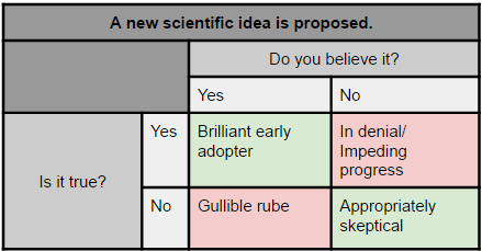
For example, for my brother’s class, this is the contingency matrix:

Skepticalgullible

In terms of outcomes,  we have 4 options:

  1. True Positive:  Believing a true idea (brilliant early adopter).
  2. False Negative (Type II error): Not believing a true idea (in denial/impeding progress).
  3. False Positive (Type I error): Believing a false idea (gullible rube)
  4. True Negative: Not believing a false idea (appropriately skeptical)

Of those four options, #2 and #3 are the two we want to avoid. In those cases the reality (true or not) clashes with the test (in this case our assessment of the truth).  In my talk and my brother’s later lessons, we focused on eliminating #3. One way of doing this is to be more discerning with what we believe or we don’t, but many people can leave with the impression that disbelieving everything is the way to go. While that will absolutely reduce the number of false positive beliefs, it will also increase the number of false negatives. Now, depending on the field this may not be a bad thing, but overall it’s just substituting one lack of thought for another. What’s trickier is to stay open to evidence while also being skeptical.

It’s probably worth mentioning that not everyone gets into these categories honestly…some people believe a true thing pretty much by accident or fail to believe a false thing for bad reasons. Every field has an example of someone who accidentally ended up on the right side of history. There also aren’t always just two possibilities, many scientific theories have shades of gray.

Caveats aside, it’s important to at least raise the possibility that not all errors are the same. Most of us have a bias towards one error or another, and will exhort others to avoid one at the expense of the other. However, for both our own sense of humility and the full education of others, it’s probably worth keeping an eye on the other way of being wrong.

Statistical Tricks and Treats

Well hi!

After 8 fantastic weeks of working with Ben on the good, the bad, and the ugly of Pop Science, it’s time to move on to a new Sunday series.

When I give my talk to high school students, one of my biggest struggles is really not having time to cover any math. That’s  what I really love, but it’s pretty much impossible in a short time frame and when I’ve tried I always feel like I do kids a disservice. I mentioned some of this struggle in Part 7 of my Internet Science series, and I realized I probably have enough to say about this that I can make a whole series about it.

A few likely posts you’ll be seeing:

  1. That sneaky average
  2. Base rates and other shenanigans
  3. Independence and Probability
  4. To replicate or not to replicate
  5. Correlation and causation

If you’d like to see anything else, let me know!