The Signal and the Noise: Chapter 4

I’ve been going through the book The Signal and the Noise, and pulling out some of the anecdotes in to contingency matrices. Chapter 4 covers weather forecasts.

Chapter 4 of this book was pretty interesting, as it covered weather predictions from various sources. It presented some data that showed how accurate weather predictions from various sources were. Essentially the graphs plotted the prediction (i.e. “20% chance of rain”) against the frequency of rain actually occurring after the prediction.  They found that the National Weather Service is the most accurate, then the Weather Channel, then local TV stations.

While that was interesting in and of itself, what really intrigued me was the discussion of whether an accurate forecast was actually a good forecast. People watching the local news for their weather are almost invariably going to make decisions based on that forecast, so meteorologists actually have a lot of incentives to exaggerate bad weather a bit. After all, people are much less likely to be annoyed by the time they brought an umbrella and didn’t need it than the time they got soaked by a storm they didn’t expect. The National Weather Service on the other hand is taxpayer funded to be as accurate as possible, and may end up seeing their track record put in front of Congress at some point. Different incentives mean different choices.

SignalNoiseCh4

To give you an idea of the comparison, when the National Weather Service says the chance of rain is 100%, it’s about 98%. When the Weather Channel says it, it’s about 92%. When a local station says it, it’s about 68%. When Aaron Justus says it….well, this happens:

Rewind: Politics and Polling in 1975

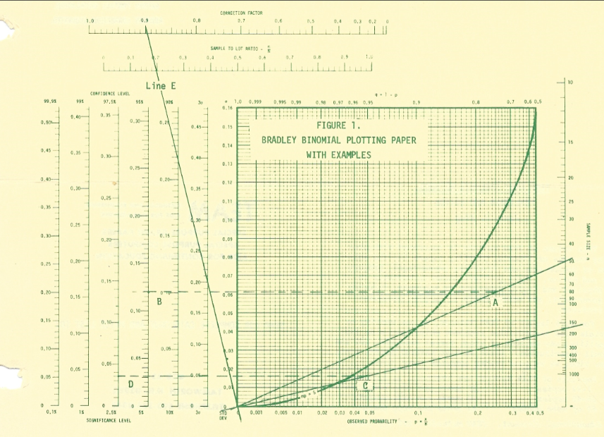
I’ve mentioned before on this blog that my grandfather was a statistician who ran his own company producing probability chart paper. For those of you under the age of 40 (50? 60?) who weren’t raised around such things, this was basically graphing software before there were computers. Probability chart paper manipulated the axes of charts and allowed you to graph fancy distributions without actually have to calculate every value out by hand. Kind of like a slide rule, but for graphing. Not helping the under 40 crowd with that analogy I’m sure.

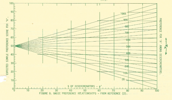
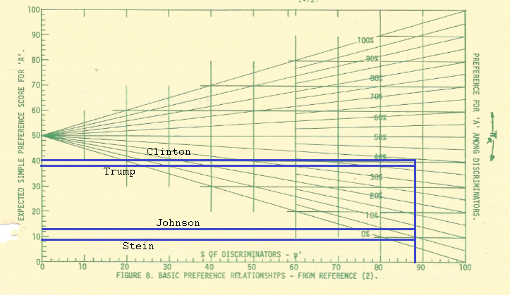
ANYWAY, what I don’t think I’ve mentioned here is that my grandfather also happened to be a stats blogger before computers existed. From 1974 to 1985 he produced a quarterly newsletter teaching people how to use statistics more effectively. I found out a few months ago that my father had actually saved a copy of all of these newsletters, and I’ve made it my goal this summer to read and digitize every issue. While a lot of the newsletters are teaching people how to do hand calculations (shudder), I may be pulling out a few snippets here and there and posting them. Today I was reading the issue from Late Winter (January and February) of 1975, and stumbled across this gem I thought people would appreciate:

TEAMnewsletter1

I still don’t know how he typed all those equations with a typewriter.

Gee, glad things have improved so much.

Fun possibly exaggerated family legend: my grandfather was a Democrat for most of his life, but he hated Ted Kennedy so much he maintained a Massachusetts address for almost a year after he moved to New Hampshire just so he could continue voting against him.

Medical Marijuana and Painkiller Overdoses: Does One Reduce the Other?

I’ve talked before here about the issues with confusing correlation and causation, and more recently I’ve also talked about the steps needed to establish a causal link between two things.

Thus I was interested to see this article in the Washington Post recently about the attempts to establish a causal link between access to medical marijuana and a decrease in painkiller related deaths. There had been studies suggesting that access to medical marijuana was associated with lower rates of overdose related deaths since this JAMA paper was published in 2014, and those findings were repeated and broadened in 2015 with this paper. Both papers found increased access to medical marijuana reduced painkiller related deaths by up to 25% over states with no such access. This showed at least some promise of moving towards a causal link, as it established a reproducible consistent association.

This was not without it’s critics. When the Washington Post covered the story about the 2015 paper, they interviewed a skeptical researcher who pointed out that painkiller users are at higher risk for overdose when they use medical marijuana as well. Proponents of medical marijuana pointed out that this only studied those who were prescribed painkillers. If it could be established that access to medical marijuana reduced the number of painkiller prescriptions being written, then you could actually start to establish a plausible and coherent theory….2 more links on the chain of causality.

Long story short, that’s what this new paper did. They took a look at how many prescriptions your average physician wrote in states with legal medical marijuana vs those without, and found this:

As a balance, they also looked at other drugs that had nothing to do with medical marijuana (like antibiotics or blood thinners) and discovered there was no difference in those prescription rates.

While the numbers for anxiety and depression medication are interesting, they may only translate in to a handful of patients per year. That pain medication number on the other hand is pretty damn impressive. 1,826 doses of painkillers could actually translate in to at least half a dozen patients per physician (if you’re assuming daily use for a year) or more if you’re assuming less frequent use. This gives some pretty hefty proof that medical marijuana could be lowering overdose rates by lowering the number of patients getting a different painkiller prescription to begin with.

I’d be interested to see if there’s a dose response relationship here….within the states that have legal medical marijuana, do states with looser laws/more access see even lower death rates? And do those states with the lower overdose death rates see an increase in any other death rates, like motor vehicle accidents?

Interesting data to ponder, especially since full legalization is on my state ballot this November. Regardless of the politics however, it’s a great example of how to slowly but surely make a case for causality.

Type IV Errors: When Being Right is Not Enough

Okay, after discussing Type I and Type II errors a few weeks ago and Type III errors last week, it’s only natural that this week we’d move on to Type IV errors. This is another error type that doesn’t have a formal definition, but is important to remember because it’s actually been kind of a problem in some studies. Basically, a Type IV error is an incorrect interpretation of a correct result.

For example, let’s say you go to the doctor because you think you tore your ACL

A Type I error would occur if the doctor told you that your ACL was torn when it wasn’t. (False Positive)

A Type II error would occur if the doctor told you that you just bruised it, but you had really torn your ACL. (False Negative)

A Type III error would be if the doctor said you didn’t tear your ACL, and you hadn’t, but she sent you home missed that you had a tumor on your hip causing the knee pain. (Wrong problem)

A Type IV error would be if you were correctly diagnosed with an ACL tear, then told to put crystals on it every day until it healed. Alternatively, the doctor refers for surgery and the surgery makes the problem worse. (Wrong follow up)

When you put it like that, it’s decently easy to spot, but a tremendous number of studies can end up with some form of this problem. Several papers have found that when using ANOVA tables, as many as 70% of authors will end up doing incorrect or irrelevant follow up statistical testing.  Sometimes these affect the primary conclusion and sometimes not, but it should be concerning to anyone that this could happen.

Other types of Type IV errors:

  1. Drawing a conclusion for an overly broad group because you got results for a small group. This is the often heard “WEIRD” complaint, when psychological studies use populations from White Educated Industrialized Rich Democratic countries (especially college students!) and then claim that the results are true of humans in general. The results may be perfectly accurate for the group being studied, but not generalizable.
  2. Running the wrong test or running the test on the wrong data.  A recent example was the retraction that had to be made when it turned out the authors of a paper linking conservativism and psychotic traits had switched the coding for conservatives and liberals. This meant all of their conclusions were exactly reversed, and they now linked liberalism and psychotic traits. They correctly rejected the null hypothesis, but were still wrong about the conclusion.
  3. Pre-existing beliefs and confirmation bias. There’s interesting data out there that suggests that people who write down their justifications for decisions are more hesitant to walk back on those decisions when it looks like they are wrong. It’s hard for people to walk back on things once they’ve said them. This was the issue with a recent Politifact “Pants on Fire Ranking” ranking it gave a Donald Trump claim. Trump had claimed that “crime was rising”. PolitiFact said he was lying. When it was pointed out to them that preliminary 2015 and 2016 data suggests that violent crime is rising, they said preliminary data doesn’t count stood by the ranking. The Volokh Conspiracy has the whole breakdown here, but it struck them (and me) that it’s hard to call someone a full blown liar if they have  preliminary data on their side. It’s not that his claim is clearly true, but there’s a credible suggestion it may not be false either. Someone remind me to check when those numbers finalize.

In conclusion: even when you’re right, you can still be wrong.


The Signal and the Noise: Chapter 3

This is a series of posts featuring anecdotes from the book The Signal and the Noise by Nate Silver.  Read all the Signal and the Noise Posts here, or go back the Chapter 2 post here.

Baseball talk. The stats guys vs scouts debates are my favorite.SignalNoiseCh3

Two Ways to Be Wrong: I Swallowed Batman

I’ve often repeated on this blog that there are really two ways to be wrong. I bring it up so often because it’s important to remember that being right does not always mean preventing error, but at times requires us to consider how we would prefer to err.

I bring all this up because I had to make a very tough decision this past Saturday, and it all started with Batman.

It was 3 am or so when I heard my 4 year old son crying. This wasn’t terribly unusual…between nightmares or other middle of the night issues this happens just about every other week. I went out in the hall to see what was happening, and I found him crying hysterically. I picked him up and asked him what was wrong, noticing that he seemed particularly upset and very red. “Mama, I swallowed Batman and he’s stuck in my throat and I can’t get him out” he wailed. My heart shot to my throat. He had a small Batman action figure he had taken to bed with him. I had thought it was too big to swallow, and he was a little old for swallowing toys….but in his sleep I had no idea what he could have done. Before I could even look in his mouth he started making a horrible coughing/choking sound l’d never heard before and was gasping for air through the tears. I looked in his mouth and saw nothing, but thought I felt something.

I woke my husband up, and we briefly debated what to do. Our son was still breathing, but he sounded horrible. I was unsure what, if anything was in his throat. I had never called 911 to my own house before, and I ran down the other options. Call the pediatrician? They could take an hour to call back. Drive to the ER? What if something happened in the middle of the highway? Call my mother? She couldn’t do much over the phone.  Google? Seriously? Does “Google hypochondriac” have an antonym that means “person googling something that’s way to important for Google”?

Realizing I had no way of getting a better read on the situation and with my son still horrifically coughing and gasping in the background, I took a deep breath and thought about being wrong. Would I rather risk calling 911 unnecessarily, or risk my child starting to fully choke on an object that might be a funny shape and tough get out with the Hemleich manuever? Phrased that way, the answer was immediately clear. I made the call. The whole train of thought plus discussion with my husband took less than two minutes.

The police and EMTs arrive a few minutes later. My son had started to calm down, and they were great with him. They examined his mouth and throat, and were relatively sure there was nothing in the airway. They found the Batman toy still in his bed. Knowing that his breathing was safe, we drove to the ER ourselves to make sure he hadn’t swallowed anything that was now in his stomach, and that his throat hadn’t gotten irritated or reactive. He still had the horrible sounding cough. He brought Batman with him.

In the end, there was nothing in his stomach. He had spasmodic croup (first time he’s  had croup at all), and the doctor thinks that his “I swallowed Batman” statement was his way of trying to explain to us that he woke up with either a spasm or painful mucus blockage in his throat. The crying had made it worse, which was why he sounded so bad when I went to him. While we were there he picked up Batman, pointed to the tiny cloth cape and said “see, that’s what was in my throat!”. We got some steroids to calm his throat down, and we were on our way home. We all went back to bed.

In the end, I was wrong. I didn’t really need to call 911, and we could have just driven to the hospital ourselves. We needed the stomach x-ray for reassurance and the steroids so he could get some sleep, but there was no emergency. But I tell this whole story because this is where examining up front the preferred way of being wrong comes in handy: I had already acknowledged that being wrong in this way was  something I could live with. My decision making rested in part on being wrong in the right direction. I can live with an unnecessary call. I couldn’t have lived with the alternative way of being wrong.

911

Written out here, this seems so simplistic. However in a (potential) emergency, the choices that go in to each box can vary the calculation wildly.

  1. Can you get more information to increase your chances of being right? (I couldn’t, it was 3 in the morning)
  2. How soon will the consequences occur if you’re wrong? (Choking is a minutes and seconds issue)
  3. How prepared are you to deal with the worst outcome? (I know the Heimlich, but have never done it on a child and was worried that an oddly shaped object might make it difficult)
  4. How severe are the consequences? (Don’t even want to think about this one)

That’s a lot to think about in the middle of the night, but I was glad I had the general mental model on hand. I think it helped save some extra panic, and if I had it to do over again I’d make the same decision.

As for my son, the next morning he informed me that from now on “I’m going to keep my coughs in my mouth. They scare mama.” Someone clearly needs his own contingency matrix.

Type III Errors: Another Way to Be Wrong

I talk a lot about ways to be wrong on this blog, and most of them are pretty recognizable logical fallacies or statistical issues. For example, I’ve previously talked about the two ways of being wrong when hypothesis testing that are generally accepted by statisticians.  If you don’t feel like clicking, here’s the gist: Type I errors are also known as false positives, or the error of believing something to be true when it is not. Type II errors are the opposite, false negatives, or the error of believing an idea to be false when it is not.

Both of those definitions are really useful when testing a scientific hypothesis, which is why they have formal definitions. Today though, I want to bring up the proposal for there to be a recognized Type III error: correctly answering the wrong question.

Here are a couple of examples:

  1. Drunk Under a Streetlight: Most famously, this could be considered a variant of the streetlight effect. It’s named after this anecdote: “A policeman sees a drunk man searching for something under a streetlight and asks what the drunk has lost. He says he lost his keys and they both look under the streetlight together. After a few minutes the policeman asks if he is sure he lost them here, and the drunk replies, no, and that he lost them in the park. The policeman asks why he is searching here, and the drunk replies, “this is where the light is.”
  2. Blame it on the GPS: In my “All About that Base Rate” post, I talked about a scenario where the police were testing trash cans for the presence of drugs. A type I error is getting a positive test on a trash can with no drugs in it. A type II error is getting a negative test on a trash can with drugs in it. A type III error would be correctly finding drugs in a trash can at the wrong house.
  3. Stressing about string theory: James recently had a post about the failure to prove some key aspects of string theory which was great timing since I just finished reading “The Trouble With Physics” and was feeling a bit stressed out by the whole thing. In the book, the author Lee Smolin makes a rather concerning case that we are putting almost all of our theoretical physics eggs in the string theory basket, and we don’t have much to fall back on if we’re wrong. He repeatedly asserts that good science is being done, but that there is very little thought given to the whole “is this the right direction” question.
  4. Blood Transfusions and Mental Health:The book “Blood Work: A Tale of Medicine and Murder in the Scientific Revolution” provides another example, as it recounts the history of the blood transfusion. Originally, the idea was that transfusions could be used as psychiatric treatments. For many many reasons, this use failed spectacularly enough that they weren’t used again for almost 150 years. At that point someone realized they should try using them to treat blood loss, and the science improved from there.

No matter how good the research was in all of these cases, the answer still wouldn’t have helped answer the larger questions at hand. Like a swimmer in open water, the best techniques in the world don’t help if you’re not headed in the right direction. It sounds obvious, but formalizing a definition like this and teaching it while you teach other techniques might help remind scientists/statisticians to look up every once in a while. You know, just to see where you’re going.


Death and Destruction: The Infographic

I am rather notoriously skeptical of infographics, but I found this one from Wait But Why today and it’s completely fascinating. It’s a comparison of how many people die/have died by various causes, some natural, some not so natural.

The whole thing is huge, but here’s a taste:

Deathtoll

I’ve been perusing this for about half an hour now, and I’ve learned about the Masada suicides, the Shensi Earthquake, and the Mao Era in China. It’s not a definitive list, but a really interesting one!

The Signal and the Noise: Chapter 2

This is a series of posts featuring anecdotes from the book The Signal and the Noise by Nate Silver.  Read the Chapter 1 post here.

Chapter 2 of The Signal and the Noise focuses on why political pundits are so often wrong. When TV channels select for those making crazy predictions, it turns out accuracy rates go way down. You can either get bold, or you can be right, but very rarely can you be both.

SignalNoiseCh2

Basically, networks don’t care about false positives….big predictions that don’t come true. What they do care about is false negatives….possibilities that don’t get raised. They consider the first just understandable bluster, but the second is unforgivable. So next time you wonder why there’s so many stupid opinions on TV, remember that’s a feature not a bug.

Read all The Signal and the Noise posts here, or go back to Chapter 1 here.

What I’m Reading: July 2016

This month my book was The Signal and the Noise,  which I enjoyed enough that I’m doing a chapter by chapter contingency matrix series on it over at the other blog.

Sampling strategy and research design can sound really boring, until you blow through $1.3 billion dollars and have nothing to show for it. This article on the long slow death of the National Children’s Study should be assigned reading for anyone who ever wanted to know why it was so damn hard to get good research done.

Did you hear the one about all the Brexit voters furiously Googling “What is the EU?” after they voted to leave it? Yeah? That was pretty bogus. It was about 1000 people total, no one knows if their Googling was “furious”, how they voted, or if those people were even eligible to vote.

This article is from a few months ago, but it’s an interesting look at motivations and political bias. It turns out people do better on “political fact” tests when you offer them money for right answers than when they take them with no incentives.  The Volokh Conspiracy discusses implications for our understanding of political ignorance.

Also from a few months ago: the Quartz guide to bad data. More properly it might be called “guide to cleaning up your spreadsheet”. If you ever actually get a large data file and don’t know how to find potential problems before you analyze it, this is a good start.

Another good guide is this list of data science books from Stitch Fix. Stitch Fix is an online personal stylist service that I just so happen to use to get most of my work clothes. They also have a REALLY active data science division that helps come up with clothing recommendations. Good stuff.

This is an interesting data visualization of the changing American obesity rates.

I actually listened to this one, but there was an interesting piece on Science Friday about “differential privacy” and response randomization. The transcript is available here,  and there’s some interesting discussion about honesty, privacy, and research in the big data era.