5 Things You Should Know About the Great Flossing Debate of 2016

I got an interesting reader question a few days ago, in the form of a rather perplexed/angry/tentatively excited message asking if he could stop flossing. The asker (who shall remain nameless) was reacting to a story from the Associated Press called “The Medical Benefits of Dental Floss Unproven“.  In it, the AP tells their tale of trying to find out why the government was recommending daily flossing, given that it appeared there was no evidence to support the practice. They filed a Freedom of Information Act request, and not only did they never receive any evidence, but they later discovered the Department of Health and Human Services had dropped the recommendation. The reason? The effectiveness had never been studied. Oops.

So what do you need to know about this controversy? Is it okay to stop flossing? Here’s 5 things to help you make up your mind:

  1. The controversy isn’t new. While the AP story seems to have brought this issue in the public eye, it’s interesting to note that people have tried to call attention to this issue for a few years now. The article I linked to is from 2013, and it cites research from the last decade attempting to figure out if flossing actually works or not. While flossing has been recommended by dentists since about 1902 and by the US government since the 1970s, it has not gone unnoticed that it’s never been studied.
  2. The current studies are a bit of a mess. Okay, so if everyone kinda knew this was a problem, why hasn’t it been resolved? Well it turns out it’s actually really freaking difficult to resolve something like this. The problem is two-fold: people hate flossing and flossing is hard to do correctly. Some studies have had people get flossed by a hygienist every day, and those folks had fewer cavities. However, when the same study looked at people who had been trained to floss themselves, they found no difference between them and those who didn’t floss. Many other studies found only tiny effects, and a meta-analysis concluded that there was no real evidence it prevented gingivitis or plaque build up. Does this require more time investment? Better technique? Or is it just that conscientious people who brush are pretty much okay either way? We don’t actually know….thus the controversy.
  3. Absence of evidence isn’t evidence of absence. All that being said, it’s important to note that no one is saying flossing is bad for you. At worst it may be useless, or at least useless the way most of us actually do it.  However, most dentists agree that you need to do something to remove bacteria and plaque from between your teeth, and that shouldn’t be taken lightly. It’s absolutely great for people to call out the American Dental Association and the Department of Health and Human Services for recommendations without evidence, but we shouldn’t make the mistake of believing that this proves flossing is useless. That assertion also has no evidence.
  4. Don’t underestimate the Catch-22 of research ethics. Okay, so now that everyone’s aware of this, we can do a really great rigorous study on this right? Well…maybe not. Clinical trial research ethics dictate that research should have a favorable cost benefit ratio for participants. Since every major dental organization endorses flossing, they’d have to knowingly ask some participants to do something they actually thought was damaging to them. That would be extremely tough to get by an Institutional Review Board for more than a few months. This leaves observational studies, which of course are notorious for being unable to settle correlation/causation issues and probably won’t end the debate. Additionally, some dentists commenting are concerned about how many of the limited research dollars available should be spent on proving something they already believe to be true. None of these are easy questions to answer.
  5. There may not be a precise answer. As with many health behaviors, it’s important to remember that flossing isn’t limited to a binary yes/no. It may turn out that flossing twice a week is just as effective as flossing every day, or it may turn out they’re dramatically different. There’s some evidence that using mouthwash every day may actually be more effective than flossing, but would some of each be even better or the same? Despite the lack of evidence for the “daily” recommendation, I do think it’s worth listening to your dentist on this one and at least attempting to keep it in your routine. Unlike oh, say, the supplement industry, I’m not really sure “Big Floss” is making a lot of money on the whole thing. On the other hand, it doesn’t appear anyone should feel bad for missing a few days, especially if you use mouthwash regularly.

So after reviewing the controversy, I have to say I will probably keep flossing daily. Or rather, I’ll keep aiming to floss daily because that has literally never translated in to more than 3 times/week. I will probably increase my use of mouthwash based on this study, but that’s something I was meaning to do anyway.  Whether it causes a behavior change or not though, we should all be happy with a push for more evidence.

Selection Bias: The Bad, The Ugly and the Surprisingly Useful

Selection bias and sampling theory are two of the most unappreciated issues in the popular consumption of statistics. While they present challenges for nearly every study ever done, they are often seen as boring….until something goes wrong. I was thinking about this recently because I was in a meeting on Friday and heard an absolutely stellar example of someone using selection bias quite cleverly to combat a tricky problem. I get to that story towards the bottom of the post, but first I wanted to go over some basics.

First, a quick reminder of why we sample: we are almost always unable to ask the entire population of people how they feel about something. We therefore have to find a way of getting a subset to tell us what we want to know, but for that to be valid that subset has to look like the main population we’re interested in. Selection bias happens when that process goes wrong. How can this go wrong? Glad you asked! Here’s 5 ways:

  1. You asked a non-representative group Finding a truly “random sample” of people is hard. Like really hard. It takes time and money, and almost every researcher is short on both. The most common example of this is probably our personal lives. We talk to everyone around us about a particular issue, and discover that everyone we know feels the same way we do. Depending on the scope of the issue, this can give us a very flawed view of what the “general” opinion is. It sounds silly and obvious, but if you remember that many psychological studies rely exclusively on W.E.I.R.D. college students for their results, it becomes a little more alarming. Even if you figure out how to get in touch with a pretty representative sample, it’s worth noting that what works today may not work tomorrow. For example, political polling took a huge hit after the introduction of cell phones. As young people moved away from landlines, polls that relied on them got less and less accurate. The selection method stayed the same, it was the people that changed.
  2. A non-representative group answered Okay, so you figured out how to get in touch with a random sample. Yay! This means good results, right? No, sadly. The next issue we encounter is when your respondents mess with your results by opting in or opting out of answering in ways that are not random. This is non-response bias, and basically it means “the group that answered is different from the group that didn’t answer”. This can happen in public opinion polls (people with strong feelings tend to answer more often than those who feel more neutrally) or even by people dropping out of research studies(our diet worked great for the 5 out of 20 people who actually stuck with it!). For health and nutrition surveys, people also may answer based on how good they feel about their response, or how interested they are in the topic.  This study from the Netherlands,for example, found that people who drink excessively or abstain entirely are much less likely to answer surveys about alcohol use than those who drink moderately.   There’s some really interesting ways to correct for this, but it’s a chronic problem for people who try to figure out public opinion.
  3. You unintentionally double counted This example comes from the book Teaching Statistics by Gelman and Nolan. Imagine that you wanted to find out the average family size in your school district. You randomly select a whole bunch of kids and ask them how many siblings they have, then average the results. Sounds good, right? Well, maybe not. That strategy will almost certainly end up overestimating the average number of siblings, because large families are by definition going to have a better chance of being picked in any sample.  Now this can seem obvious when you’re talking explicitly about family size, but what if it’s just one factor out of many? If you heard “a recent study showed kids with more siblings get better grades than those without” you’d have to go pretty far in to the methodology section before you might realize that some families may have been double (or triple, or quadruple) counted.
  4. The group you are looking at self selected before you got there Okay, so now that you understand sampling bias, try mixing it with correlation and causation confusion. Even if you ask a random group and get responses from everyone, you can still end up with discrepancies between groups because of sorting that happened before you got there. For example, a few years ago there was a Pew Research survey that showed that 4 out of 10 households had female breadwinners, but that those female breadwinners earned less than male breadwinner households. However, it turned out that there were really 2 types of female breadwinner households: single moms and wives who outearned their husbands. Wives who outearned their husbands made about as much as male breadwinners, while single mothers earned substantially less. None of these groups are random, so any differences between them may have already existed.
  5. You can actually use all of the above to your advantage. As promised, here’s the story that spawned this whole post: Bone marrow transplant programs are fairly reliant on altruistic donors. Registries that recruit possible donors often face a “retention” problem….i.e. where people initially sign up, then never respond when they are actually needed. This is a particularly big problem with donors under the age of 25, who for medical reasons are the most desirable donors. Recently a registry we work with at my place of business told us their new recruiting tactic used to mitigate this problem. Instead of signing people up in person for the registry, they get minimal information from them up front, then send them an email with further instructions about how to finish registering. They then only sign up those people who respond to the email. This decreases the number of people who end up registering to be donors, but greatly increases the number of registered donors who later respond when they’re needed. They use selection bias to weed out those who were least likely to be responsive….aka those who didn’t respond to even one initial email. It’s a more positive version of the Nigerian scammer tactic.

Selection bias can seem obvious or simple, but since nearly every study or poll has to grapple with it, it’s always worth reviewing. I’d also be remiss if I didn’t  include a link here for those ages 18 to 44 who might be interested in registering to be a potential bone marrow donor.

5 Things You Should Know About the Body Mass Index

This post comes from a reader question I got asking for my opinion on  the Body Mass Index (BMI). Quick intro for the unfamiliar: the BMI is a calculated value that related your height and weight. It takes your weight (in kilograms) and divides it by your height (in meters) squared. For those of you in the US, that’s weight (in pounds) times 703, divided by height (in inches) squared. Automatic calculator here.  A BMI score of less than 18.5 is considered underweight, 18.5-24.9 is normal, 25-29.9 is overweight, and >30 is obese. So what’s the deal with this thing?

  1. It was developed for use in population health, and it’s been around longer than you might think. The BMI was invented by Adolphe Quetlet in between 1830 and 1850. He was a statistician who needed an easy way of comparing population weights that actually took height in to account. Now this makes a lot of sense….height is more strongly correlated with weight than any other variable. In fact as a species we’re about 4 inches taller than we were when the BMI was invented. Anyway, it was given the name “Body Mass Index” by Ancel Keys in 1972. Keys was conducting research on the relative obesity of different populations throughout the world, and was sorting through all the various equations that related height and weight and how they correlated with measured body fat percentage. He determined this was the best, though his comparisons did not include women, children or those over 65, or non-Caucasians.
  2. Being outside the normal range means more than being inside of it. So if Keys was looking for something that correlated to body fat percent, how does the BMI do? Well, a 2010 study found that the correlation is about r = .66 for men and r=.84 for women. However, the researchers also looked at it’s usefulness as a screening test….how often did it accurately sort people in to “high body fat” or “not-high body fat”? Well, for those with BMIs greater than 30, the positive predictive value is better than the negative predictive value. So basically, if you know you have a BMI over 30, you are also likely to have excess body fat (87% of men, 99% of women). However, if you have a BMI of under 30, about 40% of men and 46% of women still had excess body fat.  If you move the line down to a BMI of 25, some gender differences show up: 69% of men with BMIs over 25 actually have excess body fat, compared to 90% of women. This means a full 30% of “overweight” males are actually fine. About 20% of both genders with BMIs under 25 actually have excess body fat. So basically if you’re above 30, you almost certainly have excess body fat, but being below that line doesn’t necessarily let you off the hook.
  3. It doesn’t always take population demographics into account One possible reason for the gender discrepancy above is height….BMI is actually weaker the further you fall outside the 5’5”-5’9” range. I would love to see the data from #2 actually rerun not by gender but by height, to see if the discrepancy holds. In terms of health predictions though, BMI cutoffs show variability by race. For example, a white person with a BMI of 30 carries the same diabetes risk as a South Asian with a BMI of 22 or a Chinese person with a BMI of 24. That’s a huge difference, and is not always accounted for in worldwide obesity tables.
  4. Overall it’s a pretty well correlated with early mortality. So with all the inaccuracies, why do we use it? Well, this is why:Obesitycurve That graph is from this 2010 paper that looked at 1.46 million white adults in the US. The hazard ratio is for their all cause mortality at the ten year mark (median start age was 58). Particularly for the higher numbers, that’s a pretty big difference. To note: some other observational studies have had a slightly different shaped curve, especially at the lower end (25-30 BMI) that suggested an “obesity paradox”. More recent studies haven’t found this, and there’s some controversy about how to correctly interpret these studies.  The short version is that correlation isn’t causation, and we don’t know if losing weight helps with these numbers.
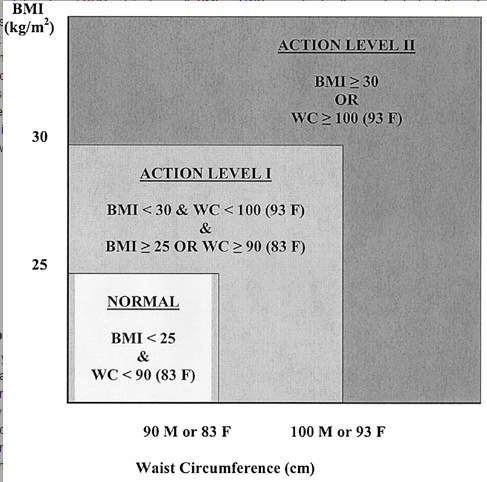
  5. For individuals on the borderline, you need another metric Back to individuals though….should you take your BMI seriously? Well maybe. It’s pretty clear if you’re getting a number over 30 you probably should. There’s always the “super muscled athlete” exception, but you pretty much would know if that were you. If you need another quick metric to assess disease risk though, it looks like using a combination of waist circumference and BMI may yield a better picture of health than BMI alone, especially for men.  Here’s the suggested action range from that paper:ActionlevelWhile waist circumference is obviously not something that most people know off the top of their head, it should be easy enough for doctors to take in an office visit.

Overall, it’s important to remember that metrics like the BMI or waist circumference are really just screening tests and you get what you pay for. While we hope they catch most people who are at high risk, there will always be false positives and false negatives. While in population studies these may balance each other out, for any individual it’s important to take a look at all the various factors that go in to health. So, um, talk to your doctor and avoid over-interpretation.

5 Definitions You Need to Remember When Discussing Mass Shootings This Week

In the wake of the Orlando tragedy of last week, the national conversation rapidly turned to what we could do to prevent situations like this in the future. I’ve heard/seen a lot of commentary on this, and I get concerned at how often statistics get thrown out without a clear explanation of what the numbers actually do or don’t say.  I wanted to review a few of the common issues I’m seeing, and to clarify what some of the definitions are. While I obviously have my own biases, my goal is NOT to endorse one viewpoint or another here. My goal is to make sure everyone knows what everyone else is talking about when they throw numbers out there.

Got it? Let’s go!

  1. Base rate Okay, this is obviously one of my pet issues right now, but this is a great example of a time you have to keep the concept of a base rate in mind. In the wake of mass shootings, many people propose various ideas that will help us predict who future mass shooters might be. Vox does a great article here about why most of the attempts to do this would be totally futile. Basically, for every mass shooter in this country, there are millions and millions of non mass shooters. Even a detection algorithm that makes the right call 99.999% of the time would yield a couple hundred false positives (innocent people incorrectly identified) for every true positive.  Read my post on base rates here for the math, but trust me, this is an issue.
  2. Mass Shooting I’ve seen the claim a couple of places that we have about one mass shooting per day in this country, and I’ve also seen the claim that we had 4-6 last year.  This Mother Jones article does an excellent deep dive on the statistic, but basically it comes down to circumstances. Most people agree that “mass” refers to 3 or 4 people killed at one time, but the precipitating events can be quite different. There are basically three types of mass shootings: 1. Domestic/family violence 2. Shootings that occur during/around other criminal activity 3. Indiscriminate public shootings. If you count all 3 together, you get the “one per day” number. If you only count #3, you get 4-6 per year. While obviously all of these events are horrible, the methods  of addressing each are going to be different. At the very least, it’s good to know when we’re talking about one and when we’re talking about ALL of them.
  3. Gun Deaths Even more common than the confusion about the term “mass shooting” is the term “gun deaths”. This pops up frequently that I’ve been posting about it almost as long as I’ve been blogging and have made a couple of graphs (here and here) that have come in handy in some Twitter debates. The short version is that anything marked “gun deaths” almost always includes suicides and accidents. Suicide is the biggest contributor to this category, and any numbers or graphs generated from “gun death” data tend to look really different when these are taken out.
  4. Locations This is a somewhat minor issue compared to the others, but take care when someone mentions “school shootings” or “attacks on American soil”. As I covered here, sometimes people use very literal definitions of locations to include situations you wouldn’t normally think of.
  5. Gun violence Okay, this one should be obvious, but gun violence only refers to, um, gun violence. In the wake of a tragedy like Orlando, I’ve seen the words “gun violence” and “terrorism” tossed about as though they are interchangeable.  When you state it clearly, it’s obvious that’s not true, but in the heat of the moment it’s an easy point to conflate. In one of my guns and graphs posts, I discovered that states with higher rates of gun murders also tend to have higher rates of non-gun murders with r=.6 or so. In most states gun murders are higher than non-gun murders, but it’s important to remember other types of violence exist as well….especially if we’re talking about terrorism.

One definition I didn’t cover here is the word “terrorism”. I’ve been looking for a while, and I’m not I’ve found a great consensus on what constitutes terrorism and what doesn’t. Up until a few years ago for example, the FBI ranked “eco-terrorism” as a major threat (and occasionally the number one domestic threat) to the the US, despite the fact that most of these incidents caused property damage rather than killing people.

Regardless of political stance, I always think it’s important to understand the context of quoted numbers and what they do or don’t say. Stay safe out there.

5 Replication Possibilities to Keep in Mind

One of the more basic principles of science is the idea of replication or reproducibility.  In its simplest form, this concept is pretty obvious: if you really found the phenomena you say you found, then when I look where you looked I should be able to find it too. Most people who have ever taken a science class are at least theoretically familiar with this concept, and it makes a lot of sense…..if someone tells you the moon is green, and no one else backs them up, then we know the observation of the moon being green is actually a commentary on the one doing the looking as opposed to being a quality of the moon itself.

That being said, this is yet another concept that everyone seems to forget the minute they see a headline saying “NEW STUDY BACKS UP IDEA YOU ALREADY BELIEVED TO BE TRUE”. While every field faces different challenges and has different standards, scientific knowledge is not really a binary “we know it or we don’t” thing. Some studies are stronger than other studies, but in general, the more studies that find the same thing, the stronger we consider the evidence. While many fields have different nuances, I wanted to go over some of the possibilities we have when someone tries to go back and replicate someone else’s work.

Quick note: in general, replication is really applicable to currently observable/ongoing phenomena. The work of some fields can rely heavily on modeling future phenomena (see: climate science), and obviously future predictions cannot be replicated in the traditional sense. Additionally attempts to explain past behavior can often not be replicated (see: evolution) as they have already occurred.

Got it? Great….let’s talk in generalities! So what happens when someone tries to replicate a study?

  1. The replication works. This is generally considered a very good thing. Either someone attempted to redo the study under similar circumstances and confirmed the original findings, or someone undertook an even stronger study design and still found the same findings. This is what you want to happen. Your case is now strong. This is not always 100% definitive, as different studies could replicate the same error over and over again (see the ego depletion studies that were replicated 83 times before they were called in to question) but in general, this is a good sign.
  2. You get a partial replication. For most science, the general trajectory of discovery is one of refining ideas.  In epidemiology for example, you start with population level correlations, and then try to work your way back to recommendations that can be useful on an individual level. This is normal. It also means that when you try to replicate certain findings, it’s totally normal to find that the original paper had some signal and some noise. For example, a few months ago I wrote about headline grabbing study that claimed that women’s political, social and religious preference varied with their monthly cycle. The original study grabbed headlines in 2012, and by the time I went back and looked at it in 2016 further studies had narrowed the conclusions substantially. Now the claims were down to “facial preferences for particular politicians may vary somewhat based on monthly cycles, but fundamental beliefs do not”. I would like to see the studies replicated using the 2016 candidates to see if any of the findings bear out, but even without this you can see that subsequent studies narrowed the findings quite a bit. This is not necessarily a bad thing, but actually a pretty normal process. Almost every initial splashy finding will undergo some refinement as it continues to be studied.
  3. The study is disputed. Okay, this one can meander off the replication path here a bit. When I say “disputed” here, I’m referencing the phenomena that occurs when one studies findings are called in to question by another study that found something different, but they used two totally different methods to get there and now no one knows what’s right. Slate Star Codex has a great overview of this in Beware the Man of One Study, and a great example in Trouble Walking Down the Hallway. In the second post he covers two studies, one that shows a pro-male bias in hiring a lab manager and one that shows a pro-female bias in hiring a new college faculty member. Everyone used the study whose conclusions they liked better to bolster their case while calling the other study “discredited” or “flawed”. The SSC piece breaks it down nicely, but it’s actually really hard to tell what happened here and why these studies would be so different. To note: neither came to the conclusion that no one was biased. Maybe someone switched the data columns on one of them. 
  4. The study fails to replicate. As my kiddos preschool teacher would say “that’s sad news”. This is what happens when a study is performed under the same conditions and effect goes away. For a good example, check out the Power Pose/Wonder Woman study, where a larger sample size undid the original findings….though not before TED talk went viral or the book the research wrote about it got published. This isn’t necessarily bad either, thanks to p-value dependency we expect some of this, but in some fields it has become a bit of a crisis.
  5. Fraud is discovered. Every possibility I mentioned above assumes good faith. However, some of the most bizarre scientific fraud situations get discovered because someone attempts to replicate a previous published study and can’t do it. Not replicate the findings mind you, but the experimental set up itself. Most methods sections are dense enough that any set up can sound plausible on paper, but it’s in practice that anomalies appear. For example, in the case of a study about how to change people’s views on gay marriage, a researcher realized the study set up was prohibitively expensive when he tried to replicate the original. While straight up scientific fraud is fairly rare, it does happen. In these cases, attempts at replication are some of our best allies at keeping everyone honest.

It’s important to note here that not all issues fall neatly in one of these categories. For example, in the Women, Ovulation and Voting study I mentioned in #2, two of the research teams had quite the back and forth over whether or not certain findings had been replicated.  In an even more bizarre twist, when the fraudulent study from #5 was actually done, the findings actually stood (still waiting on subsequent studies!).  For psychology, the single biggest criticism of the replication project (which claims #4) is that it’s replications aren’t fair and thus it’s actually #3 or #2.

My point here is not necessarily that any one replication effort is obviously in one bucket or the other, but to point out that there are a range of possibilities available. As I said in the beginning, very few findings will end up going in a “totally right” or “total trash” bucket, at least at first. However, it’s important to realize any time you see a big exciting headline that subsequent research will almost certainly add or subtract something from the original story. Wheels of progress and all that.

5 Ways that Average Might Be Lying to You

One of the very first lessons every statistics students learns in class is how to use measures of central tendency to assess data. While in theory this means most people should have at least a passing familiarity with the terms “average” or “mean, median and mode”, the reality is often quite different. For whatever reason, when presented with a statement about your average we seem to forget the profound vulnerabilities of the “average”. Here’s some of the most common:

  1. Leaving a relevant confounder out of your calculations Okay, so maybe we can never get rid of all the confounders we should, but that doesn’t mean we can’t try at least a little. The most commonly quoted statistic I hear that leaves out relevant confounders is the “Women make 77 cents  for every dollar a man earns” claim.  Now this is a true statement IF you are comparing all men in the US to all women in the US, but it gets more complicated if you want to compare male/female pay by hours worked or within occupations. Of course “occupation and hours worked” are two things most people actually tend to assume are included in the original statistic, but they are not. The whole calculation can get really tricky (Politifact has a good breakdown here), but I have heard MANY people tag “for the exact same work” on to that sentence without missing a beat. Again, it’s not possible to control for every confounder, but your first thought when you hear a comparison of averages should be to make sure your assumptions about the conditions are accurate.
  2. A subset of the population could be influencing the value of the whole population. Most people are at least somewhat familiar with the idea of outlier type values and “if Bill Gates walks in to a bar, the average income goes way up” type issues. What we less often consider is how different groups being included/excluded from a calculation can influence things. For example, in the US we are legally required to educate all children through high school. The US often does not do well when it comes to international testing results. However in this review by the Economic Policy Institute, they note that in some of the countries (Germany and Poland for example) certain students are assigned to a “vocational track” quite early and may not end up getting tested at all. Since those children likely got put on that track because they weren’t good test takers, the average scores go up simply by removing the lowest performers. We saw a similar phenomena within the US when more kids started taking the SATs. While previous generations bemoaned the lower SAT scores of “kids these days” the truth was those were being influenced by expanding the pool of test takers to include a broader range of students. Is that the whole explanation? Maybe not, but it’s worth keeping in mind.
  3. The values could be bimodal (or another non-standard distribution) One of my first survey consulting gigs consisted of taking a look at some conference attendee survey data to try and figure out what the most popular sessions/speakers were. One of the conference organizers asked me if he could just get a list of the sessions with the highest average ranking. That sounded reasonable, but I wasn’t sure that was what they really wanted. You see, this organization actually kind of prided itself on challenging people and could be a little controversial. I was fairly sure that they’d feel very differently about a session that had been ranked mostly 1’s and 10’s, as opposed to a session that had gotten all 5’s and 6’s. To distill the data to a simple average would be to lose a tremendous amount of information about the actual distribution of the ratings. It’s like asking how tall the average human is…..you get some information, but lose a lot in the process. Neither the mean or median account for this.
  4. The standard deviations could be different Look, I get why people don’t always report on standard deviations….the phrase itself probably causes you to lose at least 10% of readers automatically. However, just because two data sets have the same average doesn’t mean the members of those groups look the same. In #3 I was referring to those groups that have two distinct peaks on either side of the average, but even less dramatic spreads can cause the reality to look very different than the average suggests.
  5. It could be statistically significant but not practically significant. This one comes up all the time when people report research findings. You find that one group does “more” of something than another. Group A is happier than Group B.  When you read these, it’s important to remember that given a sample size large enough ANY difference can become statistically significant. A good hint this may be an issue is when people don’t tell you the effect size up front. For example, in this widely reported study it was shown that men with attractive wives are more satisfied with their marriages in the first 4 years. The study absolutely found a correlation between attractiveness of the wife and the husband’s marital satisfaction….a gain of .36 in satisfaction (out of a possible 45 points) for every 1 point increase in attractiveness (on a scale of 1 to 10). That’s an interesting academic finding, but probably not something you want to knock yourself out worrying about.

Beware the average.

5 Studies About Politics and Bias to Get You Through Election Season

Last week, the Assistant Village Idiot posed a short but profound question on his blog:

Okay, let us consider the possibility that it really is the conservatives who are ignorant, aren’t listening, and reflexively reject other points of view.
How are we going to measure whether that is true?  Something that would stand up when presented to a man from Mars.

I liked this question because it calls for empirical evidence on a topic where both sides believe their superiority is breathtakingly obvious. I gave my answer in the comments there, but I wanted to take a few minutes here to review how I think you would measure this, and pull together some of my favorite studies on politically motivated bias as a general reference.

Before we start on that, I should mention that the first three parts of my answer to the original question covered how you would actually define your target demographic. Defining ahead of time who is a conservative and who is a liberal, and/or what types of conservatives or liberals you care about is critical. As we’ve seen in the primaries this year, both conservatives and liberals can struggle to establish who the “true” members of their parties are. With 42% of voters now refusing to identify with a particular political party, this is no small matter. Additionally, we would have to define what types of people we were looking at. Are we surveying your average Joe or Jane, or are we looking at elected leaders? Journalists? Academics? Activists? It’s entirely plausible that visible subgroups of either party could be less thoughtful/more ignorant/etc than the average party member.

On more thing: there’s a really interesting part in Jonathan Haidt’s book “The Righteous Mind” where he talks about how conservatives are better at explaining liberal arguments than liberals are at explaining conservative ones. As far as I can tell, he did not actually publish this study, so it’s not included here. If you want to read about it though, this is a good summary. Alright, with those caveats, let’s look at some studies!

  1. Overall Recognition of Bias: The Bias Blind Spot: Perceptions of Bias in Self Versus Others This one is not politically specific, but does speak to our overall perception of bias. This series of studies asked people (first college students, then random people at an airport) to rate how biased they were in comparison to others. They were also asked to rate themselves on other negative traits such as procrastination and poor planning. Most people were happy to admit they procrastinate even MORE than the average person, but when it came to bias almost everyone was convinced they were better than average. Even after being told bias would likely compel them to overrate themselves, people didn’t really change their opinion. That’s the problem with figuring out who is more biased. The first thing bias does is blind you to it’s existence. It would be rather interesting to see if political affiliation influenced these results though. In the meantime, try the Clearer Thinking political bias test to see where you score.
  2. Biased Interpretations of Objective Facts: Motivated Numeracy and Enlightened Self-Government  Okay, I bring this study up a lot. I wrote about it both here and for another site here.  In this study people were presented with one of four math problems, all containing the same numbers and all requiring the same calculations. The only thing that changed in each version of the problem was the words that set up the math. In two versions, it was a neutral question about whether or not a skin cream worked as advertised. In the other two versions, it was a question about gun control. The researchers then recorded whether or not your political beliefs influenced your ability to do math correctly if doing so would give you an answer you didn’t like. The answer was a strong YES. People who were otherwise great at math did terribly on this question if they didn’t like what the math was telling them. This effect was seen in both parties. The effect was actually worse the better at math you were. The effects size was equal (on average) for both parties.
  3. Dogmatism and Complex Thinking: Are Conservatives Really More Simple-Minded than Liberals? The Domain Specificity of Complex Thinking I posted about this one back in February when I did a sketchnote of the study structure. This study took a look at dogmatic beliefs and the complexity of the reasoning people used to justify their beliefs. The study was done because the typical “dogmatism scale” used to study political beliefs had almost always showed that conservatives were less thoughtful and more dogmatic about their beliefs than liberals were. The study authors suspected that finding was because the test was specifically designed to test conservatives on things they were, well, more dogmatic about. They ran several tests, and each showed that dogmatism and simplistic thinking were actually topic specific, not party specific. For example, conservatives tended to be dogmatic about religion, while liberals tended to be more dogmatic about the environment. This study actually looked at both everyday people AND transcripts from presidential debates for their rankings. The stronger the belief, the more dogmatic people were.
  4. Asking People Directly: Political Diversity in Social and Personality Psychology While we generally assume people won’t admit to bias, sometimes they actually view it as the rational choice. In this paper, two self-described liberal researchers asked other social psychologists what their political affiliation was and if they would discriminate on . They found that social psychology was quite liberal, though most people within the field actually overestimated this. Additionally, many people reported that they would discriminate against a conservative in hiring practices, wouldn’t give them grants, and would reject their papers on the basis of political affiliation. I think this study is a good subset of the dogmatism one….depending on the topic some groups may be more than happy to admit they don’t want to hear the other side. Not everyone considers dismissing those with opposing viewpoints a bad thing. I’m picking on liberals here, but given the dogmatism study above, I would be cautious about thinking this is a  phenomena only one party is capable of. Regardless, asking people directly how much they thought they should listen to the other side might yeild some intriguing results.
  5. Voting Pattern Changes: Unequal Incomes, Ideology and Gridlock: How Rising Inequality Increases Political Polarization When confronted with the results of that last study, one social psychologist ended up stating that social psychology hadn’t gotten more liberal, but rather that conservatives had gotten more conservative. It’s an interesting charge, and one that should be examined a bit. The paper above took a look at this on the state level, and found that in many states the values of conservative and liberal elected leaders have changed. Basically, in states with high income inequality, liberal voters vote out moderate liberals and nominate more extreme liberals. Then, in the general election, the more moderate candidate tends to be Republican, so the unaffiliated voters go there. This means that fewer liberals get elected, but the ones who do get in are more extreme. The Republicans on the other hand now get a majority, meaning the legislatures as a whole skew more conservative. These conservatives are both ideologically farther apart from the remaining liberals AND less incentivized to work with them. So in this case, a liberal looking at their state government could accurately state “things have shifted to the right” and be completely correct. Likewise, a conservative could look at the liberal members of the legislature and say “they seem further to the left than the guys they replaced” and ALSO be correct. So everyone can be right and end up believing the best course is to double down.

Overall, I don’t know where this election is going or what the state of the political parties will be after it’s done. However, I do know that our biases probably aren’t helping.

5 Things You Should Know About Medical Errors and Mortality

Medical Errors are No. 3 Cause of US Deaths“.  As someone who has spent her entire career working in hospitals, I was interested to see this headline a few weeks ago. I was intrigued by the data, but a little skeptical. Not only have I seen a lot of patient deaths, but it seems relatively rare in my day-to-day life that I see someone reference a death by medical error.  However, according to Makary et al in the BMJ this month, it happens over 250,000 times a year.

Since the report came out, two of my favorite websites (Science Based Medicine and Health News Review ) have come out with some critiques of the study. The pieces are both excellent and long, so I thought I’d go over some highlights:

  1. This study is actually a review, combined with some mathematical modeling. Though reported as a study in the press, this was actually an extrapolation based off of 4 earlier studies from 1999, 2002, 2004 and 2010. I don’t have access to the full paper, but according to the Skeptical Scalpel, the underlying papers found 35 preventable deaths. It’s that number that got extrapolated out to 250,000.
  2. No one needs to have made an error for something to be called an error. When you hear the word “error” you typically think of someone needing to do “x” but instead doing “y” or doing nothing at all. All 4 studies used in the Makary analysis had a different definition of “error”, and it wasn’t always that straightforward and required a lot of judgment calls to classify. Errors were essentially defined as “preventable adverse events”, even in cases where no one could say how you would have prevented it. For example, in one study serious post-surgical hemorrhaging was  always considered an error, even when there was no error identified. Essentially some conditions were assumed to ALWAYS be caused by an error, even if they were a known risk of the procedure. That definition wasn’t even the most liberal one used by the way….at least one of the studies called ALL “adverse events” during care preventable. That’s pretty broad.
  3. Some of the samples were skewed. The largest paper included actually looked exclusively at Medicare recipients (aka those over 65), and at least according to the Science Based Medicine review, it doesn’t seem they controlled for the age issue when extrapolating for the country as a whole. The numbers ultimately suggest that 1/3 of all deaths occurring in a hospital are due to error…..which seems a bit high.
  4. Prior health status isn’t known or reported. One of the primary complaints of the authors of the study is that “medical error” isn’t counted in official cause of death statistics, only the underlying condition. This means that someone seeking treatment for cancer they weren’t otherwise going to die from who dies of a medical error gets counted as a cancer death. On the other hand, this means that someone who was about to die of cancer but also has a medical error gets counted as a cancer death. Since sick people receive far more treatment, we do know most of these errors are happening to already sick people. Really the ideal metric here would be “years of life lost” to help control for people who were severely ill prior to the error.
  5. Over-reporting of medical errors isn’t entirely benign. A significant amount of my job is focused on improving the quality of what we do. I am always grateful when people point out that errors happen in medicine, and draw attention to the problem. On the other hand, there is some concern that stories like this could leave your average person with the impression that avoiding hospitals is safer than actually seeking care. This isn’t true. One of the reasons we have so many medical errors in this country is because medicine can actually do a lot for you. It’s not perfect by any means, but the more options we have and the longer we keep people alive using medicine, the more likely it is that someone administering that care is going to screw up. In many cases, delaying or avoiding care will kill you a heck of a lot faster even the most egregiously sloppy health care provider.

Again, none of this is to say that errors aren’t a big deal. No matter how you define them, we should always be working to reduce them. However, as with all data, it’s good to know exactly what we’re looking at here.

Five Reasons Not to Use a Blog Post as a Reference

Recently I had a discussion with a friend from childhood who is now a teacher. She had liked my “Intro to Internet Science” series, and we were discussing the possibility of me coming and chatting with her AP chemistry class about it. We were discussing time frames, and she mentioned it might be best to come in April when the kids started writing their thesis. “Every year they get upset I won’t let them use blog posts instead of peer-reviewed journal articles.” she said.

Oh boy. As a long time blogger who likes to think she’s doing her part to elevate the discourse, let me say this clearly: NEVER CITE A BLOG POST AS A PRIMARY SOURCE. Not even mine.  Here’s why:

Anybody can be a blogger. One of the best things about blogging is that it’s an incredibly easy field to enter. It takes less than 15 minutes to set up a blogger or WordPress account and get started. It takes about $20 to register a custom domain name. This is awesome because you can hear lots of voices on lots of topic you wouldn’t have otherwise had access too.  This is also terrible because there are lots of voices on lots of topics you wouldn’t have otherwise had to deal with.

Nothing stops people from fabricating credentials, using misleading titles or just flat out making stuff up. Don’t believe me? Health and wellness blogger Belle Gibson built an enormous empire based on her “I cured my cancer through whole foods” schtick…..only to have it revealed she never had cancer and had no idea what she was talking about.

Peer review isn’t perfect, but any deception perpetrated in published papers will have taken a huge amount of time to pull off.  Simply out of laziness, that means there will be less outright fraud (although it does still happen).

No one checks bloggers before we hit publish. Like many bloggers, I do most of my blogging late at night, early in the morning or on weekends. I have a full time job, a husband, a child, and I take classes. I’m tired a lot. Despite my best intentions, sometimes I say things poorly, let my biases slip in, or just do my math wrong1. I happen to have smart commenters who call me out, but it’s plausible even they miss something.

I try to adhere to a general blogger code of conduct and provide sources/update mistakes/be clear on my biases when I can, but I will not always be perfect. No one will be. With peer-reviewed papers, you know MANY people looked at the papers before they went to press. Doesn’t make them perfect, but it does mean they’ll far less likely to contain glaring errors before publication.

Also, good bloggers talking about a scientific paper will ALWAYS cite the primary source so you can find it and see for yourself. Here’s a few rules for assessing how they did that.

Blog posts can mislead. While many bloggers are driven by nothing more than a desire to share their thoughts with the world, many are doing it for money or other motivations. Assuming that blog posts are actually marketing tools until they prove otherwise.  I wrote a whole 10 part series on this here, but suffice it to say there are many ways blog posts can deceive you or make things sound more convincing than they are.

Science changes, but the internet is forever. Even if you find a good solid blog post from a thoughtful person who cited sources and knew what they were talking about, you’re still not out of the woods. The longer the internet sticks around, the more things will outdate or need updating, even if they were right at the time the author wrote them. I’ve started a series where I go back to posts I wrote back in 2012/2013 and update them with new developments, but nothing will stop Google from pulling them up in search results as is.

Using blog posts robs you of a good chance to learn how to read scientific papers. Reading scientific papers is a bit of an art form, and it takes practice. Learning how to find critical information, how to figure out what was done well (or not at all!), and doing more than just reading the press release can take some practice. Everyone has a slightly different strategy, and you’re not going to find the one that works for you unless you read a lot of them. If you’re still at the point in your life where you have external motivations to read papers (like, say, a teacher requesting that you do it), take advantage of that. It’s a skill you’ll value later, one of those “you’ll thank my when you’re older” things.

In conclusion: One of my favorite blog taglines ever is from Scott Greenfield’s Simple Justice blog “Nothing in this blog constitutes legal advice. This is free. Legal advice you have to pay for.” Same goes for science blogging. If it’s free, you get what you pay for.

1. I’m actually perfect, but I figured I’d throw the hypothetical out there.

5 Statistics Books You Should Read

Since I’m on a bit of a book list kick at the moment, I thought I’d put together my list of the top 5 stats and critical thinking books people should read if they’re looking to go a bit more in depth with any of these topics.  Here they are, in no particular order:

If you’re looking for….a good overview:
How to Lie with Statistics

This is one of those books that should be given to every high school senior, or maybe even earlier. In fact, I know more than a few people who give this out as a gift. It’s 60 years old, but it still packs a punch. It’s written by a journalist, not a statistician, so it’s definitely for the layperson.

If you’re looking for….something a bit more in depth:
Thinking Statistically

If you want to know how to think about statistical concepts without actually having to do any math, this book is for you. What I would get my philosophy major brother for Christmas so we could actually talk about things I’m interested in for once.

If you’re looking for….something a little more medical:
Bad Science: Quacks, Hacks, and Big Pharma Flacks

Ben Goldacre is a doctor from the UK, so it’s no surprise he focuses mostly on bad interpretations of medical data.  He calls out journalists, popular science writers and all sorts of other folks in the process though, and helps consumers be more educated about what’s really going on.

If you’re looking for….something that will actually help you pass a class:
The Cartoon Guide to Statistics

Not a very advanced class, but a pretty solid re-explaining of stats 101. I keep this one at work and hand it out when people have basic questions or want to brush up on things.

If you’re looking for….a handy guide for those who actually get stats:
Statistical Rules of Thumb

This is one of the few textbooks I actually bought just to have on hand and to flip through for fun. It’s pricey compared to a regular book, but worth it if you’re using statistics a lot and need a in depth reference book. It contains all those “real world” reminders that statisticians can forget if they’re not paying attention. With different sections for basics, observational studies, medicine, etc, and advice like “beware linear models” and “never use a pie chart”, this is my current favorite book.

As always,  further recommendations welcome!