What I’m Reading: February 2018

No, there haven’t been 18 school shootings so far this year. Parkland is a tragedy, but no matter what your position, spreading stats like these doesn’t help.

I’ve followed Neuroskeptic long enough to know I should be skeptical of fMRI studies, and this paper shows why: some studies trying to look at brain regions may be confounded by individual variation. In other words, what was identified as “change” may have just been individual differences.

Speaking of questionable data, I’ve posted a few times about Brian Wansink and the ever-growing scrutiny of his work. This week his marquee paper was called in to question: the bottomless bowl experiment.  This experiment involved diners with “self-refilling” bowls of tomato soup, and the crux of the finding is that without visual cues people tend to underestimate how much they’ve eaten. The fraud accusations were surprising, given that:

  1. This finding seems really plausible
  2. This finding pretty much kicked off Wansink’s career in the public eye

If this finding was based on fake data, it seems almost certain everything that ever came out of his lab is suspect. Up until now I think the general sense was more that things might have gotten sloppy as the fame of his research grew, but a fake paper up front would indicate a different problem.

Related: a great thread on Twitter about why someone should definitely try to replicate the soup study ASAP. Short version: the hypothesis is still plausible and your efforts will definitely get you attention.

Another follow-up to a recent post: AL.com dives in to Alabama school districts to see if school secession (i.e. schools that split off from a county system to a city controlled system) are racially motivated.  While their research was prompted by a court ruling that one particular proposed split was racially motivated, they found that in general schools didn’t significantly change their racial or class makeup all that much when they split off from larger districts. What they did find was that cities who split off their schools ended up spending more per student than they did when they were part of a county system. This change isn’t immediate, but a few years out it was almost universally true. This suggests that taxpayers are more agreeable to increasing tax rates when they have more control over where the money is going. Additionally, the new schools tend to wind up more highly rated than the districts they left, and the kids do better on standardized testing. Interesting data, and it’s nice to see a group look at the big picture.


5 Things About that “Republicans are More Attractive than Democrats” Study

Happy Valentine’s Day everyone! Given the spirit of the day, I thought it was a good time to post about a study Korora passed along a few days ago called “Effects of physical attractiveness on political beliefs”, which garnered a few headlines for it’s findings that being attractive was correlated with being a Republican. For all of you interested in what was actually going on here, I took a look at the study and here’s what I found out:

  1. The idea behind the study was not entirely flattering. Okay, while the whole “my party is hotter than your party” thing sounds like compliment, the premise of this study was actually a bit less than rosy. Essentially the researchers hypothesized that since attractive people are known to be treated better in many aspects of life, those who were more attractive may get a skewed version of how the world works. Their belief/experience that others were there to help them and going to treat them fairly may cause them to develop a “blind spot” that caused them to believe people didn’t need social programs/welfare/anti-discrimination laws  as much as less attractive people might think.
  2. Three hypotheses were tested Based on that premise, the researchers decided to test three distinct hypotheses. First, that attractive people were more likely to believe things like “my vote matters” and “I can make a difference”, regardless of political party. Second, they asked them about ideology, and third partisanship. I thought that last distinction was interesting, as it drew a distinction between the intellectual undertones and the party affiliation.
  3. Partisans are more attractive than ideologues. To the shock of no one, better looking people were much more likely to believe they would have a voice in the political process, even when controlled for education and income. When it came to ideology vs partisanship though, things got a little interesting. Attractive people were more likely to rate themselves as strong Republicans, but not necessarily as strong conservatives. In fact in the first data set they used (from the years 1972, 1974 and 1976) only one year should any association between conservatism and attractiveness, but all 3 sets showed a strong relationship between being attractive and saying you were a Republican. The later data sets (2004 and 2011) show the same thing, with the OLS coefficient for being conservative about half (around .30) of what the coefficient for Republicanism was (around .60). This struck me as interesting because the first headline I saw specifically said “conservatives” were more attractive, but that actually wasn’t the finding. Slight wording changes matter.
  4. We can’t rule out age cohort effects When I first saw the data sets, I was surprised to see some of the data was almost 40 years old. Then I saw they used data from 2004 and 2011 and felt better. Then I noticed that the 2004 and 2011 data was actually taken from the Wisconsin Longitudinal Study, whose participants were in high school in 1957 and have been interviewed every few years ever since. Based on the age ranges given, the people in this study were born between 1874 and 1954, with the bulk being 1940-1954. While the Wisconsin study controlled for this by using high school yearbook photos rather than current day photos, the fact remains that we only know where the subjects politics ended up (not what they might have been when they were young) and we don’t know if this effect persists in Gen X or millenials. It also seems a little suspect to me that one data set came during the Nixon impeachment era, as strength of Republican partisanship dropped almost a whole point over the course of those 4 years. Then again, I suppose lots of generations could claim a confounder.
  5. Other things still  are higher predictors of affiliation. While overall the study looked at the effect of attractiveness by controlling  for things like age and gender, the authors wanted to note that those other factors actually still played a huge role. The coefficients for the association of Republican leanings with age (1.08) and education (.57) for example  were much higher than attractiveness the coefficient for attractiveness (.33). Affinity for conservative ideology/Republican partisanship was driven by attractiveness (.37/.72) but also by income (.60/.62) being non-white (-.59/-1.55) and age (.99/1.45). Education was a little all over the place…it didn’t have an association with ideology (-.06), but it did with partisanship (.94). In every sample, attractiveness was one of the smallest of the statistically significant associations.

While this study is interesting, I would like to see it replicated with a younger cohort to see if this was a reflection of an era or a persistent trend. Additionally, I would be interested to see some more work around specific beliefs that might support the initial hypothesis that this is about social programs. With the noted difference between partisanship and ideology, it might be hard to hang your hat on an particular belief as the driver.

Regardless, I wouldn’t use it to start a conversation with your Tinder date. Good luck out there.

Idea Selection and Survival of the Fittest

It probably won’t come as a shock to you that I spend a lot of time ruminating over why there are so many bad ideas on the internet. Between my Intro to Internet Science, my review of the Calling Bullshit class, and basically every other post I’ve written on this site, I’ve put a lot of thought in to this.

One of the biggest questions that seems to come up when you talk about truth in the social media age is a rather basic “are we seeing something new here, or are we just seeing more of what’s always happened?” and what are the implications for us as humans in the long run? It’s a question I’ve struggled a lot with, and I’ve gone back and forth in my thinking. On the one hand, we have the idea that social media simply gives bigger platforms to bad actors and gives the rest of more situations in which we may be opining about things we don’t know much about.  On the other hand, there’s the idea that something is changing, and it’s going to corrupt our way of relating to each other and the truth going forward. Yeah, this and AI risk are pretty much what keeps me up at night.

Thus I was interested this week to see this Facebook post by Eliezer Yudkowsky about the proliferation of bad ideas on the internet. The post is from July, but I think it’s worth mentioning. It’s long, but in it Yudkowsky raises the theory that we are seeing the results of hypercompetition of ideas, and they aren’t pretty.

He starts by pointing out that in other fields, we’ve seen the idea that some pressure/competition is good, but too much can be bad. He uses college admissions and academic publishing as two examples. Basically, if you have 100 kids competing for 20 slots, you may get all the kids to step up their game. If you have 10,000 kids competing for 1 slot, you get widespread cheating and  test prep companies that are compared to cartels. Requiring academics to show their work is good, “publish or perish” leads to shoddy practices and probably the whole replication crisis. As Goodheart’s law states “When a measure becomes a target, it ceases to be a good measure”. In practical terms, hypercompetition ends up with a group that optimizes for one thing and only one thing, while leaving the back door completely unguarded.

Now take that entire idea and apply it to news and information in the social media age. While there are many good things about democratizing the spread of information, we have gone from moderate competition (get a local newspaper or major news network to pay attention to you, then everyone will see your story) to hypercompetition (anyone can get a story out there, you have to compete with billions of other stories to be read). With that much competition, we are almost certainly not going to see the best or most important stories rise to the top, but rather the ones that have figured out how to game the system….digital, limbic, or some combination of both. That’s what gets us to Toxoplasma of Rage territory, where the stories that make the biggest splash are the ones that play on your worst instincts. As Yudkowsky puts it “Print magazines in the 1950s were hardly perfect, but they could sometimes get away with presenting a complicated issue as complicated, because there weren’t 100 blogs saying otherwise and stealing their clicks”.

Depressed yet? Let’s keep going.

Hypercompetitive/play to your worst instincts stories clearly don’t have a great effect on the general population, but what happens to those who are raised on nothing other than that? In one of my favorite lines of the post, Yudkowsky says “If you look at how some groups are talking and thinking now,  “intellectually feral children” doesn’t seem like entirely inappropriate language.”  I’ve always thought of things like hyperreality in terms of virtual reality vs physical reality or artificial intelligence vs human intelligence, but what if we are kicking that off all on our own? Wikipedia defines it as “an inability of consciousness to distinguish reality from a simulation of reality, especially in technologically advanced postmodern societies.”, and isn’t that exactly what we’re seeing here on many topics? People use technology, intentionally or unintentionally to build bubbles that skew their view of how the world works, but consistently get reinforcement that they are correct?

Now of course it’s entirely possible that this is just a big “get off my lawn” post and that we’ll all be totally fine. It’s also entirely possible that I should not unwind from long weeks by drinking Pinot Noir and reading rationalist commentary on the future of everything, as it seems to exacerbate my paranoid tendencies. However, I do think that much of what’s on the internet today is the equivalent of junk food, and living in an environment full of junk food doesn’t seem to be working out too well for many of us. In physical health, we may have reached the point where our gains begin to erode, and I don’t think it’s crazy to think that a similar thing could happen intellectually.  Being a little more paranoid about why we’re seeing certain stories or why we’re clicking on certain links may not be the worst thing. For those of us who have still developing kids, making sure their ideas get challenged may be progressively more critical.

Good luck out there.

Tidal Statistics

I’m having a little too much fun lately with my “name your own bias/fallacy/data error” thing, so I’ve decided I’m going to make it a monthly-ish feature. I’m gathering the full list up under the “GPD Lexicon” tab.

For this month, I wanted to revisit a phrase I introduced back in October: buoy statistic. At the time I defined the term as:

Buoy statistic: A statistic that is presented on its own as free-floating, while the context and anchoring data is hidden from initial sight.

This was intended to cover a pretty wide variety of scenarios, such as when we hear things like “women are more likely to do thing x” without being told that the “more likely” is 3 percentage points over men.

While I like this term, today I want to narrow it down to a special subcase: tidal statistics. I’m defining those as…..

Tidal Statistic: A metric that is presented as evidence of the rise or fall of one particular group, subject or issue, during a time period when related groups also rose or fell on the same metric

So for example, if someone says “after the CEO said something silly, that company’s went down on Monday” but they don’t mention that the whole stock market went down on Monday, that’s a tidal statistic. The statement by itself could be perfectly true, but the context changes the meaning.

Another example: recently Vox.com did an article about racial segregation in schools in which they presented this graph:

Now this graph initially caught my eye because they had initially labeled it as being representative of the whole US (they later went back and corrected it to clarify that this was just for the south), and I started to wonder how this was impacted by changing demographic trends. I remembered seeing some headlines a few years back that white students were now a minority-majority among school age children, which means at least some of that drop is likely due a decrease in schools whose student populations are > 50% white.

Turns out my memory was correct, and according to the National Center for Education Statistics, in the fall of 2014, white students became a minority majority in the school system at 49.5% of the school age population.  For context, when the graph starts (1954) the US was about 89% white. I couldn’t find what that number was for just school age kids, but it was likely much higher than 49.5%.   So basically if you drew a similar graph for any other race, including white kids, you would see a drop. When the tide goes down, every related metric goes down with it.

Now to be clear, I am not saying that school segregation isn’t a problem or that the Vox article gets everything wrong. My concern is that graph was used as one of their first images in a very lengthy article, and they don’t mention the context or what that might mean for advocacy efforts. Looking at that graph, we have no idea what percentage of that drop is due to a shrinking white population and what is due to intentional or de facto segregation. It’s almost certainly not possible to substantially raise the number of kids going to schools who have more than 50% white kids, simply because the number of schools like that is shrinking.  Vox has other, better, measures of success further down in the article, but I’m disappointed they chose to lead with one that has a major confounder baked in.

This is of course the major problem with tidal statistics. The implication tends to be “this trend is bad, following our advice can turn it around”. However, if the trend is driven by something much broader than what’s being discussed, any results you get will be skewed. Some people exploit this fact, some step in to it accidentally, but it is an interesting way that you can tell the truth and mislead at the same time.

Stay safe out there.


Praiseworthy Wrongness: Dr vs Ms

I ran across a pretty great blog post this week that I wanted to call attention to. It’s by a PhD/science communicator Bethany Brookshire who blogs at Scicurious.com and hosts a podcast Science for the People*.

The post recounts her tale of being wrong on the internet in a Tweet that went viral.

For those too lazy to click the link, it happened like this: early one Monday morning, she checked her email and noticed that two scientists she’d reached out to for interviews had gotten back to her, one male and one female.  The male had started his reply with “Dear Ms. Brookshire”, and the woman “Dear Dr Brookshire”. She felt like this was a thing that had happened before, so she sent this Tweet:

After sending it and watching it get passed around, she started to feel uneasy. She realized that since she actually reached out to a LOT of people for interviews over the last 2 years, she could actually pull some data on this. Her blog post is her in depth analysis of what she found (and I recommend you read the whole thing), but basically she was wrong. While only 7% of people called her “Dr Brookshire”, men were actually slightly more likely to do so than women. Interestingly, men were also more likely to launch is to their email without using any name, and women were actually more likely to use “Ms”. It’s a small sample size so you probably can’t draw any conclusions other than this: her initial Tweet was not correct. She finishes her post with a discussion of recency bias and confirmation bias, and how things went awry.

I kept thinking about this blog post after I read it, and I realized it’s because what she did here is so uncommon in the 2018 social media world. She got something wrong quite publicly, and she was willing to fess up and admit it. Not because she got caught or might have gotten caught (after all, no one had access to her emails) but simply because she realized she should check her own assumptions and make things right if she could. I think that’s worthy of praise, and the kind of thing we should all be encouraging of.

As part of my every day work, I do a lot of auditing of other people’s work and figuring out where they might be wrong. This means I tend to do a lot of meditating on what it means to be wrong….how we handle it, what we do with it, and how to make it right. One of the things I always say to staff when we’re talking about mistakes is that the best case scenario is that you don’t make a mistake, but the second best case is that you catch it yourself. Third best is that we catch it here, and fourth best is someone else has to catch us. I say that because I never want staff to try to hide errors or cover them up, and I believe strongly in having a “no blame” culture in medical care. Yes, sometimes that means staff might think confessing is all they have to do, but when people’s health is at stake the last thing you want is for someone to panic and try to cover something up.

I feel similarly about social media. The internet has made it so quick and easy to announce something to a large group before you’ve thought it through, and so potentially costly to get something wrong that I fear we’re going to lose the ability to really admit when we’ve made a mistake. Would it have been better if she had never erred? Well, yes. But once she did I think self disclosure is the right thing to do. In our ongoing attempt to call bullshit on internet wrongness, I think  giving encouragement/praise to those who own their mistakes is a good thing. Being wrong and then doubling down (or refusing to look in to it) is far worse than stepping back and reconsidering your position. The rarer this gets, the more I feel the need to call attention those who are willing to do so.

No matter what side of an issue you’re on, #teamtruth should be our primary affiliation.

*In the interest of full disclosure, Science for the People is affiliated with the Skepchick network, which I have also blogged for at their Grounded Parents site. Despite that mutual affiliation and the shared first name, I do not believe I have ever met or interacted with  Dr Brookshire. Bethany’s a pretty rare first name, so I tend to remember it when I meet other Bethanys (Bethanii?)


5 Things About the GLAAD Accelerating Acceptance Report

This past week a reader contacted me to ask what I thought of a recent press release about a poll commissioned by GLAAD for their “Accelerating Acceptance” report. The report struck me as pretty interesting because the headlines mentioned that in 2017 there was a 4 point drop in LGBT acceptance, and I had actually just been discussing a Pew poll that showed a 7 point jump in the support for gay marriage in 2017. 

I was intrigued by this discrepancy, so I decided to take a look at the report (site link here, PDF here), particularly since a few of the articles I read about the whole things seemed a little confused about what it actually said. Here are 5 things I found out:

  1. The GLAAD report bases comfort/acceptance on reaction to seven different scenarios In order to figure out an overall category for each person, respondents were asked how comfortable they’d feel with seven different scenarios. The scenarios were things like “seeing a same sex couple holding hands” or “my child being assigned an LGBT teacher”. Interestingly, respondents were most likely to say they’d be uncomfortable if they found out their child was going to have a lesson in school on LGBT history (37%), and they were least likely to say they’d be uncomfortable if an LGBT person was at their place of worship (24%).
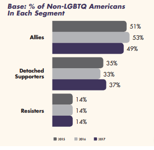
  2. The answers to those questions were used to assign people to a category Three different categories were assigned to people based on the responses they gave to the previous seven questions. “Allies” were respondents who said they’d be comfortable in all 7 situations. “Resisters” were those who said they’d be uncomfortable in all 7 situations. “Detached supporters” were those whose answers varied depending on the situation.
  3. It’s the “detached supporter” category that gained people this year. So this is where things got interesting. Every single question I mentioned in #1 saw an increase in the “uncomfortables” this year, all by 2-3%. While  that’s right at the margin of error for a survey this size (about 2,000 people), the fact that every single one went up by a similar amount give some credence to the idea that it’s an uptick. To compound that point, this was not driven by an uptick of people responding they were uncomfortable in every situation, but actually more people saying they were uncomfortable in some situations but not others:
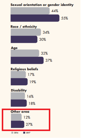
  4. The percent of gay people reporting discrimination has gone up quite a bit. Given the headlines, you’d think the biggest finding of this study would be the drop in the number of allies for LGBT people, but I actually thought the most striking finding was the number of LGBT people who said they had experienced discrimination. That went from 44% in 2016 to 55% in 2017, which was a bigger jump than other groups: That red box there is the only question I ended up with. Why is the 27% so small? Given that I saw no other axis/scale issues in the report, I wondered if that was a typo. Not the biggest deal, but curiosity inducing nonetheless.
  5. Support for equal rights stayed steady For all the other findings, it was interesting to note that 79% of people continue to say they support equal rights for LGBT people. This number has not changed.

So overall, what’s going on here? Why is support for gay marriage going up, support for equal rights unchanged, but discrimination reports going up and individual comfort going down? I have a few thoughts.

First, for the overall “comfort” numbers, it is possible that this is just a general margin of error blip. The GLAAD survey only has 4 years of data, so it’s possible that this is an uptick with no trend attached. Pew Research has been tracking attitudes about gay marriage for almost 20 years, and they show a few years where a data point reversed the trend, only to change the next year. A perfectly linear trend is unlikely.

Second, in a tense political year, it is possible that different types of people pick up the phone to answer survey questions. If people are reporting similar or increased levels of support for concrete things (like legal rights) but slightly lower levels of comfort around people themselves, that may be a reflection of the polarized nature of many of our current political discussions. I know my political views haven’t changed much in the past 18 months, but my level of comfort around quite a few people I know has.

Third, there very well could be a change in attitudes going on here. One data point does not make a trend, but every trend starts with a data point. I’d particularly be interested in drilling in to those discrimination numbers to see what types of discrimination were on the uptick. Additionally, the summary report mentions that they’ve changed some of the wording (back in 2016) to make it clearer that they were asking about both LGB and T folks, which makes me wonder if the discrimination is different between those two groups. I wasn’t clear from the summary if they had separate answers for each or if they just mentioned each group specifically, so I could be wrong about what data they have here.

Regardless, the survey for next year should shed some light on the topic.

What I’m Reading: January 2018

I recently finished a book called Deep Survival, and I haven’t stopped thinking about it since. If you haven’t heard of it before, it’s an examination of people who get stuck in life threatening situations (particularly in nature) and live. The book seeks to understand what behaviors are common to survivors, and what they did differently than others. While not directly about statistics (and suffering from some quite literal survivor bias), it’s a good examination of how we calculate risk and process information at critical moments.

Since I’ve brought up gerrymandering before, I thought I’d point to the ongoing 538 series on the topic, which includes this article about how fixing gerrymandering might not fix anything. That included this graphic, which shows that if you break down partisan voting by county lines (which are presumably not redrawn as often), you still see a huge jump in polarized voting: 

There was an interesting hubbub this week when California proposed a new law that would find restaurants $1000 if their waiters  offered people “unsolicited straws”. The goal of the bill was to cut down on straw use, which the sponsors said was 500 million straws per day. Reason magazine questioned that number, and discovered that it was based on some research a 9 year old did. To be fair to the 9 year old (now 16) he was pretty transparent and forthcoming about how he got it (more than some adult scientists), and he had put his work up on a website for others to use. What’s alarming is how many major news outlets took what was essentially an A+ science fair project as uncontested fact.  Given that there are about 350 million people in the US, it seems like a number that shows we all use 1-2 straws per day should have raised some eyebrows. (h/t Gringo)

This piece in Nature was a pretty interesting discussion of the replication crisis and what can be done about it. The authors point out that when we replicate a finding,  any biases or errors that are endemic to the whole design will remain. What they push for is “triangulation” or trying multiple approaches and seeing what they hone in on. Sounds reasonable to me.

Another topic I’ve talked about a bit in the past is the concept of food deserts, and how hard they are to measure. This article talks about about the inverse concept: food swamps. While food deserts measure how far you are from a grocery store, food swamps measure how many fast food options you have nearby. Apparently living in a food swamp is a much stronger predictor of obesity than living in a food dessert, especially if you don’t have a car.

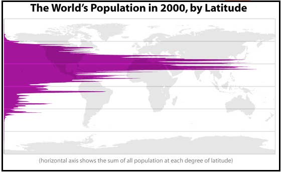
The Assistant Village Idiot has had a few good posts up recently about how to lie with maps, and this Buzzfeed article actually has a few interesting factoids about how we mis-perceive geography as well. My favorite visual was this one, showing world population by latitude:

I liked this piece on the Doomsday Clock and the downsides of trying to put a number on the risk of nuclear war. Sometimes we just have to deal with a bit of uncertainty.

Speaking of uncertainty, I liked this piece from Megan McArdle about how to wrap your head around the “body cameras don’t actually change police behavior” study.  Her advice is pretty generalizable to every study we hear that counters our intuition.

Analyzing Happiness via Social Media

Happy Wednesday everyone….or is it?

I stumbled across a new-to-me study recently: “Temporal Patterns of Happiness and Information in a Global Social Network: Hedonometrics and Twitter“, and I’ve been fascinated by it ever since. It’s a cumbersome name for an interesting study that analyzed Twitter posts to determine if there’s any pattern to when we express certain types of feelings on social media. For example, use of the word “starving” rises as you approach typical meal times, and falls once those times pass:

This data is fascinating to me because it gives some indication of where social media reflects reality, and some ideas of where it might not. For example, it appears the word starving is not often used at breakfast, but is used quite a bit for lunch. I don’t know that people are really the hungriest right before lunch, but it appears they may be most likely to want to express feelings of hunger at that time. I am guessing this is because people may have less control over when they get to eat (being at work, running around with errands, etc) and thus may get more agitated about it.

The researchers decided specifically to look at happiness as expressed through social media posts. They tracked this on a day to day basis, and the decided to figure out which days of the week were the happiest ones. Turns out Wednesday’s not looking so good:

I know the running joke is about Monday, but it’s interesting to note that Tuesday fared  the worst on this ranking. I suspect that’s related to the fact that Monday’s may instill the most dread in people, but aggravation you want to express may need a day or two to build up. Of course if you look at the overall scale, it’s not clear how much of a difference a score of 6.025 vs 6.08 really makes, but I’ll roll with it for now.

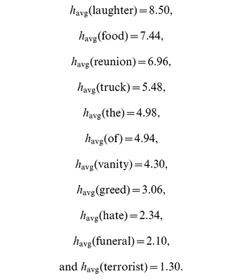
That havg on the y-axis there kind of an interesting number. They pulled out a lot of commonly used Twitter words, then asked people on Mechanical Turk to rate how happy each word made them on a scale of 1 to 9. Here’s how some common words fared:

I love that they ranked “the” and “of”, and was interested to see that vanity was more highly rated than greed.

Interestingly, in  order to keep their data clean, the researchers also excluded a few days that produced noticeable changes in happiness measures. Some of these were for obvious reasons (like holidays, days of natural disasters), but some were kind of funny. For example, they noted that May 24, 2010 as an unusual date because:

the finale of the last season of the highly rated television show ‘Lost’, marked by a drop in our time series on May 24, 2010, and in part due to the word ‘lost’ having a low happiness score of havg = 2.76, but also to an overall increase in negative words on that date.”

This of course shows an interesting weakness in social media studies….you always risk counting things that shouldn’t be counted. Additionally, you may give more credit to certain days than they deserve. For example, Saturday got a boost because of the high rankings of the word “party” and “wedding”, both of which are mostly held on Saturdays.

As social media continues to dominate our lives, I’m sure we’ll see progressively more research like this. Always interesting to consider the possible insights vs ways it can be misleading. Good luck with Wednesday folks, Saturday’s right around the corner.

Penguin Awareness Day and Extinction Threat Levels

Sometimes Twitter teaches me the most interesting things. Apparently yesterday was Penguin Awareness Day, which I found out when someone I knew retweeted this:

(Link if embed doesn’t work)

I was intrigued by the color coding under each, and was rather curious what the difference between “endangered”, “vulnerable” and “near threatened” were. Since I’m always on the lookout for faux classifications, I was wondering if those were random categories, or if they had some sort of basis.

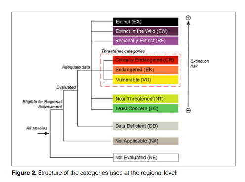
Turns out, it’s actually the latter! This is probably well known to anyone in to conservation, but the classification system is actually put out by the International Union for Conservation of Nature.  It looks like this:

They publish a rather extensive document detailing each category, and apparently they update this document every couple years.  The entire goal of this classification system was to bring some rigor to the process of assessing different species populations, and they have some interesting guidelines.

For example, if a species population drops due to known and/or reversible causes, the size of the drop dictates their status. A drop of >90% in 10 years (or 3 generations) gets you labeled critically endangered, >70% gets you labeled endangered, and a drop of >50% gets you a “vulnerable” label. “Near threatened” doesn’t have a number, but would apply if there was growing concern/problems that didn’t meet any of the other criteria. They play out some other scenarios here. All of the criteria include numbers plus ongoing threats, so there are a few different cases for each.

For example, a critically endangered species could have <250 mature individuals + a threatened habitat, or <50 mature individuals with no threat. For endangered animals, those numbers are 2500 and 500 respectively, and for vulnerable animals it’s 10,000 and 1000. I was interested to note that they include quantitative models as a valid form of forecasting extinction.

Anyway, whether you agree with the criteria or not, it was nice to know that someone’s actually tried to define these terms in a transparent way that anyone can read up on.  Hopefully that means these guys will be okay:


5 Things About the Perfect Age

When people ask me to explain why I got degrees in both family therapy and statistics, my go to answer is generally that “I like to think about how numbers make people feel.” Given this, I was extremely interested to see this article in the Wall Street Journal this weekend, about researchers who are trying to figure out what people consider the “perfect” age.

I love this article because it’s the intersection of so many things I could talk about for hours: perception, biases, numbers, self-reporting, human development, and a heavy dose of self-reflection to boot.

While the researchers haven’t found any one perfect age, they do have a lot of thought provoking commentary:

  1. The perfect age depends on your definition of perfect Some people pick the year they had the most opportunities, some the year they had the most friends, some the years they had the most time, others the year they were the happiest, and other the years they had a lot to reflect on. Unsurprisingly, different definitions lead to different results.
  2. Time makes a difference Unsurprisingly, young people (college students) tend to say if they could freeze themselves at one age, it would be sometime in their 20s. Older people on the other hand name older ages….50 seems pretty popular. This makes sense as I suspect most people who have kids would pick to freeze themselves at a point where those kids were around
  3. Anxiety is concentrated to a few decades One of the more interesting findings was that worry and anxiety were actually most present between 20 and 50.  After 50, well-being actually climbed until age 70 or so. The thought is that generally that’s when the kids leave home and people start to have more time on their hands, but before the brunt of major health problems hits.
  4. Fun is also concentrated at the beginning and end of the curve Apparently people in the 65 to 74 age range report having the most fun of any age range, with 35 to 54 year olds having the least. It’s interesting that we often think of young people as having the “fun” advantage due to youth and beauty, but apparently the “confusion about life” piece plays a big part in limiting how fun those ages feel. Sounds about right.
  5. How stressed you are in one decade might dictate how happy you are in the next one This is just me editorializing, but all of this research really makes me wonder how our stress in one decade impacts the other decades. For example, many parents find the years of raising small children rather stressful and draining, but that investment may pay off later when their kids are grown. Similar things are true of work and other “life building” activities. Conversely, current studies show that men in their 20s who aren’t working report more happiness than those in their cohort who are working….but one suspects by age 40 that trend may have reversed. You never know what life will throw at you, but even the best planned lives don’t get their highs without some work.

Of course after thinking about all this, I had to wonder what my perfect age would be. I honestly couldn’t come up with a good answer to this at the moment, especially based on what I was reading. 50 seems pretty promising, but of course there’s a lot of variation possible between now and then. Regardless, a good example of quickly shifting opinions, and how a little perspective tweak can make a difference.