Fake news is all the rage these days. We’re supposed to hate it, to loathe it, to want it forever banned from our Facebook feeds, and possibly give it credit for/blame it for the election results. Now, given my chosen blog topics and my incessant preaching of internet skepticism, you would think I would be all in on hating fake news.
Nah, too easy.
Instead I’m going to give you 5 reasons why I think the hate for fake news is overblown. Ready? Here we go!
- Fake news doesn’t have a real definition Okay, yeah I know. Fake news is clear. Fake news is saying that Hillary Clinton ran a child prostitution ring out of a DC pizza place. That’s pretty darn clear, right? Well, is it? The problem is that while there are a few stories that are clearly “fake news”, other things aren’t so clear. One mans “fake news” is another mans “clear satire”, and one woman’s “fake news” is another’s “blind item”. Much of the controversy around fake news seems to center around the intent of the story (ie to deceive or make a particular candidate look bad), but that intention is quite often a little opaque. No matter what standard you set, someone will find a way to muddy the water.
- Fake news is just one gullible journalist away from being a “hoax” Jumping off point #1, let’s remember that even if Facebook bans “fake news” you still are going to be seeing fake news in your news feed. Why? Because sometimes journalists buy it. See if you or I believe a fake story, we “fell for fake news”. If a journalist with an established audience does it, it’s a “hoax”. Remember Jackie from Rolling Stone? Dan Rather and the Killian documents? Or Yasmin Seweid from just last month? All were examples of established journalists getting duped by liars and reporting those lies as news. You don’t always even need a person to spearhead the whole thing. For example, not too long ago a research study made headlines because it claimed eating ice cream for breakfast made you smarter. Now skeptical readers (ie all of you) will doubt that finding was founded, but you’d be reasonable in assuming the study at least existed. Unfortunately your faith would be unfounded, as Business Insider pointed out that no one reporting on this had ever seen the study. Every article pointed to an article in the Telegraph which pointed to a website that claimed the study had been done, but the real study was not locatable. It may still be out there somewhere, but it ludicrously irresponsable of so many news outlets to publish it without even making sure it existed.
- Fake news can sometimes be real news In point #1, I mentioned that it was hard to actually put a real definition on “fake news”. If one had to try however, you’d probably say something like “a malaciously false story by a disreputable website or news group that attempts to discredit someone they don’t like”. That’s not a bad definition, but it is how nearly every politician initially categorizes every bad story about themselves. Take John Edwards for example, whose affair was exposed by the National Inquirer in 2007. At the time, his attorney said “”The innuendos and lies that have appeared on the internet (sic) and in the National Enquirer concerning John Edwards are not true, completely unfounded and ridiculous.” It was fake news, until it wasn’t. Figuring out what’s fake and who’s really hiding something isn’t always as easy at it looks.
- Fake news probably doesn’t change minds Now fake news obviously can be a huge problem. Libel is against the law for a reason, and no one should knowingly make a false claim about someone else. It hurts not just the target, but can hurt innocent bystanders as well. But aside from that, people get concerned that these stories are turning people against those they would otherwise be voting for. Interestingly, there’s not a lot of good evidence for this. While the research is still new, the initial results suggest that people who believe bad things about a political candidate probably already believed those things, and that seeing the other side actually makes them more adament about what they already believed. In other words, fake news is more a reflection of pre-existing beliefs than a creater of those beliefs.
- Fake news might make us all more cautious There’s an interesting paradox in life that sometime by making things safer you actually make them more dangerous. The classic example is roads: the “safer” and more segregated (transportation mode-wise) roads are, the more people get in to accidents. In areas where there is less structure, there are fewer accidents. Sometimes a little paranoia can go a long way. I think a similar effect could be caused by fake news. The more we suspect someone might be lying to us, the more we’ll scrutinize what we see. If Facebook starts promising that they’ve “screened” fake news out, it gives everyone an excuse to stop approaching the news with skepticism. That’s a bad move. While I reiterate that I never support libel, lying or “hoaxes”, I do support constant vigilance against “credible” news sources. With the glut of media we are exposed to, this is a must.
To repeat for the third time, I don’t actually support fake news. Mostly this was just an exercise in contrarianism. But sometimes bad things can have upsides, and sometimes paranoia is just good sense.
 If you think about it, this makes a lot of sense. If money is a struggle, it affects your happiness. Once you’ve stopped struggling, it stops having the same effect. So basically it’s more accurate to say that money can’t buy happiness, but a lack of money sure can stress you out.
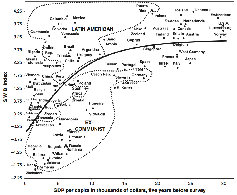 So countries that struggle to develop do take their toll on their citizens, but at some point development stops yielding returns in well being. It would be interesting to see if the effect of personal wealth varied with country GDP, but alas I can’t find that data.


