On my last post, I gave a few scattered thoughts about the UKs healthcare system vs the US system. In the comments, a very astute commenter mentioned that life expectancy was not a great way of measuring how well your health care system was working. This is an excellent point that I think deserves some discussion.
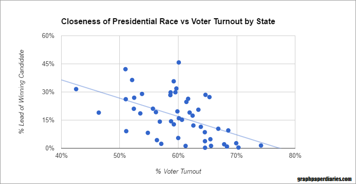
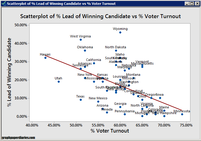
If you start looking in to the US healthcare system, you will very quickly run across a graph like this one that shows health care spending vs life expectancy:
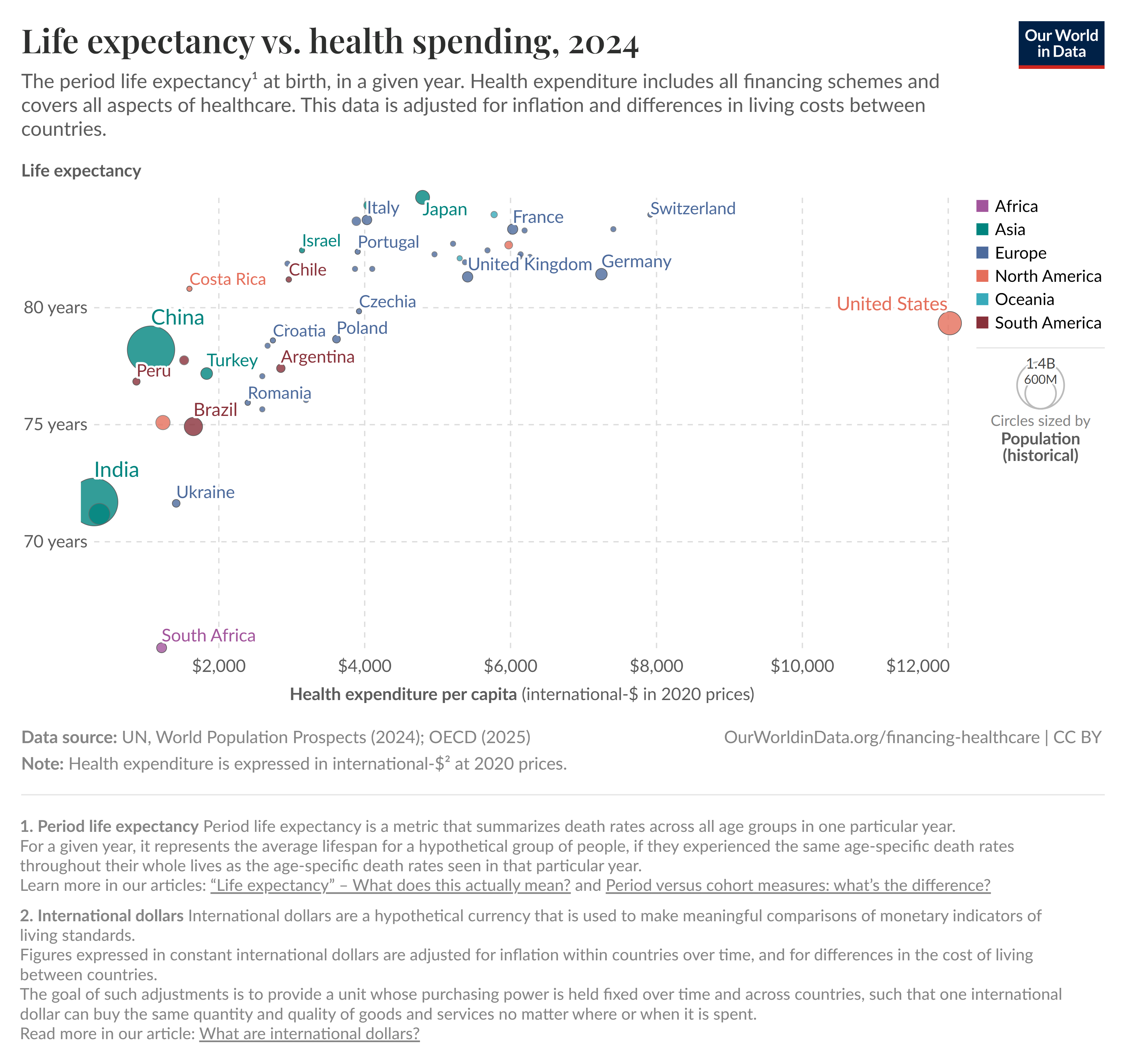
There’s a variety of these charts but they all show the same thing: the US spends the most on health care per capita by a good margin, but does not have the highest life expectancy in the world. We’re about 5 years behind a country like Japan (84.7 years vs US 79.3 years), despite us spending 3 times what they do ($4k vs $12k per capita). I think it’s worth diving in to why this is, and why it may or may not be an accurate measure of how our healthcare system is doing.
Life Expectancy Calculations
There’s a actually a few different ways to calculate life expectancies, and the exact details of what you’re trying to do matter quite a bit. But one thing most ways of calculating it have in common is that they are all impacted quite a bit by people who die young. This is an issue a lot of us are familiar with when looking at historic life expectancies, which tend to be weighed down by the high number of children who died before their 5th birthday. This is a big enough issue that the UN actually looks at both life expectancy from birth and life expectancy at age 15, just to account for both child mortality and mortality at older ages.
So the point is, if you’re in a developed country and you want to understand why your life expectancy looks like it does, the first thing to take a look at is what kills your young people. So what kills young people in the US? Guns, drugs and cars.
Guns, Drugs and Cars
Ok, so before we go any further, I want to acknowledge that the topics of guns, drugs and cars tend to get people a little worked up. Given this, I want to clarify why I’m going in to this. I am NOT attempting to recommend any particular policy solution to the things I’m talking about below. I’ve done some of that in other posts over the years, but in this post I am specifically focusing on 1. If guns, drugs and cars kill people in the US at rates higher than in other countries and 2. If those deaths can be stopped by healthcare spending. This is important because again, that graph above gets used All. The. Time.
If life expectancy has some factors going in to it that cannot be fixed with healthcare spending, then that is a reason to take that graph a little less seriously next time you see it. Alright, with that out of the way, let’s look at some data!
Since 1981, the single largest killer of those under age 44 in the US has been “unintentional injuries”. This is a large category that includes drowning, poisoning, falls, motor vehicle accidents and “other” accidents. 90% of them are motor vehicle accidents or poisoning, and “poisoning” is the broad category that includes (and indeed is dominated by) recreational drug overdoses. Here’s a quick comparison of the top causes of death for those age 1-44 in 1981 vs 2023. Note: these are raw numbers, not population adjusted. ChatGPT suggests the under 44 population probably went up by 22 million people during the 42 years covered here.
| 1981 | 2023 | |
| Unintentional injuries | 58,500 | 83,300 |
| Malignant neoplasms | 22,000 | 17,400 |
| Homicide | 17,900 | 16,900 |
| Heart Disease | 16,400 | 16,100 |
| Suicide | 15,900 | 23,400 (now #2 cause) |
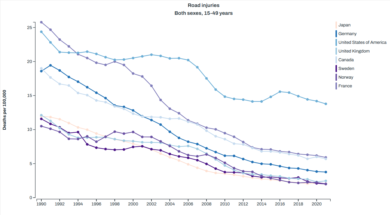
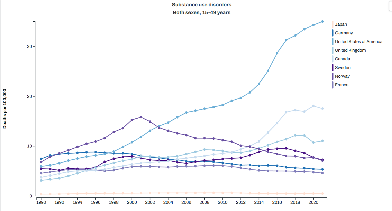
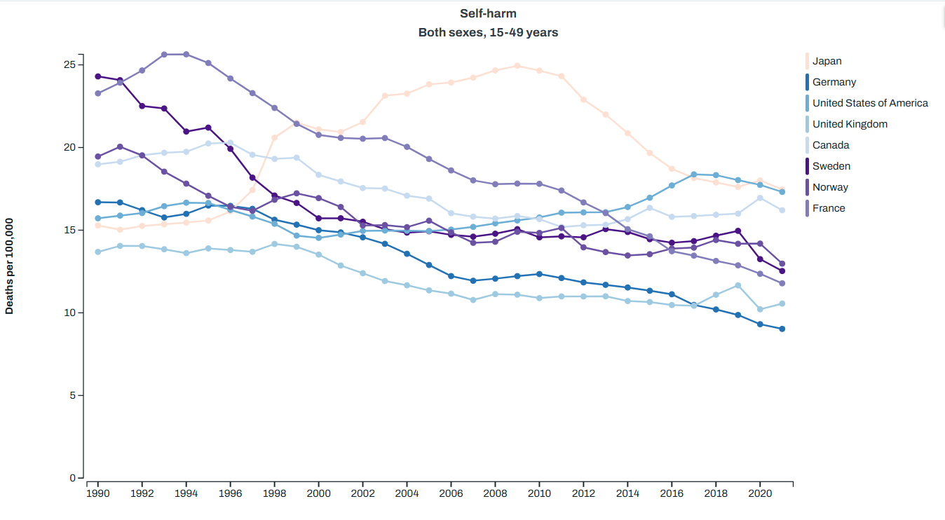
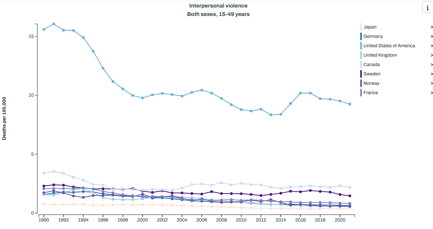
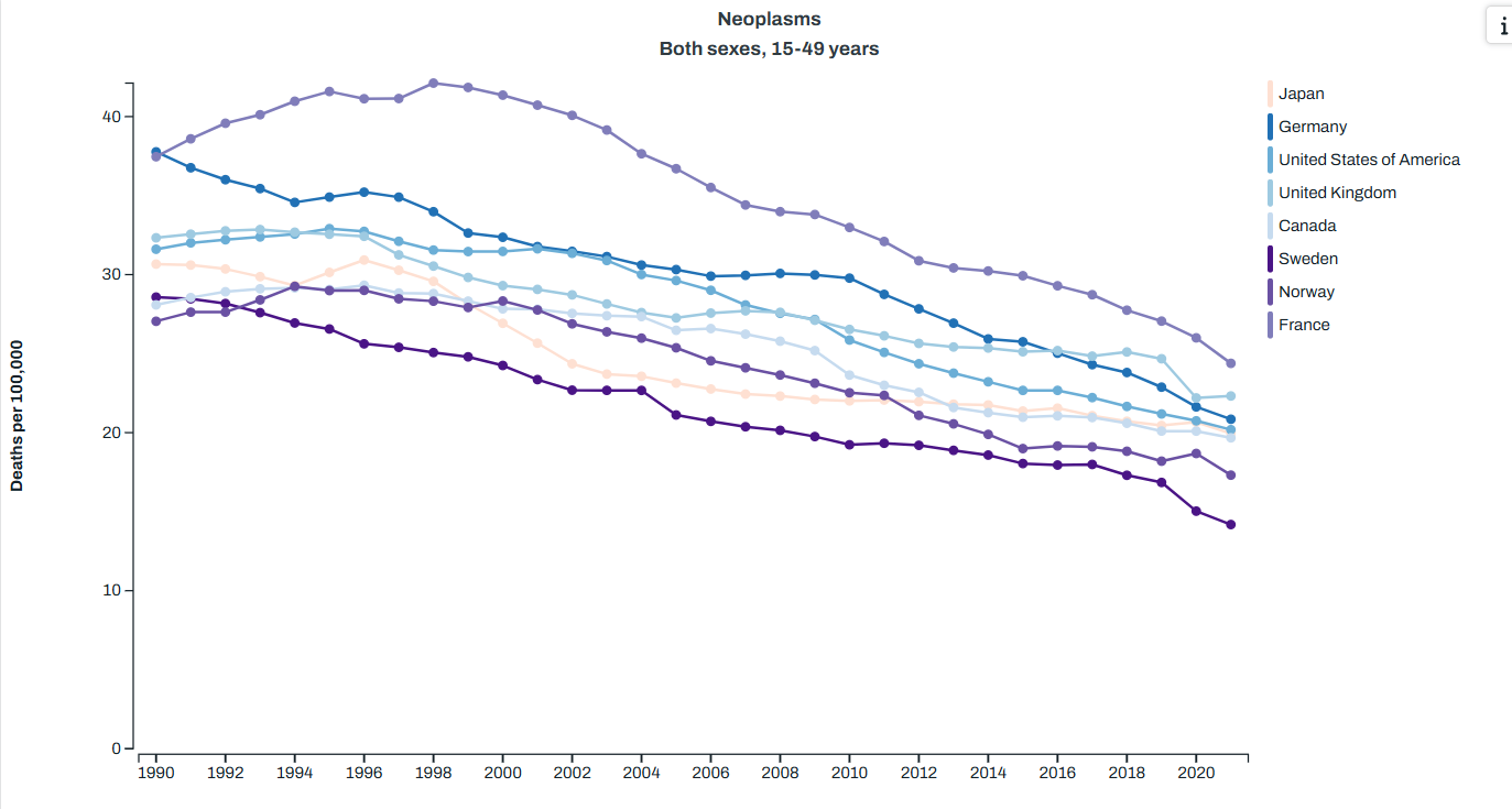
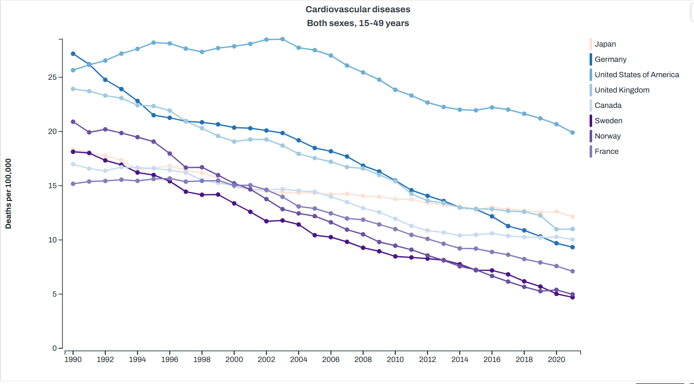
You can quickly note that the two categories here that the healthcare system has the most control over malignant neoplasms (cancer) and heart disease both went down during the timeframe we’re looking at here. Homicides also went down, but suicide and injury deaths went up. Given that in the US suicides are about 50% firearm deaths and homicides are about 80%, we can pretty accurately sum up the top killers of young people as “guns, drugs and cars” So how does this compare to other countries? Well the Global Health Data Exchange visualization tool can help us there. I picked a few countries that show up as having higher life expectancies than the US for less money to compare us to on the top causes of death, and here’s what I got. Note: I had to pick one age category for the visualization, and they didn’t have exactly the age 1-44 used above, so I used 15-49. We’re just getting a sense of the differences here. Anyway, here’s what I got:
Road injuries: the US sees twice as many deaths per capita as the next closest country, and substantially more than the lowest comparison countries I picked.
Drug abuse deaths (aka overdoses): again, we lead substantially here.
Suicide: we are one of the top here, but are much closer to other countries
Homicide (aka “interpersonal violence”): again, we are top
Cancer (aka “neoplasms”): we are middle of the pack
Heart disease: back at the top
So again, guns, drugs and cars appear to have a rather substantial impact on our mortality in younger people, and it’s not clear what our healthcare system could do differently to stop this. For motor vehicle accidents and murders, the health care system is mostly involved after the fact. There’s some argument that we could maybe improve our care of severely wounded people, but I don’t think anyone is really making the argument that our trauma care in the US isn’t as effective as that in Japan. It seems more likely that there’s just a lot more car accidents and violent incidents here. Healthcare spending can’t stop that.
For suicides and drug overdoses, one can argue perhaps that a better funded mental health/rehab system could help things, but as anyone who has dealt with a suicidal or addicted family member knows that it’s not quite as simple as that.
I will note that I often hear obesity thrown out there as another issue the US faces, and I think this is true based on the cardiovascular disease numbers. The only reason I don’t include it in “the big three” is because it is mostly taking out people in later years, and while we are above most other countries, our problem isn’t twice as bad like it is with road deaths, homicides or overdoses. We could definitely add it in though, and we’d still get back to healthcare spending not changing much. New medications like Ozempic might change that math, but up until recently that was pretty true.
I also leave it out because honestly I’ve heard waaaaaaaaaaaaay too much “if we stopped spending money on medication and let everyone go to the farmers market, we’d be great!” type stuff. That’s a nifty idea but it’s still not gonna change car crash deaths, overdoses or homicides, and so the bulk of our problem remains.
Impact on Life Expectancy
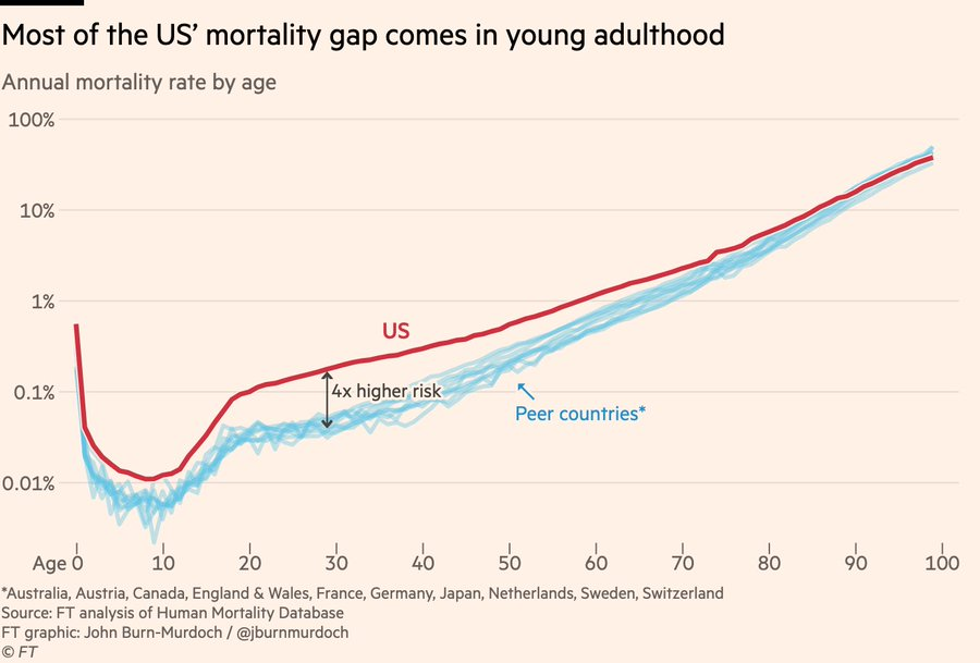
Ok, so what does this do to life expectancy, and how do we know this is the major driver? Well the Financial Times did an interesting analysis here. It’s paywalled, but the author did a Twitter thread here. Some graphs were included, like this one that shows that US citizens over 75 basically have the same life expectancy as our peer countries, whereas those under 40 have a much greater chance of dying:
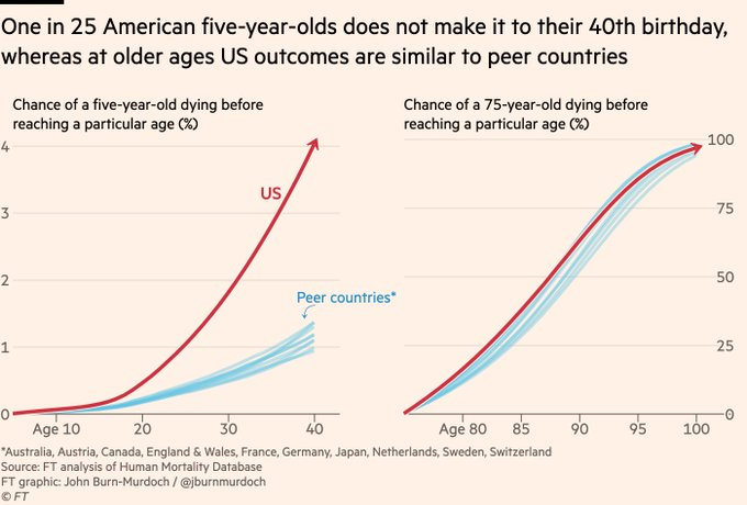
This graph shows a similar thing, the probability of dying at a particular age is much higher for young people in the US vs peer countries, and similar for older ages:
If you look at the actuarial tables from the Social Security Administration, you can see this as well. Those tables look at a hypothetical cohort of 100,000 people born in the same year and show how many will still be living at each age. The UK releases similar data:
| US – male | UK – male | US – female | UK – female | |
| Age at which 1 in 100 of the cohort are deceased | 16 | 24 | 21 | 34 |
| 1 in 20 | 35 | 50 | 49 | 57 |
| 1 in 10 | 50 | 60 | 59 | 66 |
| 1 in 5 | 62 | 69 | 69 | 74 |
People in the US are just more likely to know someone who died young.
Other Causes
I actually couldn’t find a comprehensive source for top issues with our life expectancy in the US, but I did finally think to use ChatGPT to ask, a resource I’m still not used to. I was pleased that despite not using it until this point in the post, the top causes it listed that are making the biggest impact are drugs, cars and guns. I asked it a few different ways how much we could add to our national life expectancy if those were closer to peer nations, and it suggested we’d add 2-5 years, which if you’ll recall would put us up much closer to the top.
After it listed those causes, we got in to a few (cardiovascular and metabolic disorders) which can be tied to obesity. It also added in smoking, maternal health, and general mental health. Racial differences, socioeconomic status and access to healthcare were listed last, with an estimate we could get back about a year of life expectancy if we fixed all of that.
To reiterate the point that things that impact young people count a lot more than things that impact older people, ChatGPT estimated that “solving” the opioid crisis would give us back about a year of life expectancy for our entire population. “Solving” obesity? About half a year. Stunning when you consider how many more obese people there are than opioid addicts, but again, one death of a 22 year old takes off 56 life years, as much as 11 people dying at 74 rather than 79.
Immigration?
One weird data point I encountered while doing this work is the differences in how countries count non-citizens. I couldn’t verify how each country counted immigrants/illegal immigrants/refugees, but it seems likely that how they do that counting could impact their overall numbers. I don’t know for sure but I would guess that those raised in third world without adequate access to nutrition or health care may always have higher medical needs (including translation services) and lower life expectancies than those who have always lived in a first world country. Differences in counting is going to matter quite a bit here.
Impact on Healthcare Spending
So finally we loop back to the ultimate topic: are we really spending more money for worse outcomes? Well yes, sort of! But it’s not really the healthcare systems fault. If you have two countries with the same exact health care system but one country has people who get in lots of car accidents and the other doesn’t, life expectancy will be lower and costs will be higher. External injury deaths are a huge driver of mortality in the young, and if they are not equal across populations their outcomes will be unequal. The healthcare system mostly cannot prevent these deaths, they are just dealing with what comes across their door.
It’s worth noting that in addition to the deaths counted above, there are also going to be a bunch of people impacted by car crashes, drugs and guns who won’t die but will end up with health problems that will both cost money and shorten their lifespan. Many people I know who were in bad car accidents when they were younger end up with early arthritis in the impacted joints or other issues. Former drug users also may carry long term issues like Hepatitis C or HIV infections. Basically the pool of people who died under 50 is just the center of a much larger group of those injured early on who may have issues. These will also run up healthcare costs.
Again, none of this is to say what, if anything, we should do about these risks. But it is important to know when you see the spending/life expectancy graph exactly what we’re dealing with, and what can or can’t be fixed simply by throwing healthcare dollars at it.