Counting Terrorism and the Pitfalls of Open Source Databases

Terrorism is surging in the US, fueled by right-wing ideologies

Someone posted this rather eye catching story on Twitter recently, which came from an article back in August from QZ.com. I’ve blogged about how we classify terrorism or other Mass Casualty Incidents over the years, so I decided to click through to the story.

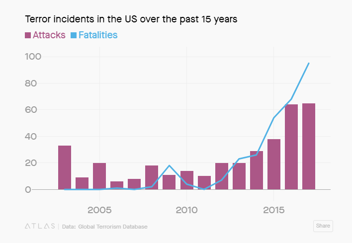
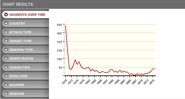
It came with two interesting graphs that I thought warranted a closer look. The first was a chart of all terror incidents (the bars) vs the fatalities in the US:

Now first things first: I always note immediately where the year starts. There’s a good reason this person chose to do 15 years and not 20, because including 9/11 in any breakdown throws the numbers all off. This chart peaks at less than 100 fatalities, and we know 2001 would have had 30 times that number.

Still, I was curious what definition of terrorism was being used, so I went to look at the source data they cited from the Global Terrorism Database. The first thing I noted when I got to the website is that data collection for incidents is open source. Interesting. Cases are added by individual data collectors, then reviewed by those who maintain the site. I immediately wondered exactly how long this had been going on, as it would make sense that more people added more incidents as the internet became more ubiquitous and in years where terrorism hit the news a lot.

Sure enough, on their FAQ page, they actually specifically address this (bolding mine):

Is there a methodological reason for the decline in the data between 1997 and 1998, and the increases since 2008 and 2012?

While efforts have been made to assure the continuity of the data from 1970 to the present, users should keep in mind that the data collection was done as events occurred up to 1997, retrospectively between 1998 and 2007, and again concurrently with the events after 2008. This distinction is important because some media sources have since become unavailable, hampering efforts to collect a complete census of terrorist attacks between 1998 and 2007. Moreover, since moving the ongoing collection of the GTD to the University of Maryland in the Spring of 2012, START staff have made significant improvements to the methodology that is used to compile the database. These changes, which are described both in the GTD codebook and in this START Discussion Point on The Benefits and Drawbacks of Methodological Advancements in Data Collection and Coding: Insights from the Global Terrorism Database (GTD), have improved the comprehensiveness of the database. Thus, users should note that differences in levels of attacks before and after January 1, 1998, before and after April 1, 2008, and before and after January 1, 2012 may be at least partially explained by differences in data collection; and researchers should adjust for these differences when modeling the data.

So the surge in incidents might be real, or it might be that they started collecting things more comprehensively, or a combination of both. This is no small matter, as out of the 366 incidents covered by the table above, 266 (72%)had no fatalities. 231  incidents (63%) had no fatalities AND no injuries. Incidents like that are going to be much hard to find records for unless they’re being captured in real time.

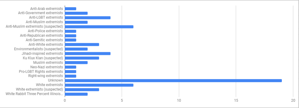
The next graph they featured was this one, where they categorized incidents by perpetrator:

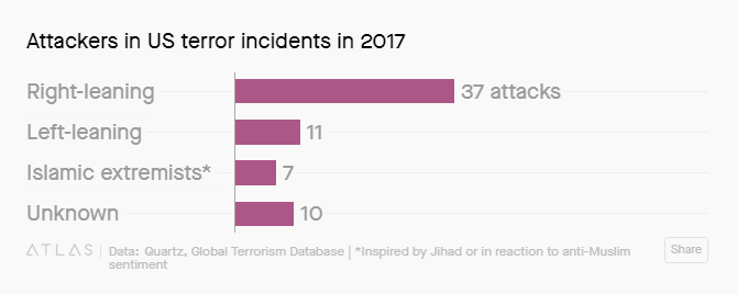
The original database contains a line for “perpetrator group”, which seems to speak loosely to motivation. Overall they had 20 different categories for 2017, and Quartz condensed them in to the 4 above. I started to try to replicate what they did, but immediately got confused because the GTD lists 19 of the groups as “Unknown”, so Quartz had to reassign 9 of them to some other group. Here’s what you get just from the original database:

Keep in mind that these categories are open source, so differences in labeling may be due to different reviewers.

Now it’s possible that information got updated in the press but not in the database. It seems plausible that incidents might be added shortly after they occur, then not reviewed later when more facts were settled. For example, the Las Vegas shooter was counted under “anti-government extremists”, but we know that the FBI closed the case 6 months ago stating they never found a motive. In fact, the report concluded that he had a marked disinterest in political and religious beliefs, which explains his lack of manifesto or other explanation for his behavior. While anti-government views had been floated as a motive originally, that never panned out. Also worth noting, the FBI specifically concluded this incident did not meet their definition for terrorism.

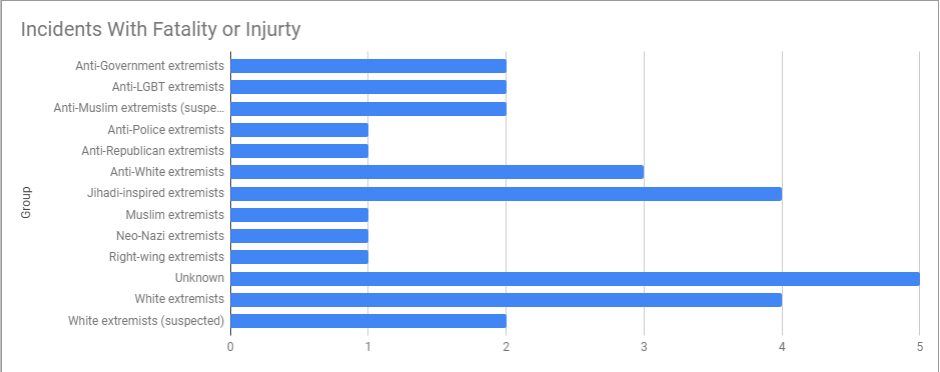
Out of curiosity, I decided to take a look at just the groups that had an injury or fatality associated with their actions (29 out of the 65 listed for 2017):

If you want to look at what incident each thing is referring to, the GTD list is here. Glancing quickly, the one incident listed as explicitly right wing was Mitchell Adkins, who walked in to a building and stabbed 3 people after asking them their political affiliation. The one anti-Republican one was the attack on the Republican Congressional softball team.

I think overall I like the original database categories better than broad left or right wing categories, which do trend towards oversimplification. Additionally, when using crowd sourced information, you have to be careful to account for any biases in reporting. If the people reporting incidents are more likely to come from certain regions or to pay more attention to certain types of crimes, the database will reflect that.

To illustrate that point, I should note that 1970 is by FAR the worst year for terrorist incidents they have listed. Here’s their graph:

Now I have no idea if 1970 was really the worst year on record or if it got a lot of attention for being the first year they started this or if there’s some quirk in the database here, but that spike seems unlikely. From scanning through quickly, it looks like there’s a lot of incidents that happened in the same day. That trend was also present in the current data, and there were a few issues I noted that looked like duplicates but also could have been two things done similarly in the same day.

Overall though, I think comparing 1970 to 2017 shows an odd change in what we call terrorism. Many of the incidents listed in 1970 were done by people who specifically seemed to want to make a point about their group. In 2017, many of the incidents seemed to involve someone who wanted to be famous, and picked their targets based on whoever drew their ire.  You can see this by the group names. In 2017 only one named group was responsible for a terrorist attack (the White Rabbit Militia one) whereas in 1970 there at least a dozen groups with names like “New World Liberation Front” or “Armed Revolutionary Independence Movement“.

Overall, this change does make it much harder to figure out what ideological group terrorists belong to, as a large number of them seem to be specifically eschewing group identification. Combine that with the pitfalls of crowd sourcing, and changing definitions, and I’d say this report is somewhat inconclusive.

Reporting the High Water Mark

Another day, another weird practice to add to my GPD Lexicon.

About two weeks ago, a friend sent me that “People over 65 share more fake news on Facebook” study to ask me what I thought. As I was reviewing some of the articles about it, I noticed that they kept saying the sample size was 3,500 participants. As the reporting went on however, the articles clarified that not all of those 3,500 people were Facebook users, and that about half the sample opted out. Given that the whole premise of the study was that the researchers had looked at Facebook sharing behavior by asking people for access to their accounts, it seemed like that initial sample size wasn’t reflective of those used to obtain the main finding. I got curious how much this impacted the overall number, so I decided to go looking.

After doing some follow up with the actual paper, it appears that 2,771 of those people had Facebook to begin with,  1,331 people actually enrolled in the study, and 1,191 were able to link their Facebook account to the software the researchers needed. So basically the sample size the study was actually done on is about a third of the initially reported value.

While this wasn’t necessarily deceptive, it did strike me as a bit odd. The 3,500 number is one of the least relevant numbers in that whole list. It’s useful to know that there might have been some selection bias going on with the folks who opted out, but that’s hard to see if you don’t report the final number.  Other than serving as a selection bias check though (which the authors did do), 63% of the participants had no link sharing data collected on them, and thus are irrelevant to the conclusions reported.  I assumed at first that reporters were getting this number from the authors, but it doesn’t seem like that’s the case.  The number 3,500 isn’t in the abstract. The press release uses the 1,300 number. From what I can tell, the 3,500 number is only mentioned by itself in the first data and methods section, before the results and “Facebook profile data” section clarify how the interesting part of the study was done. That’s where they clarify that 65% of the potential sample wasn’t eligible or opted out.

This was not a limited way of reporting things though, as even the New York Times went with the 3,500 number. Weirdly enough, the Guardian used the number 1,775, which I can’t find anywhere. Anyway, here’s my new definition:

Reporting the high water mark: A newspaper report about a study that uses the sample size of potential subjects the researchers started with, as opposed the sample size for the study they subsequently report on.

I originally went looking for this sample size because I always get curious how many 65+ plus people were included in this study. Interestingly, I couldn’t actually find the raw number in the paper. This strikes me as important because if older people are online in smaller numbers thank younger ones, the overall number of fake stories might be larger among younger people.

I should note that I don’t actually think the study is wrong. When I went looking in the supplementary table, I noted that the authors mentioned that the most commonly shared type of fake news article was actually fake crime articles. At least in my social circle, I have almost always seen those shared by older people rather than younger ones.

Still, I would feel better if the relevant sample size were reported first, rather than the biggest number the researchers looked at throughout the study.

What I’m Reading: January 2019

Well my best read of the month was the draft manuscript of my brother’s upcoming book Addiction Nation: What the Opioid Crisis Reveals About Us . This book came out of an article he wrote about his own opioid addiction, which I blogged about here. I’m super proud of him for this book, so expect more mentions of this as the publication date draws closer. He’s asked me if I’d do some blogging with him about some of the research around this topic, so if anyone had anything in particular they’d be interested on that topic please let me know.

A recent bout of Wikipedia reading led me to this really interesting visual about the Supreme Court.  My dad had mentioned recently the idea that there used to be a “Catholic seat” on the Supreme Court, before the more recent trend of Catholics dominating SCOTUS. Turns out there’s a visual that shows how right he was:

So basically for almost 60 years there was only one Catholic justice, and they seemed to be nominated to replace each other. Then in the late 80s that all changed, and by the late 2000s Catholics would dominate the court. As it stands today the breakdown is 5 Catholics, 3 Jews, and 1 Episcopalian.

I stumbled across an interesting paper a few weeks ago called “Metacognitive Failure as a Feature of Those Holding Radical Beliefs” that found that people who held “radical” beliefs were more likely to be overconfident/less aware of their errors in neutral areas as well. I haven’t read through the full study, but the idea that radical beliefs are due to generalized overconfidence as opposed to attachment to a specific idea is intriguing.

As someone who was raised with a good dose of 90s era environmentalism, I thought this Slate Star Codex post about “What Happened to 90s Environmentalism?” was fascinating. Turns out some of the stuff we were warned about was solved, some was overhyped and some….just stopped being talked about.

On a totally different note, I’ve decided to do a cookbook challenge this year, and am cooking my way through the book 12 Months of Monastery Soups. I sort of started blogging about it, but I’m not sure if I like that format or not. If I end up ditching that, then I’m still going to post pictures on my heretofore neglected Instagram account.

Updates on Mortality Rates and the Impact of Drug Deaths

A couple of years ago now, there was a lot of hubbub around a paper about mortality rates among white Americans. This paper purported to show that mortality for middle aged white people in the US were not decreasing (like other countries/races/ethnicities) were, but was actually increasing.

Andrew Gelman and others challenged this idea, and noted that some of the increase in mortality was actually a cohort effect. In other words, mortality was up, but so was the average age of a “45-54 year old”. After adjusting for this, their work suggested that actually it was white middle aged women in the south who were seeing an increase in mortality:

In this article for Slate, they published the state by state data to make this even clearer:

In other words, there are trends happening, but they’re complicated and not easy to generalize.

One of the big questions that came up when this work was originally discussed was how much “despair deaths” like the opioid overdoses or suicide rates were driving this change.

In 2017, a paper was published that showed that this was likely only partially true. Suicide and alcohol related deaths had remained relatively stable for white people, but drug deaths had risen:

Now, there appears to be a new paper coming out  that shows there may be elevated mortality in even earlier age groups. It appears only the abstract is up at the moment, but the initial reporting shows that there may be some increase in Gen X (current 38-45 year olds) and some Gen Y (27-37 year olds). They have reportedly found elevated mortality patterns among white men and women in that age group, being partially driven by drug overdoses and alcohol poisonings.

From the abstract, the generations with elevated mortality were:

    • Non-Hispanic Blacks and Hispanics: Baby Boomers
    • Non-Hispanic White females: late-Gen Xers and early-Gen Yers
    • Non-Hispanic White males: Baby Boomers, late-Gen Xers, and early-Gen Yers.

Partial drivers for each group:

  • Baby Boomers: drug poisoning, suicide, external causes, chronic obstructive pulmonary disease and HIV/AIDS for all race and gender groups affected.
  • Late-Gen Xers and early-Gen Yers: are at least partially driven by mortality related to drug poisonings and alcohol-related diseases for non-Hispanic Whites.

And finally, one nerve-wracking sentence:

Differential patterns of drug poisoning-related mortality play an important role in the racial/ethnic disparities in these mortality patterns.

It remains to be seen if this paper will have some of the cohort effect problems that have plagued other analyses, but the drug poisoning death issue seems to be a common feature. It remains to be seen what the long term outcomes of this will be, but here’s an interesting visualization from Senator Mike Lee’s website:

Not a pretty picture.

GPD Most Popular Posts of 2018

Well here we are, the end of 2018. I always get a kick out of seeing what my most popular posts are each year, as they are never what I expect them to be, so I always enjoy my year end roundup.

My most popular posts this year continue to be ones I think people Google for school assignments (6 Examples of Correlation/Causation Confusion and 5 Examples of Bimodal Distributions), and the Immigration, Poverty and Gumballs post. Every time immigration debates hit the news, Numbers USA reposts the video that sparked that post and my traffic goes with it. At this point I find that utterly bizarre as the video is 8 years old and the numbers he quotes over a decade old, but people still contact me wanting to fight about them. Sigh.

Okay, now on to 2018! Here were my most popular posts written in 2018:

  1. 5 Things About that “Republicans are More Attractive than Democrats” Study I was surprised to see this post topped my list, until I realized it’s actually just been an extremely steady performer, garnering equal number of hits every month since it went live. Apparently partisan attractiveness is a timeless concern.
  2. Vitamin D Deficiency: A Supplement Story Yet another one that surprised me. Moderately popular when I first posted it, this has become increasingly popular as we enter winter months.
  3. What I’m Reading: September 2018 My link fests don’t often make my most read list, but my discussion of the tipping point paper (i.e. how many people have to advocate for a thing before the minority can convince the majority) got this one some traffic from the AVI at Chicago Boyz.
  4. 5 Things About the GLAAD Accelerating Acceptance Report This was the post I personally shared the most this year, with and odd number of people I knew actually bringing it up to me. Yay self-promotion!
  5. GPD Lexicon I was pleased to see my new GPD Lexicon page made the list, and I really enjoy putting these together. I think my 2019 resolution is to try to figure out how to put some of these in to an ebook. Writing them makes me happy.
  6. Tick Season 2018 I think this post got put up on an exterminator website as a good example of why you needed their spraying services. Glad I could help?
  7. Death Comes for the Appliance This actually may have been my favorite post of the year. I learned so much weird trivia and now have way too many talking points when people bring up appliance lifespans. Thanks to all who participated in the comments.
  8. 5 Things About Fertility Rates I still think about this post every time someone mentions fertility rates. The trends are fascinating to me.
  9. Tidal Statistics  I was very gratified to find people linking to this one when encountering their own statistics problems. Easier to fight the problem when you can actually name it.
  10. The Mandela Effect: Group False Memory This entire concept still makes me laugh and think, all at the same time.

Well that’s a wrap folks, see you in the new year!


GPD Lexicon: Proxy Preference

It’s been a little while since I added anything to the GPD Lexicon, but I got inspired this week by a Washington Post article on American living situations. It covered a Gallup Poll that asked people an interesting question:

“If you could live anywhere you wished, where would you prefer to live — in a
big city, small city, suburb of a big city, suburb of a small city, town, or rural area?”

The results were then compared to where people actually live, to give the following graph:

Now when I saw this I had a few thoughts:

  1. I wonder if everyone actually knew what the definition of each of those was when they answered.
  2. I wonder if this is really what people want.

The first was driven by my confusion over whether the town I grew up in would be considered a town or a “small city suburb”.

The second thought was driven by my deep suspicion that almost 30% of the US actually wanted to live in rural areas, whereas only half that number actually live in one. While I have no doubt that many people actually do want to live in rural areas, it seems like for at least some people that might be a bit of a proxy for something else. For example, one of the most common reason for moving away from rural areas is to find work elsewhere. Did saying you wanted to live in a rural area represent (for some people) a desire to not have to work or to be able to work less? A desire to not have economic factors influence where you live?

To test this theory, I decided to ask a few early to mid 20s folks at my office where they would live if they could live anywhere. All of them currently live in the city, but all gave different answers.  This matched the Gallup poll findings, where 29% of 18-29 year olds were living in cities, but only 17% said they wanted to. As they put it:

“One of the most interesting contrasts emerges in reference to big-city suburbs. The desire to live in such an area is much higher among 18- to 29-year-olds than the percentage of this age group who actually live there. (As reviewed above, 18- to 29-year-olds are considerably more likely to want to live in a big-city suburb than in a big city per se.)”

Given this, it seems like if I asked any of my young coworkers if they wanted to rent a room from me in my large city suburb home, they’d say yes. And yet I doubt they actually would. When they were answering,  almost none of them were talking about their life as it currently stands, but more what they hope their life could be. They wanted to get married, have kids, live somewhere smaller or in the suburbs. Their vision of living in the suburbs isn’t just the suburbs, it’s owning their own home, maybe having a partner, a good job, and/or kids. They don’t want a room in my house. They want their own house, and a life that meets some version of what they call success.

I think this is a version of what economists call a “revealed preference“, where you can tell what people really want by what they actually buy. In this version though, people are using their answers to one question to express other desires that are not part of the question. In other words this:

Proxy Preference: A preference or answer given on a survey that reflects a larger set of wants or needs not reflected in the question.

An example: Some time ago, I saw a person claiming that women should never plan to return to the workforce after having kids, because all women really wanted to work part time. To prove this, she had pointed to a survey question that asked women “if money were not a concern, what would your ideal work set up be?”. Unsurprisingly, many women said they’d want to work part time. I can’t find it now, but that question always seemed unfair to me. Of course lots of people would drop their hours if they had no money concerns! While many of us are lucky enough to like a lot of what we do, most of us are ultimately working for money.

A second example: I once had a pastor mention in a sermon that as a high schooler he and his classmates had been asked if they would rather be rich, famous, very beautiful or happy. According to his story, he was one of the only people who picked “happy”. When he asked his classmates why they’d picked the other things, they all replied that if they had those things they would be happy. It wasn’t that they didn’t want happiness, it was that they believed that wealth, fame and beauty actually led directly to happiness.

Again, I don’t think everyone who says they want to live in a rural area only means they want financial security or a slower pace of life, but I suspect they might. It would be interesting to narrow the question a bit to see what kind of answers you’d get. Phrasing it “if money were no object, where would you prefer to live today?” might reveal some interesting answers. Maybe ask a follow up question about “where would you want to live in 5 or 10 years?”, which might reveal how much of the answer had something to do with life goals.

In the meantime though, it’s good to remember that when a  large number of people say they’d prefer to do something other than what they are actually doing, thinking about the reasons for the discrepancy can be revealing.

Who Believes What: How We Categorize Religious Beliefs

One of the more common themes in political reporting is to track how different religious groups vote on certain issues. Ever since Trump got elected there has been a lot of reporting on Evangelical support for Trump (an issue I’ve posted about previously), and other topics are framed through the religious lens as well.

This discussion came up again from a different angle this week when Ross Douthat published a column praising WASPs, and people (including Ross himself) ended up discussing who WASPs were today. This led to a few exchanges that showed people debating whether it was fair to call today’s Evangelical Christians “Protestant”.

It’s an interesting question, and one that can be hard to parse if you’re not part of either group. Having been raised in Evangelical churches and schools, I would say that most Evangelicals consider themselves a subset of Protestant-ism as opposed to a separate group, but would agree that there are noticeable differences between the groups. The polling companies generally address this issue by calling groups “Evangelical” vs “Mainline Protestant”. PBS did a quick summary of what the differences in belief are here.

From a polling perspective Christianity is the most subdivided religion in the US, probably because Christianity is the most popular religion in the US. Here’s how Pew Research breaks down Christian respondents:

The orange arrows mean you can expand the section to see what was counted under it. Go here for the full clickable table to see who is in each bucket.

This shows that while most of the country (70.6%) claims the Christian faith, the exact flavor can vary. Evangelicals are the largest group, but Catholics are the largest denomination. Some of the denominations listed are not even particularly accepted by many Christians as part of the Christian faith, such as Jehovah’s Witness. Racial history is also used to subdivide religious groups. Confusingly for anyone not well acquainted with the topic, many churches with the same names actually can fall in three different categories. For example, Southern Baptists (5.3% of the US) are Evangelical, American Baptist Churches (1.5% of the US)are Mainline Protestant, and the National Baptist Convention (1.4% of the US) is a historically Black Protestant denomination. Overall, someone referencing a “Baptist” is most likely talking about an Evangelical type church (9.2% of the US) or a Historically Black Protestant Church (4% of the US). Mainline Protest Baptists are only 1.5% of the US.

For other religions, Pew breaks down “World Religions” (those having large numbers of adherents elsewhere in the world, but small numbers in the US ) and “Other Faiths”, which are basically Unitarians, New Age Religions and Native American traditions. For World Religions they include Judaism, Islam, Buddhist, Hindu and “other”.

When using race and ethnicity in breakdowns, the Public Religion Research Institute actually takes it a step further than Pew, and subdivides Catholics in to “Hispanic” vs “non-Hispanic”:

Finally, there are the “nones”. This group is currently the second biggest group in the US, big enough that Pew has started subdividing it as well:

As you can see, “none” sometimes mean a specific belief (atheist, agnostic), none by default (nothing in particular, religion not important), or seemingly non-committal (nothing in particular, religion important). These groups make up nearly equal portions of the 22.8% of people in this category.

Of course with all of these categories, it’s important to remember that this is all self-defined. No one checks that someone calling themselves a Baptist of any sort actually goes to church or even believes in God. Given that about 50% of people in the US say they rarely or never attend church, this definitely can skew things.  This has led some surveyors to split out “regular church attendees” vs those who don’t often go. Conversely, on the atheist side, Scientific American reported that 1/3 of people who call themselves atheists stated that they believe in some form of life after death, and 6% said they believed in resurrections.  Because of this, some groups have started to come up with new ways of categorizing religious people based on participation and belief levels.

So what’s right here? Should we categorize based on self-identification, participation, or belief? Well, I think it depends. Each of these things can be important depending on what your question actually is, and it’s important to know how surveyors or study authors addressed these issues before drawing any conclusions. It’s also probably important to remember that the distinctions drawn in US surveys are simply reflective of the US population. Muslims aren’t lumped together because Islam is a monolith, but rather because it would be hard to get a meaningful sample size of Sunni vs Shia in the US. If the population of the US shifts, we may see different groups highlighted.

If you know of any other interesting ways of breaking down religions, please let me know! Categorizing belief systems is an interesting challenge, and I like seeing how people address it.

5 Things About Crime Statistics

Commenter Bluecat57 passed along an article a few weeks ago about the nightclub shooting in Thousand Oaks, California. Prior to the tragedy, Thousand Oaks had been rated the third safest city in the US, and it quickly lost that designation after the shooting. He raised the issue of crime statistics and how a city could be deemed “safe”. This seemed like a decent question to look in to, so I thought I’d round up a few interesting debates that crime statistics have turned up over the years.

Ready? Here we go!

  1. There’s no national definition for some crimes In this age of hyperconnectedness, we tend to all assume that having cities report crime is a lot like reporting your taxes or something. Unfortunately, that’s not the case. Participation in most national crime databases is voluntary, and every jurisdiction has their own way of counting things. For example, 538 reported that in New York City, people who were hit by glass from a gunshot weren’t counted as victims of a shooting, but other jurisdictions do count them as such. Thus, any city that reports those as shootings will always look like they have a higher rate of crime than those that don’t.
  2. Data is self-reported by cities and states Self reporting of anything can be known to influence the rates, and crime is no exception. One doesn’t have to look hard to find stories of cities changing how they classify crimes in response to public pressure. Even when everyone’s trying to be honest though, self-reports can be prone to typos and other issues. That’s why earlier this year NPR found that national school shooting numbers appear to have been skewed upward by reporting mistakes made by districts in Cleveland and California. One way of catching these issues is to ask people themselves how often they’ve been victimized and to compare it to the official reported statistics, but this can lead to other problems….
  3. Crimes are self-reported by people For all crimes other than murder (most of the time) police can’t do much if they don’t know about a crime. Some crimes are underreported because people are embarrassed (falling for scams comes to mind), but some are underreported for other reasons. In some places, people don’t believe  the police will help, that they will make things worse, or that they won’t respond quickly, so they will not report. Unauthorized immigrants frequently will not call the police for crimes committed against them, and some studies show that when their legal status changes their crime reporting rate triples. Additionally, crimes are typically not reported when the others involved were also committing crimes. Gang members will probably not report assault, and sex workers likely won’t report being robbed.
  4. Denominators fluctuate One of the more interesting ideas Bluecat57 brought up when he passed the article on to me is that some cities suffer from having changing populations. For example, cities with a lot of tourists will get all of the crimes committed against the tourists, but the tourists will not be counted in their denominator. In Boston, the city population fluctuates by 250,000 people when the colleges are in session, but I’m not clear what population is used for crime reporting. Interestingly, this is the same reason we see states like Hawaii and Nevada reporting the highest marriage rates in the country…they get tourist weddings without keeping the tourists.
  5. Unusual events can throw everything off Getting back to the original article that sparked this whole discussion, it’s hard to calculate crime rates when there’s one big event in the data. For example, people have struggled with whether or not to include 9/11 in NYCs homicide data. Some have, some haven’t. It depends on what your goal is, really. For a shooting like the one in Thousand Oaks, this would put them well ahead of the national average for this year (around 5 murders per 100,000 people) at 9 per 100,000, and immediately on par with cities like Tampa, FL. A big event in a small population can do that.

So overall, some interesting things to keep in mind when you read these things. As a report in Vox a few years ago said “In order for statistics to be reliable, they need to be collected for the purpose of reliability. In the meantime, the best that the public can do is to acknowledge the problems with the data we have, but use it as a reference anyway.” In other words, caveat emptor, caveats galore.


Where is the Center?

Last week there was an interesting controversy about a New York Times op-ed (this one, in case you’re curious) that sparked an email discussion between some friends and I. I had been reading up on the concerns about the op-ed, which were mostly coming from left-leaning folks (summary of the controversy here) and was interested to note that in many of the discussions the political orientation of the New York Times was considered germane, as the NYTs was not considered a “friendly” publication to the left. I read multiple times that the NYT was obviously a “center right” publication.

This assertion surprised me, as I had always heard the NYTs referred to as a left leaning publication. As I’ve previously mentioned, I went to Baptist school through 12th grade, so this was actually a thing pretty frequently discussed.

As tends to happen when I hear two sides who disagree on something, I immediately wondered what definitions everyone was using. As I mentioned recently while discussing the political tribes study, measuring where the center is when it comes to compromise is hard. How do we measure where the center is when it comes to journalism? Or in general?

It strikes me that when we use the word “center”, people can mean a few things:

  1. Center of public opinion of the country This one makes sense when we’re talking about elections, though can be deceptive. I heard someone recently mention that most people were actually liberal, because most people support expanding social services. Well yeah. The problem is that most people really tend to hate when their tax bill goes up, so they also tend to vote against that. What “most people want” can shift and wiggle depending on specifics.
  2. Center of public opinion of those they are aware of I’ll come back to this one in a second, but who we see every day matters. A person growing up in Massachusetts will almost certainly end up with a slightly different idea of “center” than a person growing up in Texas. Likewise, a person spending a lot of time on the internet may believe that the center is something different than it is in real life.
  3. Center of public opinion of a group of countries/the world This one comes up a lot when people talk about things like healthcare or anything that starts with “out of the G8 countries, the US is the only one without _____”. Likewise, a friend of mine who is Methodist recently sent out a video where their pastor pointed out that what was being proposed as a “moderate” stance on LGBT issues would actually be a radical stance for the Methodist churches located in Africa. Center changes quickly if you move outside the US.
  4. Moderate political beliefs While there doesn’t appear to be a firm definition of moderate vs centrist, I did really like this Quora discussion about the difference. There’s an interesting assertion that non-extreme liberals like to use the word “centrist” whereas non-extreme conservatives like to use the word “moderate”. The political tribes study certainly took this stance, and called the right leaning center the “moderates”. Essentially though, “moderate” seems to imply a slower paced version of the liberal beliefs you align with. So someone who was “moderate” on taxes might believe they should be lowered, but would advocate gradual change. Someone who was “centrist” might believe they should stay where they are.
  5. People who express their beliefs politely and are willing to listen to others, or who otherwise strive for harmony I’ll be coming back to this one as well, but there is an idea that “centrists” may just be people who don’t really like to openly argue with others. They may be people who put harmony ahead of political stances. They may be center by disposition, not by belief. Interestingly, the political tribes study I just mentioned put those who were “politically disengaged” in the exact center, flanked by those they called “passive liberals” and those they called “moderates”.
  6. Someone who doesn’t agree with you on a key issue, but agrees on others. This one would be particularly key if you had one issue you felt strongly about. Major political parties tend to have a platform, but there are many people who are more single issue. If someone disagreed with them on that one issue, they may end up not thinking of them as  on “their side” even if they were based on our traditional definitions.

With all those options, some groups that try to assess political bias have taken a multifaceted approach to ranking media outlets. For example, the website AllSides.com uses reader surveys that include a measure of the readers own bias in the calculation. When you sign up, you take a survey to assess your own bias, then they weight your rating of articles/outlets with that in mind. They also tell you how disputed the rankings are, and for large newspapers they rank the news and the editorial page separately. All Sides ranks The New York Times news section is rated “leans left” and their editorial page is rated “left”, FWIW.

So why the perception that the NYTs is center right?

Well, I thought about this and I’m guessing it’s a bit of #1 and 6 put together.

The first time I saw the NYTs referred to as “right leaning” was when they started profiling Trump voters after the election. Some people thought that was giving more air time to half the country than the other half, as there were not equal profiles of non-Trump voters. Of course the response is that the NYTs newsroom is almost certainly made up of non-Trump voters, along with much of their readership and that their typical articles reflect this, but there was still some thought that this should have been made more equal. This seems to have gotten in to the conventional wisdom in some circles, and now is getting repeated.

However on a deeper level, I wonder if #2 and #5 are coming in to play, particularly for younger people. It occurred to me that most of us older than, I don’t know, 25 or so, probably grew up with a different exposure to media than younger people have. When I was a kid, my parents subscribed to the newspaper (the Union Leader) and maybe watched the evening news. Now, both my husband and I read our news online. We’ve never gotten a newspaper, and we only watch the news when something big happens. This means my son has almost never seen how we get the news. He has much less of a baseline for news than I would have at the same age. If I’m not careful, his first exposure to reading the news will be random stories that catch his attention on Facebook/Twitter/whatever social media dominates when he starts getting in to it.

It occurred to me that if the bulk of your initial media exposure is viral headlines and journalism that openly advocates for certain positions, you’re going to have a very different take on what “center” is. If you’re used to media outlets marketing themselves directly to your demographic, then anything that doesn’t do that may not feel like “your side”. The further we get in to the internet/market segmentation age, the more people will have grown up without exposure to anything different.

I have no idea what the outcome of that would be, or if it will be a good thing or a bad thing. I do think it might have an impact on where we consider “the center” to be, as it may more and more come to mean “those not given to conflict” as opposed to “those attempting to represent both sides”. Not sure if that change is for the better or for the worse, but I do suspect there will be a shift.

I will note that we may already be seeing a shift in journalism due to Twitter. Someone noted recently that while about 20% of Americans have a Twitter account (including <18), almost 100% of journalists do. This means that journalists are most likely to hear from those who want to go on Twitter and mix it up with journalists, which almost certainly leaves out the “passive liberal” and “politically disengaged” off their radar. The survey suggested that’s 41% of the population, so that could lead to a serious skewing of perception. If they’re not hearing from “moderates” often, then they’re missing almost 60% of the US. One guesses they are hearing from the extremes (8% and 6%) more often than anyone else.

So those are my thoughts. BTW, if any of my readers happen to hold the opinion that the NYTs is center right, I would actually be rather interested in hearing why you drew that conclusion. I’ll admit I do not tend to read them, so I may have missed something. For everyone else, I’m equally curious what you call “center” and how you get there, or just in general what you think of the All Sides rankings. They seem to have gotten my two local papers right (Boston Herald – leans right, Boston Globe – leans left), so as far as I can tell they’re solid.

Good luck out there.


What I’m Reading: November 2018

Happy post-Thanksgiving everyone! Hope yours was lovely. I went mostly computer free so if you’ve emailed me or sent me something recently, I promise it’s not off my radar. I didn’t get much reading in, but I did get sent two interesting pop culture graphics that are worth a gander.

First up, a visual representation of how accurate “based on a true story” movies are. Shows not only how often it’s inaccurate, but where those inaccuracies take place and how inaccurate they are. For example, here’s Selma (the highest rated) vs Imitation Game (one of the lowest rated). Bright red means false, light red means false-ish, grey is unknown, light blue is true-ish, dark blue is true. :

Check out the actual site, as you can click on each bar to see exactly what the scene was that got the rating. I was interested to see what they called “unknown”, and it appears that those are mostly things like conversations between two characters who definitely spoke, and almost certainly about that topic, but no specific record of or reference to the conversation exists.

Next up, from John: Are pop lyrics getting more repetitive? Using the same algorithm used to compress digital photos in to smaller file sizes, this guy tries to measure how repetitive the lyrics in the Billboard Top 100 songs for the last few decades. Not only is this an interesting project, but he spells out his methodology, assumptions, the outliers and his step by step process REALLY nicely. He shows examples of songs ranked highly repetitive, why he chose to use a log scale for his axis, and how his algorithm would evaluate a regular paragraph of text. Seriously, if scientific papers in general had methodology sections this robust we wouldn’t have a replication crisis.

So what was the most repetitive song in the 15,000 he looked at? Around the World by Daft Punk. Considering that song is just the phrase “Around the World” repeated 100+ times, this makes sense. He breaks down the most repetitive songs by decade, which I thought might be of interest to folks here. Remember, these are only songs that made it to the Billboard Hot 100:

1960s top 3:

  • Chain of Fools (Part 1) – Jimmy Smith, 1968 (92% size reduction)
  • Jingo – Sanata, 1969  (85% size reduction)
  • Any Way You Want It – The Dave Clark Five, 1964 (83% reduction)

(Note to my Dad – You Really Got Me by the Kinks was #5 for the decade at 81%)

1970s top 3:

  • Let’s All Chant – The Michael Zager Band, 1978 (88% size reduction)
  • Keep it Comin’ Love – KC and the Sunshine Band, 1977 (87%)
  • Who’d She Coo? – Ohio Players, 1976 (86%

1980s top 3:

  • Pump Up the Jam – Technotronic, 1989 (85%)
  • Funkytown – Lipps Inc. 1980 (85%)
  • Got My Mind Set On You – George Harrison, 1987 (80%)

1990s top 3:

  • Around the World – Daft Punk, 1997 (98%)
  • The Rockafeller Skank – Fatboy Slim, 1998 (95%)
  • Send Me On My Way – Rusted Root, 1995 (85%)

2000s top 3:

  • Better Off Alone – Alice Deejay, 2000 (84%)
  • Thong Song – Sisqo, 2000 (81%)
  • Dance With Me – 112, 2001 (81%)

2010s top 3:

  • Get Low – Dillon Francis & DJ Snake, 2015 (90%)
  • Barbra Streisand – Duck Sauce, 2011 (89%)
  • Feliz Navidad – Jose Feliciano, 2017 (89%)

Overall, songs did get more repetitive, both overall and the top 10 from each year. In 1960 the average song on the Top 100 was 46% compressible, while in 2015 it was 56% compressible. Interestingly, the top 10 songs are always more repetitive than the rest of them by about 2-6% or so.

There’s also a lot of interesting breakdowns by artist. I learned that the Guess Who was particularly repetitive for the 70s, and that country is much less repetitive than pop music. Apparently this even applies within artists, as Taylor Swift showed a sharp rise in repetitive lyrics after she switched from country to pop.

Anyway, go check it out, the graphics are great!